One of the most paradoxical aspects of AI is that while it is hailed as the route to abundance, the most important financial outcomes have been about scarcity. The first and most obvious example has been Nvidia, whose valuation has skyrocketed while demand for its chips continues to outpace supply:
Another scarce resource that has come to the forefront over the last few months is AI talent; the people who are actually building and scaling the models are suddenly being paid more than professional athletes, and it makes sense:
The potential financial upside from “winning” in AI are enormous
Outputs are somewhat measurable
The work-to-be-done is the same across the various companies bidding for talent
It’s that last point that is fairly unique in tech history. While great programmers have always been in high demand, and there have been periods of intense competition in specific product spaces, over the past few decades tech companies have been franchises, wherein their market niches have been fairly differentiated: Google and search, Amazon and e-commerce, Meta and social media, Microsoft and business applications, Apple and devices, etc. This reality meant that the company mattered more than any one person, putting a cap on individual contributor salaries.
AI, at least to this point, is different: in the long run it seems likely that there will be dominant product companies in various niches, but as long as the game is foundational models, then everyone is in fact playing the same game, which elevates the bargaining power of the best players. It follows, then, that the team they play for is the team that pays the most, through some combination of money and mission; by extension, the teams that are destined to lose are the ones who can’t or won’t offer enough of either.
Apple’s Reluctance
It’s that last point I’m interested in; I’m not in position to judge the value of any of the players changing teams, but the teams are worth examining. Consider Meta and Apple and the latest free agent signing; from Bloomberg:
Apple Inc.’s top executive in charge of artificial intelligence models is leaving for Meta Platforms Inc., another setback in the iPhone maker’s struggling AI efforts. Ruoming Pang, a distinguished engineer and manager in charge of the company’s Apple foundation models team, is departing, according to people with knowledge of the matter. Pang, who joined Apple from Alphabet Inc. in 2021, is the latest big hire for Meta’s new superintelligence group, said the people, who declined to be named discussing unannounced personnel moves.
To secure Pang, Meta offered a package worth tens of millions of dollars per year, the people said. Meta Chief Executive Officer Mark Zuckerberg has been on a hiring spree, bringing on major AI leaders including Scale AI’s Alexandr Wang, startup founder Daniel Gross and former GitHub CEO Nat Friedman with high compensation. Meta has also hired Yuanzhi Li, a researcher from OpenAI, and Anton Bakhtin, who worked on Claude at Anthropic PBC, according to other people with knowledge of the matter. Last month, it hired a slew of other OpenAI researchers. Meta, later on Monday, confirmed it is hiring Pang. Apple, Pang, OpenAI and Anthropic didn’t respond to requests for comment.
That Apple is losing AI researchers is a surprise only in that they had researchers worth hiring; after all, this is the company who already implicitly signaled its AI reluctance in terms of that other scarce resource: Nvidia chips. Again from Bloomberg:
Former Chief Financial Officer Luca Maestri’s conservative stance on buying GPUs, the specialized circuits essential to AI, hasn’t aged well either. Under Cook, Apple has used its market dominance and cash hoard to shape global supply chains for everything from semiconductors to the glass for smartphone screens. But demand for GPUs ended up overwhelming supply, and the company’s decision to buy them slowly — which was in line with its usual practice for emerging technologies it isn’t fully sold on — ended up backfiring. Apple watched as rivals such as Amazon and Microsoft Corp. bought much of the world’s supply. Fewer GPUs meant Apple’s AI models were trained all the more slowly. “You can’t magically summon up more GPUs when the competitors have already snapped them all up,” says someone on the AI team.
It may seem puzzling that the company that in its 2024 fiscal year generated $118 billion in free cash flow would be so cheap, but Apple’s reluctance makes sense from two perspectives.
First, the potential impact of AI on Apple’s business prospects, at least in the short term, are fairly small: we still need devices on which to access AI, and Apple continues to own the high end of devices (there is, of course, long-term concern about AI obviating the need for a smartphone, or meaningfully differentiating an alternative platform like Android). That significantly reduces the financial motivation for Apple to outspend other companies in terms of both GPUs and researchers.
Second, AI, at least some of the more fantastical visions painted by companies like Anthropic, is arguably counter to Apple’s entire ethos as a company.
Tech’s Two Philosophies
It was AI, at least the pre-LLM version of it, that inspired me in 2018 to write about Tech’s Two Philosophies; one was represented by Google and Facebook (now Meta):
In Google’s view, computers help you get things done — and save you time — by doing things for you. Duplex was the most impressive example — a computer talking on the phone for you — but the general concept applied to many of Google’s other demonstrations, particularly those predicated on AI: Google Photos will not only sort and tag your photos, but now propose specific edits; Google News will find your news for you, and Maps will find you new restaurants and shops in your neighborhood. And, appropriately enough, the keynote closed with a presentation from Waymo, which will drive you…
Zuckerberg, as so often seems to be the case with Facebook, comes across as a somewhat more fervent and definitely more creepy version of Google: not only does Facebook want to do things for you, it wants to do things its chief executive explicitly says would not be done otherwise. The Messianic fervor that seems to have overtaken Zuckerberg in the last year, though, simply means that Facebook has adopted a more extreme version of the same philosophy that guides Google: computers doing things for people.
The other philosophy was represented by Apple and Microsoft:
Earlier this week, while delivering Microsoft’s Build conference keynote, CEO Satya Nadella struck a very different tone…This is technology’s second philosophy, and it is orthogonal to the other: the expectation is not that the computer does your work for you, but rather that the computer enables you to do your work better and more efficiently. And, with this philosophy, comes a different take on responsibility. Pichai, in the opening of Google’s keynote, acknowledged that “we feel a deep sense of responsibility to get this right”, but inherent in that statement is the centrality of Google generally and the direct culpability of its managers. Nadella, on the other hand, insists that responsibility lies with the tech industry collectively, and all of us who seek to leverage it individually.
This second philosophy, that computers are an aid to humans, not their replacement, is the older of the two; its greatest proponent — prophet, if you will — was Microsoft’s greatest rival, and his analogy of choice was, coincidentally enough, about transportation as well. Not a car, but a bicycle:
I remember reading an article when I was about 12 years old, I think it might have been in Scientific American, where they measured the efficiency of locomotion for all these species on planet earth, how many kilocalories did they expand to get from point A to point B, and the condor came in the top of the list, surpassed everything else, and humans came in about a third of the way down the list, which was not such a great showing for the crown of creation.
But somebody there had the imagination to test the efficiency of a human riding a bicycle, and a human riding a bicycle blew away the condor all the way off the top of the list. And it made a really big impression on me that we humans are tool builders, and that we can fashion tools that amplify these inherent abilities that we have to spectacular magnitudes. And so for me a computer has always been a bicycle of the mind, something that takes us far beyond our inherent abilities. I think we’re just at the early stages of this tool, very early stages, and we’ve come only a very short distance, and it’s still in its formation, but already we’ve seen enormous changes. I think that’s nothing compared to what’s coming in the next 100 years.
We are approximately forty years on from that clip, and Steve Jobs’ prediction that enormous changes were still to come is obviously prescient: mobile and the Internet have completely transformed the world, and AI is poised to make those impacts look like peanuts. What I’m interested in in the context of this Article, however, is the interplay between business opportunity — or risk — and philosophy. Apple’s position is here:
In this view the company’s conservatism makes sense: Apple doesn’t quite see the upside of AI for their business (and isn’t overly concerned about the downsides), and its bias towards tools means that AI apps on iPhones are sufficient; Apple might be an increasingly frustrating platform steward, but they are at their core a platform company, and apps on their platform are delivering Apple users AI tools.
This same framework also explains Meta’s aggressiveness. First, the opportunity is huge, as I documented last fall in Meta’s AI Abundance (and, for good measure, there is risk as well, as time — the ultimate scarcity for an advertising-based business — is spent using AI). Second, Meta’s philosophy is that computers do things for you:
Given this graph, is it any surprise that Meta hired away Apple’s top AI talent?
I’m Feeling Lucky
Another way to think about how companies are approaching AI is through the late Professor Clayton Christensen’s discussion around sustaining versus disruptive innovation. From an Update last month after the news of Meta’s hiring spree first started making waves:
The other reason to believe in Meta versus Google comes down to the difference between disruptive and sustaining innovations. The late Professor Clayton Christensen described the difference in The Innovator’s Dilemma:
Most new technologies foster improved product performance. I call these sustaining technologies. Some sustaining technologies can be discontinuous or radical in character, while others are of an incremental nature. What all sustaining technologies have in common is that they improve the performance of established products, along the dimensions of performance that mainstream customers in major markets have historically valued. Most technological advances in a given industry are sustaining in character. An important finding revealed in this book is that rarely have even the most radically difficult sustaining technologies precipitated the failure of leading firms.
Occasionally, however, disruptive technologies emerge: innovations that result in worse product performance, at least in the near-term. Ironically, in each of the instances studied in this book, it was disruptive technology that precipitated the leading firms’ failure. Disruptive technologies bring to a market a very different value proposition than had been available previously. Generally, disruptive technologies underperform established products in mainstream markets. But they have other features that a few fringe (and generally new) customers value. Products based on disruptive technologies are typically cheaper, simpler, smaller, and, frequently, more convenient to use.
The question of whether generative AI is a sustaining or disruptive innovation for Google remains uncertain two years after I raised it. Obviously Google has tremendous AI capabilities both in terms of infrastructure and research, and generative AI is a sustaining innovation for its display advertising business and its cloud business; at the same time, the long-term questions around search monetization remain as pertinent as ever.
Meta, however, does not have a search business to potentially disrupt, and a whole host of ways to leverage generative AI across its business; for Zuckerberg and company I think that AI is absolutely a sustaining technology, which is why it ultimately makes sense to spend whatever is necessary to get the company moving in the right direction.
The problem with this analysis is the Google part: how do you square the idea that AI is disruptive to Google with the fact that they are investing just has heavily as everyone else, and in fact started far earlier than everyone else? I think the answer goes back to Google’s founding, and the “I’m Feeling Lucky” button:
While that button is now gone from Google.com, I don’t think it was an accident that it persisted long after it was even usable (instant search results meant that by 2010 you didn’t even have a chance to click it); “I’m Feeling Lucky” was a statement of purpose. From 2016’s Google and the Limits of Strategy:
In yesterday’s keynote, Google CEO Sundar Pichai, after a recounting of tech history that emphasized the PC-Web-Mobile epochs I described in late 2014, declared that we are moving from a mobile-first world to an AI-first one; that was the context for the introduction of the Google Assistant.
It was a year prior to the aforementioned iOS 6 that Apple first introduced the idea of an assistant in the guise of Siri; for the first time you could (theoretically) compute by voice. It didn’t work very well at first (arguably it still doesn’t), but the implications for computing generally and Google specifically were profound: voice interaction both expanded where computing could be done, from situations in which you could devote your eyes and hands to your device to effectively everywhere, even as it constrained what you could do. An assistant has to be far more proactive than, for example, a search results page; it’s not enough to present possible answers: rather, an assistant needs to give the right answer.
This is a welcome shift for Google the technology; from the beginning the search engine has included an “I’m Feeling Lucky” button, so confident was Google founder Larry Page that the search engine could deliver you the exact result you wanted, and while yesterday’s Google Assistant demos were canned, the results, particularly when it came to contextual awareness, were far more impressive than the other assistants on the market. More broadly, few dispute that Google is a clear leader when it comes to the artificial intelligence and machine learning that underlie their assistant.
The problem — apparent even then — was the conflict with Google’s business model:
A business, though, is about more than technology, and Google has two significant shortcomings when it comes to assistants in particular. First, as I explained after this year’s Google I/O, the company has a go-to-market gap: assistants are only useful if they are available, which in the case of hundreds of millions of iOS users means downloading and using a separate app (or building the sort of experience that, like Facebook, users will willingly spend extensive amounts of time in).
Secondly, though, Google has a business-model problem: the “I’m Feeling Lucky” button guaranteed that the search in question would not make Google any money. After all, if a user doesn’t have to choose from search results, said user also doesn’t have the opportunity to click an ad, thus choosing the winner of the competition Google created between its advertisers for user attention. Google Assistant has the exact same problem: where do the ads go?
What I articulated in that Article was Google’s position on this graph:
AI is the ultimate manifestation of “I’m Feeling Lucky”; Google has been pursuing AI because that is why Page and Brin started the company in the first place; business models matter, but they aren’t dispositive, and while that may mean short-term difficulties for Google, it is a reason to be optimistic that the company will figure out AI anyways.
Microsoft, OpenAI, and Anthropic
Frameworks like this are useful, but not fully explanatory; I think this particular one goes a long way towards contextualizing the actions of Apple, Meta, and Google, but is much more speculative for some other relevant AI players. Consider Microsoft, which I would place here:
Microsoft doesn’t have any foundational models of note, but has invested heavily in OpenAI; its most important AI product are its various Copilots, which are indeed a bet on the “tool” philosophy. The question, as I laid out last year in Enterprise Philosophy and the First Wave of AI, is whether rank-and-file employees want Microsoft’s tools:1
Notice, though, how this aligned with the Apple and Microsoft philosophy of building tools: tools are meant to be used, but they take volition to maximize their utility. This, I think, is a challenge when it comes to Copilot usage: even before Copilot came out employees with initiative were figuring out how to use other AI tools to do their work more effectively. The idea of Copilot is that you can have an even better AI tool — thanks to the fact it has integrated the information in the “Microsoft Graph” — and make it widely available to your workforce to make that workforce more productive.
To put it another way, the real challenge for Copilot is that it is a change management problem: it’s one thing to charge $30/month on a per-seat basis to make an amazing new way to work available to all of your employees; it’s another thing entirely — a much more difficult thing — to get all of your employees to change the way they work in order to benefit from your investment, and to make Copilot Pages the “new artifact for the AI age”, in line with the spreadsheet in the personal computer age.
OpenAI’s nascent strength in the enterprise market is giving its partner and biggest investor indigestion. Microsoft salespeople describe being caught flatfooted at a time when they’re under pressure to get Copilot into as many customers’ hands as possible. The behind-the-scenes dogfight is complicating an already fraught relationship between Microsoft and OpenAI…It’s unclear whether OpenAI’s momentum with corporations will continue, but the company recently said it has 3 million paying business users, a 50% jump from just a few months earlier. A Microsoft spokesperson said Copilot is used by 70% of the Fortune 500 and paid users have tripled compared with this time last year…
This story is based on conversations with more than two dozen customers and salespeople, many of them Microsoft employees. Most of these people asked not to be named in order to speak candidly about the competition between Microsoft and OpenAI. Both companies are essentially pitching the same thing: AI assistants that can handle onerous tasks — researching and writing; analyzing data — potentially letting office workers focus on thornier challenges. Since both chatbots are largely based on the same OpenAI models, Microsoft’s salesforce has struggled to differentiate Copilot from the much better-known ChatGPT, according to people familiar with the situation.
As long as AI usage relies on employee volition, ChatGPT has the advantage; what is interesting about this observation, however, is that it shows that OpenAI is actually in the same position as Microsoft:
This, by extension, explains why Anthropic is different; the other leading independent foundational lab is clearly focused on agents, not chatbots, i.e. AI that does stuff for you, instead of a tool. Consider the contrast between Cursor and Claude Code: Cursor is an integrated development environment (IDE) that provides the best possible UI for AI-augmented programming; Claude Code, on the other hand, barely bothers with a UI at all. It runs in the terminal, which people put up with because it is the best at one-shotting outputs; this X thread was illuminating:
More generally, I wrote in an Update after the release of Claude 4, which was heavily focused on agentic workloads:
Computing didn’t start with the personal computer, but rather with the replacement of the back office. Or, to put it in rather more dire terms, the initial value in computing wasn’t created by helping Boomers do their job more efficiently, but rather by replacing entire swathes of them completely…Agents aren’t copilots; they are replacements. They do work in place of humans — think call centers and the like, to start — and they have all of the advantages of software: always available, and scalable up-and-down with demand…
Benioff isn’t talking about making employees more productive, but rather companies; the verb that applies to employees is “augmented”, which sounds much nicer than “replaced”; the ultimate goal is stated as well: business results. That right there is tech’s third philosophy: improving the bottom line for large enterprises.
Notice how well this framing applies to the mainframe wave of computing: accounting and ERP software made companies more productive and drove positive business results; the employees that were “augmented” were managers who got far more accurate reports much more quickly, while the employees who used to do that work were replaced. Critically, the decision about whether or not to make this change did not depend on rank-and-file employees changing how they worked, but for executives to decide to take the plunge.
This strikes me as a very worthwhile goal, at least from a business perspective. OpenAI is busy owning the consumer space, while Google and its best-in-class infrastructure and leading models struggles with product; Anthropic’s task is to build the best agent product in the world, including not just state-of-the-art models but all of the deterministic computing scaffolding that actually makes them replacement-level workers. After all, Anthropic’s API pricing may look expensive relative to Google, but it looks very cheap relative to a human salary.
That means that Anthropic shares the upper-right quadrant with Meta:
Again, this is just one framework; there are others. Moreover, the boundaries are fuzzy. OpenAI is working on agentic workloads, for example, and the hyperscalers all benefit from more AI usage, whether user- or agent-driven; Google, meanwhile, is rapidly evolving Search to incorporate generative AI.
At the same time, to go back to the talent question, I don’t think it’s a surprise that Meta appears to be picking off more researchers from OpenAI than from Anthropic: my suspicion is that to the extent mission is a motivator the more likely an AI researcher is to be enticed by the idea of computers doing everything, instead of merely augmenting humans. And, by extension, the incumbent tool-makers may have no choice but to partner with the true believers.
Il colosso cinese Xiaomi vanta diverse sotto-marche, e tra queste Poco sta conquistando sempre più attenzione. Nata come Poco by Xiaomi e poi evoluta in brand semi-indipendente, Poco si rivolge a chi cerca prestazioni di alto livello a un prezzo contenuto, con lo slogan “tutto ciò di cui hai bisogno, niente di superfluo”.
Il Poco F6 Pro è il modello di punta della linea, presentato come un “flagship completo” capace di competere con i top di gamma più costosi. E sotto molti aspetti, mantiene la promessa: design elegante, potenza hardware e uno schermo di altissima qualità ne fanno un dispositivo perfetto per il gaming e la multimedialità.
Lo smartphone è disponibile in tre varianti: 12 GB di RAM con 256 o 512 GB di memoria interna, e una versione top da 16 GB di RAM con 1 TB di storage. Il prezzo di lancio in Europa parte da 579,90 euro, una cifra estremamente competitiva per le specifiche offerte.
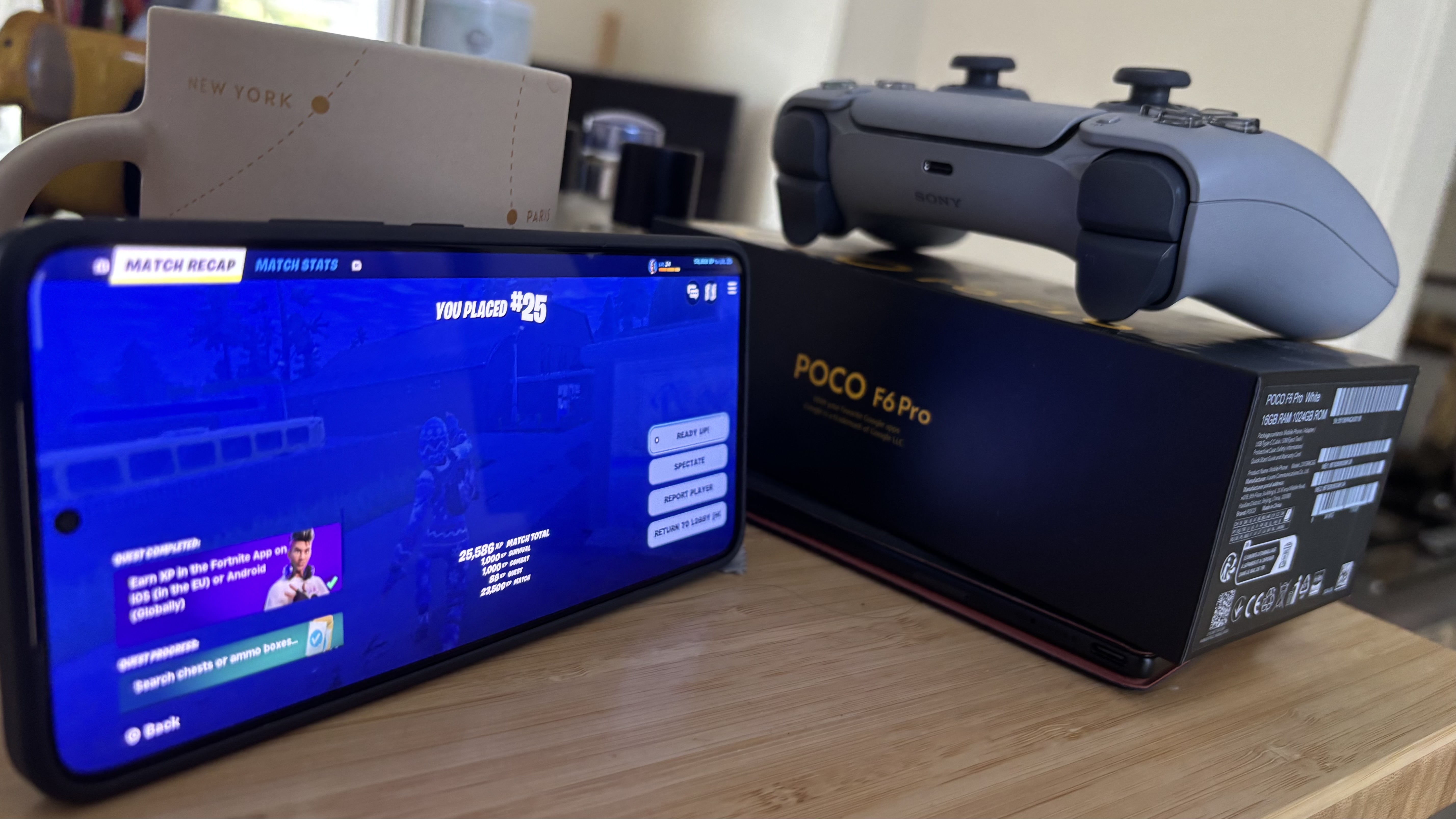
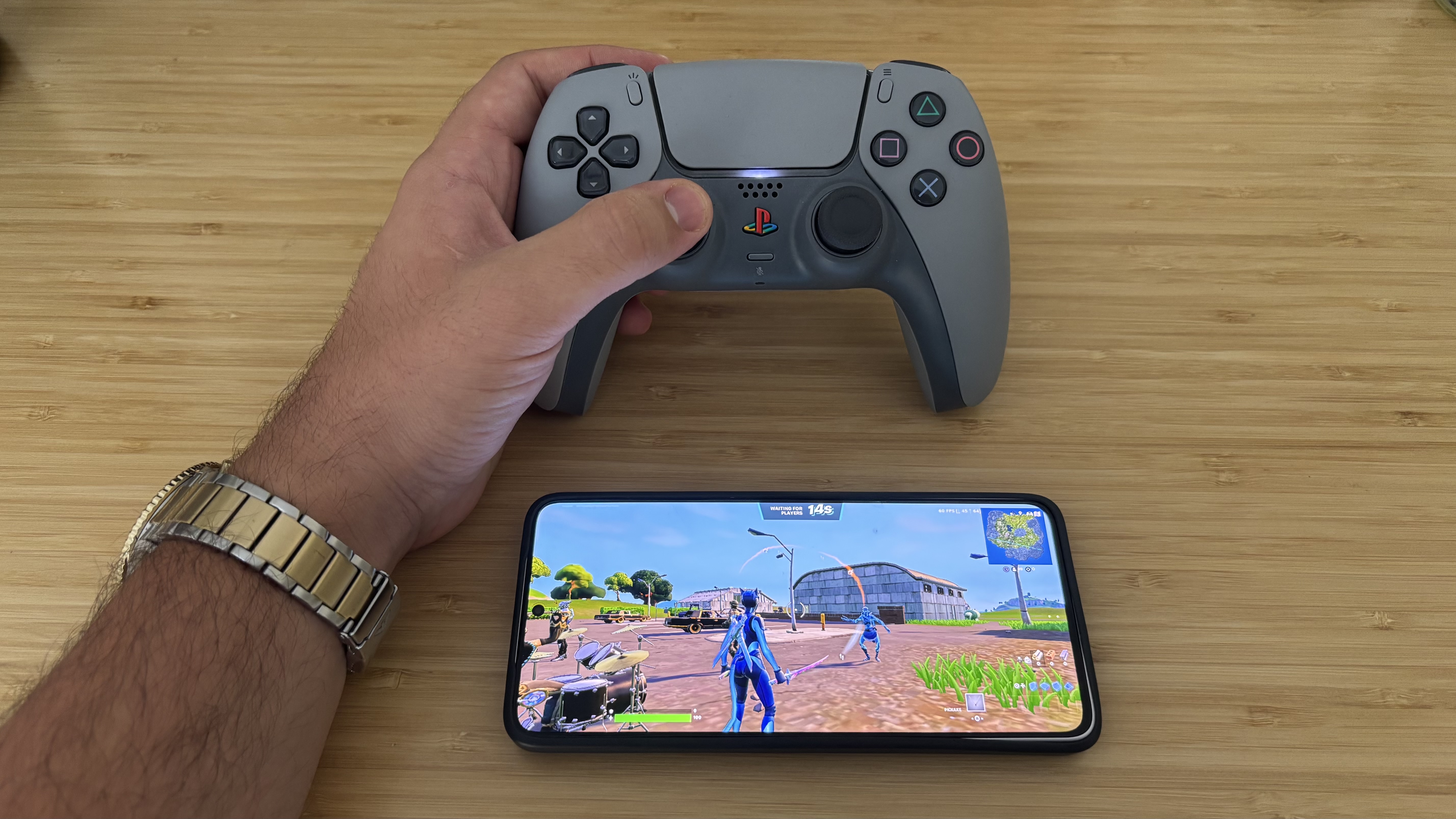
Anche senza essere orientato al gaming spinto, il Poco F6 Pro riesce a garantire prestazioni fluide anche con titoli esigenti come Fortnite, Rocket League o PUBG Mobile, mantenendo i 60FPS stabili con impostazioni grafiche elevate. Un dispositivo pensato per chi cerca il massimo senza dover spendere una fortuna.
Playing Fortnite on the Poco F6 Pro (Image credit: Future)
Il Poco F6 Pro sfoggia un ampio display da 6,67 pollici WQHD+ con colori vivaci e nitidi, ideale per chi cerca un’esperienza visiva premium. Il refresh rate a 120Hz garantisce fluidità nei giochi, mentre la risoluzione 3200 x 1440 eleva la qualità di film e serie TV. Con una luminosità di picco di 4000 nit, si avvicina perfino al livello del OnePlus 12 (4500 nit), offrendo visibilità eccellente anche sotto il sole diretto.
Il comparto fotografico comprende un sensore principale da 50MP, una ultra-grandangolare da 8MP e una macro da 2MP. Pur non raggiungendo le performance dei migliori camera phone, il F6 Pro offre scatti definiti e ricchi di dettagli, anche in condizioni di luce molto scarsa, grazie all’intervento dell’IA che migliora automaticamente nitidezza e contrasto.
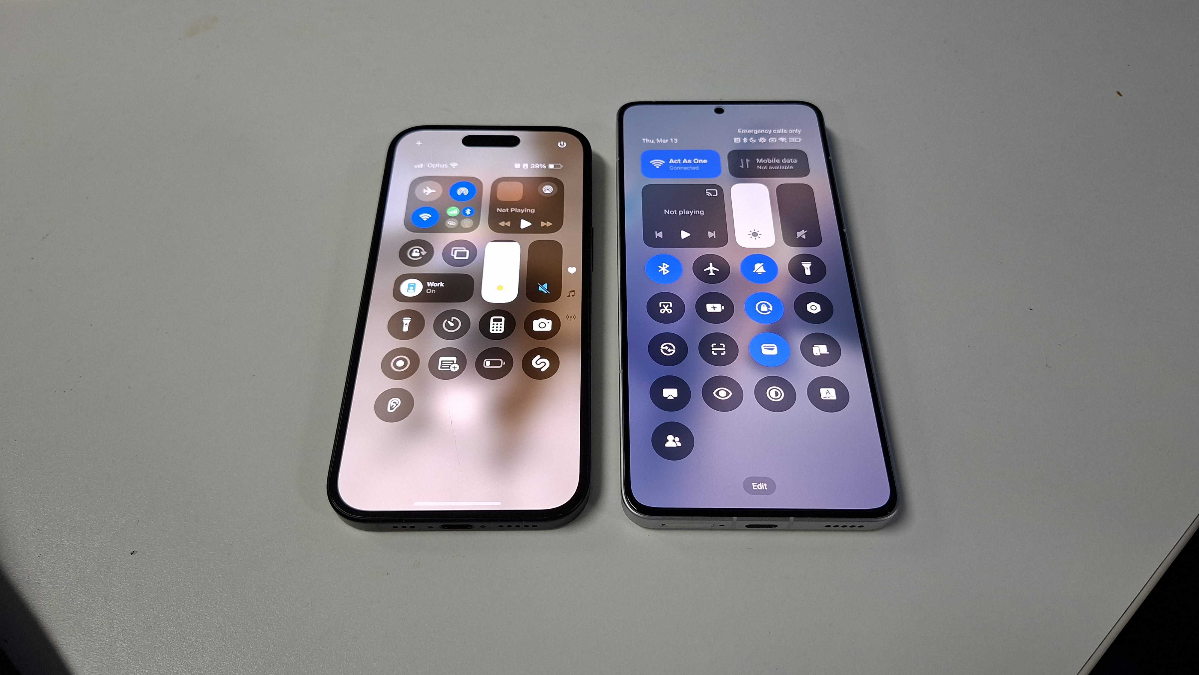
Chi proviene da un iPhone potrebbe apprezzare l’interfaccia HyperOS, che riprende chiaramente il Centro di Controllo di iOS con lo swipe dall’alto. Un dettaglio che rende la transizione più naturale per chi è abituato all’ecosistema Apple, distinguendosi dalle interfacce più classiche come la One UI di Samsung.
The Control Center of the iPhone 15 compared to the Poco F6 Pro (Image credit: Future)
E ora veniamo al vero punto dolente: la quantità eccessiva di bloatware. Appena acceso, il Poco F6 Pro presenta un numero spropositato di applicazioni preinstallate, comprese duplicazioni delle app Google, giochi inutili come Bubble Shooter e app di terze parti che affollano il drawer. Peggio ancora, non è possibile eliminarle in blocco: ogni app va rimossa manualmente, una per una.
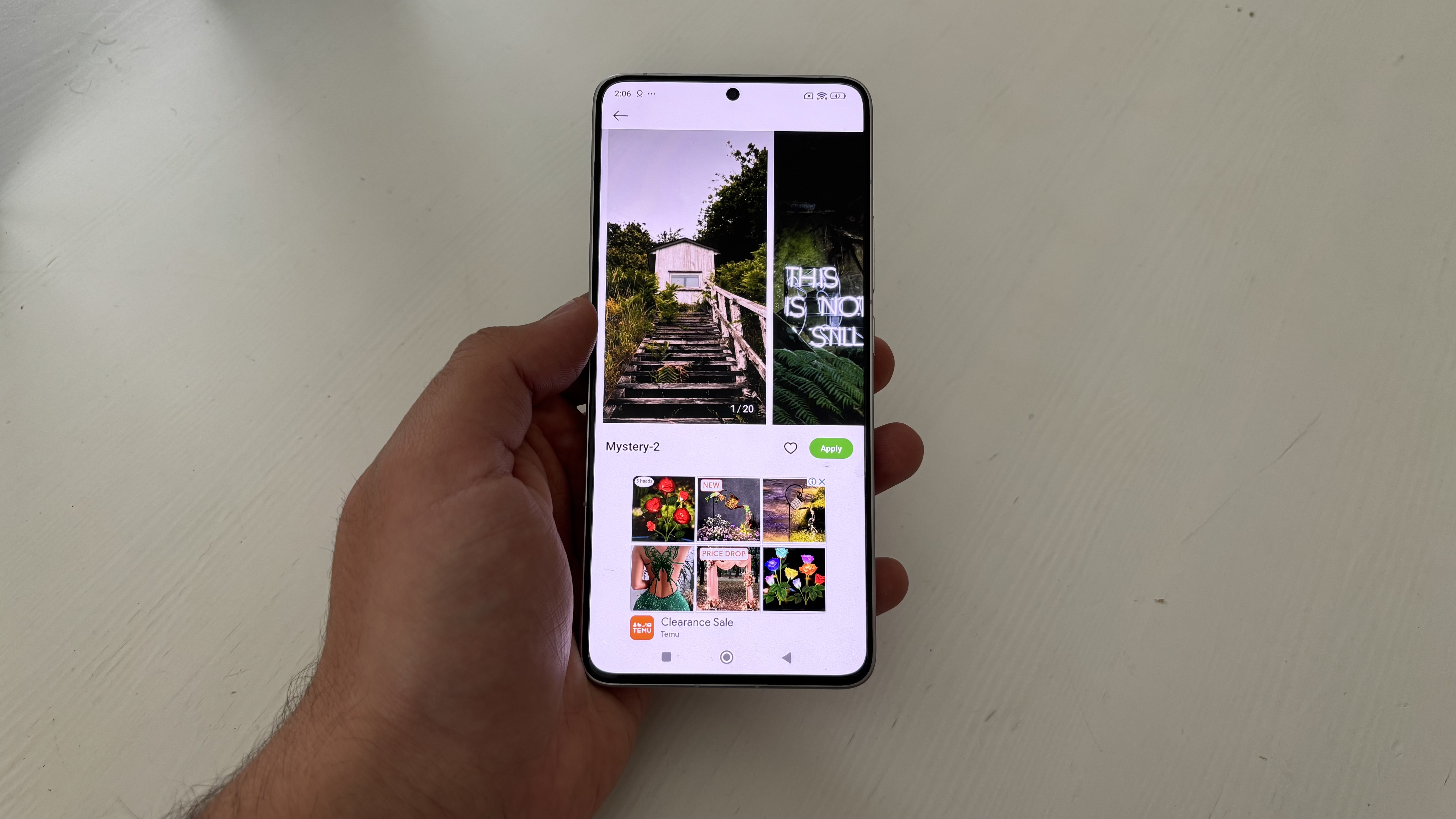
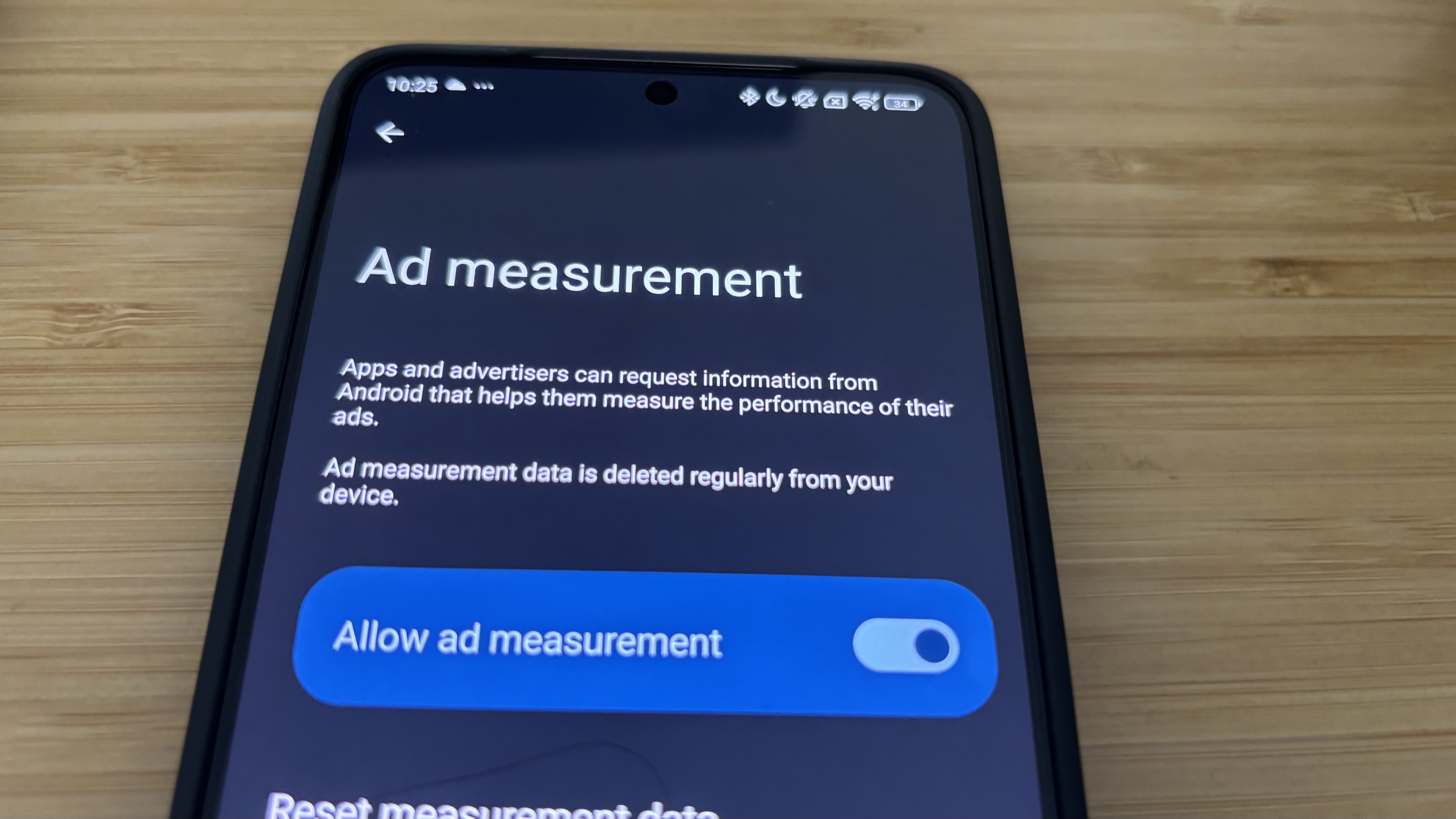
A rendere l’esperienza iniziale ancora più frustrante, ci sono anche annunci pubblicitari integrati nelle app di sistema, come ad esempio nei Temi. È vero, possono essere disattivati, ma resta assurdo che su uno smartphone a pagamento si debba subire pubblicità predefinite. Anche dopo averle tolte, il fastidio resta.
In un segmento dove Samsung, Google, Motorola e perfino Apple con il nuovo iPhone 16e offrono un’esperienza utente più pulita, questo aspetto frena il F6 Pro dal raggiungere l’eccellenza tra i migliori telefoni economici.
Detto ciò, superato lo scoglio iniziale, ci si ritrova tra le mani uno smartphone potente, con un display eccellente, batteria longeva e una qualità costruttiva da fascia alta. Poco include anche nella confezione un caricatore da 120W (in alcuni Paesi), un cavo USB-C e una custodia ben fatta, dettaglio sempre più raro.
Per chi cerca un dispositivo veloce, affidabile e adatto a giocare, scattare foto o guardare contenuti multimediali, il Poco F6 Pro offre un valore davvero difficile da battere.
Poco F6 Pro recensione: prezzo e disponibilità
(Image credit: Future)
Il Poco F6 Pro è stato lanciato a maggio 2024 in Europa in tre configurazioni: la versione base con 12GB di RAM e 256GB di storage al prezzo di circa 499 euro, quella intermedia con 512GB a 549 euro, e infine il modello più potente da 16GB di RAM e 1TB di memoria interna a 599 euro. La variante da 512GB è quella più facilmente reperibile, mentre le altre due risultano spesso limitate a mercati selezionati o difficilmente disponibili.
Fin dal primo utilizzo, il telefono ha dato l’impressione di voler offrire molto più di quanto il suo marchio ancora poco noto lasci intendere. Nonostante sia ancora poco conosciuto in Europa, Poco ha dimostrato con questo modello di poter davvero competere nella fascia media-alta del mercato, puntando tutto su un’esperienza visiva e prestazionale di livello quasi premium.
A rendere ancora più interessante il rapporto qualità-prezzo ci pensa il contenuto della confezione: oltre allo smartphone, sono inclusi un caricatore da 120W con presa Europlug CEE 7/16, un cavo USB-C e una cover protettiva – elementi che molte aziende hanno ormai eliminato, persino nei loro modelli di punta.
Nonostante alcuni difetti minori già affrontati in precedenza, il Poco F6 Pro ha colpito per la sua capacità di offrire prestazioni solide a un prezzo competitivo. Chi cerca il massimo risparmio potrebbe orientarsi verso il più economico Poco X7 Pro, ma per chi vuole un equilibrio tra potenza, schermo e autonomia senza spendere troppo, questo modello rappresenta una delle proposte più complete nella sua fascia.
Valore: 4.5/5
Poco F6 Pro recensione: specifiche
A giudicare dalla nomenclatura, sembrerebbe ovvio che il Poco F6 Pro sia lo smartphone più costoso e performante rispetto al Poco F6 standard, ma la realtà è più complessa. Il Poco F6 Pro è un mid-range versatile con una forte vocazione al gaming, ma il suo gemello più economico lo supera in alcune aree grazie a un focus più marcato sulla velocità.
Il Poco F6 Pro monta il chip Snapdragon 8 Gen 2, mentre il Poco F6 è dotato del più recente Snapdragon 8s Gen 3, garantendo un boost prestazionale in diversi scenari. Inoltre, anche sul fronte della resistenza, il modello standard ha la meglio: IP64 e Gorilla Glass Victus battono nettamente la certificazione IP54 e il più datato Gorilla Glass 5 della versione Pro.
Tra le specifiche da segnalare del F6 Pro troviamo il display WQHD+ da 6,67 pollici (risoluzione 3200 x 1440), un comparto fotografico posteriore 50/8/2MP e una batteria da 5.000mAh con ricarica cablata a 120W.
Dimensioni:
160.86 x 74.95 x 8.21mm
Peso:
209g
Display:
6.67-inch WQHD+ AMOLED
Risoluzioni:
3200 x 1440
Luminosità
1,200 nits (4,000 peak)
Chipset:
Qualcomm Snapdragon 8 Gen 2
RAM:
12GB / 16GB
Memoria:
256GB / 512GB / 1TB
OS:
Android 15 with HyperOS
Fotocamere:
50 MP main; 8MP ultra-wide; 2MP Macro
Selfie:
16MP
Batteria:
5,000mAh
Ricarica:
120W wired
Colori:
Nero, Bianco
Poco F6 Pro recensione: design
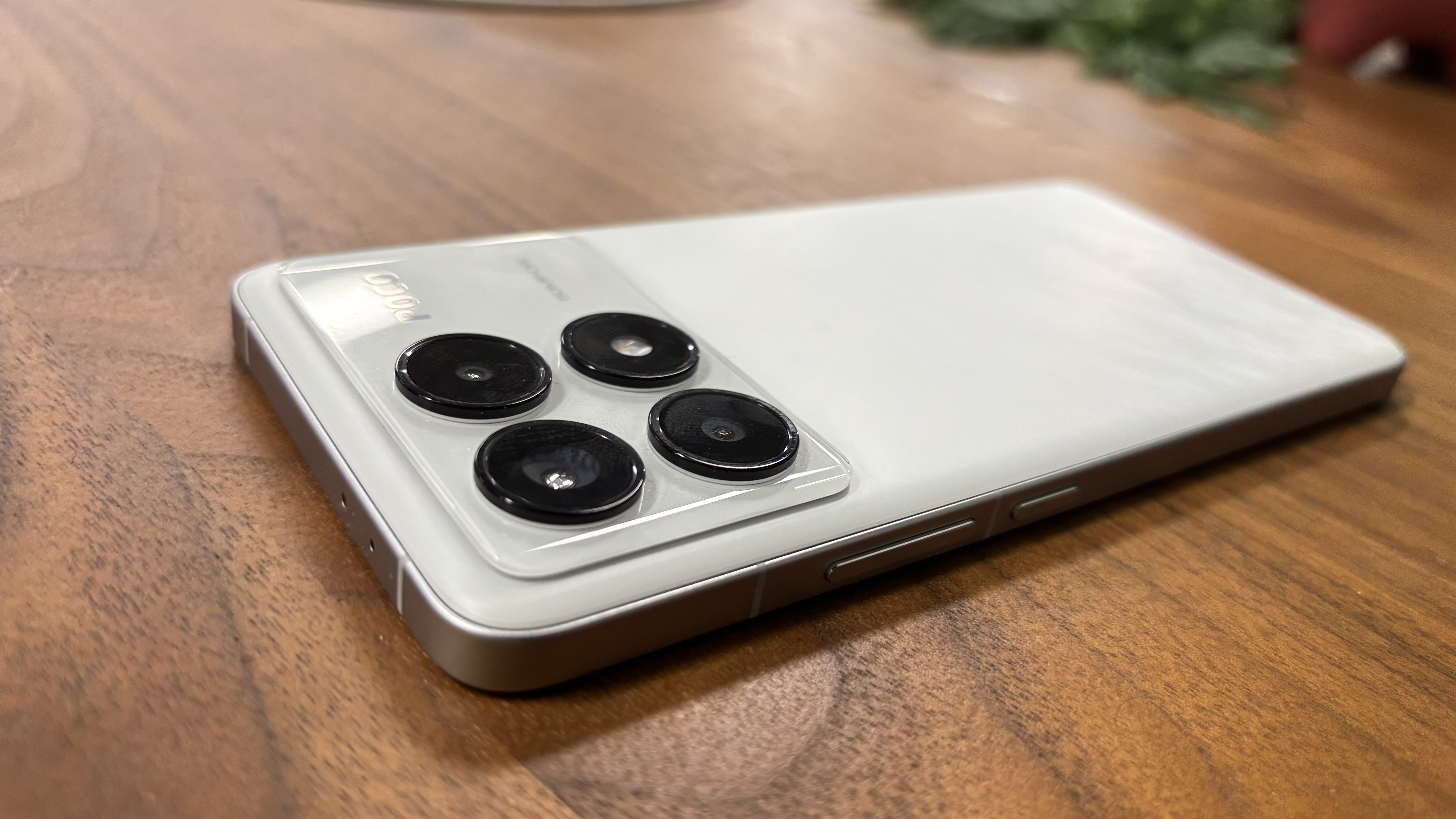
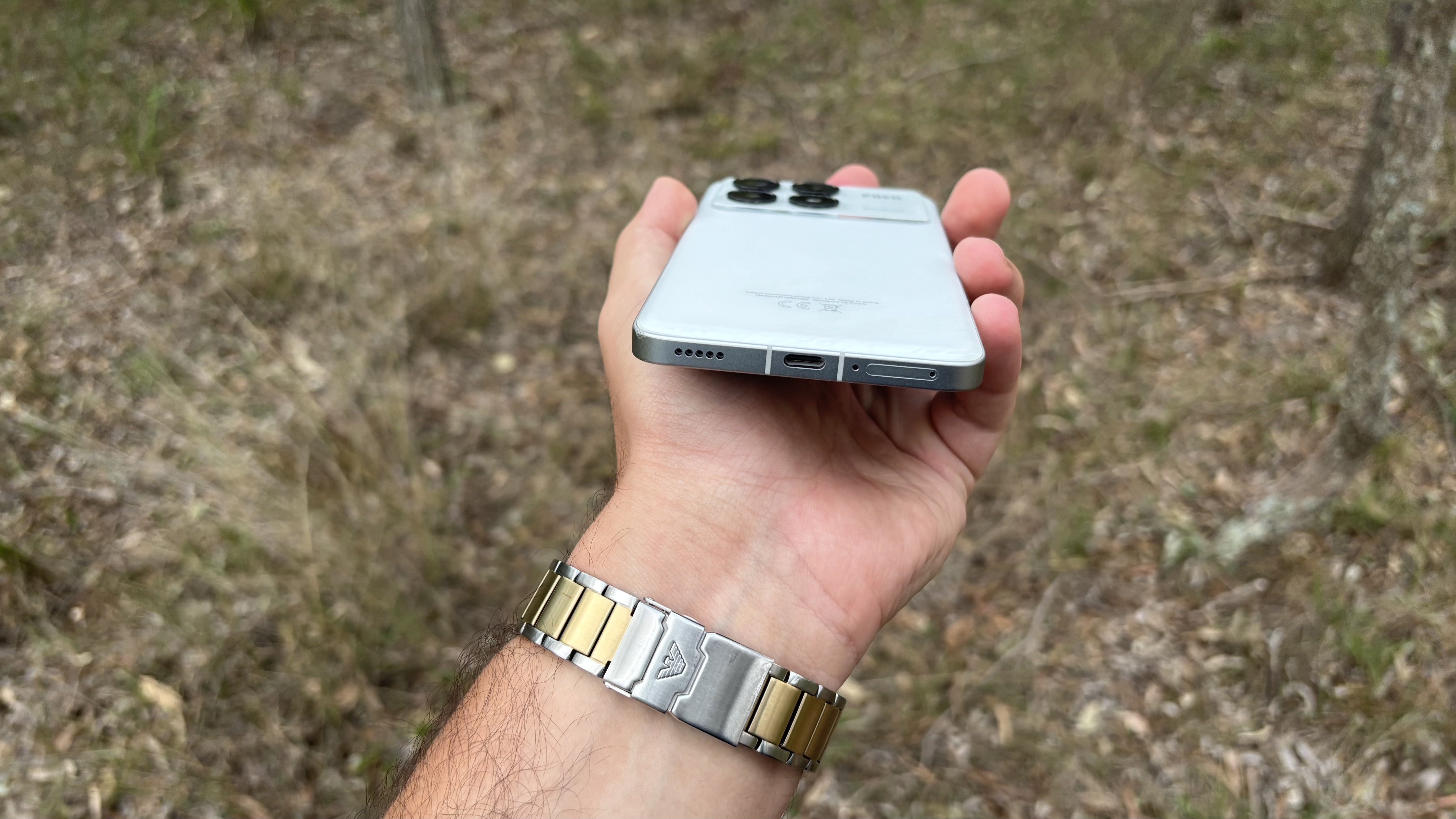
Poco F6 Pro camera bump and side buttons (Image credit: Future)
Proprio come il nuovo iPhone 16e, anche il Poco F6 Pro rinuncia ai colori vivaci per puntare su una scelta più sobria: solo nero e bianco, abbandonando il classico giallo brillante visto su molti altri dispositivi Poco. Il risultato è uno smartphone dal design premium, ma visivamente un po’ anonimo.
A differenza del Poco F6, che adotta una scocca in plastica, il F6 Pro sfoggia una cornice in alluminio e un retro in vetro quad-curvo con effetto marmorizzato, che conferiscono al telefono una sensazione di fascia alta ben al di sopra del suo prezzo.
Il modello in prova era bianco, e pur essendo più incline a preferire il nero, ho apprezzato fin da subito questa variante, soprattutto considerando la possibilità di utilizzare la custodia nera in dotazione.
A proposito della cover in gomma inclusa, sorprende per la sua qualità: dà un’impressione più solida rispetto agli accessori standard, quasi fosse acquistata a parte su Amazon.
Tuttavia, nemmeno la custodia può compensare il principale difetto del design: la certificazione IP54, che garantisce solo una protezione limitata da polvere e schizzi d’acqua. In confronto a rivali che partono da IP67, il Poco F6 Pro risulta meno adatto per ambienti ostili o situazioni climatiche avverse.
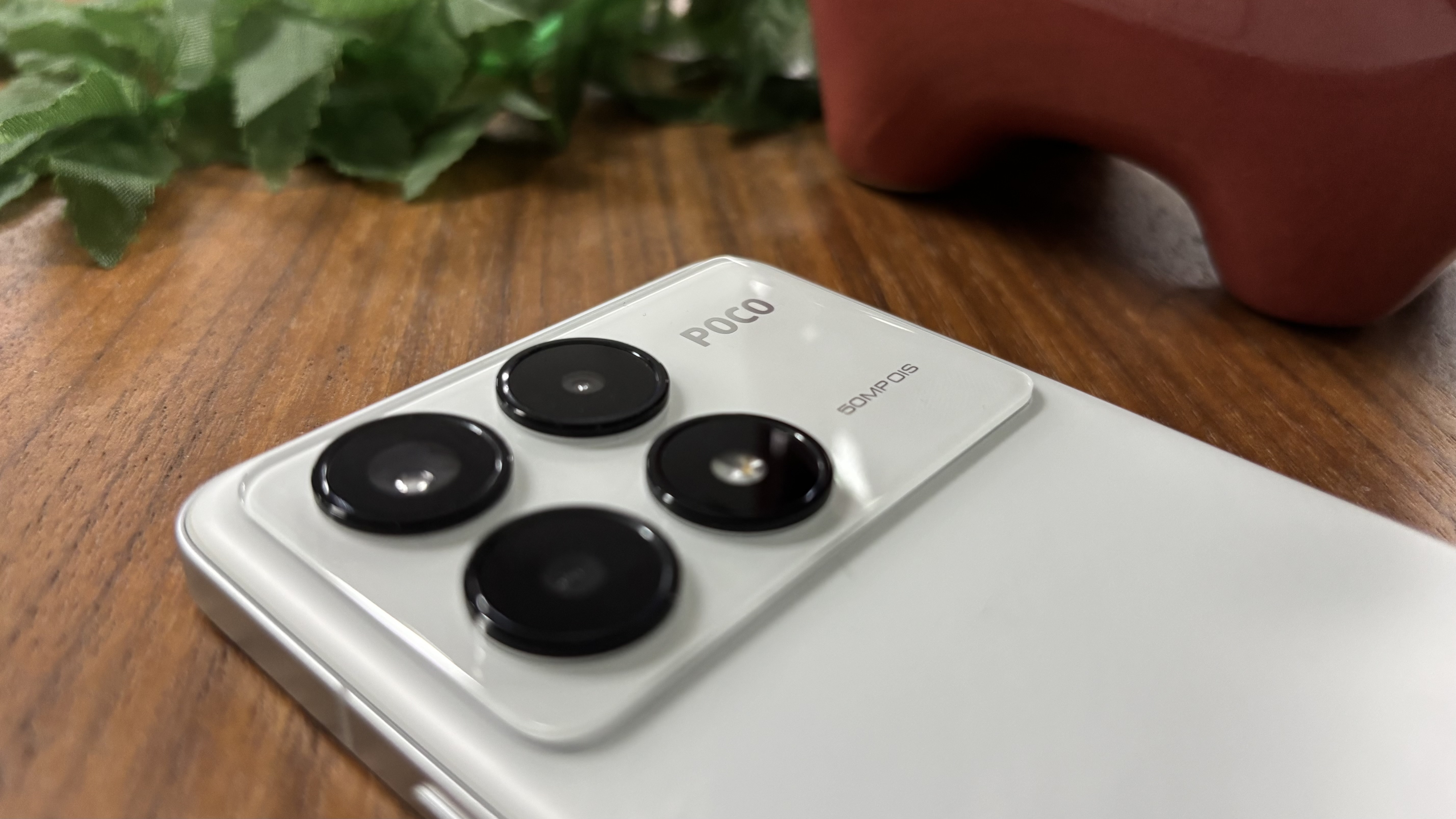
Sul retro, l’unico elemento che sporge davvero – oltre al discreto marchio Poco – è il modulo fotografico. Le tre lenti di grandi dimensioni e il flash occupano la parte superiore, ma grazie al design non provocano il classico ondeggiamento sul tavolo.
Bello da ogni angolazione e comodo da tenere sia con una che con due mani, il design del F6 Pro sarebbe stato uno dei suoi punti di forza… se il dispositivo non brillasse ancora di più in altri ambiti.
Design: 3.5/5
Poco F6 Pro recensione: display
(Image credit: Future)
Oltre alla sua potenza in ambito gaming, uno degli aspetti più sorprendenti del Poco F6 Pro è senza dubbio il display: visivamente, è tra i migliori che si possano trovare in questa fascia di prezzo.
Abituato al formato compatto dell’iPhone 12 mini, ho dovuto riadattarmi ai telefoni più grandi. E se è vero che grande non è sempre sinonimo di meglio, lo schermo da 6,67 pollici del Poco F6 Pro riesce a centrare perfettamente l’equilibrio tra maneggevolezza e immersione visiva.
Va detto: non tutti i display sono uguali. In passato ho avuto difficoltà con il Motorola Edge 50 Pro, troppo lungo e stretto nonostante i suoi 6,7 pollici, mentre il Samsung Galaxy A55 da 6,6 pollici è risultato decisamente più comodo da tenere in mano. Ho mani piuttosto grandi, ma il Poco F6 Pro si avvicina molto di più all’ergonomia del Galaxy A55, offrendo una presa salda e confortevole.
Per chi cerca una grande esperienza visiva senza sacrificare l’usabilità, il display del Poco F6 Pro è una delle sue armi più convincenti.
(Image credit: Future)
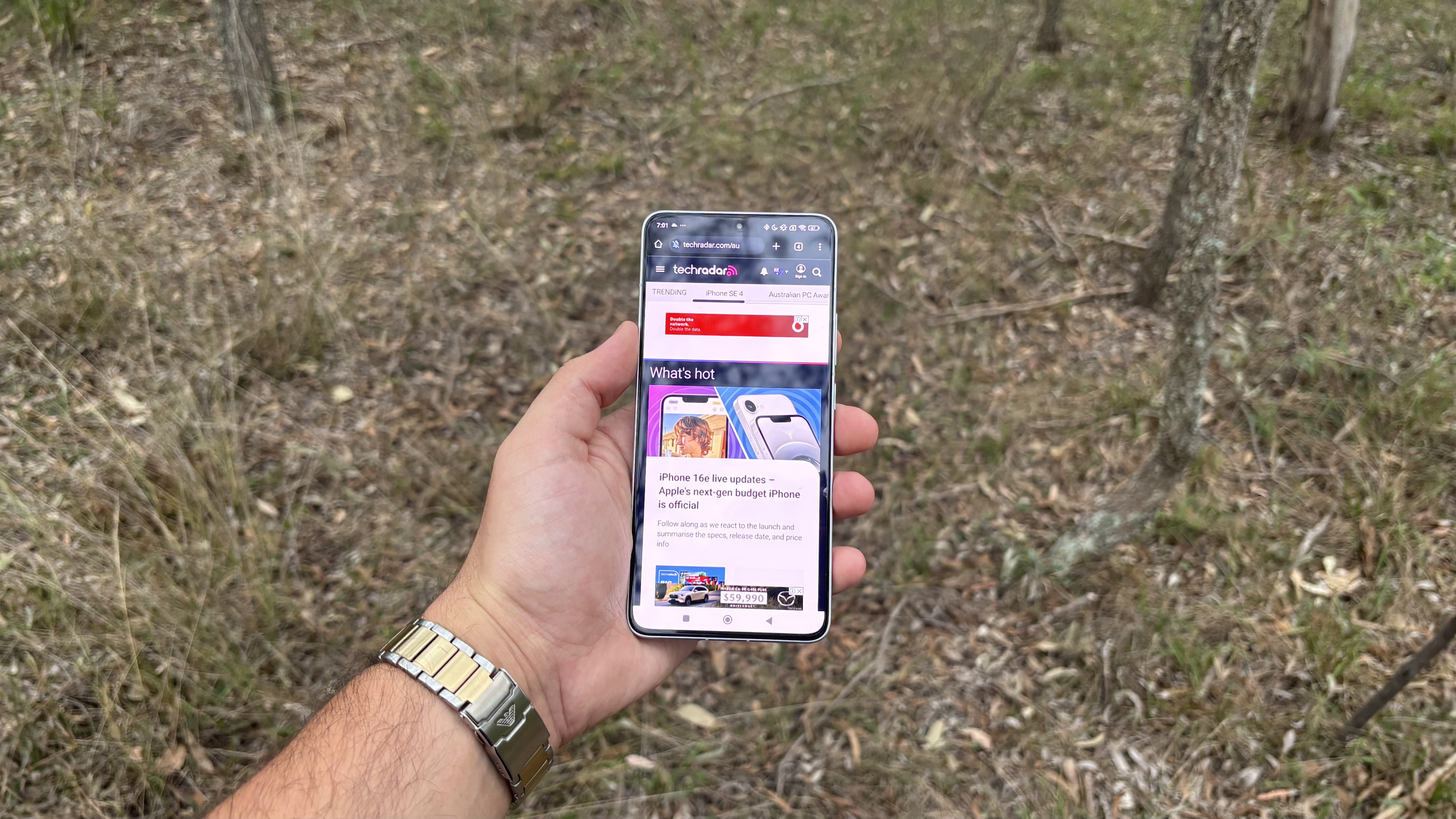
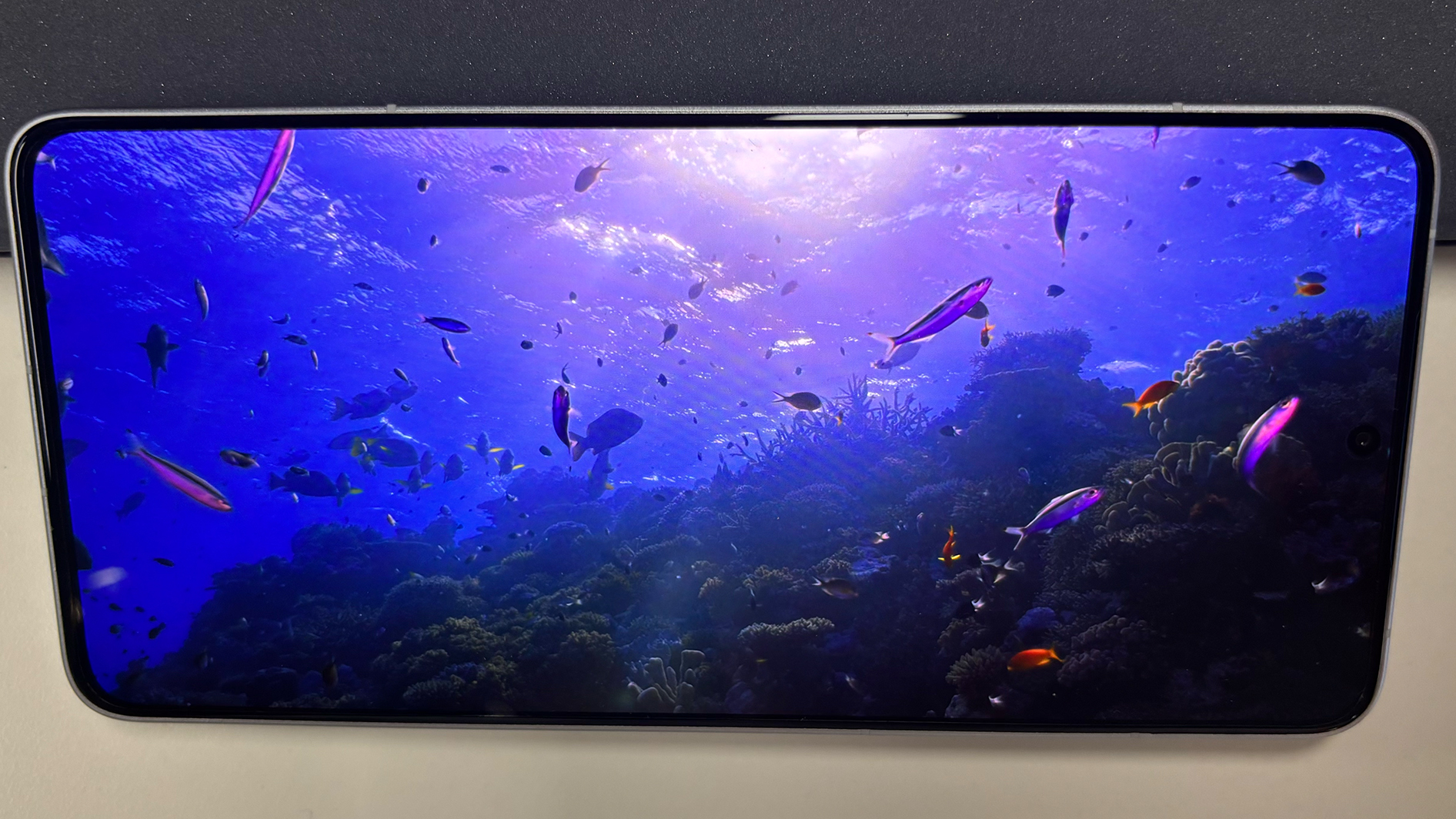
Al di là delle dimensioni, il Poco F6 Pro stupisce per la qualità del suo pannello: risoluzione 3200 x 1440, refresh rate a 120Hz (che va attivato manualmente nelle impostazioni, partendo da un valore predefinito di 60Hz) e luminosità di picco da 4000 nit. Che si tratti di leggere, giocare o guardare video, lo schermo appare sempre nitido e brillante, anche sotto il sole estivo australiano.
Peccato che, proprio sul fronte della resistenza, il F6 Pro mostri una delle sue debolezze principali. In modo piuttosto curioso, è il più economico Poco F6 a risultare più robusto, grazie alla protezione del Gorilla Glass Victus. Il F6 Pro, invece, si ferma al più datato Gorilla Glass 5, una scelta che lo penalizza rispetto a concorrenti diretti nella stessa fascia.
(Image credit: Future)
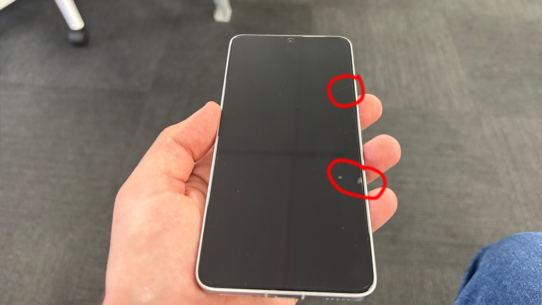
Di norma preferirei non testare la resistenza del vetro, ma il mio Poco F6 Pro è caduto dal lavandino del bagno su piastrelle dure, riportando piccoli danni. Ho notato inoltre quanto sia facile graffiarlo: qualche segno è comparso semplicemente tenendolo in tasca o nello zaino. Il problema maggiore, però, è che il vetro protettivo è visibilmente sopraelevato rispetto al pannello, un dettaglio che rovina l’estetica dello schermo.
Il display del Poco F6 Pro è luminoso, reattivo e piacevole da usare sia per guardare contenuti sia per giocare, ma nella stessa fascia di prezzo – e persino su modelli più economici, come il suo fratello minore – si trovano schermi più resistenti e meglio integrati, privi di un rivestimento così invasivo alla vista.
Display: 4/5
Poco F6 Pro recensione: software
(Image credit: Future)
Uno degli aspetti più belli di un nuovo smartphone è l’interfaccia pulita, ancora immacolata. Ma il Poco F6 Pro sembrava indossare sette cappelli, tre orologi e nove paia di calzini. In altre parole, il comparto software è forse il punto più debole del dispositivo.
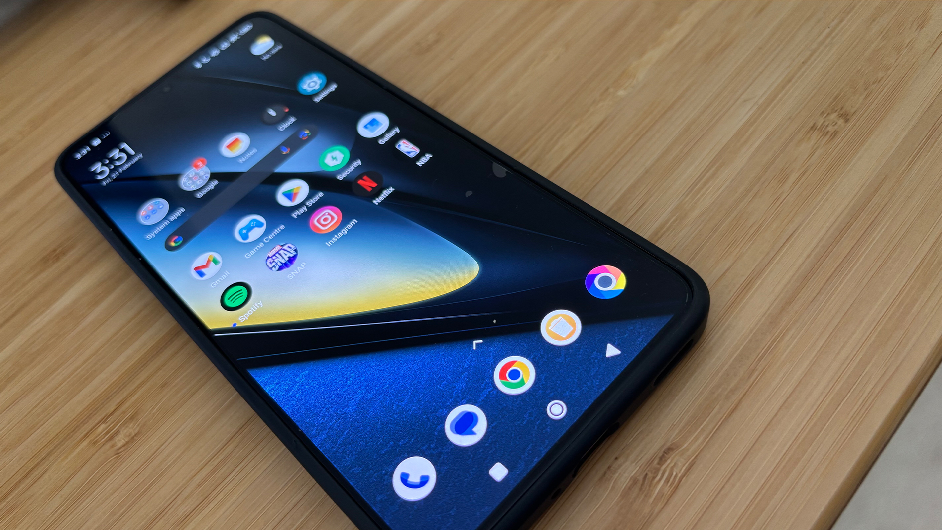
Le app preinstallate sono comuni sugli smartphone Android, ma qui si va oltre la semplice duplicazione di app di sistema come Galleria e Google Foto. Trattandosi del mio primo Xiaomi, l’esperienza col bloatware ha superato ogni aspettativa negativa: mai cancellato così tante applicazioni solo per avere una home screen pulita.
Due store, App Vault, Facebook, TikTok, Farm Frenzy, Booking.com, Bubble Shooter, LinkedIn, Mi Mover, Mi Remote, Mi Video, Poco Community… e l’elenco continua. E no, non si tratta di errori nell’installazione: anche rifiutando le app opzionali in fase di setup, vi troverete comunque con troppe app inutili preinstallate.
Va detto che, una volta eliminato tutto il superfluo, HyperOS si rivela un’interfaccia snella e gradevole, offrendo un’esperienza Android molto più semplice e godibile. Ma ci si arriva solo dopo una lunga operazione di pulizia.
Image 1 of 7
(Image credit: Future)
Image 2 of 7
(Image credit: Future)
Image 3 of 7
(Image credit: Future)
Image 4 of 7
(Image credit: Future)
Image 5 of 7
(Image credit: Future)
Image 6 of 7
(Image credit: Future)
Image 7 of 7
(Image credit: Future)
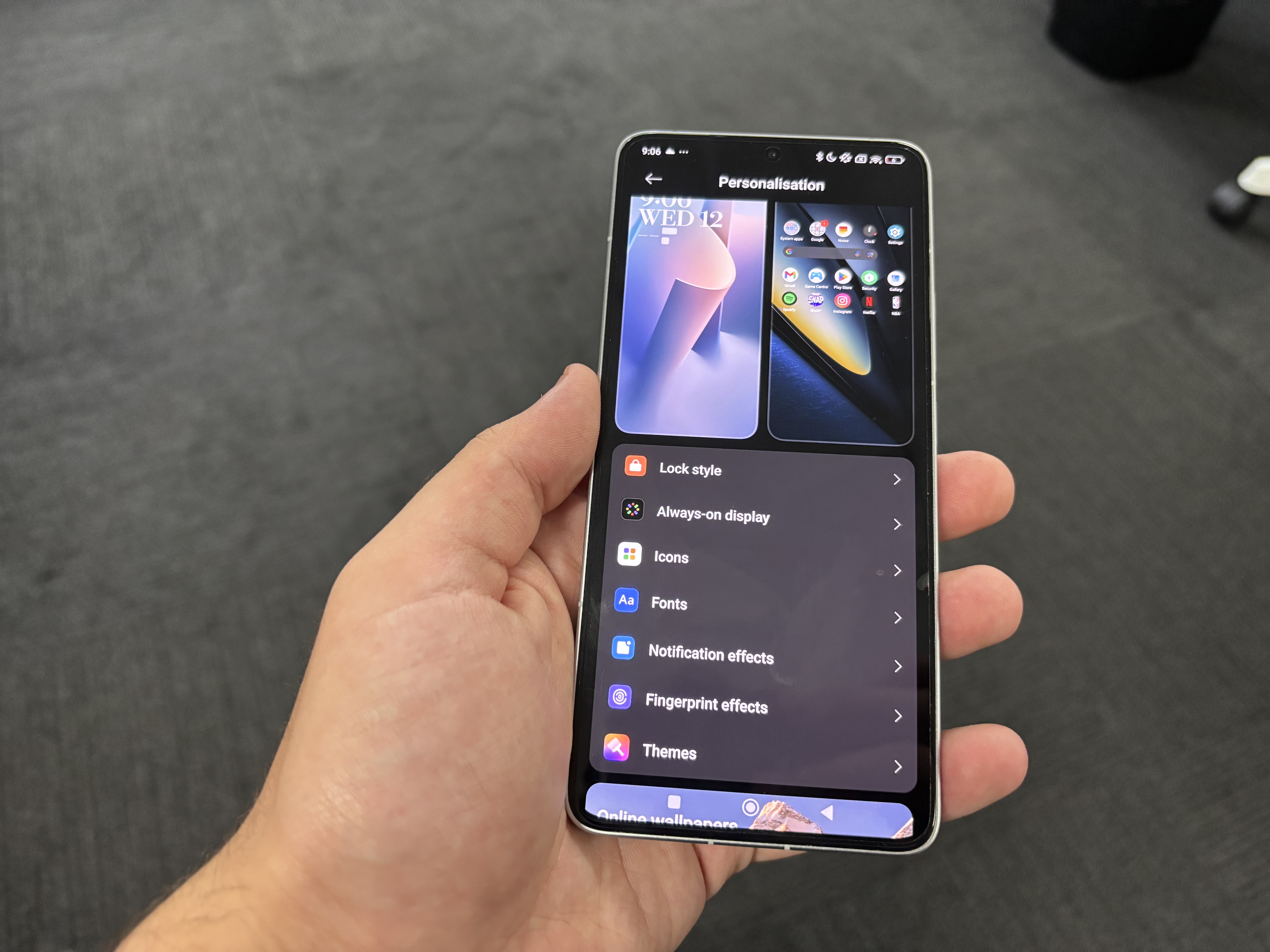
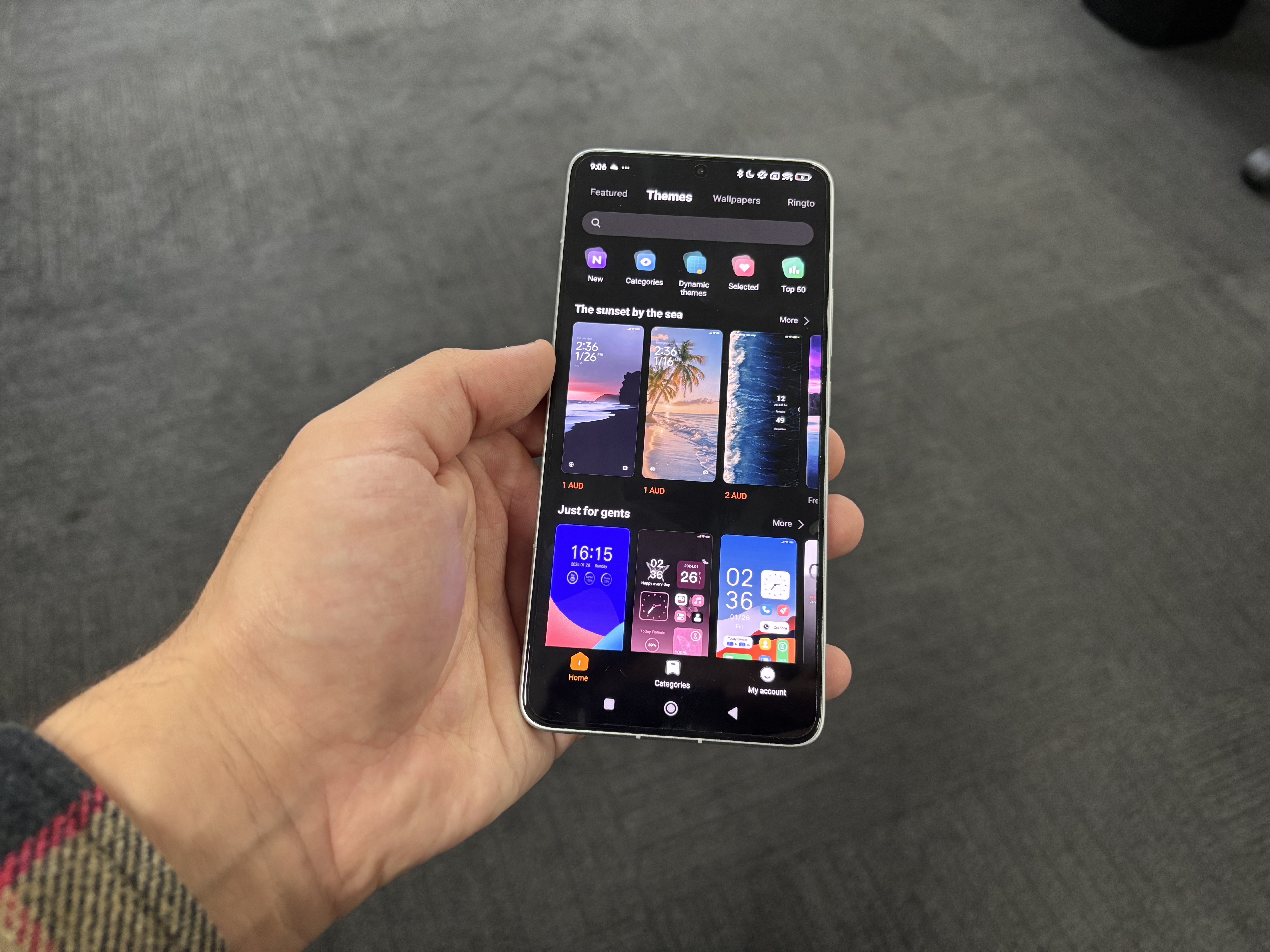
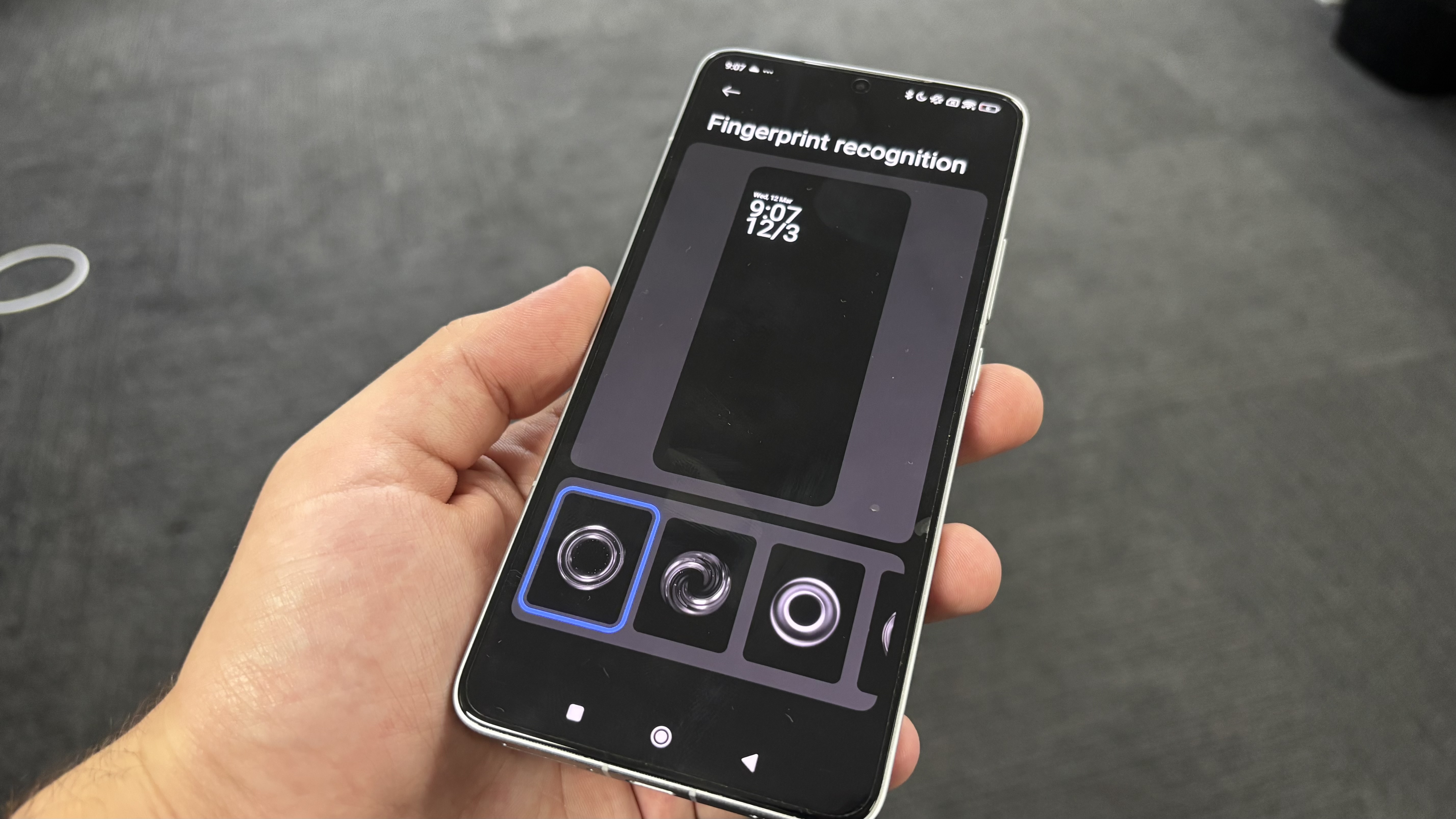
Sul fronte della personalizzazione, il Poco F6 Pro offre una vasta gamma di opzioni. È possibile modificare lo stile della schermata di blocco, le icone, i font, gli effetti delle notifiche e persino l’animazione dello sblocco tramite impronta.
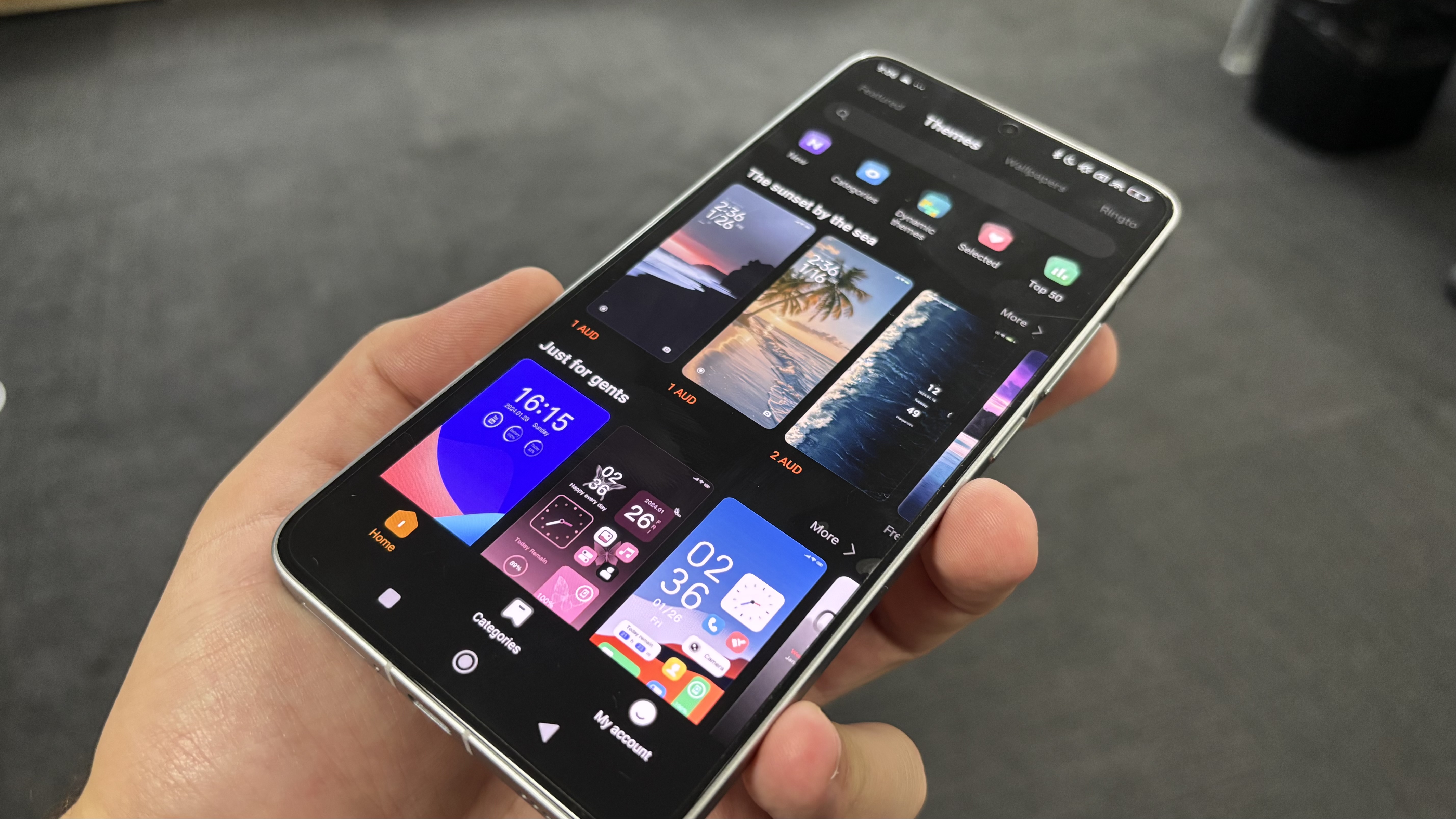
Inoltre, grazie al supporto ai temi completi, è facile cambiare simultaneamente più elementi estetici, ottenendo un look coerente e su misura. Un vantaggio notevole per chi ama adattare lo smartphone al proprio stile personale.
Image 1 of 4
(Image credit: Future)
Image 2 of 4
(Image credit: Future)
Image 3 of 4
(Image credit: Future)
Image 4 of 4
(Image credit: Future)
Per chi apprezza le funzionalità basate sull’intelligenza artificiale, il Poco F6 Pro ne offre davvero molte. Google Gemini è integrato e si attiva tenendo premuto il tasto di accensione: permette di fare domande su ciò che appare a schermo, impartire comandi vocali o scrivere richieste. È presente anche la funzione Cerchia e Cerca di Google.
Le opzioni IA non si fermano qui: in Note, Galleria e Registratore si trovano strumenti intelligenti per riassunti automatici, correzioni di testo, traduzioni, espansione e modifica delle immagini, trascrizioni, riconoscimento vocale e generazione di riassunti. C’è persino un interprete IA in tempo reale per le conversazioni e le chiamate, e sottotitoli IA per tradurre i video durante la riproduzione.
Nel complesso, abbiamo apprezzato l’esperienza offerta da HyperOS su Poco F6 Pro: fluida, reattiva e personalizzabile. I tre anni di aggiornamenti software non sono il massimo sul mercato, ma rappresentano comunque una promessa accettabile per questa fascia di prezzo.
Software: 3/5
Poco F6 Pro recensione: fotocamere
(Image credit: Future)
The ability to snap great photos on a cheap smartphone is one of the key needs for budget buyers. Sure, you want to save money by avoiding bank-breaking flagship devices, but you don’t want to struggle to take family photos, or be left with blurry results when you snap a selfie at the end of your hike.
That’s why, right next to battery life, camera performance is one of the top qualities of many of the best cheap phones, from the Motorola Edge 50 Pro, to the Edge 50 Fusion, Galaxy A55, Pixel 8a and more. That’s not the case for the Poco F6 Pro – it makes no apologies for focusing on gaming power and all-day battery. However, it still does well enough for most users to be happy with their results, especially if it’s a secondary need to gaming.
It is not the best camera I have used while testing the other budget phones, but it was satisfactory across the board. From the 50MP main camera, to the 8MP ultra-wide, 2MP macro and 16MP selfie camera, the Poco F6 Pro lets you take any photo you want.
Image 1 of 11
(Image credit: Future)
Image 2 of 11
(Image credit: Future)
Image 3 of 11
(Image credit: Future)
Image 4 of 11
(Image credit: Future)
Image 5 of 11
(Image credit: Future)
Image 6 of 11
(Image credit: Future)
Image 7 of 11
(Image credit: Future)
Image 8 of 11
(Image credit: Future)
Image 9 of 11
(Image credit: Future)
Image 10 of 11
(Image credit: Future)
Image 11 of 11
(Image credit: Future)
Il comparto fotografico del Poco F6 Pro non è tra i più completi del mercato: manca di molte modalità avanzate e filtri creativi presenti su altri modelli della stessa fascia. In particolare, la modalità macro può risultare frustrante: ottenere la messa a fuoco corretta richiede pazienza e soggetti immobili. Una volta trovata la giusta distanza, però, gli scatti sono buoni.
Ci sono comunque alcune funzionalità extra come lo scanner di documenti e la lunga esposizione, utili per chi vuole andare oltre le semplici foto e video. Il telefono promette molto sulla fotografia notturna, e in effetti riesce a catturare dettagli sorprendenti anche in ambienti quasi bui. Tuttavia, in condizioni di scarsa illuminazione reali, come un ristorante poco illuminato, i risultati sono stati altalenanti.
Image 1 of 3
(Image credit: Future)
Image 2 of 3
(Image credit: Future)
Result with Night Mode deactivated
Image 3 of 3
(Image credit: Future)
Il Poco F6 Pro non è tra i migliori smartphone per la fotografia, nemmeno nel segmento economico. Modelli come il Motorola Edge 50 Pro, il Samsung Galaxy A55 e il Galaxy A56 offrono risultati superiori in praticamente ogni condizione. Tuttavia, se il vostro obiettivo è semplicemente scattare buone foto a famiglia, animali o durante un’escursione, questo smartphone è più che sufficiente.
Fotocamere: 3.5/5
Poco F6 Pro recensione: performance
(Image credit: Future)
Classificare i processori degli smartphone non è mai semplice: alcuni eccellono in velocità pura, altri nel gaming, nell’efficienza energetica o in compiti specifici. Detto questo, il Poco F6 Pro monta uno dei migliori chip attualmente disponibili, lo Snapdragon 8 Gen 2.
Le prestazioni sono eccellenti sotto ogni aspetto, con particolare spicco nel gaming e nella durata della batteria. Riesce persino a superare il Dimensity 8400 presente nel più recente Poco X7 Pro.
La variante da 1TB e 16GB di RAM utilizzata durante il test ha stupito anche per la capacità di restare fresca sotto stress. Molti telefoni economici tendono a surriscaldarsi anche con compiti leggeri, e persino l’iPhone 15 usato abitualmente dal recensore si scalda durante attività semplici come la scelta di un podcast.
Il Poco F6 Pro è rimasto sempre fresco, anche durante sessioni di gioco intensive e mentre era in carica.
(Image credit: Future)
Le ottime prestazioni del Poco F6 Pro si confermano anche nei test sintetici. Nei benchmark Geekbench, che misurano la potenza della CPU, il telefono ha registrato un punteggio multi-core di 4.733, superando dispositivi come Google Pixel 9 Pro XL, Nothing Phone 2 e Motorola Razr 50 Ultra. Il punteggio single-core di 1.375 lo posiziona invece in linea con modelli di fascia media come Pixel 7a, Poco F5 Pro e Redmi Note 12 Turbo.
Passando ai test 3D Mark, pensati per valutare le prestazioni grafiche nei giochi, il Poco F6 Pro surclassa gli altri modelli economici e di fascia media, avvicinandosi addirittura a dispositivi di fascia alta.
Performance: 4.5/5
Poco F6 Pro recensione: batteria
(Image credit: Future)
Un telefono potente dovrebbe avere anche un’ottima autonomia, e nel caso del Poco F6 Pro, questa regola viene pienamente rispettata. Con una batteria da 5.000mAh, lo smartphone si allinea ai migliori dispositivi sul mercato, non solo nella fascia economica. Persino modelli come il Google Pixel 9 Pro (4.700mAh) risultano meno capienti, mentre il F6 Pro eguaglia la Samsung Galaxy S25 Ultra.
Naturalmente, la capacità della batteria non è tutto. È la LiquidCool Technology 4.0 con Ice Loop a fare la differenza, migliorando l’efficienza energetica e garantendo temperature contenute anche sotto stress. Il telefono si scalda appena durante il gaming a batteria scarica, ma riesce comunque ad arrivare tranquillamente a fine giornata.
Durante i test, con un uso che iniziava alle 5 del mattino e si concludeva alle 18, il Poco F6 Pro conservava ancora circa il 20% di carica, confermando una resistenza eccellente.
(Image credit: Future)
Il Poco F6 Pro include un caricatore da 120W, anche se non compatibile con le prese australiane. Poco promette una ricarica completa in soli 19 minuti con HyperCharge, a patto di avere l’alimentatore adeguato. Utilizzando il caricatore Xiaomi GaN da 67W (acquistabile separatamente), lo smartphone ha comunque dimostrato ottime performance: +22% in 5 minuti, circa 70% in un quarto d’ora, e 85% in mezz’ora.
Durante la prova su Fortnite Mobile, il dispositivo ha garantito oltre 3 ore e mezza di gameplay continuo a 60FPS con impostazioni grafiche elevate e luminosità all’80%. A fine giornata, con l’8% di batteria residua, ha resistito a sei partite di Marvel Snap (15 minuti totali), scendendo al 2%, con il sistema che stimava ancora 30 minuti di autonomia in standby.
Sia per l’uso quotidiano che per sessioni intense di gaming, il Poco F6 Pro si dimostra una scelta eccellente nella fascia economica, unendo prestazioni solide e ricarica ultra rapida.
Batteria: 4/5
Perché acquistare il Poco F6 Pro ?
Ragioni per acquistare
Siete gamer mobili ma avete anche altre esigenze
Il Poco F6 Pro garantisce ottime prestazioni in gioco, ma potrebbero esserci alternative migliori se cercate un dispositivo più equilibrato per altri utilizzi.
Guardate spesso contenuti dal telefono
Non offre lo schermo più grande o avanzato sul mercato, ma per chi guarda spesso video in mobilità e ha un budget limitato, il display da 6,67 pollici ad alta risoluzione è un’ottima soluzione.
Non volete preoccuparvi della batteria
La batteria da 5.000mAh potrebbe non spiccare sulla carta, ma grazie all’eccellente efficienza energetica, alla ricarica rapida e alle varie opzioni di risparmio energetico, il Poco F6 Pro vi accompagna fino a fine giornata senza problemi.
Ragioni per NON acquistare
Le fotocamere sono la vostra priorità
Le fotocamere del Poco F6 Pro offrono risultati discreti, ma esistono opzioni migliori allo stesso prezzo o anche a meno. Vale la pena considerare l’attesa per il Google Pixel 9a.
Preferite un’esperienza pulita fin dall’inizio
Il dispositivo arriva con molte app preinstallate, spesso doppioni di quelle base come store, galleria o posta. Se cercate una configurazione pulita e senza ingombri, non è la scelta ideale.
Volete tenere lo smartphone per anni
Se lavorate in ambienti difficili o volete semplicemente un telefono più resistente e duraturo, sul mercato ci sono alternative più robuste e meglio protette rispetto al Poco F6 Pro.
Traditional WordPress page builders had their moment. Builders like Elementor, Divi, and Oxygen have been around for years. So long, in fact, that many of us just accepted their limitations as the cost of using WordPress.
But Droip, a relatively new no-code website builder, steps in with a completely different philosophy. It is built to provide Webflow and Framer-level power in WordPress, complete design freedom, built-in performance, and no reliance on third-party plugins.
In this review, we’re putting Droip head-to-head with traditional builders according to all the things that matter when choosing a website builder:
Price,
Affect on website performance,
User-friendliness vs flexibility,
Features,
Theme and layout options.
What Is Droip?
Droip is a no-code visual website builder for WordPress, designed to bridge the gap where other page builders fall short.
Unlike other page builders, Droip is an all-in-one solution that aims to provide everything you need to build websites without any third-party dependencies, shifting from the norm in WordPress!
And the best part? It’s all included in your subscription, so you won’t be hit with surprise upgrades.
Pricing: A Smarter Investment with All Features Included
While most page builders upsell critical features or require multiple add-ons, Droip keeps it simple: one platform, all features, no hidden costs.
It’s surprisingly affordable for the value it delivers. The Starter plan is just $34.50/year (currently at 50% off) for one site and includes all premium features.
If you compare it with Elementor, that’s almost half the cost of Elementor Pro’s Essential plan, which starts at $60/year and still keeps several essentials behind paywalls.
Droip also has a Lifetime plan. For a one-time payment of $299.50, you get unlimited use, forever. No renewals, no upcharges.
All Droip Pro plans are fully featured from the start. You don’t need to stack plugins or pay extra to unlock dynamic content support, pop-up builders, or submission forms. You also get access to the entire growing template library from day one.
Performance directly impacts user experience, SEO, and conversion rates. So, to get a clear picture of how different page builders impact performance, we put Droip and Elementor to the test under identical conditions to see how each builder stacks up.
We installed both on a clean WordPress setup using the default Twenty Twenty-Five theme to ensure a fair comparison. Then, we created identical layouts using comparable design elements and ran Lighthouse performance audits to measure load time, responsiveness, and Core Web Vitals.
Test Conditions:
Clean WordPress installation.
Same theme: Twenty Twenty-Five.
Same layout structure and design elements.
Lighthouse is used for performance scoring.
Sample Layout
Droip’s Performance
Elementor’s Performance
Droip’s Code Output
Elementor’s Code Output
The difference was immediately clear. Droip generated a much cleaner DOM with significantly fewer <div>s and no unnecessary wrappers, resulting in faster load times and higher scores across all boards.
Elementor, on the other hand, added heavily nested markup and extra scripts, even on this simple layout, which dragged down its performance.
If clean code, fast loading, and technical efficiency are priorities for you, Droip clearly comes out ahead.
Exploring The Features
Now that we’ve seen how Droip outperforms the competition and does it at a highly competitive price, let’s dive into the features to see what makes it such a powerful all-in-one builder.
Freeform Visual Canvas For True Design Freedom
What makes Droip different from the existing page builders is its freeform visual canvas.
With Droip, you finally get the layout flexibility modern design demands and no longer need to place elements into rigid structures.
The editor is powerful, modern, and feels more like designing in a modern interface tool like Figma.
You can place elements exactly where you want, overlap sections, layer backgrounds, and create complex animations & interactions all visually. Every element’s layout behavior is editable on canvas, giving you pixel-level control without touching code.
The editor supports both light and dark modes for a more comfortable, focused workspace.
If you’ve used Figma or Webflow, you’ll feel instantly at home. If you haven’t, this is the most natural way to design websites you’ve ever tried.
Instant Figma to Droip Handoff
Talking about Figma, if you have a design ready in Figma, you can instantly import it into Droip to a functional website with no need to rebuild from scratch.
Seamless import of Figma designs directly into Droip for fast development. (Large preview)
Your imported design comes in fully responsive by default, adapting to all screen sizes, including any custom breakpoints you define.
And it supports unlimited breakpoints, too. You can define layout behavior exactly how you want it, and styles will cascade intelligently across smaller screens.
No Third-Party Plugins Needed For Dynamic Content
In traditional WordPress, handling dynamic content means installing the ACF or other third-party plugins.
But with Droip, all of that is natively integrated. It comes with a powerful Dynamic Content Manager that lets you:
Create custom content types and fields.
Use reference and multi-reference relationships.
Build dynamic templates visually.
Add dynamic SEO to template pages.
Apply advanced filtering to Collection elements.
All without writing a single line of code or relying on external plugins.
Reusable Styling With Class-Based Editing
Droip also has an efficient way to manage design at scale without repetitive work.
It uses a class-based styling system that brings structure and scalability to your design process. When you style an element, those styles are automatically saved as reusable CSS classes.
Here’s what that means for you:
You can create global classes for common components like buttons, cards, or headings.
Reuse those styles across pages and projects with consistency.
Update a class once, and every instance updates instantly.
You can also create subclasses to make slight variations, like secondary buttons, while still inheriting styles from the parent.
CSS Variables For Global Styling
Droip takes styling even further with Global Variables, allowing you to define design tokens like colors, fonts, spacing, and sizing that can be reused across your entire site.
You can pair these global variables with your class-based structure to:
Maintain visual consistency;
Update values globally with a single change;
Easily manage themes like switching between light and dark modes with one click.
And while Droip offers a fully visual experience, it doesn’t limit advanced users. You can write custom CSS for any class or element, and even inject JavaScript at the page or element level when needed.
Build Complex Interactions and Animations Visually
When it comes to modern animations and interactive design, Droip leaves traditional WordPress page builders far behind.
You can build scroll-based animations, hover and click effects, interactive sections that respond across devices, and control visibility, motion, and behavior all within a visual interface.
For advanced users, Droip includes a timeline-based editor where you can:
Create multi-step animations;
Fine-tune transitions with precise timing, easing, delays, and sequencing.
Even text animations get special attention.
You can animate text by character, word, or full element. Choose custom triggers (scroll, hover, load, and so on) and select from various transition styles or create your own.
Droip’s no-code website builder truly helps you move past generic and create unique animations and complex interactions.
Seamless Integration Management With Droip Apps
Droip takes the hassle out of connecting third-party tools with its intuitive Droip Apps system. You can install and manage essential integrations such as analytics, CRMs, email marketing platforms, support widgets, and more, all from within the Droip editor itself.
This centralized approach means you never have to leave your workspace. The clean, user-friendly interface guides you through the connection process visually, making setup fast and straightforward even if you’re not a technical expert.
Accessibility Is Core To The Experience
One of Droip’s standout features is its built-in focus on accessibility from day one.
Unlike many platforms that rely on third-party plugins for accessibility, Droip integrates it directly into the core experience.
Whether you need to enlarge editor text, reduce motion effects, use a larger cursor, or work with color-blind–friendly palettes, Droip ensures an inclusive editing environment.
But it doesn’t stop at editor settings. Droip actively helps you follow best accessibility practices, enforcing semantic HTML, prompting for proper alt text, and supporting ARIA labels. Plus, its built-in contrast checker ensures your designs aren’t just visually appealing, they’re easy to read and use for everyone.
Team Collaboration Made Easy
Collaboration is also a core part of the experience, thoughtfully designed to support teams, clients, and developers alike. With Droip’s Role Manager, you can define exactly what each role can view, edit, or manage within the builder.
You can assign custom roles to team members based on their responsibilities, like designers, developers, content editors, clients, and so on.
For handling client reviews, it also generates a shareable view-only link that gives clients access to preview the site without giving them edit permissions or exposing the backend. Perfect for gathering feedback and approvals while maintaining full control.
Built-in Quality Control
Before you publish your site, Droip helps ensure your site is technically sound with its built-in Page Audit tool.
It automatically scans your layout for:
Missing alt text on images,
Broken links,
Unassigned or duplicate classes,
Accessibility issues,
And more.
So you’re not just building beautiful pages, you’re shipping fast, accessible, SEO-ready websites with confidence.
Theme & Layout Options
Droip has a growing library of high-quality templates and modular layout options, so you’re never out of options.
Template Kits: Full Website Packs
Droip’s Template Kits include complete multi-page website designs for every industry. Pick a template, update the content, and you’re ready to launch.
New template kits are added regularly, so you’re always equipped with the latest design trends. And the best part? At no additional cost. You get access to the finest designs without ever paying extra.
Pre-Designed Pages
Do you need just a landing page or a pricing page? Droip also offers standalone pre-designed pages you can drop into your project and customize instantly.
Pre-Made Sections
Prefer to build from scratch but don’t want to start with a blank canvas? It also has ready-made sections like hero banners, testimonials, pricing blocks, and FAQs. You can visually assemble your layout in minutes using these.
Wireframes
You can also map out your layout using wireframes before applying any styling. It’s a great way to get your content and structure right without distractions, perfect for planning UX and content flow.
How Easy Is Droip to Use?
If you want something dead simple and just need to build a basic site fast, there are other options like Elementor that can do that, but at the cost of power, performance, and flexibility.
Droip, on the other hand, has a bit of a learning curve. That’s because it’s way more powerful and is built for those who care about design control, clean output, and scalability.
If you’re someone who wants to fine-tune every pixel, build advanced layouts, and doesn’t mind a learning curve, you’ll appreciate the level of control it offers.
Having said that, it’s not hard to use once you understand how it works.
The learning curve, especially for complete beginners, mostly comes from understanding its powerful features like dynamic content, reusable components (called Symbols), styling logic using classes, global variables, and breakpoints, advanced interactions using custom animation timelines, etc.
But to help you get up to speed quickly, Droip includes:
Guided onboarding to walk you through the essentials.
A growing library of templates, pages, UI components, and wireframes to kickstart your projects.
An AI Generator that can scaffold entire pages and layouts in seconds.
For many users, Droip is more than just a builder. It’s the all-in-one tool WordPress has been waiting for. They are calling it the future of WordPress, a truly great alternative to tools like Framer and Webflow.
TL;DR: Why Droip Outshines Traditional Builders
All-in-one builder with no third-party bloat.
Clean, performance-optimized code output.
Figma integration + modern visual canvas.
Dynamic content, advanced interactions, and global styling.
One price, all features, no hidden costs.
Overall Verdict: Is Droip Really Better Than Alternatives?
After putting Droip through its paces, the answer is a clear yes. Droip not only matches traditional WordPress page builders where it counts, but it surpasses them in nearly every critical area.
From its cleaner, faster code output and outstanding performance to its unparalleled design freedom and powerful built-in features, Droip solves many of the pain points that users have accepted for years. Its all-in-one approach eliminates the need for multiple plugins, saving time, money, and technical headaches.
While there is a learning curve for beginners, the payoff is huge for those who want full control, scalability, and a truly modern web design experience inside WordPress.
If you’re serious about building high-quality, scalable, and visually stunning websites, Droip isn’t just an alternative; it’s the future of WordPress site building.
Ready to experience the difference yourself? Try Droip today and start building faster, cleaner, and smarter.
Two critical flaws allow users to gain access to root privileges.
Nearly all major Linux distributions are vulnerable to a couple of sudo bugs. The two vulnerabilities are CVE-2025-32462 and CVE-2025-32463. Although the first bug has a low Common Vulnerability Scoring System (CVSS) score of 2.8, the second has a score of 9.3, which is critical.
Both vulnerabilities were discovered by the Stratascale’s Cybersecurity Research Unit and the full report can be read here. One very interesting point in the report states that “CVE-2025-32462 has remained unnoticed for over 12 years, despite being present in the code all along.”
The report then mentions CVE-2025-32462, when it says, it “…is an issue that has been hidden in plain sight since the host option was implemented 12 years ago. Because it’s a built-in option, no exploit is needed to elevate privileges.” The report continues, “However, the issue can only be leveraged with specific configurations using the Host or Host_Alias directives, which are commonly used in enterprise environments.”
The sudo –host option allows users to list their sudo rules for a particular host, and the report goes into detail on how this works in conjunction with the flaws.
As far as mitigation is concerned, the only thing you need to do is to confirm that your system’s sudo version is at least version 1.9.17p1 or later, which can be done with the command sudo -V. If your version is older than 1.9.17p1, update immediately.
Qualys researchers have discovered two local privilege escalation vulnerabilities that allow hackers to gain root privileges on major Linux distributions.
In many products, setting notification channels on mute is a default, rather than an exception. The reason for that is their high frequency, which creates disruptions and eventually notification fatigue, when any popping messages get dismissed instantly.
There is a good reason for it: high frequency of notifications. In usability testing, it’s the most frequent complaint, yet every app desperately tries to capture a glimpse of our attention, sending more notifications our way. Let’s see how we could make the notifications UX slightly better.
Notifications are distractions by nature; they bring a user’s attention to a (potentially) significant event they aren’t aware of or might want to be reminded of. As such, they can be very helpful and relevant, providing assistance and bringing structure and order to the daily routine. Until they are not.
“Status communication often relies on validation, status indicators, and notifications. While they are often considered to be similar, they are actually quite different.”
In general, notifications can be either informational (calendar reminders, delay notifications, election night results) or encourage action (approve payment, install an update, confirm a friend request). They can stream from various sources and have various impacts.
UI notifications appear as subtle cards in UIs as users interact with the web interface — as such, they are widely accepted and less invasive than some of their counterparts.
In-browser push notifications are more difficult to dismiss, and draw attention to themselves even if the user isn’t accessing the UI.
In-app notifications live within desktop and mobile apps, and can be as humble as UI notifications, but can take a more central role with messages pushed to the home screen or the notifications center.
OS notifications such as software updates or mobile carrier changes also get in the mix, often appearing together with a wide variety of notes, calendar updates, and everything in between.
Finally, notifications can find their way into email, SMS, and social messaging apps, coming from chatbots, recommendation systems, and actual humans.
But we don’t pay the same amount of attention to every notification. It can take weeks until they eventually install a software update prompted by their OS notification, or just a few hours to confirm or decline a new LinkedIn request.
Not Every Notification Is Equal
The level of attention users grant to notifications depends on their nature, or, more specifically, how and when notifications are triggered. People care more about new messages from close friends and relatives, bank transactions and important alerts, calendar notifications, and any actionable and awaited confirmations or releases.
People care less about news updates, social feed updates, announcements, new features, crash reports, promotional and automated messages in general. Most importantly, a message from another human being is always valued much higher than any automated notification.
Design For Levels Of Severity
As Sara Vilas suggests, we can break down notification design across three levels of severity: high, medium, and low attention. And then, notification types need to be further defined by specific attributes on those three levels, whether they are alerts, warnings, confirmations, errors, success messages, or status indicators.
Confirmations (potentially destructive actions that need user confirmation to proceed).
Medium Attention
Warnings (no immediate action required),
Acknowledgments (feedback on user actions),
Success messages.
Low Attention
Informational messages (aka passive notifications, something is ready to view),
Badges (typically on icons, signifying something new since last interaction),
Status indicators (system feedback).
Taking it one step further, we can map the attention against the type of messaging we are providing — very similar to Zendesk’s mapping tone above, which plots impact against the type of messaging, and shows how the tone should adjust — becoming more humble, real, distilled or charming.
So, notifications can be different, and different notifications are perceived differently; however, the more personal, relevant, and timely notifications are, the higher engagement we should expect.
Start Sending Notifications Slowly But Steadily
It’s not uncommon to sign up, only to realize a few moments later that the inbox is filling up with all kinds of irrelevant messages. That’s exactly the wrong thing to do. A study by Facebook showed that sending fewer notifications improved user satisfaction and long-term usage of a product.
Initially, once the notification rate was reduced, there was indeed a loss of traffic, but it has “gradually recovered over time”, and after an extended period, it had fully recovered and even turned out to be a gain.
A good starting point is to set up a slow default notification frequency for different types of customers. As the customer keeps using the interface, we could ask them to decide on the kind of notifications they’d prefer and their frequency.
Send notifications slowly, and over time slowly increase and/or decrease the number of notifications per type of customer. This might work much better for our retention rates.
Don’t Rely On Generic Defaults: Set Up Notification Modes
Typically, users can opt in and opt out of every single type of notification in their settings. In general, it’s a good idea, but it can also be very overwhelming — and not necessarily clear how important each notification is. Alternatively, we could provide predefined recommended options, perhaps with a “calm mode” (low frequency), a “regular mode” (medium frequency), and a “power-user mode” (high frequency).
As time passes, the format of notifications might need adjustments as well. Rather than having notifications sent one by one as events occur, users could choose a “summary mode,” with all notifications grouped into a single standalone message delivered at a particular time each day or every week.
That’s one of the settings that Slack provides when it comes to notifications; in fact, the system adapts the frequency of notifications over time, too. Initially, as Slack channels can be quite silent, the system sends notifications for every posted message.
As activities become more frequent, Slack recommends reducing the notification level so the user will be notified only when they are actually mentioned.
Make Notification Settings A Part Of Onboarding
We could also include frequency options in our onboarding design. A while back Basecamp, for example, has introduced “Always On” and “Work Can Wait” options as a part of their onboarding, so new customers can select if they wish to receive notifications as they occur (at any time), or choose specific time ranges and days when notifications can be sent.
Or, the other way around, we could ask users when they don’t want to be disturbed, and suspend notifications at that time. Not every customer wants to receive work-related notifications outside of business hours or on the weekend, even if their colleagues might be working extra hours on Friday night on the other side of the planet.
Allow Users To Snooze Or Pause Notifications
User’s context changes continuously. If you notice an unusual drop in engagement rate, or if you’re anticipating an unusually high volume of notifications coming up (a birthday, wedding anniversary, or election night, perhaps), consider providing an option to mute, snooze, or pause notifications, perhaps for the next 24 hours.
This might go very much against our intuition, as we might want to re-engage the customer if they’ve gone silent all of a sudden, or we might want to maximize their engagement when important events are happening. However, it’s easy to reach a point when a seemingly harmless notification will steer a customer away, long term.
Another option would be to suggest a change of medium used to consume notifications. Users tend to associate different levels of urgency with different channels of communication.
In-app notifications, push notifications, and text messages are considered to be much more intrusive than good ol’ email, so when frequency exceeds a certain threshold, you might want to nudge users towards a switch from push notifications to daily email summaries.
Wrapping Up
As always in design, timing matters, and so do timely notifications. Start slowly, and evolve your notification frequency depending on how exactly a user actually uses the product. For every type of user, set up notification profiles: frequent users, infrequent users, one-week-experience users, one-month-experience users, and so on.
And whenever possible, allow your users to snooze and mute notifications for a while. Eventually, you might even want to suggest a change in the medium used to consume notifications. And when in doubt, postpone, rather than sending through.
Meet “Smart Interface Design Patterns”
You can find more details on design patterns and UX in Smart Interface Design Patterns, our 15h-video course with 100s of practical examples from real-life projects — with a live UX training later this year. Everything from mega-dropdowns to complex enterprise tables — with 5 new segments added every year. Jump to a free preview. Use code BIRDIE to save 15% off.
This is the fourth post in a series about the new CSS shape() function. So far, we’ve covered the most common commands you will use to draw various shapes, including lines, arcs, and curves. This time, I want to introduce you to two more commands: close and move. They’re fairly simple in practice, and I think you will rarely use them, but they are incredibly useful when you need them.
In the first part, we said that shape() always starts with a from command to define the first starting point but what about the end? It should end with a close command.
But you never used any close command in the previous articles!?
That’s true. I never did because I either “close” the shape myself or rely on the browser to “close” it for me. Said like that, it’s a bit confusing, but let’s take a simple example to better understand:
clip-path: shape(from 0 0, line to 100% 0, line to 100% 100%)
If you try this code, you will get a triangle shape, but if you look closely, you will notice that we have only two line commands whereas, to draw a triangle, we need a total of three lines. The last line between 100% 100% and 0 0 is implicit, and that’s the part where the browser is closing the shape for me without having to explicitly use a close command.
I could have written the following:
clip-path: shape(from 0 0, line to 100% 0, line to 100% 100%, close)
Or instead, define the last line by myself:
clip-path: shape(from 0 0, line to 100% 0, line to 100% 100%, line to 0 0)
But since the browser is able to close the shape alone, there is no need to add that last line command nor do we need to explicitly add the close command.
This might lead you to think that the close command is useless, right? It’s true in most cases (after all, I have written three articles about shape() without using it), but it’s important to know about it and what it does. In some particular cases, it can be useful, especially if used in the middle of a shape.
CodePen Embed Fallback
In this example, my starting point is the center and the logic of the shape is to draw four triangles. In the process, I need to get back to the center each time. So, instead of writing line to center, I simply write close and the browser will automatically get back to the initial point!
Intuitively, we should write the following:
clip-path: shape( from center, line to 20% 0, hline by 60%, line to center, /* triangle 1 */ line to 100% 20%, vline by 60%, line to center, /* triangle 2 */ line to 20% 100%, hline by 60%, line to center, /* triangle 3 */ line to 0 20%, vline by 60% /* triangle 4 */ )
But we can optimize it a little and simply do this instead:
clip-path: shape( from center, line to 20% 0, hline by 60%, close, line to 100% 20%, vline by 60%, close, line to 20% 100%, hline by 60%, close, line to 0 20%, vline by 60% )
We write less code, sure, but another important thing is that if I update the center value with another position, theclosecommand will follow that position.
CodePen Embed Fallback
Don’t forget about this trick. It can help you optimize a lot of shapes by writing less code.
The move command
Let’s turn our attention to another shape() command you may rarely use, but can be incredibly useful in certain situations: the move command.
Most times when we need to draw a shape, it’s actually one continuous shape. But it may happen that our shape is composed of different parts not linked together. In these situations, the move command is what you will need.
Let’s take an example, similar to the previous one, but this time the triangles don’t touch each other:
CodePen Embed Fallback
Intuitively, we may think we need four separate elements, with its own shape() definition. But the that example is a single shape!
The trick is to draw the first triangle, then “move” somewhere else to draw the next one, and so on. The move command is similar to the from command but we use it in the middle of shape().
clip-path: shape( from 50% 40%, line to 20% 0, hline by 60%, close, /* triangle 1 */ move to 60% 50%, line to 100% 20%, vline by 60%, close, /* triangle 2 */ move to 50% 60%, line to 20% 100%, hline by 60%, close, /* triangle 3 */ move to 40% 50%, line to 0 20%, vline by 60% /* triangle 4 */ )
After drawing the first triangle, we “close” it and “move” to a new point to draw the next triangle. We can have multiple shapes using a single shape() definition. A more generic code will look like the below:
clip-path: shape( from X1 Y1, ..., close, /* shape 1 */ move to X2 Y2, ..., close, /* shape 2 */ ... move to Xn Yn, ... /* shape N */ )
The close commands before the move commands aren’t mandatory, so the code can be simplified to this:
clip-path: shape( from X1 Y1, ..., /* shape 1 */ move to X2 Y2, ..., /* shape 2 */ ... move to Xn Yn, ... /* shape N */ )
CodePen Embed Fallback
Let’s look at a few interesting use cases where this technique can be helpful.
Cut-out shapes
Previously, I shared a trick on how to create cut-out shapes using clip-path: polygon(). Starting from any kind of polygon, we can easily invert it to get its cut-out version:
CodePen Embed Fallback
We can do the same using shape(). The idea is to have an intersection between the main shape and the rectangle shape that fits the element boundaries. We need two shapes, hence the need for the move command.
The code is as follows:
.shape { clip-path: shape(from ...., move to 0 0, hline to 100%, vline to 100%, hline to 0); }
You start by creating your main shape and then you “move” to 0 0 and you create the rectangle shape (Remember, It’s the first shape we create in the first part of this series). We can even go further and introduce a CSS variable to easily switch between the normal shape and the inverted one.
.shape { clip-path: shape(from .... var(--i,)); } .invert { --i:,move to 0 0, hline to 100%, vline to 100%, hline to 0; }
By default, --i is not defined so var(--i,)will be empty and we get the main shape. If we define the variable with the rectangle shape, we get the inverted version.
Here is an example using a rounded hexagon shape:
CodePen Embed Fallback
In reality, the code should be as follows:
.shape { clip-path: shape(evenodd from .... var(--i,)); } .invert { --i:,move to 0 0, hline to 100%, vline to 100%, hline to 0; }
Notice the evenodd I am adding at the beginning of shape(). I won’t bother you with a detailed explanation on what it does but in some cases, the inverted shape is not visible and the fix is to add evenodd at the beginning. You can check the MDN page for more details.
Another improvement we can do is to add a variable to control the space around the shape. Let’s suppose you want to make the hexagon shape of the previous example smaller. It‘s tedious to update the code of the hexagon but it’s easier to update the code of the rectangle shape.
.shape { clip-path: shape(evenodd from ... var(--i,)) content-box; } .invert { --d: 20px; padding: var(--d); --i: ,move to calc(-1*var(--d)) calc(-1*var(--d)), hline to calc(100% + var(--d)), vline to calc(100% + var(--d)), hline to calc(-1*var(--d)); }
We first update the reference box of the shape to be content-box. Then we add some padding which will logically reduce the area of the shape since it will no longer include the padding (nor the border). The padding is excluded (invisible) by default and here comes the trick where we update the rectangle shape to re-include the padding.
That is why the --i variable is so verbose. It uses the value of the padding to extend the rectangle area and cover the whole element as if we didn’t have content-box.
CodePen Embed Fallback
Not only you can easily invert any kind of shape, but you can also control the space around it! Here is another demo using the CSS-Tricks logo to illustrate how easy the method is:
CodePen Embed Fallback
This exact same example is available in my SVG-to-CSS converter, providing you with the shape() code without having to do all of the math.
Repetitive shapes
Another interesting use case of the move command is when we need to repeat the same shape multiple times. Do you remember the difference between the by and the to directives? The by directive allows us to define relative coordinates considering the previous point. So, if we create our shape using only by, we can easily reuse the same code as many times as we want.
Let’s start with a simple example of a circle shape:
clip-path: shape(from X Y, arc by 0 -50px of 1%, arc by 0 50px of 1%)
Starting from X Y, I draw a first arc moving upward by 50px, then I get back to X Y with another arc using the same offset, but downward. If you are a bit lost with the syntax, try reviewing Part 1 to refresh your memory about the arc command.
How I drew the shape is not important. What is important is that whatever the value of X Y is, I will always get the same circle but in a different position. Do you see where I am going with this idea? If I want to add another circle, I simply repeat the same code with a different X Y.
clip-path: shape( from X1 Y1, arc by 0 -50px of 1%, arc by 0 50px of 1%, move to X2 Y2, arc by 0 -50px of 1%, arc by 0 50px of 1% )
And since the code is the same, I can store the circle shape into a CSS variable and draw as many circles as I want:
.shape { --sh:, arc by 0 -50px of 1%, arc by 0 50px of 1%; clip-path: shape( from X1 Y1 var(--sh), move to X2 Y2 var(--sh), ... move to Xn Yn var(--sh) ) }
You don’t want a circle? Easy, you can update the --sh variable with any shape you want. Here is an example with three different shapes:
CodePen Embed Fallback
And guess what? You can invert the whole thing using the cut-out technique by adding the rectangle shape at the end:
CodePen Embed Fallback
This code is a perfect example of the shape() function’s power. We don’t have any code duplication and we can simply adjust the shape with CSS variables. This is something we are unable to achieve with the path() function because it doesn’t support variables.
Conclusion
That’s all for this fourth installment of our series on the CSS shape() function! We didn’t make any super complex shapes, but we learned how two simple commands can open a lot of possibilities of what can be done using shape().
Just for fun, here is one more demo recreating a classic three-dot loader using the last technique we covered. Notice how much further we could go, adding things like animation to the mix:
Joshwa & Enzo is Burning make you move at night with this banger! 🔊 Subscribe and enable alerts (🔔) for a new track upload daily! Spotify playlist ▶︎ https://nyx.lnk.to/spotify 🫵 DJ & producer recommendations: »» 20% discount on all sample packs (use code NYX20) ➡ https://techhousemarket.com »» 20% discount on all vocal packs (use code NYX20) ➡ https://vocalfy.com »» Support the artist and buy records ➡ https://beatport.com/?a_aid=67bedae00dabb »» Fresh new tech house samples & loops ➡ https://loopcloud.com/?a_aid=67bedae00dabb 🎵 Discover track IDs & legendary live moments: »» https://instagram.com/themythofnyx »» https://tiktok.com/@themythofnyx »» https://soundcloud.com/themythofnyx Connect with Joshwa: »» https://facebook.com/joshwauk »» https://soundcloud.com/joshwauk »» https://twitter.com/joshwa_uk »» https://instagram.com/joshwauk Connect to Enzo Is Morning »» https://soundcloud.com/enzo_uk Tags: #joshwa #enzoisburning #nightmoves #themythofnyx #techhouse
Il Nintendo Switch 2 Pro Controller è stato lanciato insieme alla console stessa, e da allora è diventato il mio gamepad principale per Switch 2. Già durante un evento di anteprima qualche mese fa mi aveva colpito positivamente, ma averlo tra le mani a casa ha confermato le ottime impressioni: è forse il mio controller preferito dell’anno.
La filosofia alla base del prodotto è chiara: offrire una versione aggiornata dell’eccellente Nintendo Switch Pro Controller, uno dei migliori pad disponibili per la prima Switch, mantenendo intatte tutte le caratteristiche apprezzate dagli utenti. E posso dire che questo obiettivo è stato quasi completamente raggiunto con il nuovo modello.
Il controller è straordinariamente comodo, con una qualità costruttiva eccellente, dai materiali del corpo fino ai tasti. Le levette analogiche sono fluide e reattive, e l’introduzione di due tasti posteriori rimappabili e un jack per cuffie è un’aggiunta estremamente gradita.
Un altro aspetto che aveva reso memorabile il Pro Controller originale era l’incredibile autonomia, con circa 40 ore di utilizzo con una sola carica. E sono felice di dire che anche il nuovo Switch 2 Pro Controller non delude: dopo tre settimane di utilizzo quotidiano per qualche ora al giorno, l’avviso di batteria scarica è comparso solo di recente.
Cosa manca, allora, per renderlo davvero il miglior controller di sempre? Innanzitutto, non è ancora compatibile con PC, a differenza del suo predecessore. Probabilmente bisognerà attendere un aggiornamento su Steam per il supporto ufficiale, ma non mi sorprenderei se arrivasse a breve.
In secondo luogo, sarebbe stato utile un sistema di blocco dei grilletti, per passare da input digitali ad analogici a seconda del genere di gioco (i grilletti analogici sono naturalmente migliori per i titoli di guida, ad esempio).
Infine, Nintendo continua a non integrare levette con tecnologia Hall effect, e questo è un vero peccato. In pratica, questo significa che il rischio di drift nel tempo rimane. Forse non si presenterà in modo rapido come sui Joy-Con 2 – per i quali già circolano le prime segnalazioni – ma per un controller dal prezzo così elevato, la mancanza di stick più resistenti si fa sentire. Ancora di più se si considera quanto siano piacevoli da usare.
(Image credit: Future)
Nintendo Switch 2 Pro Controller recensione: prezzo e disponibilità
Se c’è un aspetto su cui si può criticare il Nintendo Switch 2 Pro Controller, è sicuramente il prezzo, che non è affatto contenuto.
È già disponibile all’acquisto sul sito ufficiale Nintendo e presso i principali rivenditori al prezzo di circa 85 euro.
Nel complesso, però, il prezzo è inferiore a quello di una coppia di Joy-Con 2, che negli Stati Uniti costa 94,99 dollari, mentre nel Regno Unito entrambi i prodotti vengono venduti allo stesso prezzo.
Esistono comunque alternative più economiche, come il 8BitDo Ultimate 2, venduto a circa 90 euro. Si tratta di un controller di ottima qualità, recentemente aggiornato con un firmware che ne permette la piena compatibilità con Switch 2, e rappresenta una scelta interessante da valutare.
Nintendo Switch 2 Pro Controller recensione: Specifiche
Prezzo
90 euro circa
Peso
8.3oz / 235g
Dimensioni
5.8 x 4.1 x 2.4in / 148 x 105 x 60mm
Compatibilità
Nintendo Switch 2
Tipologia di connessione
Wireless (Bluetooth), Wired (USB Type-C)
Batteria
40 ore circa
(Image credit: Future)
Nintendo Switch 2 Pro Controller recensione: Design e caratteristiche
Affiancando il Nintendo Switch 2 Pro Controller al modello originale, le somiglianze sono subito evidenti. I grandi tasti frontali hanno dimensioni quasi identiche, il d-pad mantiene una forma simile e anche in questo caso vengono utilizzati grilletti digitali. Sarebbe stato interessante avere un’opzione per grilletti più reattivi, magari con un sistema di blocco, particolarmente utile in generi come i giochi di guida. Tuttavia, ci sono alcune novità che rappresentano miglioramenti ben accolti.
Il Switch 2 Pro Controller introduce funzionalità davvero comode. C’è un tasto dedicato al GameChat, come sui Joy-Con 2, per accedere rapidamente al sistema di chat vocale della console. È presente anche un jack per cuffie da 3,5 mm, assente nel controller originale, un’aggiunta che era attesa da tempo. Infine, sul retro sono stati inseriti due tasti GL/GR che possono essere rimappati per ogni singolo gioco. Di questi parleremo meglio nella sezione dedicata alle prestazioni.
A livello estetico, il nuovo Pro Controller ha uno stile semplice ma gradevole. Il look semitrasparente del primo modello è stato sostituito da una scocca opaca nera, mentre la parte superiore – dove si trovano bumper, grilletti e alloggiamento delle levette – è ora rifinita in grigio chiaro, creando un bel contrasto con il resto del pad. Non è un design che punta all’impatto visivo, ma il risultato è pulito, elegante e ben integrato con l’estetica della console.
Per il resto, il design rimane fedele a quanto già visto, con una configurazione asimmetrica estremamente comoda. Il controller si impugna in modo naturale, con grip dalla forma perfetta e indici che si posizionano automaticamente sui grilletti. Anche il primo Pro Controller offriva questa sensazione, ma il suo successore risulta ancora più rifinito e bilanciato sotto questo aspetto.
(Image credit: Future)
Nintendo Switch 2 Pro Controller recensione: Performance
Parliamo subito di ciò che la maggior parte delle persone ricorda con più affetto del Pro Controller originale: la sua batteria praticamente infinita. Anche se non ci sono miglioramenti evidenti da questo punto di vista con il Nintendo Switch 2 Pro Controller, non si può certo considerare un difetto.
Sì, anche con questo nuovo modello è possibile aspettarsi una durata che si aggira intorno alle 40-45 ore di gioco effettivo. Fin dal lancio, ho utilizzato la Switch 2 con il Pro Controller per circa 1-3 ore al giorno, e solo dopo tre settimane di utilizzo ho visto comparire per la prima volta l’avviso di batteria scarica sullo schermo. Si tratta di un’autonomia nettamente superiore a qualsiasi altro controller per Nintendo Switch, e resta un punto di riferimento assoluto nel settore.
Va detto che una batteria così capiente richiede tempo per ricaricarsi, in media tra le 3 e le 4 ore, ma collegandolo durante la notte tramite USB-C non ci sarà mai motivo di preoccuparsi per l’autonomia.
Per il resto, giocare con lo Switch 2 Pro Controller è un vero piacere. Le levette analogiche sono le protagoniste assolute: quasi incredibilmente fluide e reattive, rendono ogni sessione più precisa e coinvolgente.
Titoli come Super Mario 3D World + Bowser’s Fury o gli adrenalinici F-Zero GX beneficiano in modo evidente di questa precisione, anche se nel caso dei giochi di corse arcade resta comunque preferibile il layout del controller wireless GameCube.
(Image credit: Future)
L’unica vera lamentela riguarda il fatto che le levette analogiche non sono di tipo Hall effect: Nintendo ha scelto ancora una volta di affidarsi a potenziometri tradizionali. È una scelta discutibile, che purtroppo accomuna anche Sony e Microsoft nei loro controller proprietari. Di conseguenza, al momento è difficile stabilire quanto dureranno le levette del Pro Controller prima che si presenti il temuto stick drift. Detto questo, le levette di questo modello sembrano nettamente più robuste rispetto a quelle dei Joy-Con 2, quindi è lecito aspettarsi una maggiore longevità.
Detto ciò, l’aggiunta che ho apprezzato di più nel Nintendo Switch 2 Pro Controller è rappresentata dai tasti posteriori GL e GR. I pulsanti rimappabili non sono certo una novità assoluta, ma Nintendo li ha implementati in modo intelligente. Tenendo premuto il tasto Home durante una partita, si apre un menu rapido che permette di assegnare a GL e GR funzioni secondarie.
Il bello è che la configurazione avviene su base per-gioco, quindi non serve riconfigurarli ogni volta che si passa da un titolo all’altro. E in certi casi si rivelano veri e propri salvavita: in The Legend of Zelda: Tears of the Kingdom, ad esempio, ho assegnato corsa e salto ai due tasti posteriori, mantenendo così i pollici liberi per gestire la telecamera. In Hyrule Warriors: Definitive Edition, invece, ho impostato i tasti direzionali sinistra e destra su GL e GR, riuscendo così a scorrere l’inventario senza dover fermare il personaggio o assumere una presa innaturale sul pad.
Per il resto, ci si può aspettare le stesse ottime prestazioni del Pro Controller originale. Il sistema di puntamento giroscopico rimane solido e preciso in giochi come Splatoon 3, e il supporto NFC è pienamente presente per la lettura degli amiibo nei titoli compatibili.
(Image credit: Future)
Perché comprare il Nintendo Switch 2 Pro Controller?
Ragioni per acquistare
Volete un’alternativa ai Joy-Con 2 più economica (e migliore)
Certo, con il Pro Controller non avrete il rumble direzionale avanzato dei Joy-Con 2 né la loro predisposizione al gioco cooperativo locale, ma considerando il prezzo più basso, il comfort superiore e le levette fluide insieme ai tasti GL/GR, il Pro Controller resta la scelta vincente secondo me.
Preferite giocare in wireless
In questo caso, non c’è storia: il Nintendo Switch 2 Pro Controller offre una durata della batteria incredibile, con oltre 40 ore di autonomia con una singola carica. Una performance che supera nettamente qualsiasi altro controller wireless per Switch.
Ragioni per NON acquistare
Avete un budget limitato
Pur raccomandando senza riserve il Nintendo Switch 2 Pro Controller per ciò che offre, non si può certo dire che sia economico. Esistono alternative più accessibili, con un prezzo inferiore di 10-20 euro circa, come l’ottimo 8BitDo Ultimate 2 o persino il Pro Controller originale, che svolgono un lavoro molto simile.
Avete avuto problemi con lo stick drift
Senza levette Hall effect, non è possibile garantire quanto dureranno quelle del Switch 2 Pro Controller prima che compaia il drift. Se in passato avete già avuto problemi di questo tipo, potreste voler considerare altre opzioni più affidabili.
Back in June, the Fedora team proposed ditching support for 32-bit architecture starting with Fedora 44. That wasn’t just a strike against 32-bit hardware but also a strike against any 32-bit applications remaining in the wild.
In a discussion thread on the Fedora Project website, it was made clear that the change would break the FEX rootfs that has been in production since Fedora 42, which could have a direct impact on Linux gaming. There was also concern for Podman/Docker/Toolbox containers that use 32-bit (or 64-bit multilib) operating systems to run older native apps.
Needless to say, the Fedora community didn’t respond well to the announcement, so the Fedora team decided to back off on its decision.
In the withdrawal of the proposal, Fabio Valentini (a member of the Fedora Engineering Steering Committee) stated, “It is clear that the Fedora 44 target for this Change was too early. To some degree, I expected this to be the case, and was prepared to move the proposed implementation of the Change to a later release.” Valentini continues, “Fedora 44 was just the earliest ‘reasonable’ target. However, I think this also shows an inherent conflict in the current Changes process — if a big Change (like this one) is submitted quite early (out of caution!), that also front-loads the discussion and decision process instead of giving things more time.”
Long story short, the proposal to remove 32-bit support from Fedora has been withdrawn. Let the Linux gaming party begin.
Per fornire le migliori esperienze, utilizziamo tecnologie come i cookie per memorizzare e/o accedere alle informazioni del dispositivo. Il consenso a queste tecnologie ci permetterà di elaborare dati come il comportamento di navigazione o ID unici su questo sito. Non acconsentire o ritirare il consenso può influire negativamente su alcune caratteristiche e funzioni.
Funzionale
Always active
L'archiviazione tecnica o l'accesso sono strettamente necessari al fine legittimo di consentire l'uso di un servizio specifico esplicitamente richiesto dall'abbonato o dall'utente, o al solo scopo di effettuare la trasmissione di una comunicazione su una rete di comunicazione elettronica.
Preferenze
L'archiviazione tecnica o l'accesso sono necessari per lo scopo legittimo di memorizzare le preferenze che non sono richieste dall'abbonato o dall'utente.
Statistiche
L'archiviazione tecnica o l'accesso che viene utilizzato esclusivamente per scopi statistici.L'archiviazione tecnica o l'accesso che viene utilizzato esclusivamente per scopi statistici anonimi. Senza un mandato di comparizione, una conformità volontaria da parte del vostro Fornitore di Servizi Internet, o ulteriori registrazioni da parte di terzi, le informazioni memorizzate o recuperate per questo scopo da sole non possono di solito essere utilizzate per l'identificazione.
Marketing
L'archiviazione tecnica o l'accesso sono necessari per creare profili di utenti per inviare pubblicità, o per tracciare l'utente su un sito web o su diversi siti web per scopi di marketing simili.