MONIMEGA
  • Blog
    • Politics
    • Software
    • Technology
    • Business
    • Design
    • Hardware
    • Health
    • Italy
    • Music
    • Sports
    • Strategy
    • World
  • Contatto
  • Galleria
  • Informazioni
  • Servizi
  • openSUSE Joins End of 10

    May 14, 2025
    Software

    If you’ve not heard of it yet, End of 10 is a collective of developers and others who are trying to help Windows 10 transition to Linux. With the Windows 10 end-of-life (EOL) on the horizon, it was only matter of time before something like this arrived onto the scene. From the End of 10 site, comes this gem: “If you bought your computer after 2010, there’s most likely no reason to throw it out. By just installing an up-to-date Linux operating system you can keep using it for years to come.”

    Recently, it was announced that openSUSE would be joining the initiative. In fact, openSUSE has decided to transition its Upgrade to Freedom campaign to the End of 10 movement. Douglas DeMaio says, “A new initiative called End of 10 has launched that shares the purposes and origin of openSUSE’s Upgrade to Freedom efforts. As the #endof10 initiative also intends to help people extend the life of devices that would otherwise become e-waste, rather than dilute the messaging and narrative, members of openSUSE marketing have decided to transition the Upgrade to Freedom campaign to joining the End of 10 initiative.”

    At the same time, openSUSE has announced it’d be dropping support for the Deepin Desktop Environment. Matthias Gerstner (from openSUSE) states, “Recently, we noticed a policy violation in the packaging of the Deepin desktop environment in openSUSE. To get around security review requirements, our Deepin community packager implemented a workaround which bypasses the regular RPM packaging mechanisms to install restricted assets.” Gerstner continues to say, “As a result of this violation, and in the light of the difficult history we have with Deepin code reviews, we will be removing the Deepin Desktop packages from openSUSE distributions for the time being.”

    Although the change is for “the time being,” we’ll have to see if there’s a reverse course on the part of the DDE developers that will woo openSUSE back into the fold.


    Source: Linux Magazine News (path: lmi_news).

  • Building Custom Tooling with LLMs

    May 14, 2025
    Software

    Tools that treat diagrams as code, such as PlantUML, are invaluable for communicating complex system behavior. Their text-based format simplifies versioning, automation, and evolving architectural diagrams alongside code. In my work explaining distributed systems, PlantUML’s sequence diagrams are particularly useful for capturing interactions precisely.

    However, I often wished for an extension to walk through these diagrams step-by-step, revealing interactions sequentially rather than showing the entire complex flow at once—like a slideshow for execution paths. This desire reflects a common developer scenario: wanting personalized extensions or internal tools for their own needs.

    Yet, extending established tools like PlantUML often involves significant initial setup—parsing hooks, build scripts, viewer code, packaging—enough “plumbing” to deter rapid prototyping. The initial investment required to begin can suppress good ideas.

    This is where Large Language Models (LLMs) prove useful. They can handle boilerplate tasks, freeing developers to focus on design and core logic. This article details how I used an LLM to build PlantUMLSteps, a small extension adding step-wise playback to PlantUML sequence diagrams. The goal isn’t just the tool itself, but illustrating the process how syntax design, parsing, SVG generation, build automation, and an HTML viewer were iteratively developed through a conversation with an LLM, turning tedious tasks into manageable steps.

    Before diving into the development process, let’s briefly introduce PlantUML for those who might be unfamiliar. PlantUML is an open-source tool that allows you to create UML diagrams from a simple text-based description language. It supports various diagram types including sequence, class, activity, component, and state diagrams.

    The power of PlantUML lies in its ability to version control diagrams as plain text, integrate with documentation systems, and automate diagram generation within development pipelines. This is particularly valuable for technical documentation that needs to evolve alongside code.

    Here’s a simple example of a sequence diagram in PlantUML syntax:

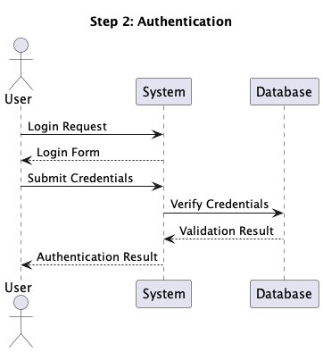
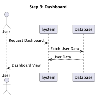
    @startuml hide footbox actor User participant System participant Database User -> System: Login Request System --> User: Login Form User -> System: Submit Credentials System -> Database: Verify Credentials Database --> System: Validation Result System --> User: Authentication Result User -> System: Request Dashboard System -> Database: Fetch User Data Database --> System: User Data System --> User: Dashboard View @enduml 

    When processed by PlantUML, this text generates a visual sequence diagram showing the interaction between components.

    The code-like nature of PlantUML makes it easy to learn and use, especially for developers who are already comfortable with text-based tools.

    This simplicity is what makes PlantUML a perfect candidate for extension. With the right tooling, we can enhance its capabilities while maintaining its text-based workflow.

    Our goal for this project is to create a tool which can divide the sequence diagram into steps and generate a step by step view of the diagram. So for the above diagram, we should be able to view login, authentication and dashboard steps one by one.

    Step 1: Designing Comment-Based Step Markers

    The first challenge was marking “steps” within .puml files without disrupting standard PlantUML rendering.

    “I’m extending PlantUML to allow step by step view of a sequence diagram. For that we need to mark ‘step’ sections directly in .puml files without affecting the standard PlantUML rendering. Propose a few syntax options that: Use PlantUML’s ‘ comment style so the core engine ignores them. Allow JSON metadata (e.g., name, newPage) on each marker.”

    Claude proposed several syntax options, including:

    I’ll propose some syntax options for step markers in PlantUML that use the single quote comment style and allow JSON metadata.Here are several options:

    1. ' @step {”name”: “User Authentication”, “newPage”: true}
    2. ' @stepStart {”name”: “Database Query”, “newPage”: false} ... ' @stepEnd
    3. ' @step:{”name”: “Payment Processing”, “newPage”: true}
    4. ' @step.begin ... ' @step.meta {”name”: “API Request”, “newPage”: false} ... ' @step.end
    5. ' step{”name”: “Error Handling”}

    Developer Insight: After evaluating the options, an experiened developer would recognize that explicit end markers could potentially lead to incomplete diagrams if any section was missed. Option 1 provides a cleaner approach where each marker defines the start of a new step, ensuring complete coverage of the diagram while maintaining a simple syntax.

    We do not need to mark step end explicitly, because we need to make sure that we do not miss any part of the sequence diagram. So option 1 looks good.
    Perfect! Using option 1 with a single marker per step is a good choice since it avoids the need to explicitly mark step ends, ensuring no part of the sequence diagram is missed.So the syntax would be: ‘ @step {”name”: “User Authentication”, “newPage”: true} This approach is clean, follows PlantUML’s comment style with the single quote, and allows for JSON metadata to specify properties for each step. The parser in your extension can look for these markers and process the sequence diagram accordingly.

    Step 2: Building the Parser Logic (and Debugging)

    “Now we need to parse the plantuml files and separate out step. Whenever we encounter a step marker, we create a step object and keep adding the next lines to it until we encounter another step marker or end of file. In case we encounter another step counter, we create new step object, it should have all the includes, actors and participants from the previous step. It should also have all the content of the previous step, unless the step metadata has ‘newPage’ attribute. If there are no step markers encountered, which is the case where we have files without steps, it should create a default step. Create a StepParser to parse given puml files and create list of steps.”

    Claude generated the initial code for a StepParser class and a Step model class to handle parsing PlantUML files with step markers. The initial implementation had some logical issues:

    • Incorrect handling of step content inheritance when newPage attribute was false
    • Improper handling of declarations (actors, participants) appearing before the first step marker
    • Issues with creating a default step for files without markers

    The Cursor editor was running in Agent mode, so after running tests and identifying these issues through the failure messages, Claude provided a corrected version that properly handled:

    • Content collected before the first step marker
    • Inheritance of content from the immediately preceding step
    • Global tracking of declarations across steps
    • Proper creation of a default step for files without markers

    With these corrections, the parser successfully passed all tests.

    The next step was to generate a gradle task.

    We need gradle task which can process puml files in src/diagrams and its sub folders. For each file it should create a directory with the name of the file where it generates valid puml file for each step. It can generate that by just adding @startuml at the start and @enduml at the end of the step content.

    I’ll help you create a Gradle task to process PlantUML files and generate step-by-step diagrams. First, let’s create the task in build.gradle:

    // Process each .puml file in the input directory and its subdirectories fileTree(inputDir).include('**/*.puml').each { pumlFile -> def relativePath = inputDir.toPath().relativize(pumlFile.toPath()).toString() def fileName = pumlFile.name.replace('.puml', '') def stepOutputDir = new File(outputDir, fileName) if (!stepOutputDir.exists()) { stepOutputDir.mkdirs() } // Run the generator for this file javaexec { classpath = sourceSets.main.runtimeClasspath mainClass = 'com.example.StepDiagramGenerator' args = [pumlFile.absolutePath, stepOutputDir.absolutePath] }

    Claude also helped generating a simple plantuml sequence diagram to test the gradle task. The same one that we used at the beginning of the article.

    The gradle task needed a class PlantUMLGenerator which can generate SVGs for each step. Cursor in the Agent mode generated the code for the class.

    It then ran the build to verify the task.

    Let's run a test to confirm our implementation works: cd /Users/unmeshjoshi/work/plantumlsequence && ./gradlew clean build Task :generateStepDiagrams Generated step diagram: /Users/unmeshjoshi/work/plantumlsteps/build/generated-diagrams/user-authentication/step-01-step-1-user-login.puml Generated step diagram: /Users/unmeshjoshi/work/plantumlsteps/build/generated-diagrams/user-authentication/step-02-step-2-authentication.puml Generated step diagram: /Users/unmeshjoshi/work/plantumlsteps/build/generated-diagrams/user-authentication/step-03-step-3-dashboard.puml Generated step flow summary: /Users/unmeshjoshi/work/plantumlsteps/build/generated-diagrams/user-authentication/summary.puml BUILD SUCCESSFUL in 543ms 3 actionable tasks: 3 executed 

    Step 3: Generating HTML Viewer for Step Sequence

    The next step was to generate a simple HTML viewer that can be used to view the step sequence.

    Now we need to generate a HTML viewer for the step files to be shown one by one. The HTML viewer can have a view area where we show the svg image generated for each step with the step name in the metadata for that step. We can have next and previous buttons to show next and previous step image.
    I’ll help you create an HTML viewer for the step diagrams. We’ll need to: Generate SVG files from the PlantUML files Create an HTML viewer with navigation controls Update the Gradle task to generate both PlantUML and SVG files, along with the HTML viewer First, let’s create a simple HTML template for the viewer: ….

    The agent mode figured out a few issues with the template but auto-fixed it by running some corrective actions.

    This setup allowed us to quickly generate step diagrams from a single PlantUML file, and view them in a step by step manner. So the above diagram can be viewed as a sequence of following steps:

    The Code is the Source of Truth

    Where to go from here?

    While the prompts and the LLM assistant (in this case, interacting in an agent-like mode, utilizing models like Claude Sonnet) provided a remarkably effective way to generate a working first version of PlantUMLSteps, it’s crucial to recognize the nature of this generated output.

    • Prompts are not Deterministic: The prompts used in our conversation were effective for this interaction, but they cannot be treated as the ultimate ‘source of truth’. The same prompts given to a different model, or even the same model at a later date, are not guaranteed to produce the exact same output due to the inherent variability in LLM generation.
    • Code Requires Management: The generated code is the source of truth for the tool’s functionality. As such, it needs to be treated like any other software artifact – checked into version control, reviewed, tested, and maintained.
    • Review for Habitability: It’s essential to revisit the LLM-generated code after the initial creation phase. Is it ‘habitable’? That is, is it reasonably easy to read, understand, and modify by a human developer? While the LLM helped overcome initial hurdles and boilerplate, ensuring the long-term maintainability and clarity of the codebase often requires human review and potential refactoring. The goal is code that not only works but can also be evolved effectively over time.

    Prompting in natural language (like English) to generate code works well in the early phases of development—when you’re exploring ideas, scaffolding functionality, or getting familiar with a new tool or framework. But as your system starts to take shape, the limits of vague or broad prompts become apparent. At this stage, what’s needed is not more code generation, but conceptual modeling—using the constructs of your programming language or technology stack to accurately represent the domain. This stage needs deeper thinking to build abstractions, and an alignment between code structure and domain concepts—something only achievable through thoughtful design, not just prompting. If prompt-based code generation without review is called “vibe coding,” then the more disciplined approach can be called “AI-assisted structured coding.”.

    Beyond Code Generation: The Developer Insight in Refactoring

    The next step was to refactor the code to make it more readable and maintainable.

    Initially, the parse method was a long, monolithic function that handled everything from detecting step markers to managing declarations and content. The code was difficult to understand and maintain.

    The full code is available in this initial commit on GitHub.

    The `StepParser.java` parse method needs refactoring. It should represent concepts used in the requirement or domain concepts and follow standard clean code practices with intentional method names and code that reads like a DSL.

    This initial request was open-ended, indicating that the developer recognized the need for improvement but was looking for guidance on how to approach it. The LLM responded with a comprehensive refactoring that introduced several new classes and methods:

    - Introduced `PlantUmlDocument` to represent the document being parsed - Smaller, more focused methods with intention-revealing names - Better encapsulation of related behaviors - More expressive variable and method names /** * Represents a PlantUML document being parsed, managing state during parsing */ private class PlantUmlDocument { private final List steps = new ArrayList(); private final List declarations = new ArrayList(); private final List contentBeforeFirstStep = new ArrayList(); private Step currentStep = null; private boolean hasStepMarkers = false; public void beginNewStep(StepMetadata metadata) { hasStepMarkers = true; // Save the current step if it exists if (currentStep != null) { steps.add(currentStep); } // Create a new step currentStep = new Step(metadata.getName(), metadata.isNewPage(), metadata.getAttributes()); // Add all declarations to the new step currentStep.addAllDeclarations(declarations); // If this isn't a new page and we have previous steps, copy all content from previous steps if (!metadata.isNewPage() && !steps.isEmpty()) { carryOverPreviousStepsContent(); } } private void carryOverPreviousStepsContent() { for (Step previousStep : steps) { for (String contentLine : previousStep.getContent()) { currentStep.addContent(contentLine); } } } public void addDeclaration(String line) { declarations.add(line); if (currentStep != null) { currentStep.addDeclaration(line); } else { contentBeforeFirstStep.add(line); } } public void addContentLine(String line) { if (currentStep != null) { currentStep.addContent(line); } else if (!line.trim().isEmpty()) { contentBeforeFirstStep.add(line); } } public void finalizeDocument() { // Add the last step if it exists and hasn't been added yet if (currentStep != null) { steps.add(currentStep); } } 

    The full code is available in this commit on GitHub.

    The `contentBeforeFirstStep` in `PlantUmlDocument.java` is used only for creating default step when there are no step markers? So we can possibly do two pass processing where we first check if there are step markers.. if there are.. we do step-based processing. Or else we just create a default step and add all declarations and content. That will remove the need to have `contentBeforeFirstStep` We can also possibily name PlantUmlDocument as `ParsedPumlFile` which represents the parsed puml file.

    The LLM implemented this suggestion with a two-pass approach. It also renamed the PlantUmlDocument as ParsedPumlFile. The full code is available in this commit on GitHub.

    `ParsedPumlFile` can be better represented as builder pattern. `StepBuilder` can be a builder for `Step` objects.

    This insight demonstrated the developer’s ability to recognize design patterns, noting that the refactored class followed the Builder pattern.

    The final refactoring represents a significant improvement over the original code:

    class StepBuilder { private final List<Step> steps = new ArrayList<>(); private final List<String> globalDeclarations = new ArrayList<>(); private Step currentStep = null; public void startNewStep(StepMetadata metadata) { if (currentStep != null) { steps.add(currentStep); } currentStep = new Step(metadata); currentStep.addAllDeclarations(globalDeclarations); if (!metadata.isNewPage() && !steps.isEmpty()) { // Copy content from the previous step Step previousStep = steps.get(steps.size() - 1); for (String contentLine : previousStep.getContent()) { currentStep.addContent(contentLine); } } } public void addDeclaration(String declaration) { globalDeclarations.add(declaration); if (currentStep != null) { currentStep.addDeclaration(declaration); } } public void addContent(String content) { // If no step has been started yet, create a default step if (currentStep == null) { StepMetadata metadata = new StepMetadata("Default Step", false, new HashMap<>()); startNewStep(metadata); } currentStep.addContent(content); } public List<Step> build() { if (currentStep != null) { steps.add(currentStep); } return new ArrayList<>(steps); } } 

    The full code is available in this commit on GitHub.

    There are more improvements possible, but I have included a few to demonstrate the nature of collaboration between LLMs and developers.

    Conclusion

    Each part of this extension—comment syntax, Java parsing logic, HTML viewer, and Gradle wiring—started with a focused LLM prompt. Some parts required some expert developer guidance to LLM, but the key benefit was being able to explore and validate ideas without getting bogged down in boilerplate. LLMs are particularly helpful when you have a design in mind but are not getting started because of the efforts needed for setting up the scaffolding to try it out. They can help you generate working glue code, integrate libraries, and generate small UIs—leaving you to focus on whether the idea itself works.

    After the initial working version, it was important to have a developer to guide the LLM to improve the code, to make it more maintainable. It was critical for developers to:

    • Ask insightful questions
    • Challenge proposed implementations
    • Suggest alternative approaches
    • Apply software design principles

    This collaboration between the developer and the LLM is key to building maintainable and scalable systems. The LLM can help generate working code, but the developer is the one who can make it more readable, maintainable and scalable.


    Source: Martin Fowler.

  • Smashing Animations Part 2: How CSS Masking Can Add An Extra Dimension

    Smashing Animations Part 2: How CSS Masking Can Add An Extra Dimension

    May 14, 2025
    Software

    Despite keyframes and scroll-driven events, CSS animations have remained relatively rudimentary. As I wrote in Part 1, they remind me of the 1960s Hanna-Barbera animated series I grew up watching on TV. Shows like Dastardly and Muttley in Their Flying Machines, Scooby-Doo, The Perils of Penelope Pitstop, Wacky Races, and, of course, Yogi Bear.

    Mike loves ’90s animation — especially Disney’s Duck Tales). So, that is the aesthetic applied throughout the design.

    I used animations throughout and have recently added an extra dimension to them using masking. So, to explain how this era of animation relates to masking in CSS, I’ve chosen an episode of The Yogi Bear Show, “Disguise and Gals,” first broadcast in May 1961. In this story, two bank robbers, disguised as little old ladies, hide their loot in a “pic-a-nic” basket in Yogi and Boo-Boo’s cave!

    What could possibly go wrong?

    What’s A Mask?

    One simple masking example comes at the end of “Disguise and Gals” and countless other cartoons. Here, an animated vignette gradually hides more of Yogi’s face. The content behind the mask isn’t erased; it’s hidden.

    In CSS, masking controls visibility using a bitmap, vector, or gradient mask image. When a mask’s filled pixels cover an element, its content will be visible. When they are transparent, it will be hidden, which makes sense. Filled pixels can be any colour, but I always make mine hot pink so that it’s clear to me which areas will be visible.

    A clip-path functions similarly to a mask but uses paths to create hard-edged clipping areas. If you want to be picky, masks and clipping paths are technically different, but the goal for using them is usually the same. So, for this article, I’ll refer to them as two entrances to the same cave and call using either “masking.”

    In this sequence from “Disguise and Gals,” one of the robbers rushes the picnic basket containing their loot into Yogi’s cave. Masking defines the visible area, creating the illusion that the robber is entering the cave.

    How do I choose when to use clip path and when to choose mask?

    I’ll explain my reasons in each example.

    When Mike Worth and I discussed working together, we knew we would neither have the budget nor the time to create a short animated cartoon for his website. However, we were keen to explore how animations could bring to life what would’ve otherwise been static images.

    Masking Using A Clipping Path

    On Mike’s biography page, his character also enters a cave. The SVG illustration I created contains two groups, one for the background and the other for the orangutan in the foreground:

    <figure> <svg viewBox="0 0 1400 960" id="cave"> <g class="background">…</g> <g class="foreground">…</g> </svg> </figure> 

    I defined a keyframe animation that moves the character from 2000px on the right to its natural position in the center of the frame by altering its translate value:

    @keyframes foreground { 0% { opacity: .75; translate: 2000px 0; } 60% { opacity: 1; translate: 0 0; } 80% { opacity: 1; translate: 50px 0; } 100% { opacity: 1; translate: 0 0; } } 

    Then, I applied that animation to the foreground group:

    .foreground { opacity: 0; animation: foreground 5s 2s ease-in-out infinite; } 

    Try this yourself:

    I wanted him to become visible at the edge of the illustration instead. As the edges of the cave walls are hard, I chose a clip-path.

    There are several ways to define a clip-path in CSS. I could use a primitive shape like a rectangle, where each of the first four values specifies its corner positions. The round keyword and the value that follows define any rounded corners:

    clip-path: rect(0px 150px 150px 0px round 5px); 

    Or xywh (x, y, width, height) values, which I find easier to read:

    clip-path: xywh(0 0 150px 150px round 5px); 

    I could use a circle:

    clip-path: circle(60px at center); 

    Or an ellipse:

    clip-path: ellipse(50% 40% at 50% 50%); 

    I could use a polygon shape:

    clip-path: polygon(...); 

    Or even the points from a path I created in a graphics app like Sketch:

    clip-path: path("M ..."); 

    Finally — and my choice for this example — I might use a mask that I defined using paths from an SVG file:

    clip-path: url(#mask-cave); 

    To make the character visible from the edge of the illustration, I added a second SVG. To prevent a browser from displaying it, set both its dimensions to zero:

    <figure> <svg viewBox="0 0 1400 960" id="cave">...</svg> <svg height="0" width="0" id="mask">...</svg> </figure> 

    This contains a single SVG clipPath. By placing this inside the defs element, this path isn’t rendered, but it will be available to create my CSS clip-path:

    <svg height="0" width="0" id="mask"> <defs> <clipPath id="mask-cave">...</clipPath> </defs> </svg> 

    I applied the clipPath URL to my illustration, and now Mike’s mascot only becomes visible when he enters the cave:

    #cave { clip-path: url(#mask-cave); } 

    Try this yourself:

    While a clipPath will give me the result I’m looking for, the complexity and size of these paths can sometimes negatively affect performance. That’s when I choose a CSS mask as its properties have been baseline and highly usable since 2023.

    The mask property is a shorthand and can include values for mask-clip, mask-mode, mask-origin, mask-position, mask-repeat, mask-size, and mask-type. I find it’s best to learn these properties individually to grasp the concept of masks more easily.

    Masks control visibility using bitmap, vector, or gradient mask images. Again, when a mask’s filled pixels cover an element, its content will be visible. When they‘re transparent, the content will be hidden. And when parts of a mask are semi-transparent, some of the content will show through. I can use a bitmap format that includes an alpha channel, such as PNG or WebP:

    mask-image: url(mask.webp); 

    I could apply a mask using a vector graphic:

    mask-image: url(mask.svg); 

    Or generate an image using a conical, linear, or radial gradient:

    mask-image: linear-gradient(#000, transparent); 

    …or:

    mask-image: radial-gradient(circle, #ff104c 0%, transparent 100%); 

    I might apply more than one mask to an element and mix several image types using what should be a familiar syntax:

    mask-image: image(url(mask.webp)), linear-gradient(#000, transparent); 

    mask shares the same syntax as CSS backgrounds, which makes remembering its properties much easier. To apply a background-image, add its URL value:

    background-image: url("background.webp"); 

    To apply a mask, swap the background-image property for mask-image:

    mask-image: url("mask.webp"); 

    The mask property also shares the same browser styles as CSS backgrounds, so by default, a mask will repeat horizontally and vertically unless I specify otherwise:

    /* Options: repeat, repeat-x, repeat-y, round, space, no-repeat */ mask-repeat: no-repeat; 

    It will be placed at the top-left corner unless I alter its position:

    /* Options: Keywords, units, percentages */ mask-position: center; 

    Plus, I can specify mask-size in the same way as background-size:

    /* Options: Keywords (auto, contain, cover), units, percentages */ mask-size: cover; 

    Finally, I can define where a mask starts:

    mask-origin: content-box; mask-origin: padding-box; mask-origin: border-box; 

    Using A Mask Image

    Mike’s FAQs page includes an animated illustration of his hero standing at a crossroads. My goal was to separate the shape from its content, allowing me to change the illustration throughout the hero’s journey. So, I created a scalable mask-image which defines the visible area and applied it to the figure element:

    figure { mask-image: url(mask.svg); } 

    To ensure the mask matched the illustration’s dimensions, I also set the mask-size to always cover its content:

    figure { mask-size: cover; } 

    Try this yourself:

    figure { clip-path: ellipse(45% 35% at 50% 50%); } 

    However, the hard edges of a clip clip-path don’t create the effect I was aiming to achieve:

    Try this yourself:

    Finally, to add an extra touch of realism, I added a keyframe animation — which changes the mask-size and creates the effect that the lamp light is flickering — and applied it to the figure:

    @keyframes lamp-flicker { 0%, 19.9%, 22%, 62.9%, 64%, 64.9%, 70%, 100% { mask-size: 90%, auto; } 20%, 21.9%, 63%, 63.9%, 65%, 69.9% { mask-size: 90%, 0px; } } figure { animation: lamp-flicker 3s 3s linear infinite; } 

    Try this yourself:

    I started by creating the binocular shape, complete with some viewfinder markers.

    Then, I applied that image as a mask, setting its position, repeat, and size values to place it in the center of the figure element:

    figure { mask-image: url(mask.svg); mask-position: 50% 50%; mask-repeat: no-repeat; mask-size: 85%; } 

    Try this yourself:

    To let someone know they might’ve reached the end of their adventure, I wanted to ape the zooming-in effect I started this article with:

    <figure> <svg>…</svg> </figure> 

    I created a circular clip-path and set its default size to 75%. Then, I defined the animation keyframes to resize the circle from 75% to 15% before attaching it to my figure with a one-second duration and a three-second delay:

    @keyframes error { 0% { clip-path: circle(75%); } 100% { clip-path: circle(15%); } } figure { clip-path: circle(75%); animation: error 1s 3s ease-in forwards; } 

    The animation now focuses someone’s attention on the hapless hero, before he sinks lower and lower into the bubblingly hot lava.

    Try this yourself:

    See the Pen Mike Worth’s error page [forked] by Andy Clarke.

    Bringing It All To Life

    Masking adds an extra dimension to web animation and makes stories more engaging and someone’s experience more compelling — all while keeping animations efficiently lightweight. Whether you’re revealing content, guiding focus, or adding more depth to a design, masks offer endless creative possibilities. So why not experiment with them in your next project? You might uncover a whole new way to bring your animations to life.

    The end. Or is it? …

    Mike Worth’s website will launch in June 2025, but you can see examples from this article on CodePen now.


    Source: Articles on Smashing Magazine — For Web Designers And Developers.

  • Coding Assistants Threaten the Software Supply Chain

    May 13, 2025
    Software

    We have long recognized that developer environments represent a weak point in the software supply chain. Developers, by necessity, operate with elevated privileges and a lot of freedom, integrating diverse components directly into production systems. As a result, any malicious code introduced at this stage can have a broad and significant impact radius particularly with sensitive data and services.

    The introduction of agentic coding assistants (such as Cursor, Windsurf, Cline, and lately also GitHub Copilot) introduces new dimensions to this landscape. These tools operate not merely as suggestive code generators but actively interact with developer environments through tool-use and Reasoning-Action (ReAct) loops. Coding assistants introduce new components and vulnerabilities to the software supply chain, but can also be owned or compromised themselves in novel and intriguing ways.

    A compromised MCP server, rules file or even a code or dependency has the scope to feed manipulated instructions or commands that the agent executes. This isn’t just a minor detail – as it increases the attack surface compared to more traditional development practices, or AI-suggestion based systems.

    Figure 1: CD pipeline, emphasizing how instructions and code move between these layers. It also highlights supply chain elements where poisoning can happen, as well as key elements of escalation of privilege

    Each step of the agent flow introduces risk:

    • Context Poisoning: Malicious responses from external tools or APIs can trigger unintended behaviors within the assistant, amplifying malicious instructions through feedback loops.
    • Escalation of privilege: A compromised assistant, particularly if lightly supervised, can execute deceptive or harmful commands directly via the assistant’s execution flow.

    This complex, iterative environment creates a fertile ground for subtle yet powerful attacks, significantly expanding traditional threat models.

    Traditional monitoring tools might struggle to identify malicious activity as malicious activity or subtle data leakage will be harder to spot when embedded within complex, iterative conversations between components, as the tools are new and unknown and still developing at a rapid pace.

    New weak spots: MCP and Rules Files

    The introduction of MCP servers and rules files create openings for context poisoning—where malicious inputs or altered states can silently propagate through the session, enabling command injection, tampered outputs, or supply chain attacks via compromised code.

    Model Context Protocol (MCP) acts as a flexible, modular interface enabling agents to connect with external tools and data sources, maintain persistent sessions, and share context across workflows. However, as has been highlighted elsewhere, MCP fundamentally lacks built-in security features like authentication, context encryption, or tool integrity verification by default. This absence can leave developers exposed.

    Rules Files, such as for example “cursor rules”, consist of predefined prompts, constraints, and pointers that guide the agent’s behavior within its loop. They enhance stability and reliability by compensating for the limitations of LLM reasoning—constraining the agent’s possible actions, defining error handling procedures, and ensuring focus on the task. While designed to improve predictability and efficiency, these rules represent another layer where malicious prompts can be injected.

    Tool-calling and privilege escalation

    Coding assistants go beyond LLM generated code suggestions to operate with tool-use via function calling. For example, given any given coding task, the assistant may execute commands, read and modify files, install dependencies, and even call external APIs.

    The threat of privilege escalation is an emerging risk with agentic coding assistants. Malicious instructions, can prompt the assistant to:

    • Execute arbitrary system commands.
    • Modify critical configuration or source code files.
    • Introduce or propagate compromised dependencies.

    Given the developer’s typically elevated local privileges, a compromised assistant can pivot from the local environment to broader production systems or the kinds of sensitive infrastructure usually accessible by software developers in organisations.

    What can you do to safeguard security with coding agents?

    Coding assistants are pretty new and emerging as of when this was published. But some themes in appropriate security measures are starting to emerge, and many of them represent very traditional best practices.

    • Sandboxing and Least Privilege Access control: Take care to limit the privileges granted to coding assistants. Restrictive sandbox environments can limit the blast radius.
    • Supply Chain scrutiny: Carefully vet your MCP Servers and Rules Files as critical supply chain components just as you would with library and framework dependencies.
    • Monitoring and observability: Implement logging and auditing of file system changes initiated by the agent, network calls to MCP servers, dependency modifications etc.
    • Explicitly include coding assistant workflows and external interactions in your threat modeling exercises. Consider potential attack vectors introduced by the assistant.
    • Human in the loop: The scope for malicious action increases dramatically when you auto accept changes. Don’t become over reliant on the LLM

    The final point is particularly salient. Rapid code generation by AI can lead to approval fatigue, where developers implicitly trust AI outputs without understanding or verifying. Overconfidence in automated processes, or “vibe coding,” heightens the risk of inadvertently introducing vulnerabilities. Cultivating vigilance, good coding hygiene, and a culture of conscientious custodianship remain really important in professional software teams that ship production software.

    Agentic coding assistants can undeniably provide a boost. However, the enhanced capabilities come with significantly expanded security implications. By clearly understanding these new risks and diligently applying consistent, adaptive security controls, developers and organizations can better hope to safeguard against emerging threats in the evolving AI-assisted software landscape.


    Source: Martin Fowler.

  • Integrating Localization Into Design Systems

    Integrating Localization Into Design Systems

    May 12, 2025
    Software

    Mark and I work as product designers for SAS, a leader in analytics and artificial intelligence recognized globally for turning data into valuable insights. Our primary role is to support the token packages and component libraries for the SAS Filament Design System. SAS’ customer base is global, meaning people from diverse countries, cultures, and languages interact with products built with the Filament Design System.

    SAS designers use Figma libraries developed by the Filament Design System team to create UX specifications. These high-fidelity designs are typically crafted in English, unknowingly overlooking multilingual principles, which can result in layout issues, text overflow, and challenges with right-to-left (RTL) languages. These issues cascade into the application, ultimately creating usability issues for SAS customers. This highlights the need to prioritize localization from the start of the design process.

    With the introduction of Figma Variables, alongside the advancements in design tokens, we saw an opportunity for designers. We imagined a system where a Figma design could dynamically switch between themes, densities, and even languages.

    This would allow us to design and test multilingual capabilities more effectively, ensuring our design system was both flexible and adaptable.

    While researching localization integration for design systems, we realized a significant gap in existing documentation on supporting localization and internationalization in design tokens and Figma Variables. Many of the challenges we faced, such as managing typography across locales or adapting layouts dynamically, were undocumented or only partially addressed in available resources.

    Our story demonstrates how combining foundational principles of multilingual design with design tokens can help tackle the complexities of language switching in design systems. We are not arguing that our approach is the best, but given the lack of documentation available on the subject, we hope it will get the conversation started.

    But before we start, it’s essential to understand the distinction between Localization (L10n) and Internationalization (I18n).

    Localization (L10n) refers to the process of adapting designs for specific languages, regions, or cultures and involves the following:

    • Translating text;
    • Adjusting layouts to accommodate language-specific requirements, such as longer or shorter text strings or right-to-left (RTL) text for languages like Arabic;
    • Ensuring visual elements are culturally appropriate and resonate with the target audience.

    Internationalization (I18n) is the preparation phase, ensuring designs are flexible and adaptable to different languages and regions. Key considerations in Figma include:

    • Using placeholder text to represent dynamic content;
    • Setting up constraints for dynamic resizing to handle text expansion or contraction;
    • Supporting bi-directional text for languages that require RTL layouts.

    These concepts are not only foundational to multilingual design but also integral to delivering inclusive and accessible experiences to global users.

    Pre-Figma Setup: Building A Framework

    Understanding Our Design Token System

    Before diving deeper, it’s crucial to understand that our design tokens are stored in JSON files. These JSON files are managed in an application we call “Token Depot,” hosted on our corporate GitHub.

    We utilize the Tokens Studio plugin (pro plan) to transform these JSON files into Figma libraries. For us, design tokens are synonymous with variables — we don’t create additional variables that only exist in Figma. However, we do create styles in Figma that serve as “recipe cards” for specific HTML elements. For instance, an H2 might include a combination of font-family, font-size, and font-weight.

    It’s important to note that our design token values are directly tied to CSS-based values.

    Initial Setup: Theme Switching And Localization

    In 2022, we took on the massive task of refactoring all our token names to be more semantic. At that time, we were only concerned with theme switching in our products.

    Our tokens were re-categorized into the following groups:

    • Color
      • Brand colors (SAS brand colors)
      • Base colors (references to Brand colors)
    • Typography (e.g., fonts, spacing, styles)
    • Space (e.g., padding, margins)
    • Size (e.g., icons, borders)
    • Style (e.g., focus styles)
    • Motion (e.g., animations)
    • Shadow.

    In our early setup:

    • A core folder contained JSON files for values unaffected by theme or brand.
    • Brand folders included three JSON files (one for each theme). These were considered “English” by default.
    • A separate languages folder contained overrides for other locales, stacked on top of brand files to replace specific token values.

    Our JSON files were configured with English as the default. Other locales were managed with a set of JSON files that included overrides for English. These overrides were minimal, focusing mainly on font and typography adjustments. For example, bold typefaces often create issues because many languages like Chinese, Japanese, or Korean (CJK languages) fonts lack distinct bold versions. Thus, we replaced the font-weight token value from 700 to 400 in our CJK locales.

    We also update the values for font-family, letter spacing, font-style, and font-variant tokens. In Figma, our application screens were originally designed in English, and in 2023, we only implemented theme-switching modes, not language options. Additionally, we created detailed lists to document which design tokens could be converted to Figma variables and which could not, as the initial release of variables supported only a limited set.

    Introducing Density Switching

    The introduction of density switching in our products marked a significant turning point. This change allowed us to revisit and improve how we handled localization and token management. The first thing we had to figure out was the necessary token sorting. We ended up with the following list:

    Tokens Impact By Theme And Density

    Unaffected by Theme or Density:

    • Color
    • Brand colors
    • Base colors
    • Motion
    • Shadow
    • Size
    • Border size
    • Outline size
    • Typography
    • Base font size
    • Letter spacing and word spacing
    • Overflow, text, and word style tokens.

    Tokens Impacted by Density:

    • Typography
    • Font sizes
    • Line Height
    • Font spacing
    • Size
    • Border radius
    • Icon sizes
    • Space
    • Base spacing.

    Tokens Impacted by Theme:

    • Colors
    • Action, body, container, dataviz, display, heading, highlight, icon, label, status, syntax, tag, text, thumbnail, and zero-stat
    • Size
    • Border size
    • Typography
    • Font-family
    • Style
    • Action (focus styles).

    With density, we expanded locale-specific value changes beyond font-family, letter spacing, font-style, and font-variant tokens to additionally include:

    • Font sizes
    • Icon sizes
    • Line height
    • Spacing
    • Border radius.

    Revisiting our type scale and performing numerous calculations, we documented the required token value changes for all the locales across the density. This groundwork enabled us to tackle the restructuring of our JSON files effectively.

    JSON File Restructuring

    In our token repository, we:

    1. Updated the tokens in the core folder.
    2. Added a density folder and a language folder in each brand.

    After collaborating with our front-end development team, we decided to minimize the number of JSON files. Too many files introduce complexity and bugs and hinder performance. Instead of creating a JSON file for each language-density combination, we defined the following language categories:

    Language Categories

    • Western European and Slavic Languages
      • Polish, English, French, German, and Spanish
    • Chinese Languages
      • Simplified and traditional scripts
    • Middle Eastern and East Asian Languages
      • Arabic, Hebrew, Japanese, Korean, Thai, and Vietnamese
    • Global Diverse
      • Africa, South Asia, Pacific, and Indigenous languages, Uralic, and Turkic groups.

    These categories became our JSON files, with one file per density level. Each file contained tokens for font size, icon size, line height, spacing, and border-radius values. For example, all Chinese locales shared consistent values regardless of font-family.

    In addition, we added a folder containing JSON files per locale, overriding core values and theme folders, such as font-family.

    Figma Setup: Bridging Tokens And Design

    Token Studio Challenges

    After restructuring our JSON files, we anticipated gaining support for typography variables in the Tokens Studio plugin. Instead, Tokens Studio released version 2.0, introducing a major shift in workflow. Previously, we imported JSON files directly into Figma and avoided pushing changes back through the plugin. Adjusting to the new version required us to relearn how to use the plugin effectively.

    Our first challenge was navigating the complexity of the import process. The $metadata.json and $themes.json files failed to overwrite correctly during imports, resulting in duplicate collections in Figma when exporting variables. Despite recreating the required theme structure within the plugin, the issue persisted. To resolve this, we deleted the existing $metadata.json and $themes.json files from the repository before pulling the updated GitHub repo into the plugin. However, even with this solution, we had to manually remove redundant collections that appeared during the export process.

    Once we successfully migrated our tokens from JSON files into Figma using the Tokens Studio plugin, we encountered our next challenge.

    Initially, we used only “English” and theme modes in Figma, relying primarily on styles since Figma’s early variable releases lacked support for typography variables. Now, with the goal of implementing theme, density, and language switching, we needed to leverage variables — including typography variables. While the token migration successfully brought in the token names as variable names and the necessary modes, some values were missing.

    Typography variables, though promising in concept, were underwhelming in practice. For example, Figma’s default line-height multiplier for “auto” was 1.2, below the WCAG minimum of 1.5. Additionally, our token values used line-height multipliers, which weren’t valid as Figma variable values. While a percentage-based line-height value is valid in CSS, Figma variables don’t support percentages.

    Our solution involved manually calculating pixel values for line heights across all typography sizes, locale categories, and densities. These values were entered as local variables in Figma, independent of the design token system. This allowed us to implement correct line-height changes for density and locale switches. The process, however, was labor-intensive, requiring the manual creation of hundreds of local variables. Furthermore, grouping font sizes and line heights into Figma styles required additional manual effort due to the lack of support for line-height multipliers or percentage-based variables.

    Examples:

    • For CJK locales, medium and low density use a base font size of 16px, while high density uses 18px.
    • Western European and Slavic languages use 14px for medium density, 16px for high, and 12px for low density.

    Additional Challenges

    • Figma vs. Web Rendering
      In Figma, line height centers text visually within the text box. In CSS, it affects spacing differently depending on the box model. This mismatch required manual adjustments, especially in light of upcoming CSS properties like leading-trim.
    • Letter-Spacing Issues
      While CSS defaults to “normal” for letter-spacing, Figma requires numeric values. Locale-specific resets to “normal” couldn’t utilize variables, complicating implementation.
    • Font-Family Stacks
      • Example stack for Chinese:
        font-family-primary: 'AnovaUI', '微软雅黑体', 'Microsoft YaHei New', '微软雅黑', 'Microsoft Yahei', '宋体', 'SimSun', 'Helvetica Neue', 'Helvetica', 'Arial', sans-serif.

    Starting with a Western font ensured proper rendering of Latin characters and symbols while maintaining brand consistency. However, Figma’s designs using only AnovaUI (SAS Brand Custom font) couldn’t preview locale-based substitutions via system fonts, complicating evaluations of mixed-content designs.

    Finally, as we prepared to publish our new library, we encountered yet another challenge: Figma Ghosts.

    What Are Figma Ghost Variables?

    Figma “ghost variables” refer to variables that remain in a Figma project even after they are no longer linked to any design tokens, themes, or components.

    These variables often arise due to incomplete deletions, improper imports, or outdated metadata files. Ghost variables may appear in Figma’s variable management panel but are effectively “orphaned,” as they are disconnected from any meaningful use or reference.

    Why They Cause Issues for Designers:

    • Clutter and Confusion
      Ghost variables make the variable list longer and harder to navigate. Designers might struggle to identify which variables are actively in use and which are obsolete.
    • Redundant Work
      Designers might accidentally try to use these variables, leading to inefficiencies or design inconsistencies when the ghost variables don’t function as expected.
    • Export and Sync Problems
      When exporting or syncing variables with a design system or repository, ghost variables can introduce errors, duplicates, or conflicts. This complicates maintaining alignment between the design system and Figma.
    • Increased Maintenance Overhead
      Detecting and manually deleting ghost variables can be time-consuming, particularly in large-scale projects with extensive variable sets.
    • Thematic Inconsistencies
      Ghost variables can create inconsistencies across themes, as they might reference outdated or irrelevant styles, making it harder to ensure a unified look and feel.

    Addressing ghost variables requires careful management of design tokens and variables, often involving clean-up processes to ensure only relevant variables remain in the system.

    Cleaning Up Ghost Variables

    To avoid the issues in our Figma libraries, we first had to isolate ghost variables component by component. By selecting a symbol in Figma and navigating the applied variable modes, we had a good sense of which older versions of variables the symbol was still connected to. We found disconnected variables in the component library and our icon library, which resulted in compounded ghost variables across the system. We found that by traversing the layer panel, along with a fantastic plug-in called “Swap Variables,” we were able to remap all the ghost variables in our symbols.

    If we had not completed the clean-up step, designers would not be able to access the overrides for theme, density, and locale.

    Designing Symbols For Localization

    To ensure Figma symbols support language swapping, we linked all text layers to our new variables, including font-family, font-size, and line height.

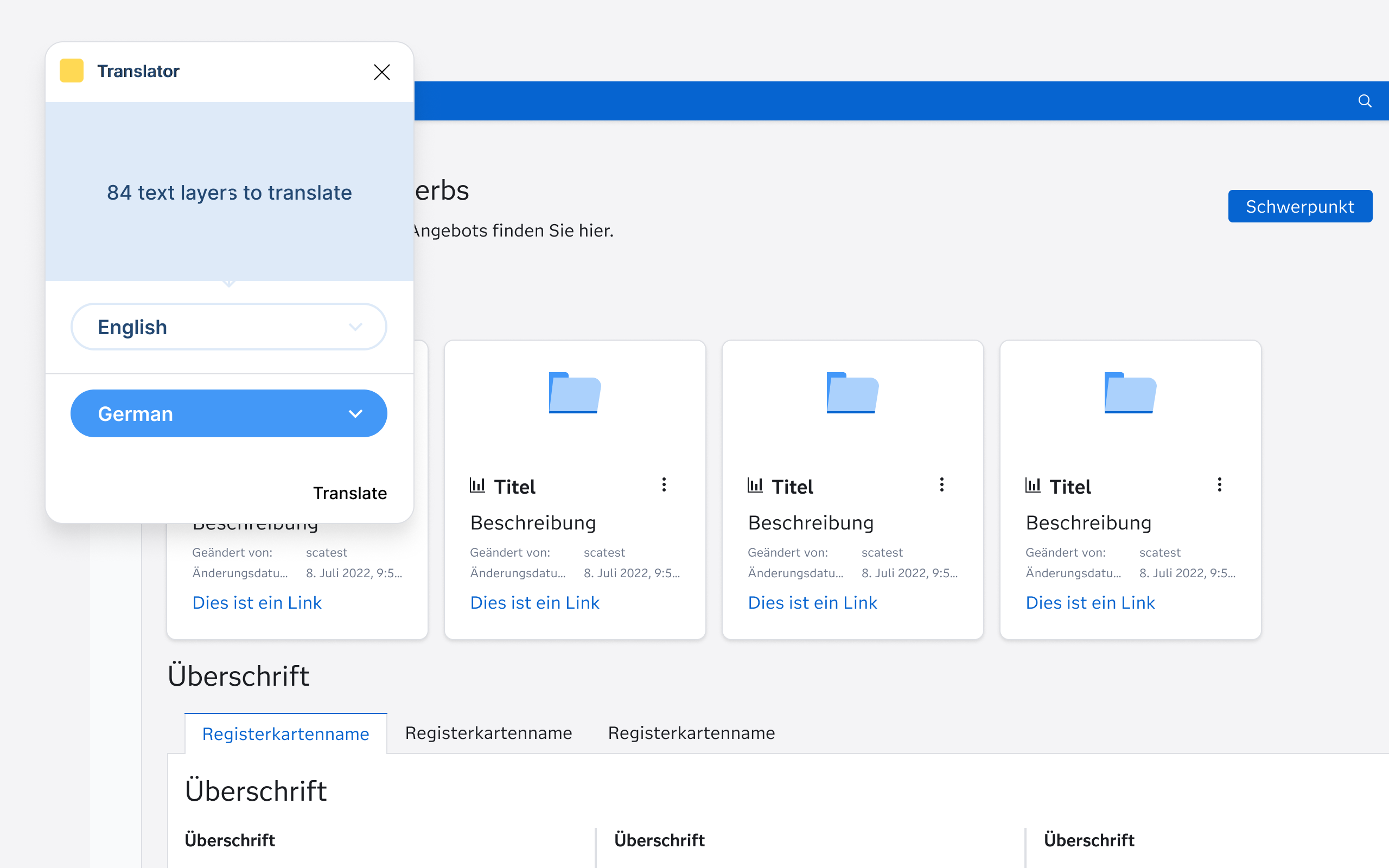
    We do not use Figma’s variable feature to define text strings for each locale (e.g., English, Spanish, French) because, given the sheer breadth and depth of our Products and solutions, it would simply be too daunting a task to undertake. For us, using an existing plug-in, such as “Translator,” gives us what we need.

    After ensuring all text layers were remapped to variables, along with the “Translator” plug-in, we were able to swap entire screens to a new language. This allowed us to start testing our symbols for unforeseen layout issues.

    We discovered that some symbols were not supporting text wrapping when needed (e.g., accommodating longer words in German or shorter ones in Japanese). We isolated those issues and updated them to auto-layout for flexible resizing. This approach ensured all our Figma symbols were scalable and adaptable for multilingual support.

    Delivering The System

    With our component libraries set up to support localization, we were ready to deliver our component libraries to product designers. As a part of this step, we crafted a “Multilingual Design Cheat Sheet” to help designers understand how to set up their application mockups with Localization and Internationalization in mind.

    Multilingual Design Cheat Sheet:

    1. General Principles
      • Design flexible layouts that can handle text wrapping and language-specific requirements such as right-to-left orientations.
      • Use real content during design and development to identify localization issues such as spacing and wrapping.
      • Research the cultural expectations of your target audience to avoid faux pas.
    2. Text & Typography
      • Use Filament Design Systems fonts to ensure support of all languages.
      • Avoid custom fonts that lack bold or italic styles for non-Latin scripts like CJK languages.
      • Reserve additional space for languages like German or Finnish.
      • Avoid hardcoded widths for text containers and use auto-layout to ensure long text strings are readable.
      • The Filament Design System tokens adjust line height per language; make sure you are using variables for line-height.
      • Use bold sparingly, as Filament tokens override bold styling in some languages. Instead, opt for alternative emphasis methods (e.g., color or size).
    3. Layout & Design
      • Mirror layouts for RTL languages (e.g., Arabic, Hebrew). Align text, icons, and navigation appropriately for the flow of the language.
      • Use auto-layout to accommodate varying text lengths.
      • Avoid embedding text in images to simplify localization.
      • Allow ample spacing around text elements to prevent crowding.
    4. Language-Specific Adjustments
      • Adapt formats based on locale (e.g., YYYY/MM/DD vs. MM/DD/YYYY).
      • Use metric or imperial units based on the region.
      • Test alignments and flows for LTR and RTL languages.
    5. Localization Readiness
      • Avoid idioms, cultural references, or metaphors that may not translate well.
      • Provide space for localized images, if necessary.
      • Use Figma translation plug-ins to test designs for localization readiness and use real translations rather than Lorem Ipsum.
      • Test with native speakers for language-specific usability issues.
      • Check mirrored layouts and interactions for usability in RTL languages.

    Lessons Learned And Future Directions

    Lessons Learned

    In summary, building a localization-ready design system was a complex yet rewarding process that taught Mark and me several critical lessons:

    • Localization and internationalization must be prioritized early.
      Ignoring multilingual principles in the early stages of design creates cascading issues that are costly to fix later.
    • Semantic tokens are key.
      Refactoring our tokens to be more semantic streamlined the localization process, reducing complexity and improving maintainability.
    • Figma variables are promising but limited.
      While Figma Variables introduced new possibilities, their current limitations — such as lack of percentage-based line-height values and manual setup requirements — highlight areas for improvement.
    • Automation is essential.
      Manual efforts, such as recalculating and inputting values for typography and density-specific tokens, are time-intensive and prone to error. Plugins like “Translator” and “Swap Variables” proved invaluable in streamlining this work.
    • Collaboration is crucial.
      Close coordination with front-end developers ensured that our JSON restructuring efforts aligned with performance and usability goals.
    • Testing with real content is non-negotiable.
      Design issues like text wrapping, RTL mirroring, and font compatibility only became apparent when testing with real translations and flexible layouts.

    Future Directions

    As we look ahead, our focus is on enhancing the Filament Design System to better support global audiences and simplify the localization process for designers:

    • Automatic mirrored layouts for RTL languages.
      We plan to develop tools and workflows that enable seamless mirroring of layouts for right-to-left languages, ensuring usability for languages like Arabic and Hebrew.
    • Improved figma integration.
      Advocacy for Figma enhancements, such as percentage-based line-height support and better handling of variable imports, will remain a priority.
    • Advanced automation tools.
      Investing in more robust plugins and custom tools to automate the calculation and management of tokens across themes, densities, and locales will reduce manual overhead.
    • Scalable localization testing framework.
      Establishing a framework for native speaker testing and real-world content validation will help us identify localization issues earlier in the design process.
    • Expanding the multilingual design cheat sheet.
      We will continue to refine and expand the cheat sheet, incorporating feedback from designers to ensure it remains a valuable resource.
    • Community engagement.
      By sharing our findings and lessons, we aim to contribute to the broader design community, fostering discussions around integrating localization and internationalization in design systems.

    Through these efforts, Mark and I hope to create a more inclusive, scalable, and efficient design system that meets the diverse needs of our global audience while empowering SAS designers to think beyond English-first designs.

    Further Reading On SmashingMag

    • “Internationalization And Localization For Static Sites,” Sam Richard
    • “CSS-Driven Internationalization In JavaScript,” Maksim Chemerisuk
    • “How To Conduct Website Localization: Don’t Get Lost In Translation,” Julia Rozwens
    • “12 Commandments Of Software Localization,” Zack Grossbart

    Source: Articles on Smashing Magazine — For Web Designers And Developers.

  • Integrating Design And Code With Native Design Tokens In Penpot

    Integrating Design And Code With Native Design Tokens In Penpot

    May 8, 2025
    Software

    This article is a sponsored by Penpot

    It’s already the fifth time I’m writing to you about Penpot — and what a journey it continues to be! During this time, Penpot’s presence in the design tools scene has grown strong. In a market that recently felt more turbulent than ever, I’ve always appreciated Penpot for their clear mission and values. They’ve built a design tool that not only delivers great features but is also open-source and developed in active dialogue with the community. Rather than relying on closed formats and gated solutions, Penpot embraces open web standards and commonly used technologies — ensuring it works seamlessly across platforms and integrates naturally with code.

    Their latest release is another great example of that approach. It’s also one of the most impactful. Let me introduce you to design tokens in Penpot.

    Design tokens are an essential building block of modern user interface design and engineering. But so far, designers and engineers have been stuck with third-party plugins and cumbersome APIs to collaborate effectively on design tokens and keep them in sync. It’s high time we had tools and processes that handle this better, and Penpot just made it happen.

    About Design Tokens

    Design tokens can be understood as a framework to document and organize your design decisions. They act as a single source of truth for both designers and engineers and include all the design variables, such as colors, typography, spacing, fills, borders, and shadows.

    The concept of design tokens has grown in popularity alongside the rise of design systems and the increasing demand for broader standards and guidelines in user interface design. Design tokens emerged as a solution for managing increasingly complex systems while keeping them structured, scalable, and extensible.

    The goal of using design tokens is not only to make design decisions more intentional and maintainable but also to make it easier to keep them in sync with code. In the case of larger systems, it is often a one-to-many relationship. Design tokens allow you to keep the values agnostic of their application and scale them across various products and environments.

    Design tokens create a semantic layer between the values, the tools used to define them, and the software that implements them.

    On top of maintainability benefits, a common reason to use design tokens is theming. Keeping your design decisions decoupled means that you can easily swap the values across multiple sets. This allows you to change the appearance of the entire interface with applications ranging from simple light and dark mode implementations to more advanced use cases, such as handling multiple brands or creating fully customizable and adjustable UIs.

    Implementation Challenges

    Until recently, there was no standardized format for maintaining design tokens — it remained a largely theoretical concept, implemented differently across teams and tools. Every design tool or frontend framework has its own approach. Syncing code with design tools was also a major pain point, often requiring third-party plugins and unreliable synchronization solutions.

    However, in recent years, W3C, the international organization responsible for developing open standards and protocols for the web, brought to life a dedicated Design Tokens Community Group with the goal of creating an open standard for products and design tools to handle design tokens. Once this standard gets more widely adopted, it will give us hope for a more predictable and standardized approach to design tokens across the industry.

    To make that happen, work has to be done on two ends, both design and development. Penpot is the very first design tool to implement design tokens in adherence to the standard that the W3C is working on. It also solves the problem of third-party dependencies by offering a native API with all the values served in the official, standardized format.

    Design Tokens In Practice

    To better understand design tokens and how to use them in practice, let’s take a look at an example together. Let’s consider the following user interface of a login screen:

    Imagine we want this design to work in light and dark mode, but also to be themable with several accent colors. It could be that we’re using the same authentication system for websites of several associated brands or several products. We could also want to allow the user to customize the interface to their needs.

    If we want to build a design that works for three accent colors, each with light and dark themes, it gives us six variants in total:

    Designing all of them by hand would not only be tedious but also difficult to maintain. Every change you make would have to be repeated in six places. In the case of six variants, that’s not ideal, but it’s still doable. But what if you also want to support multiple layout options or more brands? It could easily scale into hundreds of combinations, at which point designing them manually would easily get out of hand.

    This is where design tokens come to the rescue. They allow you to effectively maintain all the variants and test all the possible combinations, even hundreds of them, while still building a single design without repetitive work.

    You can start by creating a design in one of the variants before starting to think about the tokens. Having a design already in place might make it easier to plan your tokens’ hierarchy and structure accordingly.

    In this case, I created three components: 2 types of buttons and input, and combined them with text layers into several Flex layouts to build out this screen. If you’d like to first learn more about building components and layouts in Penpot, I would recommend you revisit some of my previous articles:

    • Build Design Systems With Penpot Components
    • Penpot’s CSS Grid Layout: Designing With Superpowers
    • Penpot’s Flex Layout: Building CSS Layouts In A Design Tool

    Now that we have the design ready, we can start creating tokens. You can create your first token by heading to the tokens tab of the left sidebar and clicking the plus button in one of the token categories. Let’s start by creating a color.

    In Penpot, you can reference other tokens in token values by wrapping them in curly brackets. So, if you select “slate.1” as your text color, it will reference the “slate.1” value from any other set that is currently active. With the light set active, the text will be black. And with the dark set active, the text will be white.

    This allows us to switch between brands and modes and test all the possible combinations.

    What’s Next?

    I hope you enjoyed following this example. If you’d like to check out the file presented above before creating your own, you can duplicate it here.

    Colors are only one of many types of tokens available in Penpot. You can also use design tokens to maintain values such as spacing, sizing, layout, and so on. The Penpot team is working on gradually expanding the choice of tokens you can use. All are in accordance with the upcoming design tokens standard.

    The benefits of the native approach to design tokens implemented by Penpot go beyond ease of use and standardization. It also makes the tokens more powerful. For example, they already support math operations using the calc() function you might recognize from CSS. It means you can use math to add, multiply, subtract, etc., token values.

    Once you have the design token in Penpot ready, the next step is to bring it over to your code. Already today, you can export the tokens in JSON format, and soon, an API will be available that connects and imports the tokens directly into your codebase. You can follow Penpot on LinkedIn, BlueSky, and other social media to be the first to hear about the next updates. The team behind Penpot is also planning to make its design tokens implementation even more powerful in the near future with support for gradients, composite tokens (tokens that store multiple values), and more.

    To learn more about design tokens and how to use them, check out the following links:

    • Design Token Overview, Penpot website
    • What are design tokens? A complete guide, Penpot Blog
    • Design Tokens, Penpot Docs
    • Design tokens format module, W3C Community Group Draft Report

    Conclusion

    By adding support for native design tokens, Penpot is making real progress on connecting design and code in meaningful ways. Having all your design variables well documented and organized is one thing. Doing that in a scalable and maintainable way that is based on open standards and is easy to connect with code &mdahs; that’s yet another level.

    The practical benefits are huge: better maintainability, less friction, and easier communication across the whole team. If you’re looking to bring more structure to your design system while keeping designers and engineers in sync, Penpot’s design tokens implementation is definitely worth exploring.

    Tried it already? Share your thoughts! The Penpot team is active on social media, or just share your feedback in the comments section below.


    Source: Articles on Smashing Magazine — For Web Designers And Developers.

  • Smashing Animations Part 1: How Classic Cartoons Inspire Modern CSS

    Smashing Animations Part 1: How Classic Cartoons Inspire Modern CSS

    May 7, 2025
    Software

    Browser makers didn’t take long to add the movement capabilities to CSS. The simple :hover pseudo-class came first, and a bit later, the transitions between two states. Then came the ability to change states across a set of @keyframes and, most recently, scroll-driven animations that link keyframes to the scroll position.

    Even with these added capabilities, CSS animations have remained relatively rudimentary. They remind me of the Hanna-Barbera animated series I grew up watching on TV.

    These animated shorts lacked the budgets given to live-action or animated movies. They were also far lower than those available when William Hanna and Joseph Barbera made Tom and Jerry shorts while working for MGM Cartoons. This meant the animators needed to develop techniques to work around their cost restrictions and the technical limitations of the time.

    They used fewer frames per second and far fewer cells. Instead of using a different image for each frame, they repeated each one several times. They reused cells as frequently as possible by zooming and overlaying additional elements to construct a new scene. They kept bodies mainly static and overlayed eyes, mouths, and legs to create the illusion of talking and walking. Instead of reducing the quality of these cartoons, these constraints created a charm often lacking in more recent, bigger-budget, and technically advanced productions.

    The simple and efficient techniques developed by Hanna-Barbera’s animators can be implemented using CSS. Modern layout tools allow web developers to layer elements. Scaleable Vector Graphics (SVG) can contain several frames, and developers needn’t resort to JavaScript; they can use CSS to change an element’s opacity, position, and visibility. But what are some reasons for doing this?

    Animations bring static experiences to life. They can improve usability by guiding people’s actions and delighting or surprising them when interacting with a design. When carefully considered, animations can reinforce branding and help tell stories about a brand.

    Introducing Mike Worth

    I’ve recently been working on a new website for Emmy-award-winning game composer Mike Worth. He hired me to create a bold, retro-style design that showcases his work. I used CSS animations throughout to delight and surprise his audience as they move through his website.

    Mike loves ’80s and ’90s animation — especially Disney’s Duck Tales). Unsurprisingly, my taste in cartoons stretches back a little further to the 1960s Hanna-Barbera shows like Dastardly and Muttley in Their Flying Machines, Scooby-Doo, The Perils of Penelope Pitstop, Wacky Races, and, of course, Yogi Bear.

    So, to explain how this era of animation relates to CSS, I’ve chosen an episode of The Yogi Bear Show, “Home Sweet Jellystone,” first broadcast in 1961. In this story, Ranger Smith inherits a mansion and (spoiler alert) leaves Jellystone.

    Dissecting Movement

    In this episode, Hanna-Barbera’s techniques become apparent as soon as a postman arrives with a telegram for Ranger Smith. The camera pans sideways across a landscape painting by background artist Robert Gentle to create the illusion that the postman is moving.

    The background loops when a scene lasts longer than a single pan of Robert Gentle’s landscape painting, with bushes and trees appearing repeatedly.

    This can be recreated using a single element and an animation that changes the position of its background image:

    @keyframes background-scroll { 0% { background-position: 2750px 0; } 100% { background-position: 0 0; } } div { overflow: hidden; width: 100vw; height: 540px; background-image: url("…"); background-size: 2750px 540px; background-repeat: repeat-x; animation: background-scroll 5s linear infinite; } 

    The economy of movement was essential for producing these animated shorts cheaply and efficiently. The postman’s motorcycle bounces, and only his head position and facial expressions change, which adds a subtle hint of realism.

    Likewise, only Ranger Smith’s facial expression and leg positions change throughout his walk cycle as he dashes through his mansion. The rest of his body stays static.

    In a discarded scene from my design for his website, the orangutan adventurer mascot I created for Mike Worth can be seen driving across the landscape.

    I drew directly from Hanna-Barbera’s bouncing and scrolling technique for this scene by using two keyframe animations: background-scroll and bumpy-ride. The infinitely scrolling background works just like before:

    @keyframes background-scroll { 0% { background-position: 960px 0; } 100% { background-position: 0 0; } } 

    I created the appearance of his bumpy ride by animating changes to the keyframes’ translate values:

    @keyframes bumpy-ride { 0% { translate: 0 0; } 10% { translate: 0 -5px; } 20% { translate: 0 3px; } 30% { translate: 0 -3px; } 40% { translate: 0 5px; } 50% { translate: 0 -10px; } 60% { translate: 0 4px; } 70% { translate: 0 -2px; } 80% { translate: 0 7px; } 90% { translate: 0 -4px; } 100% { translate: 0 0; } } figure { /* ... */ animation: background-scroll 5s linear infinite; } img { /* ... */ animation: bumpy-ride 1.5s infinite ease-in-out; } 

    Watch the episode and you’ll see these trees appear over and over again throughout “Home Sweet Jellystone.” Behind Yogi and Boo-Boo on the track, in the bushes, and scaled up in this close-up of Boo-Boo:

    The animators also frequently layered foreground elements onto these background paintings to create a variety of new scenes:

    In my deleted scene from Mike Worth’s website, I introduced these rocks into the foreground to add depth to the animation:

    If I were using bitmap images, this would require just one additional image:

    <figure> <img id="bumpy-ride" src="..." alt="" /> <img id="apes-rock" src="..." alt="" /> </figure> 
    figure { position: relative; #bumpy-ride { ... } #apes-rock { position: absolute; width: 960px; left: calc(50% - 480px); bottom: 0; } } 

    Likewise, when the ranger reads his telegram, only his eyes and mouth move:

    If you’ve wondered why both Ranger Smith and Yogi Bear wear collars and neckties, it’s so the line between their animated heads and faces and static bodies is obscured:

    SVG delivers incredible performance and also offers fantastic flexibility when animating elements. The ability to embed one SVG inside another and to manipulate groups and other elements using CSS makes it ideal for animations.

    I replicated how Hanna-Barbera made Ranger Smith and other characters’ mouths move by first including a group that contains the ranger’s body and head, which remain static throughout. Then, I added six more groups, each containing one frame of his mouth moving:

    <svg> <!-- static elements --> <g>...</g> <!-- animation frames --> <g class="frame-1">...</g> <g class="frame-2">...</g> <g class="frame-3">...</g> <g class="frame-4">...</g> <g class="frame-5">...</g> <g class="frame-6">...</g> </svg> 

    I used CSS custom properties to define the speed at which characters’ mouths move and how many frames are in the animation:

    :root { --animation-duration: 1s; --frame-count: 6; } 

    Then, I applied a keyframe animation to show and hide each frame:

    @keyframes ranger-talking { 0% { visibility: visible; } 16.67% { visibility: hidden; } 100% { visibility: hidden; } } [class*="frame"] { visibility: hidden; animation: ranger-talking var(--animation-duration) infinite; } 

    Before finally setting a delay, which makes each frame visible at the correct time:

    .frame-1 { animation-delay: calc(var(--animation-duration) * 0 / var(--frame-count)); } /* ... */ .frame-6 { animation-delay: calc(var(--animation-duration) * 5 / var(--frame-count)); } 

    In my design for Mike Worth’s website, animation isn’t just for decoration; it tells a compelling story about him and his work. Every movement reflects his brand identity and makes his website an extension of his creative world.

    Think beyond movement the next time you reach for a CSS animation. Consider emotions, identity, and mood, too. After all, a well-considered animation can do more than catch someone’s eye. It can capture their imagination.

    Mike Worth’s website will launch in June 2025, but you can see examples from this article on CodePen now.


    Source: Articles on Smashing Magazine — For Web Designers And Developers.

  • Function calling using LLMs

    May 6, 2025
    Software

    While LLMs excel at generating cogent text based on their training data, they may also need to interact with external systems. Kiran Prakash describes how we get them to construct external function calls to do this. The LLM does not execute these calls directly, instead it creates a data structure that describes the call, passing that to a separate program for execution and further processing. The LLM’s prompt includes details about possible function calls and when they should be used.

    more…


    Source: Martin Fowler.

  • Masonry In CSS: Should Grid Evolve Or Stand Aside For A New Module?

    Masonry In CSS: Should Grid Evolve Or Stand Aside For A New Module?

    May 6, 2025
    Software

    You’ve got a Pinterest-style layout to build, but you’re tired of JavaScript. Could CSS finally have the answer? Well, for a beginner, taking a look at the pins on your Pinterest page, you might be convinced that the CSS grid layout is enough, but not until you begin to build do you realise display: grid with additional tweaks is less than enough. In fact, Pinterest built its layout with JavaScript, but how cool would it be if it were just CSS? If there were a CSS display property that gave such a layout without any additional JavaScript, how awesome would that be?

    Maybe there is. The CSS grid layout has an experimental masonry value for grid-template-rows. The masonry layout is an irregular, flowing grid. Irregular in the sense that, instead of following a rigid grid pattern with spaces left after shorter pieces, the items in the next row of a masonry layout rise to fill the spaces on the masonry axis. It’s the dream for portfolios, image galleries, and social feeds — designs that thrive on organic flow. But here’s the catch: while this experimental feature exists (think Firefox Nightly with a flag enabled), it’s not the seamless solution you might expect, thanks to limited browser support and some rough edges in its current form.

    Maybe there isn’t. CSS lacks native masonry support, forcing developers to use hacks or JavaScript libraries like Masonry.js. Developers with a good design background have expressed their criticism about the CSS grid form of masonry, with Rachel highlighting that masonry’s organic flow contrasts with Grid’s strict two-dimensional structure, potentially confusing developers expecting Grid-like behaviour or Ahmad Shadeed fussing about how it makes the grid layout more complex than it should be, potentially overwhelming developers who value Grid’s clarity for structured layouts. Geoff also echoes Rachel Andrew’s concern that “teaching and learning grid to get to understand masonry behaviour unnecessarily lumps two different formatting contexts into one,” complicating education for designers and developers who rely on clear mental models.

    Perhaps there might be hope. The Apple WebKit team just sprung up a new contender, which claims not only to merge the pros of grid and masonry into a unified system shorthand but also includes flexbox concepts. Imagine the best of three CSS layout systems in one.

    Given these complaints and criticisms — and a new guy in the game — the question is:

    Should CSS Grid expand to handle Masonry, or should a new, dedicated module take over, or should item-flow just take the reins?

    The State Of Masonry In CSS Today

    Several developers have attempted to create workarounds to achieve a masonry layout in their web applications using CSS Grid with manual row-span hacks, CSS Columns, and JavaScript libraries. Without native masonry, developers often turn to Grid hacks like this: a grid-auto-rows trick paired with JavaScript to fake the flow. It works — sort of — but the cracks show fast.

    For instance, the example below relies on JavaScript to measure each item’s height after rendering, calculate the number of 10px rows (plus gaps) the item should span while setting grid-row-end dynamically, and use event listeners to adjust the layout upon page load and window resize.

    /* HTML */ <div class="masonry-grid"> <div class="masonry-item"><img src="image1.jpg" alt="Image 1"></div> <div class="masonry-item"><p>Short text content here.</p></div> <div class="masonry-item"><img src="image2.jpg" alt="Image 2"></div> <div class="masonry-item"><p>Longer text content that spans multiple lines to show height variation.</p></div> </div> 

    /* CSS */ .masonry-grid { display: grid; grid-template-columns: repeat(auto-fill, minmax(200px, 1fr)); /* Responsive columns */ grid-auto-rows: 10px; /* Small row height for precise spanning */ grid-auto-flow: column; /* Fills columns left-to-right */ gap: 10px; /* Spacing between items */ } .masonry-item { /* Ensure content doesn’t overflow */ overflow: hidden; } .masonry-item img { width: 100%; height: auto; display: block; } .masonry-item p { margin: 0; padding: 10px; } 

    // JavaScript function applyMasonry() { const grid = document.querySelector('.masonry-grid'); const items = grid.querySelectorAll('.masonry-item'); items.forEach(item => { // Reset any previous spans item.style.gridRowEnd = 'auto'; // Calculate the number of rows to span based on item height const rowHeight = 10; const gap = 10; const itemHeight = item.getBoundingClientRect().height; const rowSpan = Math.ceil((itemHeight + gap) / (rowHeight + gap)); // Apply the span item.style.gridRowEnd = span ${rowSpan}; }); } // Run on load and resize window.addEventListener('load', applyMasonry); window.addEventListener('resize', applyMasonry); 

    This Grid hack gets us close to a masonry layout — items stack, gaps fill, and it looks decent enough. But let’s be real: it’s not there yet. The code sample above, unlike native grid-template-rows: masonry (which is experimental and only exists on Firefox Nightly), relies on JavaScript to calculate spans, defeating the “no JavaScript” dream. The JavaScript logic works by recalculating spans on resize or content change. As Chris Coyier noted in his critique of similar hacks, this can lead to lag on complex pages.

    Also, the logical DOM order might not match the visual flow, a concern Rachel Andrew raised about masonry layouts generally. Finally, if images load slowly or content shifts (e.g., lazy-loaded media), the spans need recalculation, risking layout jumps. It’s not really the ideal hack; I’m sure you’d agree.

    Developers need a smooth experience, and ergonomically speaking, hacking Grid with scripts is a mental juggling act. It forces you to switch between CSS and JavaScript to tweak a layout. A native solution, whether Grid-powered or a new module, has to nail effortless responsiveness, neat rendering, and a workflow that does not make you break your tools.

    That’s why this debate matters — our daily grind demands it.

    Option 1: Extending CSS Grid For Masonry

    One way forward is to strengthen the CSS Grid with masonry powers. As of this writing, CSS grids have been extended to accommodate masonry. grid-template-rows: masonry is a draft of CSS Grid Level 3 that is currently experimental in Firefox Nightly. The columns of this layout will remain as a grid axis while the row takes on masonry. The child elements are then laid out item by item along the rows, as with the grid layout’s automatic placement. With this layout, items flow vertically, respecting column tracks but not row constraints.

    This option leaves Grid as your go-to layout system but allows it to handle the flowing, gap-filling stacks we crave.

    .masonry-grid { display: grid; gap: 10px; grid-template-columns: repeat(auto-fill, minmax(200px, 1fr)); grid-template-rows: masonry; } 

    First off, the grid-masonry style builds on CSS Grid’s familiarity and robust tooling (e.g., DevTools support). As a front-end developer, there’s a chance you’ve played with grid-template-columns or grid-area, so you’re halfway up the learning matrix. Masonry only extends the existing capabilities, eliminating the need to learn a whole new syntax from scratch. Also, Grid’s robust tooling comes along with Chrome DevTools’ grid overlay or Firefox’s layout inspector, removing the need for JavaScript hacks.

    Not so fast: there are limitations. Grid’s specifications already include properties like align-content and grid-auto-flow. Stacking masonry on the list risks turning it into a labyrinth.

    Then there are the edge cases. What happens when you want an item to span multiple columns and flow masonry-style? Or when gaps between items don’t align across columns? The specs are still foggy here, and early tests hint at bugs like items jumping unpredictably if content loads dynamically. This issue could break layouts, especially on responsive designs. The browser compatibility issue also exists. It’s still experimental, and even with polyfills, it does not work on other browsers except Firefox Nightly. Not something you’d want to try in your next client’s project, right?

    Option 2: A Standalone Masonry Module

    What if we had a display: masonry approach instead? Indulge me for a few minutes. This isn’t just wishful thinking. Early CSS Working Group chats have floated the idea, and it’s worth picturing how it could improve layouts. Let’s dive into the vision, how it might work, and what it gains or loses in the process.

    Imagine a layout system that doesn’t lean on Grid’s rigid tracks or Flexbox’s linear flow but instead thrives on vertical stacking with a horizontal twist. The goal? A clean slate for masonry’s signature look: items cascading down columns, filling gaps naturally, no hacks required. Inspired by murmurs in CSSWG discussions and the Chrome team’s alternative proposal, this module would prioritise fluidity over structure, giving designers a tool that feels as intuitive as the layouts they’re chasing. Think Pinterest but without JavaScript scaffolding.

    Here’s the pitch: a display value named masonry kicks off a flow-based system where items stack vertically by default, adjusting horizontally to fit the container. You’d control the direction and spacing with simple properties like the following:

    .masonry { display: masonry; masonry-direction: column; gap: 1rem; } 

    Want more control? Hypothetical extras like masonry-columns: auto could mimic Grid’s repeat(auto-fill, minmax()), while masonry-align: balance might even out column lengths for a polished look. It’s less about precise placement (Grid’s strength) and more about letting content breathe and flow, adapting to whatever screen size is thrown at it. The big win here is a clean break from Grid’s rigid order. A standalone module keeps them distinct: Grid for order, Masonry for flow. No more wrestling with Grid properties that don’t quite fit; you get a system tailored to the job.

    Of course, it’s not all smooth sailing. A brand-new spec means starting from zero. Browser vendors would need to rally behind it, which can be slow. Also, it might lead to confusion of choice, with developers asking questions like: “Do I use Grid or Masonry for this gallery?” But hear me out: This proposed module might muddy the waters before it clears them, but after the water is clear, it’s safe for use by all and sundry.

    Item Flow: A Unified Layout Resolution

    In March 2025, Apple’s WebKit team proposed Item Flow, a new system that unifies concepts from Flexbox, Grid, and masonry into a single set of properties. Rather than choosing between enhancing Grid or creating a new masonry module, Item Flow merges their strengths, replacing flex-flow and grid-auto-flow with a shorthand called item-flow. This system introduces four longhand properties:

    • item-direction
      Controls flow direction (e.g., row, column, row-reverse).
    • item-wrap
      Manages wrapping behaviour (e.g., wrap, nowrap, wrap-reverse).
    • item-pack
      Determines packing density (e.g., sparse, dense, balance).
    • item-slack
      Adjusts tolerance for layout adjustments, allowing items to shrink or shift to fit.

    Item Flow aims to make masonry a natural outcome of these properties, not a separate feature. For example, a masonry layout could be achieved with:

    .container { display: grid; /* or flex */ item-flow: column wrap dense; /* long hand version */ item-direction: column; item-wrap: wrap; item-pack: dense; gap: 1rem; } 

    This setup allows items to flow vertically, wrap into columns, and pack tightly, mimicking masonry’s organic arrangement. The dense packing option, inspired by Grid’s auto-flow: dense, reorders items to minimise gaps, while item-slack could fine-tune spacing for visual balance.

    Item Flow’s promise lies in its wide use case. It enhances Grid and Flexbox with features like nowrap for Grid or balance packing for Flexbox, addressing long-standing developer wishlists. However, the proposal is still in discussion, and properties like item-slack face naming debates due to clarity issues for non-native English speakers.

    The downside? Item Flow is a future-facing concept, and it has not yet been implemented in browsers as of April 2025. Developers must wait for standardisation and adoption, and the CSS Working Group is still gathering feedback.

    What’s The Right Path?

    While there is no direct answer to that question, the masonry debate hinges on balancing simplicity, performance, and flexibility. Extending the Grid with masonry is tempting but risks overcomplicating an already robust system. A standalone display: masonry module offers clarity but adds to CSS’s learning curve. Item Flow, the newest contender, proposes a unified system that could make masonry a natural extension of Grid and Flexbox, potentially putting the debate to rest at last.

    Each approach has trade-offs:

    • Grid with Masonry: Familiar but potentially clunky, with accessibility and spec concerns.
    • New Module: Clean and purpose-built, but requires learning new syntax.
    • Item Flow: Elegant and versatile but not yet available, with ongoing debates over naming and implementation.

    Item Flow’s ability to enhance existing layouts while supporting masonry makes it a compelling option, but its success depends on browser adoption and community support.

    Conclusion

    So, where do we land after all this? The masonry showdown boils down to three paths: the extension of masonry into CSS Grid, a standalone module for masonry, or Item Flow. Now, the question is, will CSS finally free us from JavaScript for masonry, or are we still dreaming?

    Grid’s teasing us with a taste, and a standalone module’s whispering promises — but the finish line’s unclear, and WebKit swoops in with a killer merge shorthand, Item Flow. Browser buy-in, community push, and a few more spec revisions might tell us. For now, it’s your move — test, tweak, and weigh in. The answer’s coming, one layout at a time.

    References

    • “Native CSS Masonry Layout in CSS Grid” by Rachel Andrew
    • “Should Masonry be part of CSS Grid?” by Ahmad Shadeed
    • “CSS Masonry & CSS Grid” by Geoff Graham
    • “Masonry? In CSS?!” by Michelle Barker
    • “Native CSS Masonry Layout in CSS Grids” by Chris Coyier
    • “Item Flow Part 1: A Unified Concept for Layout” by WebKit

    Source: Articles on Smashing Magazine — For Web Designers And Developers.
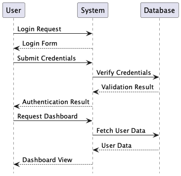
  • How To Launch Big Complex Projects

    How To Launch Big Complex Projects

    May 5, 2025
    Software

    Think about your past projects. Did they finish on time and on budget? Did they end up getting delivered without cutting corners? Did they get disrupted along the way with a changed scope, conflicted interests, unexpected delays, and surprising blockers?

    Chances are high that your recent project was over schedule and over budget — just like a vast majority of other complex UX projects. Especially if it entailed at least some sort of complexity, be it a large group of stakeholders, a specialized domain, internal software, or expert users. It might have been delayed, moved, canceled, “refined,” or postponed. As it turns out, in many teams, shipping on time is an exception rather than the rule.

    In fact, things almost never go according to plan — and on complex projects, they don’t even come close. So, how can we prevent it from happening? Well, let’s find out.

    99.5% Of Big Projects Overrun Budgets And Schedules

    As people, we are inherently over-optimistic and over-confident. It’s hard to study and process everything that can go wrong, so we tend to focus on the bright side. However, unchecked optimism leads to unrealistic forecasts, poorly defined goals, better options ignored, problems not spotted, and no contingencies to counteract the inevitable surprises.

    Hofstadter’s Law states that the time needed to complete a project will always expand to fill the available time &- even if you take into account Hofstadter’s Law. Put differently, it always takes longer than you expect, however cautious you might be.

    As a result, only 0.5% of big projects make the budget and the schedule — e.g., big relaunches, legacy re-dos, big initiatives. We might try to mitigate risk by adding 15–20% buffer — but it rarely helps. Many of these projects don’t follow “normal” (Bell curve) distribution, but are rather “fat-tailed”.

    And there, overruns of 60–500% are typical and turn big projects into big disasters.

    Reference-Class Forecasting (RCF)

    We often assume that if we just thoroughly collect all the costs needed and estimate complexity or efforts, we should get a decent estimate of where we will eventually land. Nothing could be further from the truth.

    Complex projects have plenty of unknown unknowns. No matter how many risks, dependencies, and upstream challenges we identify, there are many more we can’t even imagine. The best way to be more accurate is to define a realistic anchor — for time, costs, and benefits — from similar projects done in the past.

    Reference-class forecasting follows a very simple process:

    • First, we find the reference projects that have the most similarities to our project.
    • If the distribution follows the Bell curve, use the mean value + 10–15% contingency.
    • If the distribution is fat-tailed, invest in profound risk management to prevent big challenges down the line.
    • Tweak the mean value only if you have very good reasons to do so.
    • Set up a database to track past projects in your company (for cost, time, benefits).

    Mapping Out Users’ Success Moments

    Over the last few years, I’ve been using the technique called “Event Storming,” suggested by Matteo Cavucci many years back. The idea is to capture users’ experience moments through the lens of business needs. With it, we focus on the desired business outcome and then use research insights to project events that users will be going through to achieve that outcome.

    The image above shows the process in action — with different lanes representing different points of interest, and prioritized user events themed into groups, along with risks, bottlenecks, stakeholders, and users to be involved — as well as UX metrics. From there, we can identify common themes that emerge and create a shared understanding of risks, constraints, and people to be involved.

    Throughout that journey, we identify key milestones and break users’ events into two main buckets:

    1. User’s success moments (which we want to dial up ↑);
    2. User’s pain points or frustrations (which we want to dial down ↓).

    We then break out into groups of 3–4 people to separately prioritize these events and estimate their impact and effort on Effort vs. Value curves by John Cutler.

    The next step is identifying key stakeholders to engage with, risks to consider (e.g., legacy systems, 3rd-party dependency, etc.), resources, and tooling. We reserve special time to identify key blockers and constraints that endanger a successful outcome or slow us down. If possible, we also set up UX metrics to track how successful we actually are in improving the current state of UX.

    It might seem like a bit too much planning for just a UX project, but it has been helping quite significantly to reduce failures and delays and also maximize business impact.

    When speaking to businesses, I usually speak about better discovery and scoping as the best way to mitigate risk. We can, of course, throw ideas into the market and run endless experiments. But not for critical projects that get a lot of visibility, e.g., replacing legacy systems or launching a new product. They require thorough planning to prevent big disasters, urgent rollbacks, and… black swans.

    Black Swan Management

    Every other project encounters what’s called a Black Swan — a low probability, high-consequence event that is more likely to occur when projects stretch over longer periods of time. It could be anything from restructuring teams to a change of priorities, which then leads to cancellations and rescheduling.

    Little problems have an incredible capacity to compound large, disastrous problems — ruining big projects and sinking big ambitions at a phenomenal scale. The more little problems we can design around early, the more chances we have to get the project out the door successfully.

    So we make projects smaller and shorter. We mitigate risks by involving stakeholders early. We provide less surface for Black Swans to emerge. One good way to get there is to always start every project with a simple question: “Why are we actually doing this project?” The answers often reveal not just motivations and ambitions, but also the challenges and dependencies hidden between the lines of the brief.

    And as we plan, we could follow a “right-to-left thinking”. We don’t start with where we are, but rather where we want to be. And as we plan and design, we move from the future state towards the current state, studying what’s missing or what’s blocking us from getting there. The trick is: we always keep our end goal in mind, and our decisions and milestones are always shaped by that goal.

    Manage Deficit Of Experience

    Complex projects start with a deep deficit of experience. To increase the chances of success, we need to minimize the chance of mistakes even happening. That means trying to make the process as repetitive as possible — with smaller “work modules” repeated by teams over and over again.

    🚫 Beware of unchecked optimism → unrealistic forecasts.
    🚫 Beware of “cutting-edge” → untested technology spirals risk.
    🚫 Beware of “unique” → high chance of exploding costs.
    🚫 Beware of “brand new” → rely on tested and reliable.
    🚫 Beware of “the biggest” → build small things, then compose.

    It also means relying on reliable: from well-tested tools to stable teams that have worked well together in the past. Complex projects aren’t a good place to innovate processes, mix-n-match teams, and try out more affordable vendors.

    Typically, these are extreme costs in disguise, skyrocketing delivery delays, and unexpected expenses.

    Think Slow, Act Fast

    In the spirit of looming deadlines, many projects rush into delivery mode before the scope of the project is well-defined. It might work for fast experiments and minor changes, but that’s a red flag for larger projects. The best strategy is to spend more time in planning before designing a single pixel on the screen.

    But planning isn’t an exercise in abstract imaginative work. Good planning should include experiments, tests, simulations, and refinements. It must include the steps of how we reduce risks and how we mitigate risks when something unexpected (but frequent in other similar projects) happens.

    Good Design Is Good Risk Management

    When speaking about design and research to senior management, position it as a powerful risk management tool. Good design that involves concept testing, experimentation, user feedback, iterations, and refinement of the plan is cheap and safe.

    Eventually it might need more time than expected, but it’s much — MUCH! — cheaper than delivery. Delivery is extremely cost-intensive, and if it relies on wrong assumptions and poor planning, then that’s when the project becomes vulnerable and difficult to move or re-route.

    Wrapping Up

    The insights above come from a wonderful book on How Big Things Get Done by Prof. Bent Flyvbjerg and Dan Gardner. It goes in all the fine details of how big projects fail and when they succeed. It’s not a book about design, but a fantastic book for designers who want to plan and estimate better.

    Not every team will work on a large, complex project, but sometimes these projects become inevitable — when dealing with legacy, projects with high visibility, layers of politics, or an entirely new domain where the company moves.

    Good projects that succeed have one thing in common: they dedicate a majority of time to planning and managing risks and unknown unknowns. They avoid big-bang revelations, but instead test continuously and repeatedly. That’s your best chance to succeed — work around these unknowns, as you won’t be able to prevent them from emerging entirely anyway.

    New: How To Measure UX And Design Impact

    Meet Measure UX & Design Impact (8h), a practical guide for designers and UX leads to shape, measure and explain your incredible UX impact on business. Recorded and updated by Vitaly Friedman. Use the friendly code 🎟 IMPACT to save 20% off today. Jump to the details.

    • Video + UX Training
    • Video only

    Video + UX Training

    $ 495.00 $ 799.00 Get Video + UX Training

    25 video lessons (8h) + Live UX Training.
    100 days money-back-guarantee.

    Video only

    $ 250.00$ 395.00

    Get the video course

    25 video lessons (8h). Updated yearly.
    Also available as a UX Bundle with 2 video courses.


    Source: Articles on Smashing Magazine — For Web Designers And Developers.
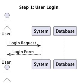
Previous Page
1 … 906 907 908 909 910 911
Next Page
MONIMEGA
  • Instagram
  • Facebook
  • Twitter
Gestisci Consenso
Per fornire le migliori esperienze, utilizziamo tecnologie come i cookie per memorizzare e/o accedere alle informazioni del dispositivo. Il consenso a queste tecnologie ci permetterà di elaborare dati come il comportamento di navigazione o ID unici su questo sito. Non acconsentire o ritirare il consenso può influire negativamente su alcune caratteristiche e funzioni.
Funzionale Always active
L'archiviazione tecnica o l'accesso sono strettamente necessari al fine legittimo di consentire l'uso di un servizio specifico esplicitamente richiesto dall'abbonato o dall'utente, o al solo scopo di effettuare la trasmissione di una comunicazione su una rete di comunicazione elettronica.
Preferenze
L'archiviazione tecnica o l'accesso sono necessari per lo scopo legittimo di memorizzare le preferenze che non sono richieste dall'abbonato o dall'utente.
Statistiche
L'archiviazione tecnica o l'accesso che viene utilizzato esclusivamente per scopi statistici. L'archiviazione tecnica o l'accesso che viene utilizzato esclusivamente per scopi statistici anonimi. Senza un mandato di comparizione, una conformità volontaria da parte del vostro Fornitore di Servizi Internet, o ulteriori registrazioni da parte di terzi, le informazioni memorizzate o recuperate per questo scopo da sole non possono di solito essere utilizzate per l'identificazione.
Marketing
L'archiviazione tecnica o l'accesso sono necessari per creare profili di utenti per inviare pubblicità, o per tracciare l'utente su un sito web o su diversi siti web per scopi di marketing simili.
  • Manage options
  • Manage services
  • Manage {vendor_count} vendors
  • Read more about these purposes
Visualizza le preferenze
  • {title}
  • {title}
  • {title}