MONIMEGA
  • Blog
    • Politics
    • Software
    • Technology
    • Business
    • Design
    • Hardware
    • Health
    • Italy
    • Music
    • Sports
    • Strategy
    • World
  • Contatto
  • Galleria
  • Informazioni
  • Servizi
  • Data Vs. Findings Vs. Insights In UX

    Data Vs. Findings Vs. Insights In UX

    May 27, 2025
    Software

    In many companies, data, findings, and insights are all used interchangeably. Slack conversations circle around convincing data points, statistically significant findings, reliable insights, and emerging trends. Unsurprisingly, conversations often mistake sporadic observations for consistent patterns.

    But how impactful is the weight that each of them carries? And how do we turn raw data into meaningful insights to make better decisions? Well, let’s find out.

    Why It All Matters

    At first, it may seem that the differences are very nuanced and merely technical. But when we review inputs and communicate the outcomes of our UX work, we need to be careful not to conflate terminology — to avoid wrong assumptions, wrong conclusions, and early dismissals.

    When strong recommendations and bold statements emerge in a big meeting, inevitably, there will be people questioning the decision-making process. More often than not, they will be the loudest voices in the room, often with their own agenda and priorities that they are trying to protect.

    As UX designers, we need to be prepared for it. The last thing we want is to have a weak line of thinking, easily dismantled under the premise of “weak research”, “unreliable findings”, “poor choice of users” — and hence dismissed straight away.

    Data ≠ Findings ≠ Insights

    People with different roles — analysts, data scientists, researchers, strategists — often rely on fine distinctions to make their decisions. The general difference is easy to put together:

    • Data is raw observations (logs, notes, survey answers) (what was recorded).
    • Findings describe emerging patterns in data but aren’t actionable (what happened).
    • Insights are business opportunities (what happened + why + so what).
    • Hindsights are reflections of past actions and outcomes (what we learned in previous work).
    • Foresights are informed projections, insights with extrapolation (what could happen next).

    Here’s what it then looks like in real life:

    • Data ↓
      Six users were looking for ”Money transfer” in “Payments”, and 4 users discovered the feature in their personal dashboard.
    • Finding ↓
      60% of users struggled to find the “Money transfer” feature on a dashboard, often confusing it with the “Payments” section.
    • Insight ↓
      Navigation doesn’t match users’ mental models for money transfers, causing confusion and delays. We recommend renaming sections or reorganizing the dashboard to prioritize “Transfer Money”. It could make task completion more intuitive and efficient.
    • Hindsight ↓
      After renaming the section to “Transfer Money” and moving it to the main dashboard, task success increased by 12%. User confusion dropped in follow-up tests. It proved to be an effective solution.
    • Foresight ↓
      As our financial products become more complex, users will expect simpler task-oriented navigation (e.g., “Send Money”, “Pay Bills“) instead of categories like “Payments”. We should evolve the dashboard towards action-driven IA to meet user expectations.

    Only insights create understanding and drive strategy. Foresights shape strategy, too, but are always shaped by bets and assumptions. So, unsurprisingly, stakeholders are interested in insights, not findings. They rarely need to dive into raw data points. But often, they do want to make sure that findings are reliable.

    That’s when, eventually, the big question about statistical significance comes along. And that’s when ideas and recommendations often get dismissed without a chance to be explored or explained.

    But Is It Statistically Significant?

    Now, for UX designers, that’s an incredibly difficult question to answer. As Nikki Anderson pointed out, statistical significance was never designed for qualitative research. And with UX work, we’re not trying to publish academic research or prove universal truths.

    What we are trying to do is reach theoretical saturation, the point where additional research doesn’t give us new insights. Research isn’t about proving something is true. It’s about preventing costly mistakes before they happen.

    Here are some useful talking points to handle the question:

    • Five users per segment often surface major issues, and 10–15 users per segment usually reach saturation. If we’re still getting new insights after that, our scope is too broad.
    • “If five people hit the same pothole and wreck their car, how many more do you need before fixing the road?”
    • “If three enterprise customers say onboarding is confusing, that’s a churn risk.”
    • “If two usability tests expose a checkout issue, that’s abandoned revenue.”
    • “If one customer interview reveals a security concern, that’s a crisis waiting to happen.”
    • “How many user complaints exactly do we need to take this seriously?”
    • “How much revenue exactly are we willing to lose before fixing this issue?”

    And: it might not be necessary to focus on the number of participants, but instead, argue about users consistently struggling with a feature, mismatch of expectations, and a clear pattern emerging around a particular pain point.

    How To Turn Findings Into Insights

    Once we notice patterns emerging, we need to turn them into actionable recommendations. Surprisingly, this isn’t always easy — we need to avoid easy guesses and assumptions as far as possible, as they will invite wrong conclusions.

    To do that, you can rely on a very simple but effective framework to turn findings into insights: What Happened + Why + So What:

    • “What happened” covers observed behavior and patterns.
    • “Why” includes beliefs, expectations, or triggers.
    • “So What” addresses impact, risk, and business opportunity.

    To better assess the “so what” part, we should pay close attention to the impact of what we have noticed on desired business outcomes. It can be anything from high-impact blockers and confusion to hesitation and inaction.

    I can wholeheartedly recommend exploring Findings → Insights Cheatsheet in Nikki Anderson’s wonderful slide deck, which has examples and prompts to use to turn findings into insights.

    Stop Sharing Findings — Deliver Insights

    When presenting the outcomes of your UX work, focus on actionable recommendations and business opportunities rather than patterns that emerged during testing.

    To me, it’s all about telling a good damn story. Memorable, impactful, feasible, and convincing. Paint the picture of what the future could look like and the difference it would produce. That’s where the biggest impact of UX work emerges.

    How To Measure UX And Design Impact

    Meet Measure UX & Design Impact (8h), a practical guide for designers and UX leads to shape, measure, and explain your incredible UX impact on business. Recorded and updated by Vitaly Friedman. Use the friendly code 🎟 IMPACT to save 20% off today. Jump to the details.

    • Video + UX Training
    • Video only

    Video + UX Training

    $ 495.00 $ 799.00 Get Video + UX Training

    25 video lessons (8h) + Live UX Training.
    100 days money-back-guarantee.

    Video only

    $ 250.00$ 395.00

    Get the video course

    25 video lessons (8h). Updated yearly.
    Also available as a UX Bundle with 2 video courses.

    Further Reading on Smashing Magazine

    • “The Human Element: Using Research And Psychology To Elevate Data Storytelling,” Victor Yocco & Angelica Lo Duca
    • “Integrations: From Simple Data Transfer To Modern Composable Architectures,” Edoardo Dusi
    • “Scaling Success: Key Insights And Practical Takeaways,” Addy Osmani
    • “Embracing Introversion In UX,” Victor Yocco

    Source: Articles on Smashing Magazine — For Web Designers And Developers.

  • Interviewed by James Lewis at goto Copenhagen

    May 23, 2025
    Software

    At goto copenhagen last year, my friend James Lewis interviewed me and Goto have just released the video. I talk about when I learned about iterative design from Kent Beck, the dangers of product owners interfering with business-developer communication, and writing the agile manifesto. During this he specifically asked about my essay Is Design Dead. There’s also a some audience questions asking if pair programming is a bad thing for introverts like us (no), and (inevitably) the role of LLMs for programmers today.

    more…


    Source: Martin Fowler.

  • What Zen And The Art Of Motorcycle Maintenance Can Teach Us About Web Design

    What Zen And The Art Of Motorcycle Maintenance Can Teach Us About Web Design

    May 23, 2025
    Software

    I think we, as engineers and designers, have a lot to gain by stepping outside of our worlds. That’s why in previous pieces I’ve been drawn towards architecture, newspapers, and the occasional polymath. Today, we stumble blindly into the world of philosophy. Bear with me. I think there’s something to it.

    In 1974, the American philosopher Robert M. Pirsig published a book called Zen and the Art of Motorcycle Maintenance. A flowing blend of autobiography, road trip diary, and philosophical musings, the book’s ‘chautauqua’ is an interplay between art, science, and self. Its outlook on life has stuck with me since I read it.

    The book often feels prescient, at times surreal to read given it’s now 50 years old. Pirsig’s reflections on arts vs. sciences, subjective vs. objective, and systems vs. people translate seamlessly to the digital age. There are lessons there that I think are useful when trying to navigate — and build — the web. Those lessons are what this piece is about.

    I feel obliged at this point to echo Pirsig and say that what follows should in no way be associated with the great body of factual information about Zen Buddhist practice. It’s not very factual in terms of web development, either.

    Buddha In The Machine

    Zen is written in stages. It sets a scene before making its central case. That backdrop is important, so I will mirror it here. The book opens with the start of a motorcycle road trip undertaken by Pirsig and his son. It’s a winding journey that takes them most of the way across the United States.

    Despite the trip being in part characterized as a flight from the machine, from the industrial ‘death force’, Pirsig takes great pains to emphasize that technology is not inherently bad or destructive. Treating it as such actually prevents us from finding ways in which machinery and nature can be harmonious.

    Granted, at its worst, the technological world does feel like a death force. In the book’s 1970s backdrop, it manifests as things like efficiency, profit, optimization, automation, growth — the kinds of words that, when we read them listed together, a part of our soul wants to curl up in the fetal position.

    In modern tech, those same forces apply. We might add things like engagement and tracking to them. Taken to the extreme, these forces contribute to the web feeling like a deeply inhuman place. Something cold, calculating, and relentless, yet without a fire in its belly. Impersonal, mechanical, inhuman.

    Faced with these forces, the impulse is often to recoil. To shut our laptops and wander into the woods. However, there is a big difference between clearing one’s head and burying it in the sand. Pirsig argues that “Flight from and hatred of technology is self-defeating.” To throw our hands up and step away from tech is to concede to the power of its more sinister forces.

    “The Buddha, the Godhead, resides quite as comfortably in the circuits of a digital computer or the gears of a cycle transmission as he does at the top of a mountain or in the petals of a flower. To think otherwise is to demean the Buddha — which is to demean oneself.”

    — Robert M. Pirsig

    Before we can concern ourselves with questions about what we might do, we must try our best to marshal how we might be. We take our heads and hearts with us wherever we go. If we characterize ourselves as powerless pawns, then that is what we will be.

    Where design and development are concerned, that means residing in the technology without losing our sense of self — or power. Technology is only as good or evil, as useful or as futile, as the people shaping it. Be it the internet or artificial intelligence, to direct blame or ire at the technology itself is to absolve ourselves of the responsibility to use it better. It is better not to demean oneself, I think.

    So, with the Godhead in mind, to business.

    Classical And Romantic

    A core concern of Zen and the Art of Motorcycle Maintenance is the tension between the arts and sciences. The two worlds have a long, rich history of squabbling and dysfunction. There is often mutual distrust, suspicion, and even hostility. This, again, is self-defeating. Hatred of technology is a symptom of it.

    “A classical understanding sees the world primarily as the underlying form itself. A romantic understanding sees it primarily in terms of immediate appearance.”

    — Robert M. Pirsig

    If we were to characterize the two as bickering siblings, familiar adjectives might start to appear:

    Classical Romantic
    Dull Frivolous
    Awkward Irrational
    Ugly Erratic
    Mechanical Untrustworthy
    Cold Fleeting

    Anyone in the world of web design and development will have come up against these kinds of standoffs. Tensions arise between testing and intuition, best practices and innovation, structure and fluidity. Is design about following rules or breaking them?

    Treating such questions as binary is a fallacy. In doing so, we place ourselves in adversarial positions, whatever we consider ourselves to be. The best work comes from these worlds working together — from recognising they are bound.

    Steve Jobs was a famous advocate of this.

    “Technology alone is not enough — it’s technology married with liberal arts, married with the humanities, that yields us the result that makes our heart sing.”

    — Steve Jobs

    Whatever you may feel about Jobs himself, I think this sentiment is watertight. No one field holds all the keys. Leonardo da Vinci was a shining example of doing away with this needless siloing of worlds. He was a student of light, anatomy, art, architecture, everything and anything that interested him. And they complemented each other. Excellence is a question of harmony.

    Is a motorcycle a romantic or classical artifact? Is it a machine or a symbol? A series of parts or a whole? It’s all these things and more. To say otherwise does a disservice to the motorcycle and deprives us of its full beauty.

    Just by reframing the relationship in this way, the kinds of adjectives that come to mind naturally shift toward more harmonious territory.

    Classical Romantic
    Organized Vibrant
    Scaleable Evocative
    Reliable Playful
    Efficient Fun
    Replicable Expressive

    And, of course, when we try thinking this way, the distinction itself starts feeling fuzzier. There is so much that they share.

    Pirsig posits that the division between the subjective and objective is one of the great missteps of the Greeks, one that has been embraced wholeheartedly by the West in the millennia since. That doesn’t have to be the lens, though. Perhaps monism, not dualism, is the way.

    In a sense, technology marks the ultimate interplay between the arts and the sciences, the classical and the romantic. It is the human condition brought to you with ones and zeros. To separate those parts of it is to tear apart the thing itself.

    The same is true of the web. Is it romantic or classical? Art or science? Structured or anarchic? It is all those things and more. Engineering at its best is where all these apparent contradictions meet and become one.

    What is this place? Well, that brings us to a core concept of Pirsig’s book: Quality.

    Quality

    The central concern of Zen and the Art of Motorcycle Maintenance is the ‘Metaphysics of Quality’. Pirsig argues that ‘Quality’ is where subjective and objective experience meet. Quality is at the knife edge of experience.

    “Quality is the continuing stimulus which our environment puts upon us to create the world in which we live. All of it. Every last bit of it.”

    — Robert M. Pirsig

    Pirsig’s writings overlap a lot with Taoism and Eastern philosophy, to the extent that he likens Quality to the Tao. Quality is similarly undefinable, with Pirsig himself making a point of not defining it. Like the Tao, Plato’s Form of the Good, or the ‘good taste’ to which GitHub cofounder Scott Chacon recently attributed the platform’s success, it simply is.

    Despite its nebulous nature, Quality is something we recognise when we see it. Any given problem or question has an infinite number of potential solutions, but we are drawn to the best ones as water flows toward the sea. When in a hostile environment, we withdraw from it, responding to a lack of Quality around us.

    We are drawn to Quality, to the point at which subjective and objective, romantic and classical, meet. There is no map, there isn’t a bullet point list of instructions for finding it, but we know it when we’re there.

    A Quality Web

    So, what does all this look like in a web context? How can we recognize and pursue Quality for its own sake and resist the forces that pull us away from it?

    There are a lot of ways in which the web is not what we’d call a Quality environment. When we use social media sites with algorithms designed around provocation rather than communication, when we’re assailed with ads to such an extent that content feels (and often is) secondary, and when AI-generated slop replaces artisanal craft, something feels off. We feel the absence of Quality.

    Here are a few habits that I think work in the service of more Quality on the web.

    Seek To Understand How Things Work

    I’m more guilty than anyone of diving into projects without taking time to step back and assess what I’m actually dealing with. As you can probably guess from the title, a decent amount of time in Zen and the Art of Motorcycle Maintenance is spent with the author as he tinkers with his motorcycle. Keeping it tuned up and in good repair makes it work better, of course, but the practice has deeper, more understated value, too. It lends itself to understanding.

    To maintain a motorcycle, one must have some idea of how it works. To take an engine apart and put it back together, one must know what each piece does and how it connects. For Pirsig, this process becomes almost meditative, offering perspective and clarity. The same is true of code. Rushing to the quick fix, be it due to deadlines or lethargy, will, at best, lead to a shoddy result and, in all likelihood, make things worse.

    “Black boxes” are as much a choice not to learn as they are something innately mysterious or unknowable. One of the reasons the web feels so ominous at times is that we don’t know how it works. Why am I being recommended this? Why are ads about ivory backscratchers following me everywhere? The inner workings of web tracking or AI models may not always be available, but just about any concept can be understood in principle.

    So, in concrete terms:

    • Read the documentation, for the love of god.
      Sometimes we don’t understand how things work because the manual’s bad; more often, it’s because we haven’t looked at it.
    • Follow pipelines from their start to their finish.
      How does data get from point A to point Z? What functions does it pass through, and how do they work?
    • Do health work.
      Changing the oil in a motorcycle and bumping project dependencies amount to the same thing: a caring and long-term outlook. Shiny new gizmos are cool, but old ones that still run like a dream are beautiful.
    • Always be studying.
      We are all works in progress, and clinging on to the way things were won’t make the brave new world go away. Be open to things you don’t know, and try not to treat those areas with suspicion.

    Bound up with this is nurturing a love for what might easily be mischaracterized as the ‘boring’ bits. Motorcycles are for road trips, and code powers products and services, but understanding how they work and tending to their inner workings will bring greater benefits in the long run.

    Reframe The Questions

    Much of the time, our work is understandably organized in terms of goals. OKRs, metrics, milestones, and the like help keep things organized and stuff happening. We shouldn’t get too hung up on them, though. Looking at the things we do in terms of Quality helps us reframe the process.

    The highest Quality solution isn’t always the same as the solution that performed best in A/B tests. The Dark Side of the Moon doesn’t exist because of focus groups. The test screenings for Se7en were dreadful. Reducing any given task to a single metric — or even a handful of metrics — hamstrings the entire process.

    Rory Sutherland suggests much the same thing in Are We Too Impatient to Be Intelligent? when he talks about looking at things as open-ended questions rather than reducing them to binary metrics to be optimized. Instead of fixating on making trains faster, wouldn’t it be more useful to ask, How do we improve their Quality?

    Challenge metrics. Good ones — which is to say, Quality ones — can handle the scrutiny. The bad ones deserve to crumble. Either way, you’re doing the world a service. With any given action you take on a website — from button design to database choices — ask yourself, Does this improve the Quality of what I’m working on? Not the bottom line. Not the conversion rate. Not egos. The Quality. Quality pulls us away from dark patterns and towards the delightful.

    The will to Quality is itself a paradigm shift. Aspiring to Quality removes a lot of noise from what is often a deafening environment. It may make things that once seemed big appear small.

    Seek To Wed Art With Science (And Whatever Else Fits The Bill)

    None of the above is to say that rules, best practices, conventions, and the like don’t have their place or are antithetical to Quality. They aren’t. To think otherwise is to slip into the kind of dualities Pirsig rails against in Zen.

    In a lot of ways, the main underlying theme in my What X Can Teach Us About Web Design pieces over the years has been how connected seemingly disparate worlds are. Yes, Vitruvius’s 1st-century tenets about architecture are useful to web design. Yes, newspapers can teach us much about grid systems and organising content. And yes, a piece of philosophical fiction from the 1970s holds many lessons about how to meet the challenges of artificial intelligence.

    Do not close your work off from atypical companions. Stuck on a highly technical problem? Perhaps a piece of children’s literature will help you to make the complicated simple. Designing a new homepage for your website? Look at some architecture.

    The best outcomes are harmonies of seemingly disparate worlds. Cling to nothing and throw nothing away.

    Make Time For Doing Nothing

    Here’s the rub. Just as Quality itself cannot be defined, the way to attain it is also not reducible to a neat bullet point list. Neither waterfall, agile or any other management framework holds the keys.

    If we are serious about putting Buddha in the machine, then we must allow ourselves time and space to not do things. Distancing ourselves from the myriad distractions of modern life puts us in states where the drift toward Quality is almost inevitable. In the absence of distracting forces, that’s where we head.

    • Get away from the screen.
      We all have those moments where the solution to a problem appears as if out of nowhere. We may be on a walk or doing chores, then pop!
    • Work on side projects.
      I’m not naive. I know some work environments are hostile to anything that doesn’t look like relentless delivery. Pet projects are ideal spaces for you to breathe. They’re yours, and you don’t have to justify them to anyone.

    As I go into more detail in “An Ode to Side Project Time,” there is immense good in non-doing, in letting the water clear. There is so much urgency, so much of the time. Stepping away from that is vital not just for well-being, but actually leads to better quality work too.

    From time to time, let go of your sense of urgency.

    Spirit Of Play

    Despite appearances, the web remains a deeply human experiment. The very best and very worst of our souls spill out into this place. It only makes sense, therefore, to think of the web — and how we shape it — in spiritual terms. We can’t leave those questions at the door.

    Zen and the Art of Motorcycle Maintenance has a lot to offer the modern web. It’s not a manifesto or a way of life, but it articulates an outlook on technology, art, and the self that many of us recognise on a deep, fundamental level. For anyone even vaguely intrigued by what’s been written here, I suggest reading the book. It’s much better than this article.

    Be inspired. So much of the web is beautiful. The highest-rated Awwwards profiles are just a fraction of the amazing things being made every day. Allow yourself to be delighted. Aspire to be delightful. Find things you care about and make them the highest form of themselves you can. And always do so in a spirit of play.

    We can carry those sentiments to the web. Do away with artificial divides between arts and science and bring out the best in both. Nurture a taste for Quality and let it guide the things you design and engineer. Allow yourself space for the water to clear in defiance of the myriad forces that would have you do otherwise.

    The Buddha, the Godhead, resides quite as comfortably in a social media feed or the inner machinations of cloud computing as at the top of a mountain or in the petals of a flower. To think otherwise is to demean the Buddha, which is to demean oneself.

    Other Resources

    • Zen and the Art of Motorcycle Maintenance by Robert M. Pirsig
    • The Beauty of Everyday Things by Soetsu Yanagi
    • Tao Te Ching
    • “The Creative Act” by Rick Rubin
    • “Robert Pirsig & His Metaphysics of Quality” by Anthony McWatt
    • “Dark Patterns in UX: How to Identify and Avoid Unethical Design Practices” by Daria Zaytseva

    Further Reading on Smashing Magazine

    • “Three Approaches To Amplify Your Design Projects,” Olivia De Alba
    • “AI’s Transformative Impact On Web Design: Supercharging Productivity Across The Industry,” Paul Boag
    • “How A Bottom-Up Design Approach Enhances Site Accessibility,” Eleanor Hecks
    • “How Accessibility Standards Can Empower Better Chart Visual Design,” Kent Eisenhuth

    Source: Articles on Smashing Magazine — For Web Designers And Developers.

  • Red Hat Releases RHEL 10 Early

    May 21, 2025
    Software
    Red Hat quietly rolled out the official release of RHEL 10.0 a bit early.

    Share

    May 21, 2025
    Jack Wallen

    Red Hat quietly rolled out the official release of RHEL 10.0 a bit early.

    Over on Phoronix, Michael Larabel reported that Red Hat did the unthinkable and made the general availability (GA) release of Red Hat Enterprise Linux (RHEL) 10.0 available. Version 10 of the enterprise Linux distribution wasn’t supposed to hit until the Red Hat Summit, which happens May 19-22 in Boston.

    As far as what’s new in version 10, you’ll find that it’s been updated for post-quantum cryptography with system-wide cryptographic policis, OpenSSL, and OpenSSH support; Sequoia PGP tools for managing OpenPGP encryption and signatures; SELinux improvements including CIL output for audit2allow and Wayland support for the SELinux sandbox; enhanced compliance and system roles; an optimized kernel for better scalability, memory management, and performance under heavy workloads; modern hardware support; and more.

    The development toolchain includes Python 3.12, Ruby 3.3, Node.js 22, Perl 5.40, PHP 8.3, Git 2.45, Subversion 1.14, GCC 14.2, glibc 2.39, Annobin 12.55, binutils 2.41, Apache 2.4.62, NGINX 1.26, Varnish Cache 7.4, Squid 6.10, MariaDB 10.11, MySQL 8.4, PostgreSQL 16, and Valkey 7.2. 

    Of course, you can also expect RHEL to embrace AI. In a recent press release, Joe Fernandes, VP and General Manager, AI Business Unit, Red Hat, had this to say, “Red Hat knows that enterprises will need ways to manage the rising cost of their generative AI deployments, as they bring more use cases to production and run at scale. They also need to address the challenge of integrating AI models with private enterprise data and be able to deploy these models wherever their data may live. Red Hat AI helps enterprises address these challenges by enabling them to leverage more efficient, purpose-built models, trained on their data and enable flexible inference across on-premises, cloud and edge environments.”

    You can download RHEL 10 from the official Red Hat download site and read the official release notes (for the beta) here.


    • Red Hat Enterprise Linux 9.5 Released

      Notify your friends, loved ones, and colleagues that the latest version of RHEL is available with plenty of enhancements.

      more »

    • AlmaLinux OS Kitten 10 Gives Power Users a Sneak Preview

      If you’re looking to kick the tires of AlmaLinux’s upstream version, the developers have a purrfect solution.

      more »

    • AlmaLinux 10.0 Beta Released

      The AlmaLinux OS Foundation has announced the availability of AlmaLinux 10.0 Beta (“Purple Lion”) for all supported devices with significant changes.

      more »

    • CIQ, Oracle, and SUSE Form Alliance to Thwart Near-Closing of the RHEL Source

      With Red Hat/IBM making it harder for developers and teams to access the source for Red Hat Enterprise Linux (RHEL), some organizations are joining forces to pave a new path forward.

      more »

    • Red Hat Migrates RHEL from Xorg to Wayland

      If you’ve been wondering when Xorg will finally be a thing of the past, wonder no more, as Red Hat has made it clear.

      more »

    Please enable JavaScript to view the comments powered by Disqus.comments powered by Disqus


    Source: Linux Magazine News (path: lmi_news).

  • Smashing Animations Part 3: SMIL’s Not Dead Baby, SMIL’s Not Dead

    Smashing Animations Part 3: SMIL’s Not Dead Baby, SMIL’s Not Dead

    May 21, 2025
    Software

    The SMIL specification was introduced by the W3C in 1998 for synchronizing multimedia. This was long before CSS animations or JavaScript-based animation libraries were available. It was built into SVG 1.1, which is why we can still use it there today.

    Now, you might’ve heard that SMIL is dead. However, it’s alive and well since Google reversed a decision to deprecate the technology almost a decade ago. It remains a terrific choice for designers and developers who want simple, semantic ways to add animations to their designs.

    Tip: There’s now a website where you can see all my Toon Titles.

    Mike loves ’90s animation — especially Disney’s) Duck Tales). Unsurprisingly, my taste in cartoons stretches back a little further to Hanna-Barbera shows like Dastardly and Muttley in Their Flying Machines, Scooby-Doo, The Perils of Penelope Pitstop, Wacky Races, and, of course, The Yogi Bear Show. So, to explain how this era of animation relates to SVG, I’ll be adding SMIL animations in SVG to title cards from some classic Yogi Bear cartoons.

    Fundamentally, animation changes how an element looks and where it appears over time using a few basic techniques. That might be simply shifting an element up or down, left or right, to create the appearance of motion, like Yogi Bear moving across the screen.

    Rotating objects around a fixed point can create everything, from simple spinning effects to natural-looking movements of totally normal things, like a bear under a parachute falling from the sky.

    Scaling makes an element grow, shrink, or stretch, which can add drama, create perspective, or simulate depth.

    Changing colour and transitioning opacity can add atmosphere, create a mood, and enhance visual storytelling. Just these basic principles can create animations that attract attention and improve someone’s experience using a design.

    These results are all achievable using CSS animations, but some SVG properties can’t be animated using CSS. Luckily, we can do more — and have much more fun — using SMIL animations in SVG. We can combine complex animations, move objects along paths, and control when they start, stop, and everything in between.

    Animations can be embedded within any SVG element, including primitive shapes like circles, ellipses, and rectangles. They can also be encapsulated into groups, paths, and polygons:

    <circle ...> <animate>...</animate> </circle> 

    Animations can also be defined outside an element, elsewhere in an SVG, and connected to it using an xlink attribute:

    <g id="yogi">...</g> ... <animate xlink:href="#yogi">…</animate> 

    Building An Animation

    <animate> is just one of several animation elements in SVG. Together with an attributeName value, it enables animations based on one or more of an element’s attributes.

    Most animation explanations start by moving a primitive shape, like this exciting circle:

    <circle r="50" cx="50" cy="50" fill="#062326" opacity="1" /> 

    Using this attributeName property, I can define which of this circle’s attributes I want to animate, which, in this example, is its cx (x-axis center point) position:

    <circle ... > <animate attributename="cx"></animate> </circle> 

    On its own, this does precisely nothing until I define three more values. The from keyword specifies the circle’s initial position, to, its final position, and the dur-ation between those two positions:

    <circle ... > <animate attributename="cx" from="50" to="500" dur="1s"> </animate> </circle> 

    If I want more precise control, I can replace from and to with a set of values separated by semicolons:

    <circle ... > <animate attributename="cx" values="50; 250; 500; 250;" dur="1s"> </animate> </circle> 

    Finally, I can define how many times the animation repeats (repeatcount) and even after what period that repeating should stop (repeatdur):

    <circle ... > <animate attributename="cx" values="50; 250; 500; 250;" dur="1s" repeatcount="indefinite" repeatdur="180s"> </circle> 

    Most SVG elements have attributes that can be animated. This title card from 1959’s “Brainy Bear” episode shows Yogi in a crazy scientist‘s brain experiment. Yogi’s head is under the dome, and energy radiates around him.

    To create the buzz around Yogi, my SVG includes three path elements, each with opacity, stroke, and stroke-width attributes, which can all be animated:

    <path opacity="1" stroke="#fff" stroke-width="5" ... /> 

    I animated each path’s opacity, changing its value from 1 to .5 and back again:

    <path opacity="1" ... > <animate attributename="opacity" values="1; .25; 1;" dur="1s" repeatcount="indefinite"> </animate> </path> 

    Then, to radiate energy from Yogi, I specified when each animation should begin, using a different value for each path:

    <path ... > <animate begin="0" … > </path> <path ... > <animate begin=".5s" … > </path> <path ... > <animate begin="1s" … > </path> 

    I’ll explain more about the begin property and how to start animations after this short commercial break.

    Try this yourself:

    I needed two types of transform animations to generate the effect of Yogi drifting gently downwards: translate, and rotate. I first added an animatetransform element to the group, which contains Yogi and his chute. I defined his initial vertical position — 1200 off the top of the viewBox — then translated his descent to 1000 over a 15-second duration:

    <g transform="translate(1200, -1200)"> ... <animateTransform attributeName="transform" type="translate" values="500,-1200; 500,1000" dur="15s" repeatCount="1" /> </g> 

    Yogi appears to fall from the sky, but the movement looks unrealistic. So, I added a second animatetransform element, this time with an indefinitely repeating +/- 5-degree rotation to swing Yogi from side to side during his descent:

    <animateTransform attributeName="transform" type="rotate" values="-5; 5; -5" dur="14s" repeatCount="indefinite" additive="sum" /> 

    Try this yourself:

    By default, the arrow is set loose when the page loads. Blink, and you might miss it. To build some anticipation, I can begin the animation two seconds later:

    <animatetransform attributename="transform" type="translate" from="0 0" to="750 0" dur=".25s" begin="2s" fill="freeze" /> 

    Or, I can let the viewer take the shot when they click the arrow:

    <animatetransform ... begin="click" /> 

    And I can combine the click event and a delay, all with no JavaScript, just a smattering of SMIL:

    <animatetransform ... begin="click + .5s" /> 

    Try this yourself by clicking the arrow:

    To bring this title card to life, I needed two groups of paths: one for Yogi and the other for the dog. I translated them both off the left edge of the viewBox:

    <g class="dog" transform="translate(-1000, 0)"> ... </g> <g class="yogi" transform="translate(-1000, 0)"> ... </g> 

    Then, I applied an animatetransform element to both groups, which moves them back into view:

    <!-- yogi --> <animateTransform attributeName="transform" type="translate" from="-1000,0" to="0,0" dur="2s" fill="freeze" /> <!-- dog --> <animateTransform attributeName="transform" type="translate" from="-1000,0" to="0,0" dur=".5s" fill="freeze" /> 

    This sets up the action, but the effect feels flat, so I added another pair of animations that bounce both characters:

    <!-- yogi --> <animateTransform attributeName="transform" type="rotate" values="-1,0,450; 1,0,450; -1,0,450" dur=".25s" repeatCount="indefinite" /> <!-- dog --> <animateTransform attributeName="transform" type="rotate" values="-1,0,450; 1,0,450; -1,0,450" dur="0.5s" repeatCount="indefinite" /> 

    Animations can begin when a page loads, after a specified time, or when clicked. And by naming them, they can also synchronise with other animations.

    I wanted Yogi to enter the frame first to build anticipation, with a short pause before other animations begin, synchronising to the moment he’s arrived. First, I added an ID to Yogi’s translate animation:

    <animateTransform id="yogi" type="translate" ... /> 

    Watch out: For a reason, I can’t, for the life of me, explain why Firefox won’t begin animations with an ID when the ID contains a hyphen. This isn’t smarter than the average browser, but replacing hyphens with underscores fixes the problem.

    Then, I applied a begin to his rotate animation, which starts playing a half-second after the #yogi animation ends:

    <animateTransform type="rotate" begin="yogi.end + .5s" ... /> 

    I can build sophisticated sets of synchronised animations using the begin property and whether a named animation begins or ends. The bulldog chasing Yogi enters the frame two seconds after Yogi begins his entrance:

    <animateTransform id="dog" type="translate" begin="yogi.begin + 2s" fill="freeze" ... /> 

    One second after the dog has caught up with Yogi, a rotate transformation makes him bounce, too:

    <animateTransform type="rotate" ... begin="dog.begin + 1s" repeatCount="indefinite" /> 

    The background rectangles whizzing past are also synchronised, this time to one second before the bulldog ends his run:

    <rect ...> <animateTransform begin="dog.end + -1s" /> </rect> 

    Try this yourself:

    In “The Runaway Bear” from 1959, Yogi must avoid a hunter turning his head into a trophy. I wanted Yogi to leap in and out of the screen by making him follow a path. I also wanted to vary the speed of his dash: speeding up as he enters and exits, and slowing down as he passes the title text.

    I first added a path property, using its coordinate data to give Yogi a route to follow, and specified a two-second duration for my animation:

    <g> <animateMotion dur="2s" path="..." > </animateMotion> </g> 

    Alternatively, I could add a path element, leave it visible, or prevent it from being rendered by placing it inside a defs element:

    <defs> <path id="yogi" d="..." /> </defs> 

    I can then reference that by using a mpath element inside my animateMotion:

    <animateMotion ... <mpath href="#yogi" /> </animateMotion> 

    I experimented with several paths before settling on the one that delivered the movement shape I was looking for:

    One was too bouncy, one was too flat, but the third motion path was just right. Almost, as I also wanted to vary the speed of Yogi’s dash: speeding him up as he enters and exits and slowing him down as he passes the title text.

    The keyPoints property enabled me to specify points along the motion path and then adjust the duration Yogi spends between them. To keep things simple, I defined five points between 0 and 1:

    <animateMotion ... keyPoints="0; .35; .5; .65; 1;" > </animateMotion> 

    Then I added the same number of keyTimes values, separated by semicolons, to control the pacing of this animation:

    <animateMotion ... keyTimes="0; .1; .5; .95; 1;" > </animateMotion> 

    Now, Yogi rushes through the first three keyPoints, slows down as he passes the title text, then speeds up again as he exits the viewBox.

    Try this yourself:

    See the Pen Runaway Bear SVG animation [forked] by Andy Clarke.

    SMIL’s Not Dead, Baby. SMIL’s Not Dead

    With their ability to control transformations, animate complex motion paths, and synchronise multiple animations, SMIL animations in SVG are still powerful tools. They can bring design to life without needing a framework or relying on JavaScript. It’s compact, which makes it great for small SVG effects.

    SMIL includes the begin attribute, which makes chaining animations far more intuitive than with CSS. Plus, SMIL lives inside the SVG file, making it perfect for animations that travel with an asset. So, while SMIL is not modern by today’s standards and may be a little bit niche, it can still be magical.

    Don’t let the misconception that SMIL is “dead” stop you from using this fantastic tool.

    Google reversed its decision to deprecate SMIL almost a decade ago, so it remains a terrific choice for designers and developers who want simple, semantic ways to add animations to their designs.


    Source: Articles on Smashing Magazine — For Web Designers And Developers.

  • Refresh of Agile Threat Modeling

    May 20, 2025
    Software

    Every software team should strive for excellence in building security into their application and infrastructure. Within Thoughtworks, we have long sought accessible approaches to threat modeling. At its heart, threat modeling is a risk-based approach to designing secure systems by identifying threats continually and developing mitigations intentionally. We believe effective threat modeling should start simple and grow incrementally, rather than relying on exhaustive upfront analysis. To demonstrate this in practice, we begin with outlining the core insights required for threat modeling. We then dive into practical threat modeling examples using the STRIDE framework.

    Start from your Dataflows

    Today’s cyber threats can seem overwhelming. Ransomware, supply chain attacks, backdoors, social engineering – where should your team begin? The attacks we read about in breach reports often chain together in unexpected and chaotic ways.

    The key to cutting through complexity in threat modeling lies in tracing how data moves through your technology stack. Start with following where the data enters your boundary. Typically, it could be via user interfaces, APIs, message queues, or model endpoints. Dive into getting a deeper understanding of how it flows between services, through data stores, and across trust boundaries through integrated systems.

    This concrete layout of the data flow between systems would transform vague worries, such as, “Should we worry about hackers?” into specific actionable questions. For example, “What happens if this API response is tampered with?” or “What if this model input is poisoned?”.

    The Crux to Identifying Threats

    From there on, identifying threats can become deceptively simple: follow each one of the data flows and ask “What can go wrong?”. You’ll find that this simple question will lead to complex technical and socio-behavioural analysis that will challenge your unconscious assumptions. It will force you to pivot from thinking “how system works” to “how system fails”, which in essence is the crux of threat modeling.

    Let’s try it. We have an API for a messaging service that accepts two inputs: a message and the recipient’s ID, which then delivers the message to all internal staff. Follow through the carousel below to see how threats appear even this simple data flow.

    External user

    Phishing attempt

    Messaging Service

    On the outset, we see an uncomplicated data flow where an external user sends a message to the messaging service with no explicit notion of security threats. This is the ‘how system works’ view.

    But when we make a cognitive pivot and ask the question, ‘What can go wrong?’ with this data flow, we can easily spot the potential for a phishing attempt since the API is unprotected. Any attacker could send malicious content using this API and cause harm to the staff.

    Like illustrated in the carousel above, even a simple dataflow could warrant potential threats and cause havoc massively. By layering the question “What can go wrong?”, we have been able to expose this perspective that would otherwise remain hidden. The essence of doing this at this small scale leads to adding appropriate defense mechanisms incrementally within every data flow and therefore build a secure system.

    STRIDE as a Practical Aid

    Brainstorming threats can become open-ended without structured frameworks to guide your thinking. As you follow key data flows through your system, use STRIDE to turbocharge your security thinking. STRIDE is an acronym and mnemonic to help remember six key information security properties, so you can methodically identify common security vulnerabilities. Mentally check each one off each time you consider a data flow:

    • Spoofed identity: Is there Authentication? Should there be? – Attackers pretending to be legitimate users through stolen credentials, phishing, or social engineering.
    • Tampering with input: What about nasty input? – Attackers modifying data, code, or memory maliciously to break your system’s trust boundaries.
    • Repudiation: Does the system show who is accountable? – When something goes wrong, can you prove which user performed an action, or could they plausibly deny responsibility due to insufficient audit trails?
    • Information disclosure: Is sensitive data inappropriately exposed or unencrypted? – Unauthorized access to sensitive data through poor access controls, cleartext transmission, or insufficient data protection.
    • Denial of service: What if we smash it? – Attacks aiming at making the system unavailable to legitimate users by flooding or breaking critical components.
    • Elevation of privilege: Can I bypass Authorization? Move deeper into the system? – Attackers gaining unauthorized access levels, obtaining higher permissions than intended, or moving laterally through your system.

    We use these STRIDE cards internally during threat modeling sessions either as printed cards or have them on screen. Another great way to help brainstorm, is to use GenAI. You don’t need any fancy tool just prompt using a normal chat interface. Give some context on the dataflow and tell it to use STRIDE- most of the time you’ll get a really helpful list of threats to consider.

    Work ‘Little and Often’

    Once you get the hang of identifying threats, it’s tempting to organize a full-day workshop to “threat model” every dataflow in your entire syste at once. This big-bang approach often overwhelms teams and rarely sticks as a consistent practice. Instead, integrate threat modeling regularly, like continuous integration for security.

    The most effective threat modeling happens in bite-sized chunks, closely tied to what your team is working on right now. Spending fifteen minutes examining the security implications of a new feature can yield more practical value than hours analyzing hypothetical scenarios for code that isn’t written yet. These small sessions fit naturally into your existing rhythms – perhaps during sprint planning, design discussions, or even daily standups.

    This “little and often” approach brings multiple benefits. Teams build confidence gradually, making the practice less daunting. You focus on immediate, actionable concerns rather than getting lost in edge cases. Most importantly, threat modeling becomes a natural part of how your team thinks about and delivers software, rather than a separate security activity.

    It’s a Team Sport!

    Effective threat modeling draws strength from diverse perspectives. While a security specialist might spot technical vulnerabilities, a product owner could identify business risks, and a developer might see implementation challenges. Each viewpoint adds depth to your understanding of potential threats.

    This doesn’t mean you need formal workshops with the entire organization. A quick conversation by the team’s whiteboard can be just as valuable as a structured session. What matters is bringing different viewpoints together – whether you’re a small team huddled around a screen, or collaborating remotely with security experts.

    The goal isn’t just to find threats – it’s to build shared understanding. When a team threat models together, they develop a common language for discussing security. Developers learn to think like attackers, product owners understand security trade-offs, and security specialists gain insight into the system’s inner workings.

    You don’t need security expertise to start. Fresh eyes often spot risks that experts might miss, and every team member brings valuable context about how the system is built and used. The key is creating an environment where everyone feels comfortable contributing ideas, whether they’re seasoned security professionals or completely new to threat modeling.

    Navigation from here

    Now that we’ve established the core principles of threat modeling, it’s time to put theory into practice. Like any skill worth mastering, threat modeling isn’t something you can fully grasp through explanation alone—it requires hands-on experience. The concepts might make sense intellectually, but the real learning happens when you start applying them. In the following sections, we’ll walk through practical exercises where you can actively identify threats alongside us, developing the mental frameworks that make effective threat modeling possible.

    You’ll see, every threat modeling exercise follows the same pattern as seen below in the table, where a set of structured activities, each leading to a specified outcome, is conducted within a team. We’ve also laid out a few different formats for the teams to run these activities. For example, as quick sessions at a whiteboard, or as a singular long-ish workshop. As with all agile ways of working, the key is finding what works in your team’s context.

    Activity Question Outcome
    Explain and explore What are you building? A technical diagram
    Identify threats What can go wrong? A list of threats
    Prioritize and fix What are you going to do? Prioritized fixes added to backlog

    The examples in this article are independent from each other. So you can pick and choose the one that which most suits your current needs, or feel free to stick through them all to gain varied perspectives. Once you’ve grasped the gist of it, we highly recommend you pick a suitable format that fits your team’s ways of working and give it a headstart immediately. Nothing can beat learning from hands-on practice!

    Quick Team Threat Modeling

    Approach and Preparation

    A quick whiteboard session within the team provides an accessible starting point for threat modeling. Rather than attempting exhaustive analysis, these informal 15-30 minute sessions focus on examining immediate security implications of features your team is currently developing. Let’s walk through the steps to conduct one with an example.

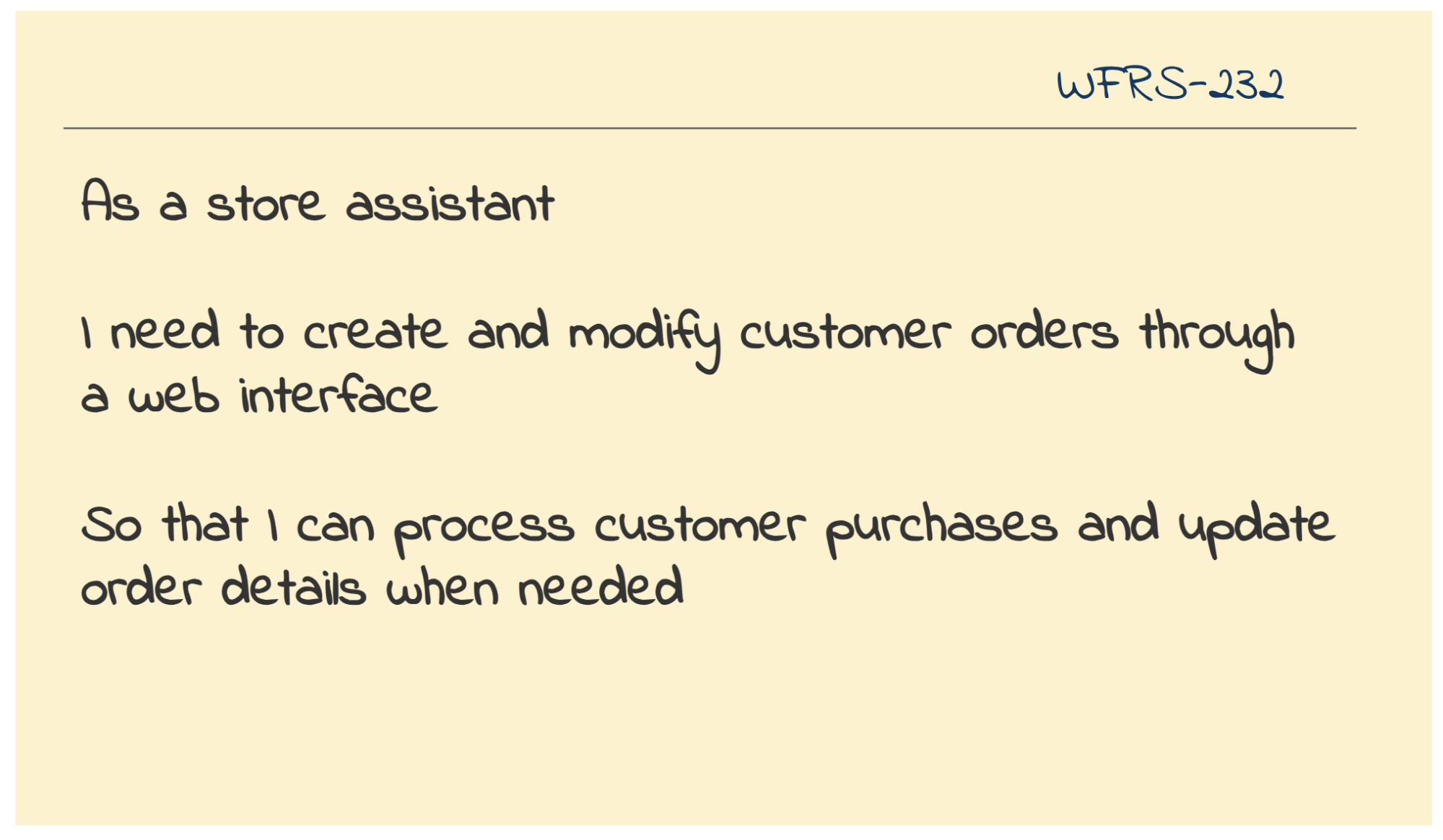
    Let’s say, a software team is working on an order management system, and is planning an epic, where store assistants can create and modify customer orders. This is a perfect scope for a threat modeling session. It is focused on a single feature with clear boundaries.

    The session requires participation from development team members, who can elaborate the technical implementation. It’s great to get attendance from product owners, who know the business context, and security specialists, who can provide valuable input but don’t have to be blocked by their unavailability. Anyone involved in building or supporting the feature, such as the testers or the business analysts too, should be encouraged to join and contribute their perspective.

    The materials needed are straightforward: a whiteboard or shared digital canvas, different colored markers for drawing components, data flows, and sticky notes for capturing threats.

    Once the team is gathered with these materials, they’re ready to ‘explain and explore’.

    Explain and Explore

    In this stage, the team aims to gain a common understanding of the system from different perspectives before they start to identify threats. Typically, the product owner begins the session with an elaboration of the functional flows highlighting the users involved. A technical overview from developers follows after with them also capturing the low-level tech diagram on the whiteboard. Here might be a good place to put those colored markers to use to clearly classify different internal and external systems and their boundaries as it helps in identifying threats greatly later on.

    Once this low-level technical diagram is up, the entities that lead to financial loss, reputation loss, or that results in legal disputes are highlighted as ‘assets’ on the whiteboard before the floor opens for threat modeling.

    A worked example:

    For the order management scope — create and modify orders — the product owner elaborated the functional flows and identified key business assets requiring protection. The flow begins with the customer service executive or the store assistant logging in the web UI, landing on the home page. To modify the order, the user will have to search the order ID from the home page, land on the orders page, and change the details required. To create a new order, the user will have to use the create order page by navigating from the home page menu. The product owner emphasized that customer data and order information are critical business assets that drive revenue and maintain customer trust, particularly as they are covered by GDPR.

    The developers walked through the technical components supporting the functional flow. They noted an UI component, an authentication service, a customer database, an order service and the orders database. They further elaborated the data flows between the components. The UI sends the user credentials to the authentication service to verify the user before logging them in, and then it calls the order service to perform /GET, /POST, and /DELETE operations to view, create and delete orders respectively. They also noted the UI component as the least trusted since it’s exposed to external access during these discussions.

    The carousel below shows how the order management team went about capturing the low-level technical diagram step-by-step on the whiteboard:

    External Customer

    UI Component

    Authentication Service

    Order Service

    Customer Database

    Sensitive asset

    Orders Database

    Sensitive asset

    Step 1: Start with capturing the key system components. The order management system has a UI component, backend services, and databases.

    Step 2: Represent the users of the system. Remember to capture the external systems with direct access separately, so that you can indicate the trust boundaries later on.

    Step 3: Indicate the data flows through the system components clearly. Draw the arrows starting from where the request is initiated with the arrow head pointing the right direction.

    Step 4: Finally, highlight the assets.

    Step 5: Optionally, you can group components that are in the same trust boundary. For instance, the UI could be prone to external threats vs. the internal services hosted in a secure infrastructure.

    Throughout the discussion, the team members were encouraged to point out missing elements or corrections. The goal was to ensure everyone understood the accurate representation of how the system worked before diving into threat modeling.

    As the next step, they went on to identifying the critical assets that need protection based on the following logical conclusions:

    • Order information: A critical asset as tampering them could lead to loss in sales and damaged reputation.
    • Customer details: Any exposure to sensitive customer details could result in legal issues under privacy laws.

    With this concrete layout of the system and its assets, the team went on to brainstorming threats directly.

    Identify Threats

    In the whiteboarding format, we could run the blackhat thinking session as follows:

    1. First, distribute the sticky notes and pens to everyone.
    2. Take one data flow on the low-level tech diagram to discuss threats.
    3. Ask the question, “what could go wrong?” while prompting through the STRIDE threat categories.
    4. Capture threats, one per sticky, with the mandate that the threat is specific such as “SQL injection from Internet” or “No encryption of customer data”.
    5. Place stickies where the threat could occur on the data flow visibly.
    6. Keep going until the team runs out of ideas!

    Remember, attackers will use the same data flows as legitimate users, but in unexpected ways. Even a seemingly simple data flow from an untrusted source can cause significant havoc, and therefore, its essential to cover all the data flows before you end the session.

    A worked example:

    The order management team opened the floor for black hat thinking after identifying the assets. Each team member was encouraged to think like a hacker and come up with ways to attack the assets. The STRIDE cards were distributed as a precursor. The team went ahead and flushed the board with their ideas freely without debating if something was really a threat or not for now, and captured them as stickies along the data flows.

    Try coming up with a list of threats based on the system understanding you’ve so far. Recall the crux of threat modeling. Start thinking what can go wrong and cross-check with the list the team came up with. You may have identified more as well. 🙂

    The carousel here shows how threats are captured along the data flows on the tech diagram as the team brainstorms:

    External Customer

    Credential Stuffing

    UI Component

    Authentication Service

    Order Service

    Auth Flooding

    SQL Injection

    Customer Database

    Order Denial

    Sensitive asset

    Orders Database

    Unencrypted Data

    Sensitive asset

    Library Exploit

    The team started with one data flow at a time for black hat thinking. As they went through the STRIDE categories one-by-one, they captured the threats in the respective data flows as highlighted in the subsequent images. We’ve demonstrated only one threat per category in the images here to keep things simple but the team could add as many as they can think of in a similar fashion.

    The first cue is ‘spoofed identity’. Since MFA isn’t a feature yet in the system, it is possible for an attacker to use username and password pairs harvested from other breaches to login and create fraudulent orders.

    The second cue is ‘tampering’. An attacker could exploit poorly validated input from the UI/API to inject malicious SQL commands, potentially modifying order details, prices, or even deleting order records entirely.

    The third cue is ‘repudiation’. Without proper logging and non-repudiation controls, a customer could claim they never authorized a purchase, leading to disputes and potential financial losses.

    The fourth cue is ‘information disclosure’. Attackers could abuse the unencrypted network traffic to intercept the sensitive customer information in transit, leading to legal lawsuits.

    The fifth cue is ‘denial of service’. As the system doesn’t prohibit anyone from making a series of login attempts, attackers could flood the authentication service, and bring it down. This could result in loss of sales for a prolonged period of time.

    The sixth cue is ‘elevation of privilege’. It is possible for any library used within the system to have open vulnerabilities that could provide access to the trusted network boundaries. For example, the order Service could be exploited to take control of the underlying operating system with such open vulnerabilities, which can become a stepping stone for future attacks, potentially compromising the entire system.

    The team flooded the whiteboard with many threats as stickies on the respective data flows similar to those depicted in the carousel above:

    Category Threats

    Spoofed identity

    1. Social engineering tricks could be played on the customer service executive or store assistant to get their login credentials, or just shoulder surfing or malware might do the trick. They can use it to change the orders.

    2. The store assistant could forget to log out, and anyone in the store could use the logged-in session to change the delivery addresses of existing orders (e.g., to their own address)

    Tampering with inputs

    3. The attacker could get hold of the order service endpoints from any open browser session and tamper with orders later, if the endpoints are not protected.

    4. Code injection could be used while placing an order to hijack customer payment details.

    Repudiation of actions

    5. Developers with production access, when they find out there are no logs for their actions, could create bulk orders for their family and friends by directly inserting records in the database and triggering other relevant processes.

    Information disclosure

    6. If the database is attacked via a back door, all the information it holds will be exposed, when the data is stored in plain text.

    7. Stealing passwords from unencrypted logs or other storage would enable the attacker to tamper with order data.

    8. The customer service executive or store assistant doesn’t have any restrictions on their operations—clarifying clear roles and responsibilities may be required as they could work with an accomplice to abuse their permissions.

    9. The /viewOrders endpoint allows any number of records to be returned. Once compromised, this endpoint could be used to view all orders. The team made a note to at least think of reducing the blast radius.

    Denial of service

    10. The attacker could perform a Distributed Denial of Service (DDoS) attack and bring down the order service once they get hold of the endpoint, leading to loss of sales.

    Elevation of privileges

    11. If an attacker manages to get hold of the credentials of any developer with admin rights, they could add new users or elevate the privileges of existing users to maintain an elevated level of access to the system in the future. They could also create, modify, or delete order records without anyone noticing, as there are no logs for admin actions.

    NOTE: This exercise is intended only to get you familiar with the threat modeling steps, not to provide an accurate threat model for an order management system.

    Later, the team went on to discuss the threats one by one and added their points to each of them. They noticed several design flaws, nuanced permission issues and also noted to discuss production privileges for team members. Once the discussion delved deeper, they realized most threats seemed critical and that they need to prioritize in order to focus on building the right defenses.

    Prioritize and Fix

    Time to turn threats into action. For each identified threat, evaluate its risk by considering likelihood, exposure, and impact. You can also try to come up with a dollar value for the loss of the respective asset. That might sound daunting, but you just need to think about whether you’ve seen this threat before, if it’s a common pattern like those in the OWASP Top 10, and how exposed your system is. Consider the worst case scenario, especially when threats might combine to create bigger problems.

    But we are not done yet. The goal of threat modeling isn’t to instill paranoia, but to drive improvement. Now that we have identified the top threats, we should adopt day-to-day practices to ensure the appropriate defense is built for them. Some of the day-to-day practices you could use to embue security into are:

    • Add security related acceptance criteria on existing user stories
    • Create focused user stories for new security features
    • Plan spikes when you need to investigate solutions from a security lens
    • Update ‘Definition of Done’ with security requirements
    • Create epics for major security architecture changes

    Remember to take a photo of your threat modeling diagram, assign action items to the product owner/tech lead/any team member to get them into the backlog as per one of the above ways. Keep it simple and use your normal planning process to implement them. Just tag them as ‘security-related’ so you can track their progress consciously.

    A worked example:

    The order management team decided to address the threats in the following ways: 1. adding cross-functional acceptance criteria across all the user stories, 2. creating new security user stories and 3. following security by design principles as elaborated here:

    Threats Measures

    Any unencrypted sensitive information in the logs, transit, and the database at rest is vulnerable for attacks.

    The team decided to address this threat by adding a cross-functional acceptance criteria to all of their user stories.

    “All sensitive information such as order data, customer data, access tokens, and development credentials should be encrypted in logs, in transit and in the database.”

    Unprotected Order service APIs could lead to exposure of order data.

    Although the user has to be logged in to see the orders (is authenticated), the team realized there is nothing to stop unauthenticated requests direct to the API. This would have been a pretty major flaw if it had made it into production! The team had not spotted it before the session. They added the following user story so it can be tested explicitly as part of sign-off.

    “GIVEN any API request is sent to the order service

    WHEN there is no valid auth token for the current user included in the request

    THEN the API request is rejected as unauthorized.”

    This is a critical architecture change as they need to implement a mechanism to validate if the auth token is valid by calling the authentication service. And the authentication service needs to have a mechanism to validate if the request is coming only from a trusted source. So they captured it as a separate user story.

    Login credentials of store assistants and customer service executives are prone to social engineering attacks.

    Given that there are significant consequences to the loss of login credentials, the team realized they need to add an epic around multi-factor authentication, role based authorization restrictions, time based auto-logout from the browser to their backlog. This is a significant chunk of scope that would have been missed otherwise leading to unrealistic release timelines.

    Along with these specific actions, the team staunchly decided to follow the principle of least privileges where each team member will only be provided the least minimum required access to any and all test and production environments, repositories, and other internal tools.

    Platform focussed threat model workshop

    Approach and Preparation

    There are times when security demands a larger, more cross-programme, or cross-organizational effort. Security issues often occur at the boundaries between systems or teams, where responsibilities overlap and gaps are sometimes overlooked. These boundary points, such as infrastructure and deployment pipelines, are critical as they often become prime targets for attackers due to their high privilege and control over the deployment environment. But when multiple teams are involved, it becomes increasingly hard to get a comprehensive view of vulnerabilities across the entire architecture.

    So it is absolutely essential to involve the right people in such cross-team threat modeling workshops. Participation from platform engineers, application developers, and security specialists is going to be crucial. Involving other roles who closely work in the product development cycle, such as the business analysts/testers, would guarantee a holistic view of risks too.

    Here is a preparation kit for such cross team threat modeling workshops:

    • Collaborative tools: If running the session remotely, use tools like Mural, Miro, or Google Docs to diagram and collaborate. Ensure these tools are security-approved to handle sensitive information.
    • Set a manageable scope: Focus the session on critical components, such as the CI/CD pipeline, AWS infrastructure, and deployment artifacts. Avoid trying to cover the entire system in one session—timebox the scope.
    • Diagram ahead of time: Consider creating basic diagrams asynchronously before the session to save time. Ensure everyone understands the diagrams and symbols in advance.
    • Keep the session concise: Start with 90-minute sessions to allow for discussion and learning. Once the team gains experience, shorter, more frequent sessions can be held as part of regular sprints.
    • Engagement and facilitation: Make sure everyone actively contributes, especially in remote sessions where it’s easier for participants to disengage. Use icebreakers or simple security exercises to start the session.
    • Prioritize outcomes: Refocus the discussions towards identifying actionable security stories as it is the primary outcome of the workshop. Prepare for documenting them clearly. Identify action owners to add them to their respective backlogs.
    • Breaks and timing: Plan for extra breaks to avoid fatigue when remote, and ensure the session finishes on time with clear, concrete outcomes.

    Explain and Explore

    We have a worked example here where we focus on threat modeling the infrastructure and deployment pipelines of the same order management system assuming it is hosted on AWS. A cross functional team comprising of platform engineers, application developers, and security specialists was gathered to uncover all of the localized and systemic vulnerabilities.

    They began the workshop with defining the scope for threat modeling clearly to everyone. They elaborated on the various users of the system:

    • Platform engineers, who are responsible for infrastructure management, have privileged access to the AWS Management Console.
    • Application developers and testers interact with the CI/CD pipelines and application code.
    • End users interact with the application UI and provide sensitive personal and order information while placing orders.

    The team then captured the low-level technical diagram showing the CI/CD pipelines, AWS infrastructure components, data flows, and the users as seen in the carousel below.

    AWS

    Application Developers

    Platform Engineers

    End users

    Application Pipeline

    Infrastructure Pipeline

    AWS Management Console

    Authentication Service

    UI – S3 Bucket

    Order service – Lambda

    DB – aurora

    Step 1: Start with capturing the system components: S3 (UI), Lambda (Order service), Aurora DB, and CI/CD pipelines for application and infrastructure deployment.

    Step 2: Represent the users of the system. Here different users have different ways to access the system. For instance, platform engineers use the AWS console, application developers use the CI/CD pipelines, and end users use the application UI.

    Step 3: Indicate the dataflows by capturing the path of deployment artifacts and configuration files through the pipelines.

    Step 4: Mark the trust boundaries of components. Here we have grouped the AWS management zone and application services zone separately.

    Step 5: Highlight the assets. Here the team identified AWS Console access, CI/CD configurations, deployment artifacts, and sensitive data in Aurora DB as assets to be protected.

    The team moved on to identifying the key assets in their AWS-based delivery pipeline based on the following conclusions:

    • AWS Management Console access: Since it provides powerful capabilities for infrastructure management including IAM configuration, any unauthorized changes to core infrastructure could lead to system-wide vulnerabilities and potential outages.
    • CI/CD pipeline configurations for both application and infrastructure pipelines: Tampering with them could lead to malicious code moving into production, disrupting the business.
    • Deployment artifacts such as application code, infrastructure as code for S3 (hosting UI), Lambda (Order service), and Aurora DB: They are sensitive IP of the organization and could be stolen, destroyed or tampered with, leading to loss of business.
    • Authentication service: Since it allows interaction with the core identity service, it can be abused for gaining illegitimate access control to the order management system.
    • Order data stored in the Aurora database: Since it stores sensitive business and customer information, it can lead to loss of business reputation when breached.
    • Access credentials including AWS access keys, database passwords, and other secrets used throughout the pipeline: These can be used for ill intentions like crypto mining leading to financial losses.

    With these assets laid on the technical diagram, the team put on their “black hat” and started thinking about how an attacker might exploit the privileged access points in their AWS environment and the application-level components in their delivery pipeline.

    Identify Threats

    The team once again adopted the STRIDE framework to prompt the discussion (refer worked example under ‘Quick Team Threat Modeling’ section above for STRIDE framework elaboration) and captured all their ideas as stickies. Here’s is the list of threats they identified:

    Category Threats

    Spoofed identity

    1. An attacker could use stolen platform engineer credentials to access the AWS Management Console and make unauthorized changes to infrastructure.

    2. Someone could impersonate an application developer in GitHub to inject malicious code into the CI/CD pipeline.

    Tampering with inputs

    3. An attacker might modify infrastructure-as-code files in the GitHub repository to disable security protections.

    4. Someone could tamper with source code for the app to include malicious code.

    Repudiation of actions

    5. A platform engineer could make unauthorized changes to AWS configurations and later deny their actions due to lack of proper logging in CloudTrail.

    6. An application developer could deploy ill-intended code, if there’s no audit trail in the CI/CD pipeline.

    Information disclosure

    7. Misconfigured S3 bucket permissions could expose the UI files and potentially sensitive information.

    8. Improperly written Lambda functions might leak sensitive order data through verbose error messages.

    Denial of service

    9. An attacker could exploit the autoscaling configuration to trigger unnecessary scaling, causing financial damage.

    10. Someone could flood the authentication service with requests, preventing legitimate users from accessing the system.

    Elevation of privilege

    11. An application developer could exploit a misconfigured IAM role to gain platform engineer level access.

    12. An attacker might use a vulnerability in the Lambda function to gain broader access to the AWS environment.

    Prioritize and Fix

    The team had to prioritize the threats to identify the right defense measures next. The team chose to vote on threats based on their impact this time. For the top threats, they discussed the defense measures as buying secret vaults, integrating secret scanners into the pipelines, building two-factor authentications, and buying specific off the shelf security related products.

    Apart from the tools, they also identified the need to follow stricter practices such as the ‘principle of least privileges’ even within the platform team and the need to design the infrastructure components with well thought through security policies. When they had successfully translated these defense measures as security stories, they were able to identify the budget required to purchase the tools, and a plan for internal approvals and implementation, which subsequently led to a smoother cross-team collaboration.

    Conclusion

    Threat modeling isn’t just another security activity – it’s a transformative practice that helps teams build security thinking into their DNA. While automated checks and penetration tests are valuable, they only catch known issues. Threat modeling helps teams understand and manage evolving cyber risks by making security everyone’s responsibility.

    Start simple and keep improving. Run retrospectives after a few sessions. Ask what worked, what didn’t, and adapt. Experiment with different diagrams, try domain-specific threat libraries, and connect with the wider threat modeling community. Remember – no team has ever found this “too hard” when approached step by step.

    At minimum, your first session will add concrete security stories to your backlog. But the real value comes from building a team that thinks about security continuously, and not as an afterthought. Just set aside that first 30 minutes, get your team together, and start drawing those diagrams.


    Source: Martin Fowler.

  • Design System In 90 Days

    Design System In 90 Days

    May 19, 2025
    Software

    So we want to set up a new design system for your product. How do we get it up and running from scratch? Do we start with key stakeholders, UI audits, or naming conventions? And what are some of the critical conversations we need to have early to avoid problems down the line?

    Fortunately, there are a few useful little helpers to get started — and they are the ones I tend to rely on quite a bit when initiating any design system projects.

    Design System In 90 Days Canvas

    Design System in 90 Days Canvas (FigJam template) is a handy set of useful questions to start a design system effort. Essentially, it’s a roadmap to discuss everything from the value of a design system to stakeholders, teams involved, and components to start with.

    A neat little helper to get a design system up and running — and adopted! — in 90 days. Created for small and large companies that are building a design system or plan to set up one. Kindly shared by Dan Mall.

    Practical Design System Tactics

    Design System Tactics is a practical overview of tactics to help designers make progress with a design system at every stage — from crafting system principles to component discovery to design system office hours to cross-brand consolidation. Wonderful work by the one-and-only Ness Grixti.

    Design System Worksheet (PDF)

    Design System Checklist by Nathan Curtis (download the PDF) is a practical 2-page worksheet for a 60-minute team activity, designed to choose the right parts, products, and people for your design system.

    Of course, the point of a design system is not to be fully comprehensive or cover every possible component you might ever need. It’s all about being useful enough to help designers produce quality work faster and being flexible enough to help designers make decisions rather than make decisions for them.

    Useful Questions To Get Started With

    The value of a design system lies in it being useful and applicable — for a large group of people in the organization. And according to Dan, a good start is to identify where exactly that value would be most helpful to tackle the company’s critical challenges and goals:

    1. What is important to our organization at the highest level?
    2. Who is important to our design system effort?
    3. What unofficial systems already exist in design and code?
    4. Which teams have upcoming needs that a system could solve?
    5. Which teams have immediate needs that can grow our system?
    6. Which teams should we and have we talked to?
    7. Which stakeholders should we and have we talked to?
    8. What needs, desires, and concerns do our stakeholders have?
    9. What components do product or feature teams need now or soon?
    10. What end-user problems/opportunities could a system address?
    11. What did we learn about using other design systems?
    12. What is our repeatable process for working on products?
    13. What components will we start with?
    14. What needs, desires, and concerns do our stakeholders share?
    15. Where are our components currently being used or planned for?

    Useful Resources

    Here are a few other useful little helpers that might help you in your design system efforts:

    • Design System Questions To Answer In First 90 Days, by Dan Mall
    • Design System Canvas (PDF / Figjam), by Paavan Buddhdev
    • LeanDS Framework (Figma), by Marianne Ashton-Booth
    • Useful UX Templates For Designers (Figma Kits), by yours truly, Vitaly Friedman
    • Design System Guide, by Romina Kavcic

    Wrapping Up

    A canvas often acts as a great conversation starter. It’s rarely complete, but it brings up topics and issues that one wouldn’t have discovered on the spot. We won’t have answers to all questions right away, but we can start moving in the right direction to turn a design system effort into a success.

    Happy crossing off the right tick boxes!

    How To Measure UX And Design Impact

    Meet Measure UX & Design Impact (8h), a practical guide for designers and UX leads to shape, measure, and explain your incredible UX impact on business. Recorded and updated by Vitaly Friedman. Use the friendly code 🎟 IMPACT to save 20% off today. Jump to the details.

    • Video + UX Training
    • Video only

    Video + UX Training

    $ 495.00 $ 799.00 Get Video + UX Training

    25 video lessons (8h) + Live UX Training.
    100 days money-back-guarantee.

    Video only

    $ 250.00$ 395.00

    Get the video course

    25 video lessons (8h). Updated yearly.
    Also available as a UX Bundle with 2 video courses.

    Further Reading on Smashing Magazine

    • “Build Design Systems With Penpot Components,” Mikołaj Dobrucki
    • “How To Turn Your Figma Designs Into Live Apps With Anima Playground,” Anima Team
    • “UX And Design Files Organization Template,” Vitaly Friedman
    • “The Digital Playbook: A Crucial Counterpart To Your Design System,” Paul Boag

    Source: Articles on Smashing Magazine — For Web Designers And Developers.

  • Building A Practical UX Strategy Framework

    Building A Practical UX Strategy Framework

    May 16, 2025
    Software

    In my experience, most UX teams find themselves primarily implementing other people’s ideas rather than leading the conversation about user experience. This happens because stakeholders and decision-makers often lack a deep understanding of UX’s capabilities and potential. Without a clear UX strategy framework, professionals get relegated to a purely tactical role — wireframing and testing solutions conceived by others.

    A well-crafted UX strategy framework changes this dynamic. It helps UX teams take control of their role and demonstrate real leadership in improving the user experience. Rather than just responding to requests, you can proactively identify opportunities that deliver genuine business value. A strategic approach also helps educate stakeholders about UX’s full potential while building credibility through measurable results.

    Strategy And The Fat Smoker

    When I guide teams on creating a UX strategy, I like to keep things simple. I borrow an approach from the book Strategy and the Fat Smoker and break strategy into three clear parts:

    1. First, we diagnose where we are today.
    2. Then, we set guiding policies to steer us.
    3. Finally, we outline actions to get us where we want to go.

    Let me walk you through each part so you can shape a UX strategy that feels both practical and powerful.

    Diagnosis: Know Your Starting Point

    Before we outline any plan, we need to assess our current situation. A clear diagnosis shows where you can make the biggest impact. It also highlights the gaps you must fill.

    Identify Status Quo Failures

    Start by naming what isn’t working. You might find that your organization lacks a UX team. Or the team has a budget that is too small. Sometimes you uncover that user satisfaction scores are slipping. Frame these challenges in business terms. For example, a slow sign‑up flow may be costing you 20 percent of new registrations each month. That ties UX to revenue and grabs attention.

    Once you have a list of failures, ask yourself:

    What outcome does each failure hurt?

    A slow checkout might reduce e‑commerce sales. Complicated navigation may dent customer retention. Linking UX issues to business metrics makes the case for change.

    Map The Aspirational Experience

    Next, visualize what an improved journey would look like. A quick way is to create two simple journey maps. One shows the current experience. The other shows an ideal path. Highlight key steps like discovery, sign‑up, onboarding, and support. Then ask:

    How will this new journey help meet our business goals?

    Maybe faster onboarding can cut support costs. Or a streamlined checkout can boost average order value.

    Let me share a real-world example. When working with the Samaritans, a UK mental health charity, we first mapped their current support process. While their telephone support was excellent, they struggled with email and text support, and had no presence on social media platforms. This was largely because volunteers found it difficult to manage multiple communication systems.

    We then created an aspirational journey map showing a unified system where volunteers could manage all communication channels through a single interface. This clear vision gave the organization a concrete goal that would improve the experience for both users seeking help and the volunteers providing support.

    This vision gives everyone something to rally around. It also guides your later actions by showing the target state.

    Audit Resources And Influence

    Next, turn your attention to what you have to work with. List your UX team members and their skills. Note any budget set aside for research tools or software licenses. Then identify where you have influence across the organization. Which teams already seek your advice? Who trusts your guidance? That might be the product group or marketing. You’ll lean on these allies to spread UX best practices.

    Finally, consider who else matters. Are there policy owners, process leads, or executives you need on board? Jot down names and roles so you can loop them in later.

    Spot Your Constraints

    Every strategy must live within real‑world limits. Maybe there’s a headcount freeze. Or IT systems won’t support a major overhaul. List any technical, budget, or policy limits you face. Then accept them. You’ll design your strategy to deliver value without asking for impossible changes. Working within constraints boosts your credibility. It also forces creativity.

    With the diagnosis complete, we know where we stand. Next, let’s look at how to steer our efforts.

    Guiding Policies: Set the North Star

    Guiding policies give you guardrails. They help you decide which opportunities to chase and which to skip. These policies reflect your priorities and the best path forward.

    Choose A Tactical Or Strategic Approach

    Early on, you must pick how your UX team will operate. You have two broad options:

    • Tactical
      You embed UX people on specific projects. They run tests and design interfaces hands‑on. This needs a bigger team. I like a ratio of one UX pro for every two developers.
    • Strategic
      You act as a center of excellence. You advise other teams. You build guidelines, run workshops, and offer tools. This needs fewer hands but a broader influence.

    Weigh your resources against your goals. If you need to move fast on many projects, go tactical. If you want to shift mindsets, work strategically. Choose the approach with the best chance of success.

    Define A Prioritization Method

    You’ll face many requests for UX work. A clear way to sort them saves headaches. Over the years, I’ve used a simple digital triage. You score each request based on impact, effort, and risk. Then, you work on the highest‑scoring items first. You can adapt this model however you like. The point is to have a repeatable, fair way to say yes or no.

    Create A Playbook Of Principles

    A playbook holds your core design principles, standard operating procedures, and templates. It might include:

    • A design system for UI patterns;
    • Standards around accessibility or user research;
    • Guides for key tasks such as writing for the web;
    • Templates for common activities like user interviews.

    This playbook becomes your team’s shared reference. It helps others repeat your process. It also captures the know‑how you need as your team grows.

    Plan Your Communication

    Strategy fails when people don’t know about it. You need a plan to engage stakeholders. I find it helpful to use a RACI chart — who is Responsible, Accountable, Consulted, and Informed. Then decide:

    • How often will you send updates?
    • Which channels should you use (email, Slack, weekly demos)?
    • Who leads each conversation?

    Clear, regular communication keeps everyone looped in. It also surfaces concerns early so you can address them.

    With guiding policies in place, you have a clear way to decide what to work on. Now, let’s turn to making things happen.

    Action Plan: Bring Strategy To Life

    Actions are the concrete steps you take to deliver on your guiding policies. They cover the projects you run, the support you give, and the risks you manage.

    Outline Key Projects And Services

    Start by listing the projects you’ll tackle. These might be:

    • Running a discovery phase for a new product.
    • Building a design system for your marketing team.
    • Conducting user tests on your main flow.

    For each project, note what you will deliver and when. You can use your digital triage scores to pick the highest priorities. Keep each project scope small enough to finish in a few sprints. That way, you prove value quickly.

    Offer Training And Tools

    If you choose a strategic approach, you need to empower others. Plan workshops on core UX topics. Record short videos on testing best practices. Build quick reference guides. Curate a list of tools:

    • Prototyping apps,
    • Research platforms,
    • Analytics dashboards.

    Make these resources easy to find in your playbook.

    Assign Stakeholder Roles

    Your strategy needs executive backing. Identify a senior sponsor who can break through roadblocks. Outline what you need them to do. Maybe it’s championing a new budget line or approving key hires. Also, pin down other collaborators. Who on the product side will help you scope new features? Who on the IT team will support user research tooling? Getting clear roles avoids confusion.

    Manage Risks and Barriers

    No plan goes off without a hitch. List your biggest risks, such as:

    • A hiring freeze delays tactical hires;
    • Key stakeholders lose interest;
    • Technical debt slows down new releases.

    For each risk, jot down how you’ll handle it. Maybe you should shift to a fully strategic approach if hiring stalls. Or you can send a weekly one‑page update to reengage sponsors. Having a fallback keeps you calm when things go sideways.

    Before we wrap up, let’s talk about making strategy stick.

    Embedding UX Into The Culture

    A strategy shines only if you deeply embed it into your organization’s culture. Here’s how to make that happen:

    • Build awareness and enthusiasm
      • Run regular “lunch and learn” sessions to showcase UX wins.
      • Host an annual UX day or mini-conference to boost visibility.
      • Create a monthly UX salon where teams share challenges and victories.
    • Make UX visible and tangible
      • Display personas and journey maps in office spaces.
      • Add design principles to everyday items like mousepads and mugs.
      • Share success metrics and improvements in company communications.
    • Embed UX into processes
      • Establish clear UX policies and best practices.
      • Review and update procedures that might hinder a good user experience.
      • Create a healthy competition between teams through UX metrics.

    These tactics transform your strategy from a document into an organizational movement. They foster a culture where everyone thinks about user experience, not just the UX team. Remember, cultural change takes time — but consistent, visible efforts will gradually shift mindsets across the organization.

    Implementing Your UX Strategy: From Plan To Practice

    We started by diagnosing your current state. Then we set policies to guide your efforts. Finally, we laid out an action plan to deliver results. This three-part framework keeps your UX work tied to real business needs. It also gives you clarity, focus, and credibility.

    However, creating a strategy is the easy part — implementing it is where the real challenge lies. This is precisely why the book Strategy and the Fat Smoker carries its distinctive title. Just as someone who is overweight or smokes knows exactly what they need to do, we often know what our UX strategy should be. The difficult part is following through and making it a reality.

    Success requires consistent engagement and persistence in the face of setbacks. As Winston Churchill wisely noted,

    “Success is going from failure to failure with no loss of enthusiasm.”

    This perfectly captures the mindset needed to implement a successful UX strategy — staying committed to your vision even when faced with obstacles and setbacks.


    Source: Articles on Smashing Magazine — For Web Designers And Developers.

  • Because of Art – Fired Up

    Because of Art – Fired Up

    May 16, 2025
    Music

    • Buy/Stream Because of Art ‘Fired Up’ EP: https://anjunadeep.co/boaf.oyd • Anjunadeep 2025: https://anjunadeep.co/deep2025.oyd • Listen to Anjunadeep Radio 24/7: https://anjunadeep.co/radio.oyd • Anjuna Music Store: https://music.anjunabeats.com/ • Anjuna Merchandise: https://store.anjunabeats.com/ • Join our newsletter for updates: https://anjunadeep.com/gb/join Because of Art makes a highly anticipated return to Anjunadeep with the ‘Fired Up EP’. With two previous collaborations with Jody Wisternoff and James Grant under his belt, Because of Art is no stranger to delivering hits for the Anjunadeep audience. First previewed via Movement Vol. 3, ‘Fired Up’ was the most popular track on the compilation and sees release just as summer is around the corner. Because of Art has gone from strength to strength in recent months. He closed out 2024 with an appearance at the Liverpool show on the Anjunadeep UK&I club tour, and kickstarted 2025 by launching his own record label and community project ART CLUB, alongside playing the main room at renowned London nightclub Ministry Of Sound. With sets at Anjunadeep Berlin, Open Air London at the Old Royal Naval College, and Explorations Festival in Albania, Because of Art is set for a similarly big summer of touring. Because of Art’s ‘Fired Up EP’ is out May 16 on Anjunadeep. Release date: 16 May 2025 Follow Anjunadeep: • Youtube: https://anjunadeep.co/youtube.oyd • Website: http://www.anjunadeep.com • Facebook: http://www.facebook.com/anjunadeep • Twitter: http://www.twitter.com/anjunadeep • Spotify: https://anjunadeep.co/spotify.oyd • Instagram: http://www.instagram.com/anjunadeep • SoundCloud: http://soundcloud.com/anjunadeep • Reddit: https://reddit.com/r/AboveandBeyond/ • Twitch: https://www.twitch.tv/anjuna • Discord: http://www.discord.gg/anjuna • Join our newsletter: https://anjunadeep.com/signup/ Follow Anjunadeep Playlists: • Anjunadeep 2025: https://anjunadeep.co/deep2025.oyd • Anjunadeep Discography: https://anjunadeep.co/discog.oyd • Anjunadeep Essentials: https://anjunadeep.co/essentialsplaylist.oyd • Anjunadeep Explorations Discography: https://exp.anjunadeep.co/discog.oyd #Anjunadeep


    Source: YouTube.

  • Fewer Ideas: An Unconventional Approach To Creativity

    Fewer Ideas: An Unconventional Approach To Creativity

    May 15, 2025
    Software

    What do the Suez Canal, the Roman Goddess Libertas, and ancient Egyptian sculptures have in common? The Statue of Liberty.

    Surprising? Sure, but the connections make sense when you know the story as recounted by Columbia University psychologist Sheena Iyengar on a recent episode of Hidden Brain.

    The French artist Frédéric Bartholdi drew inspiration from Egyptian sculptures when he submitted a design for a sculpture that was going to be built at the Suez Canal.

    That plan for the Suez Canal sculpture fell through, leading Bartholdi and a friend to raise money to create a sculpture as a gift to the United States. Bartholdi designed the sculpture after studying the intricacies of the Roman Goddess Libertas, a significant female icon in the late 1800s. He also modeled the statue on Isabelle Boyer, who was 36 years old in 1878. Finally, Bartholdi incorporated his mother’s face into the proposed design. The result? The Statue of Liberty.

    Bartholdi’s unorthodox yet methodical approach yielded one of the most famous sculptures in the world.

    How did he do it? Did he let his mind run wild? Did he generate endless lists or draw hundreds of plans for each sculpture? Was he a 19th-century brainstorming advocate?

    The Problem

    “Yes,” would be the answer of many innovation experts today. From stand-ups to workshops and templates to whiteboards, getting the creative juices flowing often involves brainstorming along with the reminder that “there are no bad ideas” and “more ideas are better.” Practiced and repeated so often, this approach to creativity must work, right?

    Wrong, says Iyengar. Too many ideas hinder creativity because the human brain can only manage a few ideas at once.

    “Creativity requires you to have a bunch of pieces and to not only be able to have them in your memory bank in a way that you can kind of say what they are, but to be able to keep manipulating them in lots of different ways. And that means, you know, in order for your mind to be able to be facile enough to do that, it is going to need fewer pieces.”

    — Hidden Brain, “How to be more creative”

    Evidence for this view includes a study published by Anne-Laure Sellier of HEC Paris and Darren W. Dahl of British Columbia. The authors compared knitting and crafting in two experimental studies. The results suggested that restricting the number of materials and other creative inputs enhanced the creativity of study participants. The reason was the participants’ ability to enjoy the creative process more, which enhanced their creative output.

    A few years ago, I had a similar experience while planning a series of studies. As with any initiative, identifying the scope was key. The problem? Rather than choose from two or three well-defined options, the team discussed several themes at once and then piled on a series of ideas about the best format for presenting these themes: Lists, tables, graphs, images, and flowcharts. The results looked something like this.

    A messy whiteboard is not inherently bad. The question is whether brainstorming results like these block or enhance creativity. If the board above seems overwhelming, it’s worth considering a more structured process for creativity and idea generation.

    The Solution: Three Ways To Enhance Creativity

    Just as Bartholdi approached his designs methodically, designers today can benefit from limits and structure.

    In this article, I’ll shed light on three techniques that enhance creativity:

    • Controlled curiosity
    • Imposing constraints and making a plan
    • Look to other domains

    Tip 1: Controlled Curiosity

    In today’s world, it’s easy to fall into the trap of believing that creativity comes from simply exposing yourself to a flood of information — scrolling endlessly, consuming random facts, and filling your mind with disconnected data points. It’s a trap because mindless absorption of information without understanding the purpose or deeper context won’t make you more creative.

    True creativity is fueled by curiosity, the drive to know more. Curiosity is powerful because it acts as an internal compass, guiding our search for knowledge with intention.

    When you’re curious, you don’t just passively take in information; you actively seek it with a purpose.

    You have a question in mind, a direction, a reason that shapes the way you explore. This sense of purpose transforms information from a chaotic influx of data into structured, meaningful insights that the brain can organize, categorize, and retrieve when needed.

    In my role as a user experience (UX) researcher, I recently needed to review 100+ internal and industry research papers to establish and understand what was already known about a specific subject. The challenge was how to sort, organize, and absorb this information without feeling overwhelmed. Was it better to leverage AI tools like Gemini or ChatGPT to summarize this body of knowledge? How reliable would these summaries be? Was it better to read the executive summaries and copy a few themes to include in a synopsis of all of these papers? What was the best way to organize this information? Which tool should I use to summarize and organize?

    Faced with a tight deadline and mounting stress, I paused to reassess. To avoid spiraling, I asked: What are the core objectives of this research review? I then defined three key goals:

    1. Extract three to five themes to present to several internal teams.
    2. Craft a research plan pegged to these themes.
    3. Leverage these themes to inform a series of screens that the design team would create to test with real users.

    With clearly defined objectives, I had a purpose. This purpose allowed me to channel my innate curiosity because I knew why I was wading through so much material and who would read and review the synthesis. Curiosity drove me to explore this large body of research, but purpose kept me focused.

    Curiosity is the drive to learn more. Creativity requires curiosity because, without this drive, designers and researchers are less likely to explore new ideas or new approaches to problem-solving. The good news is that research and design attract the naturally curious.

    The key lies in transforming curiosity into focused exploration. It’s less about the volume of information absorbed and more about the intent behind the inquiry, the depth of engagement, and the strategic application of acquired knowledge.

    Purposeful curiosity is the difference between drowning in a sea of knowledge and navigating it with mastery.

    Tip 2: Imposing Constraints And Making A Plan

    Just as purpose makes it easier to focus, constraint also contributes to creativity. Brainstorming 50 ideas might seem creative but can actually prove more distracting than energizing. Limiting the number of ideas is more productive.

    “Some people think that having constraints means they can’t be creative. The research shows that people are more creative when there are constraints.”

    — Dr. Susan Weinschenk, “The Role of Creativity in Design”

    The point is not to limit creativity and innovation but to nurture it with structure. Establishing constraints enhances creativity by focusing idea generation around a few key themes.

    Here are two ways to focus on idea generation:

    1. During meetings and workshops, how might we (HMW) statements help concentrate discussion while still leaving room for a variety of ideas? For example, “How might we condense this 15-step workflow without omitting essential information?”
    2. Identify the problem and conduct two exercises to test solutions. For example, three customer surveys conducted over the past six months show a consistent pattern: 30% of customers are dissatisfied with their call center experience, and time-on-call has increased over the same six-month period. Divide the team into two groups.
      • Group 1 writes two new versions of the greeting customer service representatives (CSRs) use when a customer calls. The next step is an A/B test.
      • Group 2 identifies two steps to remove from the current CSR script. The next step is a trial run with CSRs to record time-on-call and customer satisfaction with the call.

    “Constraint” can be negative, such as a restriction or limitation, but it can also refer to exhibiting control and restraint.

    By exercising restraint, you and your team can cultivate higher-quality ideas and concentrate on solutions. Rather than generate 50 ideas about how to reconfigure an entire call center setup, it is more productive to focus on two metrics: time-on-task and the customer’s self-rated satisfaction when contacting the call center.

    By channeling this concentrated energy towards well-defined challenges, your team can then effectively pursue innovative solutions for two closely related issues.

    Tip 3: Look To Other Domains

    Other domains or subject areas can be a valuable source of innovative solutions. When facing a challenging design problem, limiting ideas but reaching beyond the immediate domain is a powerful combination.

    The high-stakes domain of airplane design provides a useful case study of how to simultaneously limit ideas and look to other domains to solve a design problem. Did you know that Otto Lilienthal, a 19th-century design engineer, was the first person to make repeated, successful flights with gliders?

    Maybe not, but you’ve likely heard of the Wright brothers, whose work launched modern aviation. Why? Lilienthal’s work, while essential, relied on a design based on a bird’s wings, requiring the person flying the glider to move their entire body to change direction. This design ultimately proved fatal when Lilienthal was unable to steer out of a nosedive and crashed.

    The Wright brothers were bike mechanics who leveraged their knowledge of balance to create a steering mechanism for pilots. By looking outside the “flight domain,” the Wright brothers found a way to balance and steer planes and ultimately transformed aviation.

    In a similar fashion, Bartholdi, the French artist who sculpted the Statue of Liberty, did not limit himself to looking at statues in Paris. He traveled to Egypt, studied coins and paintings, and drew inspiration from his mother’s face.

    Designers seeking inspiration should step away from the screen to paint, write a poem, or build a sculpture with popsicle sticks. In other words, paint with oils, not pixels; write with ink, not a keyboard; sculpt with sticks, not white space.

    On its face, seeking inspiration from other disciplines would seem to contradict Tip 2 above — impose constraints. Examined from another angle, however, imposing constraints and exploring domains are complementary techniques.

    Rather than list ten random ideas on a whiteboard, it’s more productive to focus on a few solutions and think about these solutions from a variety of angles. For example, recently, I found myself facing a high volume of ideas, source material, and flow charts. While organizing this information was manageable, distilling it into a form others could absorb proved challenging.

    Rather than generate a list of ten ways to condense this information, I took the dog for a walk and let my eyes wander while strolling through the park. What did I see when my eyes lit upon barren trees? Branches. And what do flow charts do? They branch into different directions.

    Upon finishing the walk, I jumped back online and began organizing my source material into a series of branched flows. Was this wildly innovative? No. Was this the first time I had drawn flowcharts with branches? Also no. The difference in this case was the application of the branching solution for all of my source material, not only the flow charts. In short, a walk and a nudge from nature’s design helped me escape the constraints imposed by a two-dimensional screen.

    Stepping away from the screen is, of course, good for our mental and physical health. The occasional light bulb moment is a bonus and one I’m happy to accept.

    Conclusion

    Yet these moments alone are not enough. You must channel inspiration by applying practical techniques to move forward with design and analysis lest you become overwhelmed by so many ideas that you become paralyzed and unable to make a decision.

    To avoid paralysis and reduce the chances of wasting time, I’ve argued against brainstorming, endless lists, and wall-to-wall post-its. Instead, I’ve proposed three practical techniques to boost creativity.

    Controlled curiosity.

    From brainstorming to endless scrolling, exposing yourself to high volumes of information is a trap because absorbing information without understanding the purpose or deeper context won’t make you more creative.

    The solution lies in transforming curiosity into focused exploration. Purposeful curiosity allows you to explore, think, and identify solutions without drowning in a sea of information.

    Imposing constraints.

    Brainstorming long lists of ideas might seem creative, but can actually prove more distracting than energizing.

    The solution is to nurture creativity with structure by limiting the number of ideas under consideration.

    This structure enhances creativity by focusing idea generation around a few key themes.

    Look beyond your immediate domain.

    Otto Lilienthal’s fatal glider crash shows what can happen when solutions are examined through the single lens of one subject area.

    The solution is to concentrate on innovative solutions for a single issue while reflecting on the problem from various perspectives, such as two-dimensional design, three-dimensional design, or design in nature.

    Resources

    • How to be More Creative, Hidden Brain Media
    • “Focus Creative Success is Enjoyed through Restricted Choice” by Annie Laure-Sellier and Darren W. Dahl

    Further Reading on Smashing Magazine

    • “Boosting Up Your Creativity Without Endless Reference Scrolling,” Marina Chernyshova
    • “UX And Design Files Organization Template,” Vitaly Friedman
    • “The Scent Of UX: The Unrealized Potential Of Olfactory Design,” Kristian Mikhel
    • “Fostering An Accessibility Culture,” Daniel Devesa Derksen-Staats

    Source: Articles on Smashing Magazine — For Web Designers And Developers.

Previous Page
1 … 905 906 907 908 909 … 911
Next Page
MONIMEGA
  • Instagram
  • Facebook
  • Twitter
Gestisci Consenso
Per fornire le migliori esperienze, utilizziamo tecnologie come i cookie per memorizzare e/o accedere alle informazioni del dispositivo. Il consenso a queste tecnologie ci permetterà di elaborare dati come il comportamento di navigazione o ID unici su questo sito. Non acconsentire o ritirare il consenso può influire negativamente su alcune caratteristiche e funzioni.
Funzionale Always active
L'archiviazione tecnica o l'accesso sono strettamente necessari al fine legittimo di consentire l'uso di un servizio specifico esplicitamente richiesto dall'abbonato o dall'utente, o al solo scopo di effettuare la trasmissione di una comunicazione su una rete di comunicazione elettronica.
Preferenze
L'archiviazione tecnica o l'accesso sono necessari per lo scopo legittimo di memorizzare le preferenze che non sono richieste dall'abbonato o dall'utente.
Statistiche
L'archiviazione tecnica o l'accesso che viene utilizzato esclusivamente per scopi statistici. L'archiviazione tecnica o l'accesso che viene utilizzato esclusivamente per scopi statistici anonimi. Senza un mandato di comparizione, una conformità volontaria da parte del vostro Fornitore di Servizi Internet, o ulteriori registrazioni da parte di terzi, le informazioni memorizzate o recuperate per questo scopo da sole non possono di solito essere utilizzate per l'identificazione.
Marketing
L'archiviazione tecnica o l'accesso sono necessari per creare profili di utenti per inviare pubblicità, o per tracciare l'utente su un sito web o su diversi siti web per scopi di marketing simili.
  • Manage options
  • Manage services
  • Manage {vendor_count} vendors
  • Read more about these purposes
Visualizza le preferenze
  • {title}
  • {title}
  • {title}