MONIMEGA
  • Blog
    • Politics
    • Software
    • Technology
    • Business
    • Design
    • Hardware
    • Health
    • Italy
    • Music
    • Sports
    • Strategy
    • World
  • Contatto
  • Galleria
  • Informazioni
  • Servizi
  • Recensione Mario Kart World

    Recensione Mario Kart World

    June 11, 2025
    Hardware

    È un segno della qualità di Mario Kart World il fatto che siano già state spese oltre 35 ore sul gioco da molti utenti a meno di una settimana dal lancio, eppure la voglia di continuare a giocare resta intatta. Il primo vero nuovo Mario Kart in più di dieci anni rappresenta una ventata d’aria fresca, ma curiosamente i motivi per cui funziona così bene non sono legati alle nuove funzionalità. Quando si gareggia su uno dei tradizionali circuiti, schivando gusci mentre si cerca di mantenere il primo posto, il gioco trasmette le stesse ottime sensazioni del celebrato Mario Kart 8 Deluxe. Ma quando ci si ritrova a esplorare in modo piuttosto automatico la mappa aperta – piacevole ma monotona – o a percorrere i lunghi rettilinei che spesso separano le gare nei Gran Premi, non si ha davvero la sensazione che il mondo aperto fosse l’evoluzione di cui la serie aveva bisogno. Per fortuna, il gioco mantiene solide le basi che hanno costruito la sua eredità: pulizia tecnica impeccabile, colonna sonora eccellente, controlli precisi ma accessibili e la capacità intramontabile di rendere magico il multiplayer locale.

    World è spettacolare sotto ogni aspetto: grafica, sonoro e fluidità. In quanto titolo di punta al lancio di Nintendo Switch 2 (con buona pace di Welcome Tour), le aspettative in termini di prestazioni erano alte, e il gioco è all’altezza. Il frame rate è costante a 60 fps in modalità singolo giocatore, sia con console collegata alla TV che in portatile, e si mantiene stabile anche attraversando l’intera mappa interconnessa, senza caricamenti visibili. La grafica non punta al realismo, ma lo stile più esagerato funziona molto bene sia su schermo 4K che sul pannello da 1080p di Switch 2, e beneficia della maggiore risoluzione dell’hardware. Come osservato da molti giocatori, l’acqua è particolarmente curata graficamente, reagisce persino all’esplosione di un guscio blu, e fa venire voglia di un nuovo Wave Race.

    Le gare a 150cc sono eccellenti dal punto di vista meccanico e, sebbene la derapata non sia precisa quanto in Mario Kart 8 Deluxe, la nuova gestione del drift diventa molto apprezzabile una volta presa familiarità. Non si sente la mancanza della personalizzazione del kart: la selezione di kart, moto, tricicli e slitte è ampia, ben realizzata visivamente e fa risparmiare tempo rispetto alla scelta singola di scocca, ruote e deltaplano. Dopo undici anni con lo stesso Mario Kart, è naturale un periodo di assestamento, ma il feeling generale di World è già molto soddisfacente e promette una generazione intera da dedicare al perfezionamento della guida. Sono inoltre presenti molti dettagli curati, come l’oscillazione del kart al movimento dello stick, la pioggia che compare dopo una scarica elettrica o le animazioni personalizzate dei personaggi quando eseguono un trick.

    Il fascino Nintendo è intatto, ma il vero punto di forza è la colonna sonora. Nintendo ha mantenuto la promessa: oltre 200 nuovi arrangiamenti, ognuno dei quali contribuisce a costruire un vero omaggio musicale alla storia di Mario. Dai richiami a classici SNES come Donkey Kong Country e Yoshi’s Island, ai tributi ai precedenti Mario Kart, fino a brani originali per i nuovi circuiti, il comparto audio è una dichiarazione d’amore al franchise. Non è ancora certo se nel 2025 arriverà un nuovo platform per celebrare i 40 anni di Super Mario Bros., ma anche nel caso non accadesse, la colonna sonora di Mario Kart World è già di per sé una celebrazione degna dell’idraulico più famoso del mondo e del suo coloratissimo universo.

    Il vero fiore all’occhiello dell’atmosfera di Mario Kart World è la sua colonna sonora eccezionale. Tuttavia, proprio qui emerge una delle decisioni più discutibili prese da Nintendo: alcune delle tracce musicali si attivano durante l’esplorazione libera o nei tratti autostradali delle gare, ma non esiste alcun modo per selezionare i propri brani preferiti.

    In passato, Mario Kart 8 Deluxe ha introdotto un lettore musicale in un aggiornamento post-lancio, e giochi come Super Smash Bros. o Super Mario Odyssey hanno offerto opzioni per personalizzare la musica in-game. Per questo motivo è sorprendente che Mario Kart World non consenta di gestire la colonna sonora fin dal primo giorno. Nintendo definisce questa funzione “Jukebox”, ma di fatto si comporta più come una radio con un’unica stazione: se si apprezza un brano in particolare, non resta che sperare che venga riprodotto di nuovo. È possibile che Nintendo aggiunga in futuro una funzione più completa o che pubblichi la colonna sonora su app ufficiali, o che molti si affidino, come spesso accade, a YouTube.

    Mario Kart World introduce modifiche importanti alla formula classica: i piloti in gara passano da 12 a 24, il sistema dei trick viene ampliato con wall ride, rail grinding e salti caricati, e il mondo di gioco si trasforma in un grande open world che ospita 29 dei 30 circuiti presenti. Questi sono collegati da strade di vario tipo, che vanno da sentieri sterrati a vere e proprie autostrade trafficate. Praticamente tutte le modalità sfruttano questi tratti di collegamento, con risultati alterni.

    La modalità Gran Premio è stata completamente ristrutturata per adattarsi alla nuova struttura. Ora si corre il primo tracciato nel formato classico, ma per le gare successive si devono percorrere due giri su strade e autostrade per raggiungere la pista successiva, dove si effettua un solo giro. Il problema è che, dopo l’effetto novità iniziale, questi tratti intermedi risultano poco memorabili e meno interessanti rispetto ai circuiti veri e propri, e se si punta a ottenere tre stelle d’oro in tutte e otto le coppe, si trascorre una quantità di tempo considerevole su queste sezioni.

    Le autostrade non sono mal realizzate, alcune sono anche divertenti, ma spesso sono troppo larghe e dritte, con lunghi tratti che offrono poco in termini di gameplay. Il caos è comunque presente, dato che con 24 piloti in gara volano molti più gusci e bucce di banana, ma la sfida tecnica si perde, lasciando spazio a una gestione più caotica che strategica. È ancora divertente quando si gioca in compagnia, ma in single-player il Gran Premio perde mordente rispetto a quanto offerto da Mario Kart 8 Deluxe, dove ogni curva dava soddisfazione anche solo per la voglia di migliorarsi.

    Il modo in cui Mario Kart World cerca di ravvivare le sezioni più piatte è con le sue nuove meccaniche di parkour: grind sulle rotaie, guida sui muri e salti caricati. Queste dinamiche richiederanno tempo per essere assimilate davvero, e probabilmente daranno il meglio di sé nelle gare online ad alto livello. Sui rettilinei e nelle strade di collegamento restano poco incisive, ma sui circuiti principali offrono opportunità per scorciatoie sorprendenti, come dimostrano già i primi Time Trial più avanzati. Imparare quali rotaie convengono e quali fanno perdere tempo sarà cruciale per padroneggiare ogni tracciato.

    Per rendere meno noiosi i lunghi tratti tra una gara e l’altra, Nintendo ha inserito piastre turbo, veicoli che rilasciano oggetti, nemici mobili e momenti spettacolari, come un drago gigante che emerge dall’oceano. Tuttavia, dopo decine di corse ripetute, resta la sensazione che in alcuni segmenti si faccia poco più che tenere premuto A fino alla prossima gara. E in quei momenti, il mondo di Mario Kart comincia a somigliare un po’ troppo a un tragitto casa-lavoro.
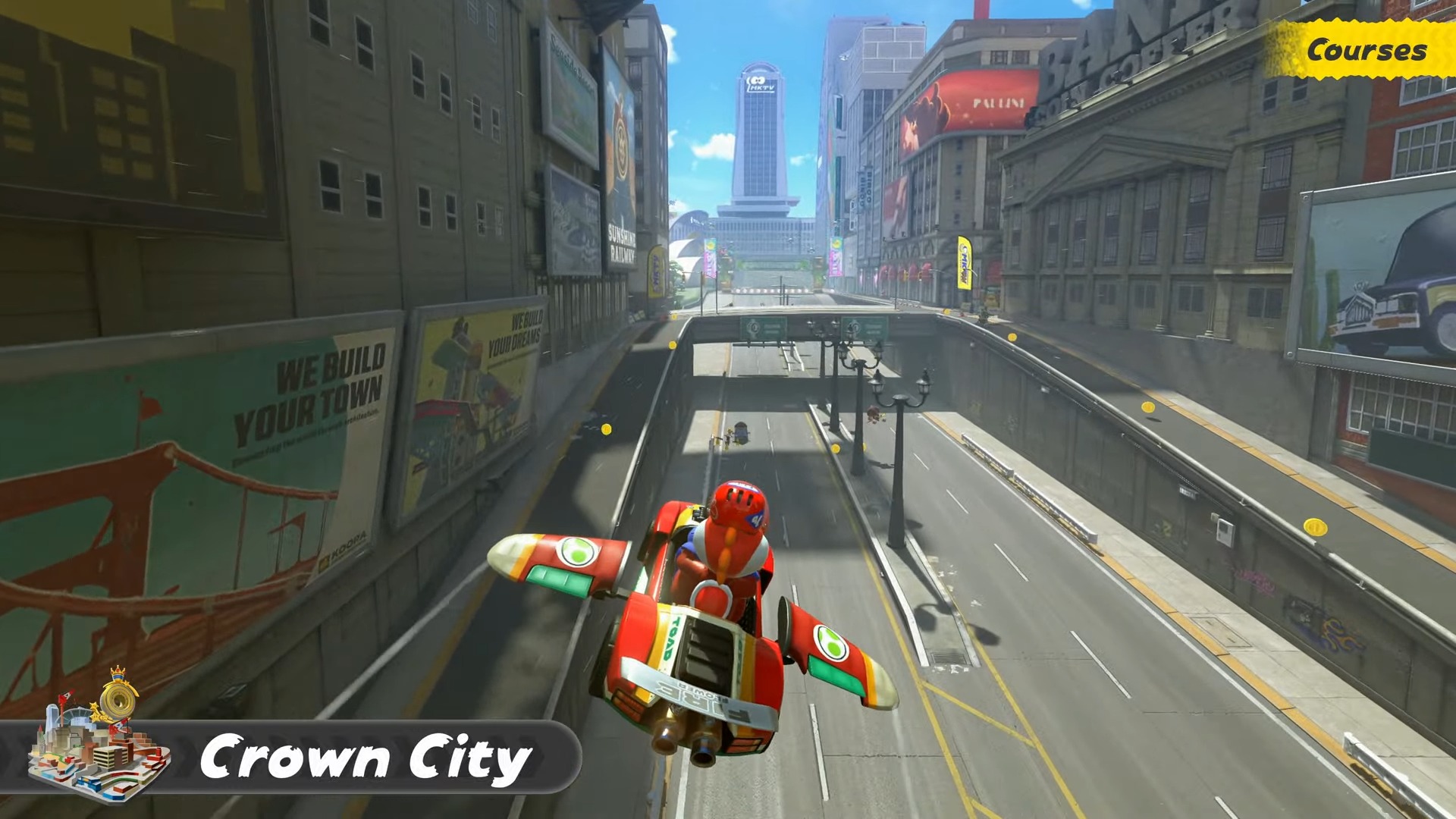
    Mario Kart World

    (Image credit: Nintendo)

    30 circuiti di puro divertimento

    Per fortuna, quasi sempre vale la pena raggiungere la destinazione finale. Più tempo si passa con i 30 circuiti di Mario Kart World, più risulta evidente quanto siano ben realizzati. Al minimo, raggiungono la qualità delle 32 piste presenti al lancio di Mario Kart 8. Alcuni circuiti si impongono già come favoriti, tra cui Great ? Block Ruins, che porta i giocatori a rimbalzare tra le nuvole e affrontare curve a U in un tempio dorato nel cielo, ricco di scorciatoie per giocatori esperti. Da segnalare anche il nuovo Bowser’s Castle, una prova di velocità elevata che porta spesso a finali tra i più spettacolari. Un’altra pista memorabile è Peach Stadium, perfetta per aprire una sessione con amici grazie alla sua atmosfera celebrativa.

    La varietà non manca: molti tracciati sfruttano le nuove modalità aereo e barca, che rappresentano un’alternativa solida alle sezioni in volo e sott’acqua di Mario Kart 7 e 8. Le fasi in barca, in particolare, risultano molto soddisfacenti, permettendo trick ad ogni onda o dopo l’impatto con l’acqua.

    Le reinterpretazioni dei circuiti storici non deludono, con versioni eccellenti di Airship Fortress, Toad’s Factory, Dino Dino Jungle e Wario Stadium, quest’ultimo arricchito da un salto su rampa in stile supercross. Alcune piste meno ispirate ci sono – Desert Hills, ad esempio – ma come in ogni gioco di corse, è normale. Nel complesso, la selezione è entusiasmante e fa tirare un sospiro di sollievo: i tracciati sono ancora una volta ben curati, pur rientrando nel complicato schema open world che Nintendo ha progettato.

    Le autostrade conducono a più ingressi per quasi ogni circuito, variando in base alla direzione di arrivo, e a volte portano a percorsi diversi all’interno della stessa pista. Per quanto l’impatto sul gameplay tra una corsa e l’altra possa dividere, il modo in cui Nintendo ha integrato tutto è una prova notevole di game design open world.

    Ci sarebbero molte altre piste da citare, ma è necessario dedicare attenzione alla migliore in assoluto: La pista arcobaleno. La versione presente in World rappresenta il punto più alto della serie e può essere considerata il miglior circuito di Mario Kart mai realizzato. È un tracciato perfetto dall’inizio alla fine. Senza anticipazioni, c’è un momento in particolare capace di colpire ogni volta. Si tratta di un finale all’altezza di un grande gioco Nintendo, comparabile a quelli di Super Mario Odyssey o Tears of the Kingdom: una corsa finale travolgente, e un esempio di come World sia riuscito a superare tutto ciò che è venuto prima.

    Per chi, invece, non apprezza particolarmente le sezioni autostradali, la modalità VS Race offre la possibilità di gareggiare secondo le regole tradizionali dei tre giri, offrendo un’ottima versione dell’esperienza classica di Mario Kart. Le Prove a Tempo utilizzano anch’esse la formula standard, e rappresentano un modo divertente per sfidare i fantasmi ufficiali o superare i propri record personali, concentrandosi esclusivamente sulle piste e senza passaggi su strada. Purtroppo non esiste una lobby online dedicata esclusivamente alla modalità tre giri, quindi chi gioca spesso online dovrà affrontare anche molte sezioni intermedie.

    L’unico contesto in cui World sfrutta al meglio il suo mondo interconnesso è la modalità Knockout Tour, la versione battle royale in stile F-Zero 99. Knockout Tour si sviluppa in cinque segmenti autostradali consecutivi, seguiti da un giro finale su un circuito classico, con eliminazione dei quattro piloti in coda in punti prestabiliti. Il risultato è una modalità ad alto tasso di tensione, e rappresenta probabilmente la miglior giustificazione per l’adozione dell’open world, con un’intensità che non si potrebbe ottenere su un tracciato classico. È emozionante attraversare deserti, tornanti innevati e altri ambienti mentre si cerca disperatamente di sopravvivere al giro corrente.

    Mario Kart World

    (Image credit: Nintendo)

    Mario Kart World punta sulla fortuna più che sull’abilità

    Ogni Mario Kart cerca un equilibrio tra abilità di guida e fortuna con gli oggetti, e World si sbilancia chiaramente verso la seconda. Il nuovo sistema a 24 piloti e le autostrade larghe e dritte rendono più facile rimontare posizioni con l’oggetto giusto al momento giusto. In Knockout Tour, per esempio, è normale passare dal fondo al primo posto grazie a una stella o a un fungo, sfruttando scorciatoie molto efficaci. World cerca di compensare con tempi di recupero più rapidi e un Bullet Bill meno punitivo, ma capita spesso di essere travolti dal caos… salvo poi rientrare subito in gara. È una formula che favorisce la strategia legata al tempismo e alla gestione degli oggetti, più che alla pura tecnica.

    Chi si infastidisce per la casualità tipica della serie potrebbe non apprezzare del tutto questo approccio, ma è probabile che Nintendo intervenga con aggiornamenti e riequilibri, come già fatto in passato con Mario Kart 8 Deluxe. Attualmente, il cosiddetto sandbagging, restare indietro apposta per ottenere oggetti migliori, è una tattica valida.

    In locale, però, Mario Kart World dà il meglio di sé. Anche con un framerate ridotto a 30 fps in split-screen a quattro giocatori, il divertimento resta altissimo. I momenti più esilaranti nascono proprio dalle gare condivise sul divano, dove urla, sorpassi e gusci volanti creano un’atmosfera inimitabile. Knockout Tour è coinvolgente anche in compagnia, ma se qualcuno viene eliminato subito, resta solo a guardare, il che lo rende meno adatto alle serate più casual, come succede anche con certe modalità in Super Smash Bros.

    Online, Knockout Tour è la modalità più interessante, grazie al ritmo serrato delle eliminazioni e alla tensione crescente ad ogni checkpoint. Le partite risultano stabili anche in portatile con Wi-Fi, e l’emozione di vincere una gara contro altri utenti reali è palpabile. Tuttavia, le opzioni multigiocatore sono deludenti: non si può formare un gruppo con amici prima di una corsa pubblica, non c’è la modalità torneo, e non si può affrontare Knockout Tour in duo se non in lobby private popolate da bot.

    È probabile che Nintendo voglia evitare che gruppi coordinati rovinino l’esperienza agli altri, ma esistono soluzioni già applicate da anni nei battle royale, come limitare i gruppi o differenziare le regole in lobby classificate. Al momento, però, la funzione più ambiziosa del gioco è anche quella più limitata, il che stona con la promessa di Switch 2 di far giocare “tutti insieme, ovunque”. Sarebbe bastato poter colpire un amico con un guscio rosso, anche online.

    Ottime idee, ma sbloccabili e free roaming restano un’occasione mancata

    Mario Kart World

    (Image credit: Nintendo)

    Il sistema di oggetti in Mario Kart World introduce qualche novità interessante, ma nulla di rivoluzionario. I martelli che lanciano proiettili in linea retta sono efficaci nei rettilinei, la piuma è utile per saltare ostacoli, raggiungere scorciatoie e schivare gusci rossi, e l’oggetto di Kamek invoca servitori di Bowser per ostacolare i piloti in testa. Anche i ristoranti di Yoshi, dove è possibile ottenere potenziamenti e costumi tramite i piatti Dash Food, sono un’aggiunta originale. Tuttavia, proprio questi elementi rivelano uno dei limiti più frustranti del gioco: il sistema di sblocco di personaggi e costumi.

    Gli sbloccabili sono gestiti in modo totalmente casuale. A parte pochi personaggi ottenibili vincendo le coppe in Gran Premio, gli altri si sbloccano solo se durante la gara un NPC utilizza Kamek e vi trasforma casualmente in un personaggio che non possedete. Per i costumi, non esiste alcuna logica tra il piatto consumato e il vestito ottenuto. La mappa minimale e la selezione personaggi confusionaria non aiutano: si può vedere quali costumi mancano, ma non come ottenerli. Serve affidarsi a guide esterne. Nonostante l’ironia di outfit come Wampire (Waluigi Vampiro) o Mario Meccanico Famicom, resta un sistema poco trasparente e scarsamente soddisfacente.

    Il free roaming, modalità esplorativa a mondo aperto, offre una mappa ricca di collezionabili e missioni, tra cui interruttori P, medaglie di Peach e pannelli ?. Le sfide cronometrate degli interruttori insegnano le basi della guida o testano le nuove meccaniche parkour, e anche se alcune sono difficili e divertenti, la varietà è limitata. Dopo poche ore, tutte seguono gli stessi schemi: raccogli le monete blu, raggiungi il traguardo in tempo e poco altro. Le missioni speciali rappresentano un’eccezione più stimolante, ma la sensazione di ripetitività rimane.

    Le medaglie di Peach, ben nascoste, offrono sfide di posizionamento più intriganti, ma nel complesso free roaming è una parentesi rilassante, non il cuore del gioco. Purtroppo, manca un sistema per monitorare i progressi: il numero totale di interruttori completati è visibile, ma non è possibile sapere in quali aree mancano ancora sfide. L’unico modo è ricordare tutto a memoria, ispezionare ogni angolo della mappa o affidarsi nuovamente a guide esterne. Questo, unito al fatto che le ricompense sono adesivi decorativi utilizzabili uno alla volta su oltre 1.000 disponibili, rende il completamento poco motivante.

    free roaming ha comunque un fascino spensierato, ideale per i più piccoli. Guidare un camion, provocare incidenti o sperimentare salti assurdi regala un senso di libertà simile a quello provato anni fa con le Prove a Tempo di Mario Kart 64. Il mondo è ben costruito e stimola la creatività, ma servirebbero più contenuti vari, ricompense più interessanti e strumenti per tenere traccia di ciò che si è fatto. Anche se presenta alcune delusioni, il free roaming ha il potenziale per diventare una modalità cult: un luogo dove divertirsi, provare scorciatoie folli e sfruttare la funzione di rewind per osare sempre.

    Conclusioni

    Nonostante l’impianto strutturale di Mario Kart World sia estremamente robusto, ci sono ancora diverse mancanze che impediscono di considerarlo un vero successore di 8 Deluxe. Uno degli aspetti più deludenti è la quasi totale assenza del Free Roam nel multiplayer locale. Esistono soluzioni alternative: è possibile esplorare la mappa con un altro giocatore in attesa di una partita locale o online, ma in questa modalità vengono rimossi gli interruttori P, cioè l’elemento centrale dell’esperienza. Si può comunque girare liberamente e scattare foto, ma data la difficoltà per attivare questa modalità e le sue limitazioni, il risultato non giustifica lo sforzo. È un’altra dimostrazione di come il comparto multiplayer, in alcune sue declinazioni, non sia stato pienamente centrato.

    Oggi, World non può sostituire completamente 8 Deluxe, ma la cosa positiva è che entrambi i titoli sono accessibili su Nintendo Switch 2, quindi non c’è necessità di scegliere. L’auspicio è che World rappresenti solo il punto di partenza, e che Nintendo adotti lo stesso approccio basato su aggiornamenti regolari già visto con Deluxe. Non sono ancora stati annunciati DLC, ma è una scelta comune nel breve periodo dopo il lancio.

    Oltre ai limiti già citati del multiplayer, manca anche la modalità 200cc, una delle preferite dalla community e ormai presente da oltre dieci anni. Allo stesso modo, si sente la mancanza di un menu per la personalizzazione degli oggetti, molto apprezzato in 8 Deluxe. È vero che nemmeno Mario Kart 8 li offriva al lancio, ma data la loro importanza consolidata, era lecito aspettarseli sin da subito anche in World.

    Detto questo, le fondamenta di Mario Kart World sono così solide che con i giusti aggiornamenti e contenuti aggiuntivi potrebbe superare 8 Deluxe nel tempo. Per ora, però, sta ancora cercando di recuperare terreno.

    Perché giocare a Mario Kart World?

    Mario Kart World

    (Image credit: Nintendo)

    Ragioni per cui giocare

    Open world interconnesso

    Tutti i 30 tracciati (tranne uno) sono collegati da un’unica mappa esplorabile senza caricamenti, offrendo un’esperienza fluida e originale per la serie.

    Fino a 24 piloti in gara

    Mario Kart World aumenta il numero di corridori da 12 a 24, alzando il livello di caos e varietà nelle corse.

    Nuove meccaniche di guida

    Il gioco introduce il rail grinding, il wall riding e i salti caricati, ampliando la profondità del gameplay e creando nuove possibilità di scorciatoia e tecnica.

    Ragioni per NON giocare

    Assenza di 200cc al lancio

    La modalità più veloce e amata dagli appassionati non è disponibile, né è stata annunciata per futuri aggiornamenti.

    Multiplayer limitato

    Al momento non è possibile creare gruppi online per partecipare insieme alle partite pubbliche, e non esistono lobby classificate o tornei personalizzati.

    Accessibilità

    Mario Kart World include diverse opzioni pensate per rendere il gioco più accessibile a tutti i tipi di giocatori. È confermata la presenza delle funzioni di guida assistita, tra cui:

    Sterzo assistito, che aiuta a rimanere in pista anche in presenza di curve strette.

    Accelerazione automatica, che consente di giocare senza dover tenere premuto il pulsante per accelerare.

    Controlli tramite sensori di movimento, disponibili anche nei Joy-Con separati.

    Il gioco è compatibile con tutti i controller supportati da Nintendo Switch 2, inclusi Joy-Con singoli, Pro Controller e comandi touch in alcune modalità. Tuttavia, non sono presenti opzioni avanzate per giocatori con disabilità visive o motorie complesse, come rimappatura completa dei comandi o sintesi vocale dei menu. Al momento, Nintendo non ha annunciato ulteriori miglioramenti futuri in ambito accessibilità per questo titolo.



    Source: Latest from TechRadar IT-IT in Reviews.

  • TuxCare Announces Support for AlmaLinux 9.2

    June 10, 2025
    Software

    TuxCare has announced that its KernelCare service has been extended to AlmaLinux 9.2 (with version 9.6 to be added soon), thereby making it the only FIPS 140-3 validated distribution (which adds years of rebootless patching).

    Although some distributions are capable of patching the Linux kernel without reboots, those reboots aren’t avoided but, rather, delayed. TuxCare KernelCare removes the necessity for reboots altogether. As well, TuxCare KernelCare offers up 100 percent vulnerability coverage (which dwarfs the 5-10 percent offered by other live patching solutions).

    According to Michael Canavan, Chief Revenue Officer at TuxCare, “This new KernelCare service for AlmaLinux is TuxCare’s latest step in ensuring that enterprise-grade reliability and security are continually available for the growing number of AlmaLinux users.” Canavan added, “We’re pleased to bring a rock-solid path for compliance and performance to the AlmaLinux community.”

    This comes on top of TuxCare announcing the release of its new TuxCare FedRAMP Bundle for AlmaLinux, which provides a streamlined path toward meeting strict compliance requirements. TuxCare FedRAMP was designed to eliminate many of the hurdles associated with FedRAMP’s stringent security, cryptography, and reporting standards.

    You can read the entire press release for the latest TuxCare KernelCare to find out more.


    Source: Linux Magazine News (path: lmi_news).

  • Recensione Lies of P: Overture

    Recensione Lies of P: Overture

    June 10, 2025
    Hardware

    Dopo due lunghi anni di attesa, Lies of P: Overture è finalmente arrivato.

    Informazioni generali

    Piattaforma per la recensione: PC
    Disponibile su: PS5, Xbox Series X|S, PC
    Uscita: 6 giugno 2025

    Lies of P: Overture è un’espansione corposa del gioco base uscito nel 2023, capace di mostrare come Round8 Studio abbia ulteriormente raffinato la propria formula soulslike. L’espansione dimostra che, anche in un titolo già maturo, c’era ancora spazio per contenuti di altissimo livello.

    Ambientata prima degli eventi principali del gioco, Overture ci riporta agli albori del caos: il protagonista e Gemini vengono trasportati indietro nel tempo, poco prima dello scoppio della Follia delle Marionette e della diffusione della Malattia della Pietrificazione. I giocatori esploreranno luoghi ormai perduti o abbandonati, e incontreranno personaggi di cui nel gioco base si parlava solo in modo indiretto.

    Gli appassionati di lore troveranno pane per i loro denti: l’espansione colma molte delle lacune narrative, approfondendo anche i segreti e le folli ricerche della fazione degli Alchimisti. Tra i nuovi scenari spiccano ambientazioni ispirate e suggestive, come lo Zoo di Krat, con la sua serra e il carnevale. Alcuni segmenti sotterranei risultano meno brillanti, e la disposizione di certi nemici è discutibile, ma il level design resta comunque all’altezza della campagna principale.

    Non mancano le boss fight, che rappresentano il punto più alto dell’espansione: impegnative, spettacolari e curate in ogni dettaglio. Il nuovo Battle Memories mode consente di riaffrontare tutti i boss in cinque livelli di difficoltà, offrendo contenuti a lungo termine per i fan più esigenti.

    La durata complessiva si aggira intorno alle 20-25 ore, circa la metà del gioco base, soprattutto a difficoltà Legendary Stalker (l’impostazione standard). Tuttavia, tra i combattimenti più duri e l’approfondimento della lore, molti utenti potrebbero impiegarci di più.

    In definitiva, chi ha apprezzato Lies of P troverà in Overture un’espansione all’altezza, capace di migliorare ulteriormente un titolo già eccellente. Round8 Studio ha ormai definito con precisione il proprio approccio al genere, lasciando grandi aspettative per il futuro.

    Lies of P: Overture

    (Image credit: Neowiz)

    Una delle prime cose da segnalare su Lies of P: Overture è quanto sia semplice accedere al DLC. Basta aver completato il Capitolo 9 del gioco base per ricevere un oggetto e un messaggio che indica chiaramente dove recarsi per avviare l’espansione. Nessuna complicazione in stile FromSoftware: in pochi secondi sarete operativi, ed è un’ottima notizia.

    Per chi volesse scoprire nel dettaglio come inizia il viaggio, è disponibile un’anteprima dedicata allo Zoo di Krat. Senza entrare nei dettagli dei singoli livelli per evitare spoiler, è comunque possibile confermare che il design rimane fedele allo stile compatto e curato del gioco base. La struttura è ancora piuttosto lineare, ma non mancano zone da esplorare e momenti in cui tornare in aree già visitate per completare missioni secondarie.

    Esplorare ogni angolo sarà fondamentale: Overture offre una gran quantità di nuove armi, costumi, oggetti consumabili, frammenti di lore, quest secondarie e anche nuove Legion Arms, strumenti da combattimento montati sul braccio sinistro. Una varietà che arricchisce ulteriormente l’esperienza di gioco.

    Lies of P: Overture

    (Image credit: Neowiz)

    Le nuove armi introdotte in Overture sono di altissimo livello. Come nel gioco base, è possibile ottenerle sconfiggendo i boss oppure scoprendole all’interno di forzieri, con la possibilità di combinare lame e impugnature per creare build personalizzate. Ottima notizia: le nuove armi sono compatibili anche con quelle del gioco base, ampliando ulteriormente le possibilità di personalizzazione.

    Chi affronta l’espansione con una build Tecnica (destrezza) potrà apprezzare fin da subito le Death’s Talons, artigli simili a quelli di Wolverine. Colpiscono rapidamente e il loro attacco Fable Art esegue una combo multipla devastante, che riempie rapidamente la barra di Stordimento del nemico e apre alla possibilità di un colpo critico.

    Un’altra novità degna di nota è la Pale Knight, un’arma in stile gunblade simile a quella di Squall Leonhart, dotata di colpi esplosivi. Pensata per build Motività (forza), combina stile e potenza, e ha tutte le carte in regola per diventare una delle preferite della community.

    Le due nuove Legion Arms segnano un netto miglioramento rispetto a molte di quelle presenti nel gioco base, che spesso avevano un utilizzo troppo situazionale. In Overture, invece, una spara un potente colpo a corto raggio in stile fucile a pompa, mentre l’altra lancia dischi rotanti che restano sospesi danneggiando i nemici nel tempo. Entrambe si rivelano molto più pratiche, soprattutto in modalità New Game Plus, dove la seconda si dimostra particolarmente efficace.

    Scritto nel sangue

    Lies of P: Overture

    (Image credit: Neowiz)

    Non sarebbe un vero soulslike senza boss capaci di mettere alla prova anche i giocatori più esperti, e Lies of P: Overture non delude affatto da questo punto di vista. Sebbene il numero di nuove boss fight non sia elevato, la qualità è chiaramente superiore alla quantità.

    Senza entrare nei dettagli per evitare spoiler, è sufficiente sapere che gli scontri presenti in Overture rappresentano le battaglie più difficili di tutto il gioco. Ogni combattimento è pensato per offrire un vero banco di prova, ma senza mai risultare scorretto.

    Chi è stanco dei boss in stile Elden Ring, con combo interminabili e spesso imprevedibili, troverà qui un’esperienza più misurata. Come nel gioco base, la chiave del successo è riconoscere i pattern, sfruttare con precisione la Perfect Guard e scegliere con attenzione se parare o schivare. I boss sono in genere più rapidi e reattivi, rendendo ancora più importante il tempismo negli attacchi.

    Una sfida autentica, ma costruita con grande equilibrio.

    Perché giocare a Lies of P: Overture?

    Lies of P: Overture

    (Image credit: Neowiz)

    Ragioni per cui giocare

    Avete amato il miglior soulslike del 2023

    Semplice: se Lies of P vi è piaciuto, Overture vi conquisterà. Round8 Studio ha alzato ulteriormente l’asticella con un’espansione ricca e curata.

    Cercate nuove armi e build da sperimentare

    Il DLC introduce un set variegato di nuove armi, ampliando le possibilità di personalizzazione. Volete infliggere più danni dopo una schivata perfetta? O eliminare un gruppo di nemici con un colpo devastante? Overture offre tutto questo e molto altro.

    Volete una nuova sfida all’altezza

    Tra boss inediti e l’ottima modalità Battle Memories per riaffrontarli a difficoltà crescenti, Overture mette a dura prova anche i veterani del genere.

    Ragioni per NON giocare

    Non avete ancora giocato a Lies of P

    Può sembrare scontato, ma Overture richiede il gioco base per poter essere avviato. Prima di valutare l’acquisto del DLC, è fondamentale completare almeno una run di Lies of P.

    Vi scoraggiate facilmente con i soulslike

    Anche con le nuove opzioni di difficoltà semplificata, Overture resta una sfida impegnativa. Se non amate affrontare più volte lo stesso boss o il ritmo tipico del genere, potrebbe non fare al caso vostro.

    Accessibilità

    Il lancio di Lies of P: Overture è accompagnato da un nuovo aggiornamento gratuito per il gioco base. Tra le novità più importanti ci sono due nuove opzioni di difficoltà semplificata, ideali per chi ha meno esperienza con il genere soulslike.

    Sono state inoltre aggiunte opzioni dedicate al daltonismo, con modalità specifiche per protanopia, deuteranopia e tritanopia, oltre a un cursore per regolare l’intensità del filtro visivo. Un aggiornamento che punta a rendere l’esperienza più accessibile a tutti.


    Source: Latest from TechRadar IT-IT in Reviews.

  • Decoding The SVG <code>path</code> Element: Line Commands

    Decoding The SVG <code>path</code> Element: Line Commands

    June 9, 2025
    Software

    In a previous article, we looked at some practical examples of how to code SVG by hand. In that guide, we covered the basics of the SVG elements rect, circle, ellipse, line, polyline, and polygon (and also g).

    This time around, we are going to tackle a more advanced topic, the absolute powerhouse of SVG elements: path. Don’t get me wrong; I still stand by my point that image paths are better drawn in vector programs than coded (unless you’re the type of creative who makes non-logical visual art in code — then go forth and create awe-inspiring wonders; you’re probably not the audience of this article). But when it comes to technical drawings and data visualizations, the path element unlocks a wide array of possibilities and opens up the world of hand-coded SVGs.

    The path syntax can be really complex. We’re going to tackle it in two separate parts. In this first installment, we’re learning all about straight and angular paths. In the second part, we’ll make lines bend, twist, and turn.

    Required Knowledge And Guide Structure

    Note: If you are unfamiliar with the basics of SVG, such as the subject of viewBox and the basic syntax of the simple elements (rect, line, g, and so on), I recommend reading my guide before diving into this one. You should also familiarize yourself with <text> if you want to understand each line of code in the examples.

    Before we get started, I want to quickly recap how I code SVG using JavaScript. I don’t like dealing with numbers and math, and reading SVG Code with numbers filled into every attribute makes me lose all understanding of it. By giving coordinates names and having all my math easy to parse and write out, I have a much better time with this type of code, and I think you will, too.

    The goal of this article is more about understanding path syntax than it is about doing placement or how to leverage loops and other more basic things. So, I will not run you through the entire setup of each example. I’ll instead share snippets of the code, but they may be slightly adjusted from the CodePen or simplified to make this article easier to read. However, if there are specific questions about code that are not part of the text in the CodePen demos, the comment section is open.

    To keep this all framework-agnostic, the code is written in vanilla JavaScript (though, really, TypeScript is your friend the more complicated your SVG becomes, and I missed it when writing some of these).

    Setting Up For Success

    As the path element relies on our understanding of some of the coordinates we plug into the commands, I think it is a lot easier if we have a bit of visual orientation. So, all of the examples will be coded on top of a visual representation of a traditional viewBox setup with the origin in the top-left corner (so, values in the shape of 0 0 ${width} ${height}.

    I added text labels as well to make it easier to point you to specific areas within the grid.

    Please note that I recommend being careful when adding text within the <text> element in SVG if you want your text to be accessible. If the graphic relies on text scaling like the rest of your website, it would be better to have it rendered through HTML. But for our examples here, it should be sufficient.

    So, this is what we’ll be plotting on top of:

    See the Pen SVG Viewbox Grid Visual [forked] by Myriam.

    Alright, we now have a ViewBox Visualizing Grid. I think we’re ready for our first session with the beast.

    Enter path And The All-Powerful d Attribute

    The <path> element has a d attribute, which speaks its own language. So, within d, you’re talking in terms of “commands”.

    When I think of non-path versus path elements, I like to think that the reason why we have to write much more complex drawing instructions is this: All non-path elements are just dumber paths. In the background, they have one pre-drawn path shape that they will always render based on a few parameters you pass in. But path has no default shape. The shape logic has to be exposed to you, while it can be neatly hidden away for all other elements.

    Let’s learn about those commands.

    Where It All Begins: M

    The first, which is where each path begins, is the M command, which moves the pen to a point. This command places your starting point, but it does not draw a single thing. A path with just an M command is an auto-delete when cleaning up SVG files.

    It takes two arguments: the x and y coordinates of your start position.

    const uselessPathCommand = `M${start.x} ${start.y}`; 

    Basic Line Commands: M , L, H, V

    These are fun and easy: L, H, and V, all draw a line from the current point to the point specified.

    L takes two arguments, the x and y positions of the point you want to draw to.

    const pathCommandL = `M${start.x} ${start.y} L${end.x} ${end.y}`; 

    H and V, on the other hand, only take one argument because they are only drawing a line in one direction. For H, you specify the x position, and for V, you specify the y position. The other value is implied.

    const pathCommandH = `M${start.x} ${start.y} H${end.x}`; const pathCommandV = `M${start.x} ${start.y} V${end.y}`; 

    To visualize how this works, I created a function that draws the path, as well as points with labels on them, so we can see what happens.

    See the Pen Simple Lines with path [forked] by Myriam.

    We have three lines in that image. The L command is used for the red path. It starts with M at (10,10), then moves diagonally down to (100,100). The command is: M10 10 L100 100.

    The blue line is horizontal. It starts at (10,55) and should end at (100, 55). We could use the L command, but we’d have to write 55 again. So, instead, we write M10 55 H100, and then SVG knows to look back at the y value of M for the y value of H.

    It’s the same thing for the green line, but when we use the V command, SVG knows to refer back to the x value of M for the x value of V.

    If we compare the resulting horizontal path with the same implementation in a <line> element, we may

    1. Notice how much more efficient path can be, and
    2. Remove quite a bit of meaning for anyone who doesn’t speak path.

    Because, as we look at these strings, one of them is called “line”. And while the rest doesn’t mean anything out of context, the line definitely conjures a specific image in our heads.

    <path d="M 10 55 H 100" /> <line x1="10" y1="55" x2="100" y2="55" /> 

    Making Polygons And Polylines With Z

    In the previous section, we learned how path can behave like <line>, which is pretty cool. But it can do more. It can also act like polyline and polygon.

    Remember, how those two basically work the same, but polygon connects the first and last point, while polyline does not? The path element can do the same thing. There is a separate command to close the path with a line, which is the Z command.

    const polyline2Points = M${start.x} ${start.y} L${p1.x} ${p1.y} L${p2.x} ${p2.y}; const polygon2Points = M${start.x} ${start.y} L${p1.x} ${p1.y} L${p2.x} ${p2.y} Z; 

    So, let’s see this in action and create a repeating triangle shape. Every odd time, it’s open, and every even time, it’s closed. Pretty neat!

    See the Pen Alternating Triangles [forked] by Myriam.

    When it comes to comparing path versus polygon and polyline, the other tags tell us about their names, but I would argue that fewer people know what a polygon is versus what a line is (and probably even fewer know what a polyline is. Heck, even the program I’m writing this article in tells me polyline is not a valid word). The argument to use these two tags over path for legibility is weak, in my opinion, and I guess you’d probably agree that this looks like equal levels of meaningless string given to an SVG element.

    <path d="M0 0 L86.6 50 L0 100 Z" /> <polygon points="0,0 86.6,50 0,100" /> <path d="M0 0 L86.6 50 L0 100" /> <polyline points="0,0 86.6,50 0,100" /> 

    Relative Commands: m, l, h, v

    All of the line commands exist in absolute and relative versions. The difference is that the relative commands are lowercase, e.g., m, l, h, and v. The relative commands are always relative to the last point, so instead of declaring an x value, you’re declaring a dx value, saying this is how many units you’re moving.

    Before we look at the example visually, I want you to look at the following three-line commands. Try not to look at the CodePen beforehand.

    const lines = [ { d: `M10 10 L 10 30 L 30 30`, color: "var(--_red)" }, { d: `M40 10 l 0 20 l 20 0`, color: "var(--_blue)" }, { d: `M70 10 l 0 20 L 90 30`, color: "var(--_green)" } ]; 

    As I mentioned, I hate looking at numbers without meaning, but there is one number whose meaning is pretty constant in most contexts: 0. Seeing a 0 in combination with a command I just learned means relative manages to instantly tell me that nothing is happening. Seeing l 0 20 by itself tells me that this line only moves along one axis instead of two.

    And looking at that entire blue path command, the repeated 20 value gives me a sense that the shape might have some regularity to it. The first path does a bit of that by repeating 10 and 30. But the third? As someone who can’t do math in my head, that third string gives me nothing.

    Now, you might be surprised, but they all draw the same shape, just in different places.

    See the Pen SVG Compound Paths [forked] by Myriam.

    So, how valuable is it that we can recognize the regularity in the blue path? Not very, in my opinion. In some cases, going with the relative value is easier than an absolute one. In other cases, the absolute is king. Neither is better nor worse.

    And, in all cases, that previous example would be much more efficient if it were set up with a variable for the gap, a variable for the shape size, and a function to generate the path definition that’s called from within a loop so it can take in the index to properly calculate the start point.

    Jumping Points: How To Make Compound Paths

    Another very useful thing is something you don’t see visually in the previous CodePen, but it relates to the grid and its code.

    I snuck in a grid drawing update.

    With the method used in earlier examples, using line to draw the grid, the above CodePen would’ve rendered the grid with 14 separate elements. If you go and inspect the final code of that last CodePen, you’ll notice that there is just a single path element within the .grid group.

    It looks like this, which is not fun to look at but holds the secret to how it’s possible:

    <path d="M0 0 H110 M0 10 H110 M0 20 H110 M0 30 H110 M0 0 V45 M10 0 V45 M20 0 V45 M30 0 V45 M40 0 V45 M50 0 V45 M60 0 V45 M70 0 V45 M80 0 V45 M90 0 V45" stroke="currentColor" stroke-width="0.2" fill="none"></path> 

    If we take a close look, we may notice that there are multiple M commands. This is the magic of compound paths.

    Since the M/m commands don’t actually draw and just place the cursor, a path can have jumps.

    So, whenever we have multiple paths that share common styling and don’t need to have separate interactions, we can just chain them together to make our code shorter.

    Coming Up Next

    Armed with this knowledge, we’re now able to replace line, polyline, and polygon with path commands and combine them in compound paths. But there is so much more to uncover because path doesn’t just offer foreign-language versions of lines but also gives us the option to code circles and ellipses that have open space and can sometimes also bend, twist, and turn. We’ll refer to those as curves and arcs, and discuss them more explicitly in the next article.

    Further Reading On SmashingMag

    • “Mastering SVG Arcs,” Akshay Gupta
    • “Accessible SVGs: Perfect Patterns For Screen Reader Users,” Carie Fisher
    • “Easy SVG Customization And Animation: A Practical Guide,” Adrian Bece
    • “Magical SVG Techniques,” Cosima Mielke

    Source: Articles on Smashing Magazine — For Web Designers And Developers.

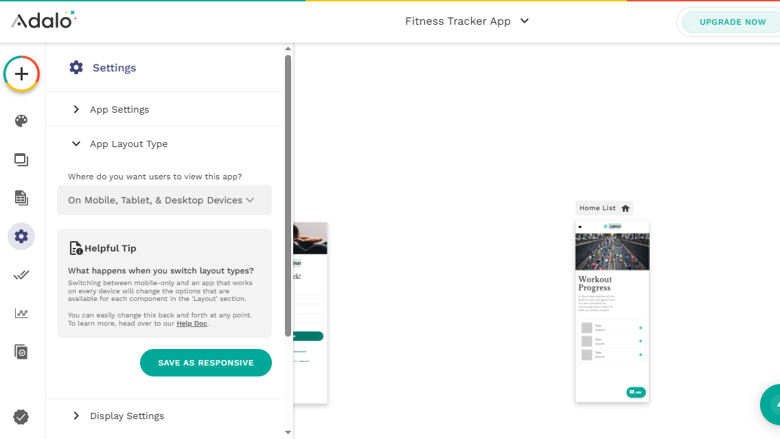
  • Recensione Adalo (no-code app builder)

    Recensione Adalo (no-code app builder)

    June 6, 2025
    Hardware

    Adalo è uno dei più popolari strumenti no-code per creare app mobile e web senza scrivere una riga di codice. La piattaforma offre un’ampia gamma di funzionalità e un’interfaccia intuitiva, che la rendono una scelta interessante per chi desidera sviluppare app in tempi rapidi.

    In questa recensione analizzeremo le caratteristiche di Adalo, la sua interfaccia, la facilità d’uso, il confronto con la concorrenza e altri aspetti per aiutarvi a capire se è la soluzione più adatta alle vostre esigenze.

    Adalo: Caratteristiche

    Adalo mette a disposizione un’ampia gamma di funzionalità che lo distinguono dagli altri strumenti no-code.

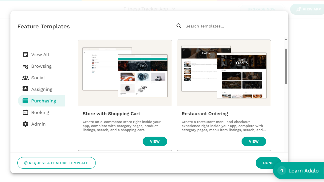
    Per cominciare, offre numerosi template predefiniti per diverse tipologie di app, come applicazioni per ordinare cibo, ecommerce, coaching, prenotazioni e molte altre. Questi modelli sono personalizzabili e permettono di risparmiare molto tempo nella fase di progettazione.

    List of pre-built templates available in Adalo

    (Image credit: Adalo)

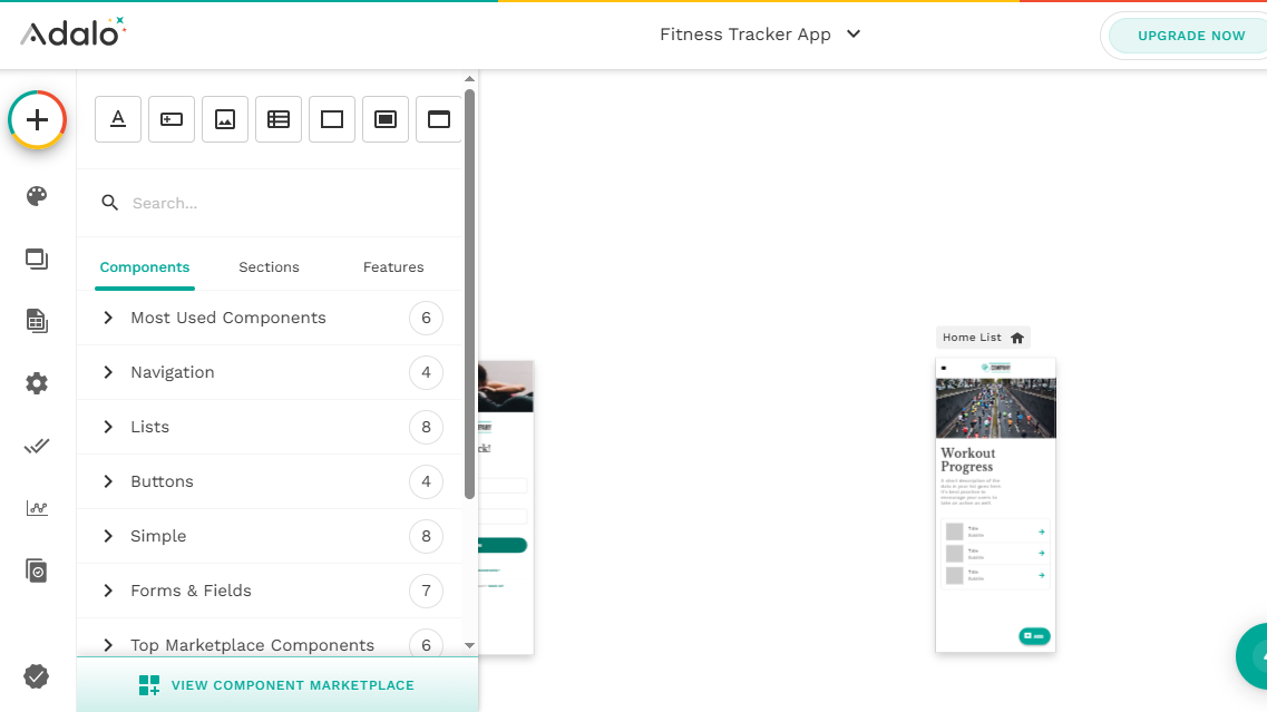
    Uno dei punti di forza dell’esperienza utente offerta da Adalo è il suo intuitivo sistema drag-and-drop. Questo permette di aggiungere facilmente qualsiasi tipo di elemento o componente dell’interfaccia utente senza scrivere una riga di codice. Adalo include decine di componenti pronti all’uso, come pulsanti, testi, liste, immagini, moduli e barre di navigazione. Basta trascinarli da un menu laterale ben organizzato e posizionarli dove si desidera all’interno dell’app.

    Inoltre, Adalo dispone di un marketplace di componenti che amplia ulteriormente le possibilità, offrendo moduli professionali per integrare servizi esterni come Stripe per i pagamenti, l’autenticazione utenti tramite Google e Apple, generatori di codici QR, widget per acquisti in-app e molto altro.

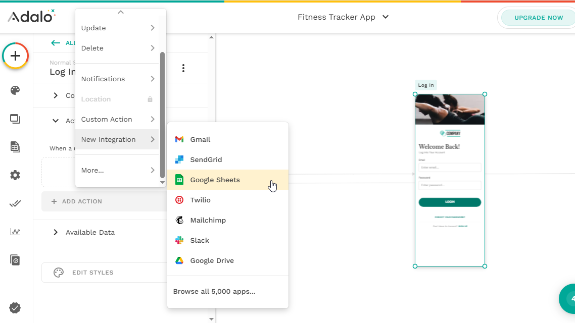
    Adalo può anche connettersi a servizi esterni tramite Zapier, facilitando l’integrazione con strumenti come Gmail, Google Sheets, Slack e altri ancora.

    Il tutto con la possibilità di creare app sia mobile che web, grazie a funzionalità di design responsive che garantiscono una resa ottimale su smartphone, tablet e desktop. Una volta completata e testata l’app, Adalo consente anche di pubblicarla direttamente su Google Play e sull’App Store di Apple.

    Adalo: Interfaccia e facilità d’uso

    L’interfaccia di Adalo è pensata appositamente per chi non ha competenze tecniche. Il builder è intuitivo e ben strutturato, con pannelli e menu disposti in modo logico per facilitare la navigazione.

    La dashboard è semplice e ordinata: da qui è possibile creare nuove app in pochi clic, rendendo l’intero processo accessibile anche a chi si avvicina per la prima volta al mondo dello sviluppo no-code.

    Adalo's list of available components

    (Image credit: Adalo)

    Con il designer di Adalo è possibile costruire l’interfaccia della propria app semplicemente trascinando e rilasciando gli elementi desiderati. Una volta selezionato un componente, è possibile personalizzarne facilmente le proprietà per modificarne aspetto e funzionalità, oltre a ridimensionarlo e posizionarlo a piacere. È anche semplice assegnare azioni ai vari elementi, come ad esempio la navigazione verso un’altra schermata.

    Inoltre, Adalo consente di aggiungere facilmente più schermate alla propria app, come la schermata di login, la home o qualsiasi altra sezione, da personalizzare singolarmente. La modalità di anteprima integrata permette di testare l’app e verificarne l’aspetto e il funzionamento direttamente su un dispositivo simulato.

    Adalo: Integrazione ed estensibilità

    Come già accennato, Adalo mette a disposizione un marketplace di componenti aggiuntivi, dove è possibile scaricare sia elementi gratuiti che a pagamento.

    La piattaforma supporta inoltre numerose integrazioni con servizi di terze parti, utili per ampliare le funzionalità dell’app e collegarla a strumenti esterni molto diffusi. Ad esempio, Adalo si integra con Stripe, permettendo di configurare sistemi di pagamento direttamente all’interno delle applicazioni create.

    List of integrations available in Adalo

    (Image credit: Adalo)

    Il punto di forza è l’integrazione con Zapier, che estende la connettività di Adalo a migliaia di altre applicazioni non supportate nativamente. Grazie a questa integrazione, è possibile automatizzare i flussi di lavoro e trasferire dati in modo fluido tra Adalo e servizi esterni come Google Sheets, Slack, Trello, SendGrid, Salesforce e molti altri.

    Gli utenti più esperti possono inoltre creare azioni personalizzate per connettersi a API esterne, ottenendo così un controllo più avanzato e una maggiore flessibilità nelle funzionalità dell’app.

    Adalo: Implementazione e manutenzione

    Per quanto riguarda le web app, Adalo consente di pubblicarle letteralmente con un solo clic. Una volta completato lo sviluppo, è possibile renderle disponibili direttamente online sotto un sottodominio Adalo oppure utilizzare un proprio dominio personalizzato.

    La piattaforma permette anche di pubblicare le app come applicazioni native sia su iOS che Android. Tuttavia, questo processo è leggermente più complesso rispetto alla distribuzione web, poiché richiede il rispetto delle linee guida di pubblicazione degli store ufficiali. Sarà quindi necessario creare un account sviluppatore sia sull’Apple Developer Program che sul Google Play Console, oltre a sottoporre l’app a revisione per l’approvazione.

    List of layouts available in Adalo

    (Image credit: Adalo)

    Per quanto riguarda gli aggiornamenti, qualsiasi modifica apportata alle web app viene applicata immediatamente. Per le app mobili su iOS e Android, invece, è necessario seguire il consueto processo di creazione di una nuova build e inviarla agli store per l’approvazione.

    È anche possibile integrare Adalo con servizi esterni come One Signal tramite Zapier, ad esempio per inviare notifiche push agli utenti in merito agli aggiornamenti disponibili.

    Adalo: Prezzi e documentazione

    Adalo propone diversi piani tariffari pensati per soddisfare esigenze differenti, dai singoli utenti che vogliono creare semplici app fino alle aziende che necessitano di funzionalità avanzate e maggiore scalabilità.

    Il Piano Gratuito consente di creare e pubblicare una sola app. Con questo piano è possibile realizzare web app, ma non è possibile creare né pubblicare app mobili su App Store o Google Play. Inoltre, tutte le app includono il branding Adalo. È pensato come punto di partenza per chi vuole esplorare la piattaforma e costruire semplici web app.

    Il Piano Starter costa circa 42 euro al mese e consente di collegare la propria app a un dominio personalizzato, oltre a offrire la possibilità di pubblicare app mobili.

    Il Piano Professional, da circa 60 euro al mese, è adatto a progetti più strutturati: supporta l’integrazione completa di API personalizzate e offre funzionalità aggiuntive.

    Infine, il Piano Team è pensato per gruppi di lavoro e team di sviluppo: al costo di circa 185 euro al mese, include strumenti collaborativi utili per lavorare in sinergia su un’unica app.

    Adalo's component's marketplace

    (Image credit: Adalo)

    Per quanto riguarda la documentazione, Adalo mette a disposizione numerose guide dettagliate e tutorial passo-passo per aiutare gli utenti a orientarsi sulla piattaforma, scoprirne le funzionalità e creare app funzionanti. È presente anche l’Adalo App Academy, con oltre 70 corsi dedicati a tutti gli aspetti della creazione di un’app.

    Oltre alla documentazione scritta, la piattaforma offre un’ampia selezione di videotutorial sul proprio canale YouTube. Gli utenti possono inoltre contare su un forum della community molto attivo, mentre chi ha sottoscritto uno dei piani a pagamento ha anche la possibilità di contattare direttamente il supporto Adalo per ricevere assistenza.

    Adalo: Competitor

    Adalo si muove in un mercato molto competitivo nel panorama dei builder no-code. Tra i principali rivali troviamo Thunkable, Glide e Bubble, ciascuno con caratteristiche distintive pensate per diversi tipi di progetti.

    Il punto di forza principale di Adalo è sicuramente la sua interfaccia drag-and-drop, estremamente intuitiva e ideale per chi è alle prime armi. Una filosofia simile è adottata anche da Thunkable, anch’esso pensato in particolare per la creazione di app mobile.

    Bubble si distingue per una maggiore flessibilità e capacità di personalizzazione avanzata, adatta a chi cerca uno sviluppo full-stack completo. Tuttavia, questa potenza si traduce anche in una curva di apprendimento più ripida rispetto ad Adalo. Sia Bubble che Thunkable si rivelano ottime scelte per progetti più complessi, ma risultano probabilmente sovradimensionati per utenti con esigenze più semplici.

    Glide, infine, è una piattaforma pensata per realizzare rapidamente app web e mobile a partire da fogli di calcolo, trasformandoli in soluzioni funzionali e immediate. Una scelta ideale per chi punta alla rapidità e semplicità, ma meno adatta a progetti più strutturati.

    Adalo: Verdetto finale

    Adalo è un potente e intuitivo builder no-code che riesce a trovare un ottimo equilibrio tra semplicità d’uso e versatilità. Il suo vero punto di forza è la capacità di creare sia app mobile che web senza scrivere una sola riga di codice.

    L’interfaccia drag-and-drop, l’ampia libreria di componenti predefiniti e le numerose integrazioni con servizi esterni lo rendono una soluzione efficace per utenti senza competenze tecniche, sviluppatori indipendenti, startup e aziende più strutturate. Che si tratti di prototipare rapidamente un’idea o di costruire un’app più evoluta, Adalo offre gli strumenti giusti per validare un MVP e arrivare fino alla pubblicazione.

    Pur trovandosi in un mercato molto competitivo, Adalo si distingue per la sua accessibilità e immediatezza, che ne fanno una scelta ideale per chi si affaccia per la prima volta nel mondo dello sviluppo di app, ma anche per chi cerca un flusso di lavoro efficiente e moderno.


    Source: Latest from TechRadar IT-IT in Reviews.

  • Go-Based Botnet Attacking IoT Devices

    June 5, 2025
    Software

    Darktrace has discovered a new Go-based botnet, named PumaBot, that is targeting Internet of Things (IoT) devices and avoiding scanning by using a C2 server to acquire targets and then use brute-force attacks to grab SSH credentials.

    PumaBot retrieves a list of targets from a command-and-control server and then establishes persistence, using system service files.

    After harvesting a list of IP addresses for IoT devices with open SSH ports, PumaBot identifies a valid SSH credential pair, logs in, self-deploys, and begins the replication process. PumaBot uses a trySSHLogin() function to perform environment fingerprint checks to avoid getting trapped in honeypots or execution environments (such as restricted shells) that are suitable for its needs. If the environment passes the checks, the malware runs the uname -a command to discover the operating system type, kernel version, and architecture. After that, it disguises itself as a legitimate Redis system file, creates a systemd service, and adds its own SSH keys to the user’s authorized_keys file.

    PumaBot does not automatically propagate like a traditional worm, but it does present worm-like behavior.

    According to Darktrace, it’s important to monitor for anomalous SSH login activity, audit systemd services, inspect the authorized_keys file, filter or alert on outbound HTTP requests with nonstandard headers (such as X-API-KEY), and apply strict firewall rules to limit SSH exposure.


    Source: Linux Magazine News (path: lmi_news).

  • Recensione Wix App Builder

    Recensione Wix App Builder

    June 5, 2025
    Hardware

    Le app aiutano le aziende a coinvolgere i clienti in modo più diretto e personalizzato. Tuttavia, svilupparle da zero può essere complesso e costoso, rappresentando un ostacolo per molte realtà. È qui che entrano in gioco le piattaforme di creazione app.

    Wix, noto per essere uno dei migliori website builder in circolazione, offre anche una piattaforma dedicata alla creazione di app mobile. Wix App Builder è lo strumento fai-da-te dell’azienda per sviluppare app native su iOS e Android, il tutto senza scrivere codice.

    A giugno 2024, Wix ha potenziato la piattaforma con l’aggiunta di un chatbot IA: basta descrivere gli obiettivi dell’app e l’intelligenza artificiale genera automaticamente un’app personalizzata, completa di funzionalità e layout. Il sistema si occupa di tutto, dal design alla pubblicazione, compresa la gestione dell’invio su App Store e Google Play.

    Gli utenti possono creare app con loghi e elementi grafici del proprio brand, a patto di avere un abbonamento attivo. Il piano Branded App Premium parte da 99 dollari al mese, ma è possibile ottenere uno sconto usando uno dei nostri codici promozionali Wix. Restano da considerare anche i costi di pubblicazione: 99 dollari l’anno per l’App Store di Apple e una tantum di 25 dollari per Google Play.

    Ciò che rende Wix App Builder davvero unico è la sua perfetta integrazione con i siti Wix: i contenuti del sito e dell’app si sincronizzano in tempo reale, con aggiornamenti automatici che evitano incongruenze.

    Wix App Builder dashboard

    (Image credit: Wix)

    A partire dal 2025, Wix App Builder è incluso nel piano premium Branded App, che parte da 99 dollari al mese (circa 92 euro al cambio attuale). Il piano offre strumenti fondamentali per creare, lanciare e mantenere un’app mobile nativa, inclusi strumenti di design basati su IA, funzionalità di personalizzazione e supporto alla pubblicazione. È possibile creare app per iOS e Android, con opzioni avanzate per e-commerce, prenotazioni, forum e altre soluzioni business.

    Oltre al costo di Wix, vanno considerati anche i costi di pubblicazione sulle piattaforme: 99 dollari all’anno (circa 92 euro) per l’App Store di Apple e una tariffa una tantum di 25 dollari (circa 23 euro) per il Google Play Store. Queste spese sono imposte direttamente da Apple e Google e non dipendono da Wix.

    Wix App Builder: Caratteristiche

    Wix App Builder è sempre stato intuitivo, ma le nuove funzionalità con intelligenza artificiale introdotte nel 2024 lo portano a un livello superiore. Ora è possibile creare app mobili personalizzate semplicemente parlando con un chatbot: si descrivono obiettivi e visione, e l’IA chiede informazioni su esigenze aziendali, funzioni desiderate e identità visiva. In base a queste risposte, viene generata un’app completa, modificabile tramite editor visuale.

    Wix offre numerose opzioni di personalizzazione grafica: è possibile creare un’icona unica, adattare il layout e integrare il proprio branding. Ma non è solo questione di estetica: Wix App Builder è compatibile con centinaia di soluzioni business, tra cui ecommerce, sistemi di prenotazione, forum, aree membri e notifiche push.

    Uno dei vantaggi principali è la sincronizzazione automatica tra sito web e app: ogni aggiornamento apportato al sito Wix si riflette immediatamente sull’app, eliminando la necessità di gestire contenuti su più piattaforme. Il sistema inoltre gestisce gli aggiornamenti tecnici, garantendo la compatibilità con le ultime versioni di iOS e Android. Tutto ciò riduce notevolmente la complessità nella gestione di un’app mobile.

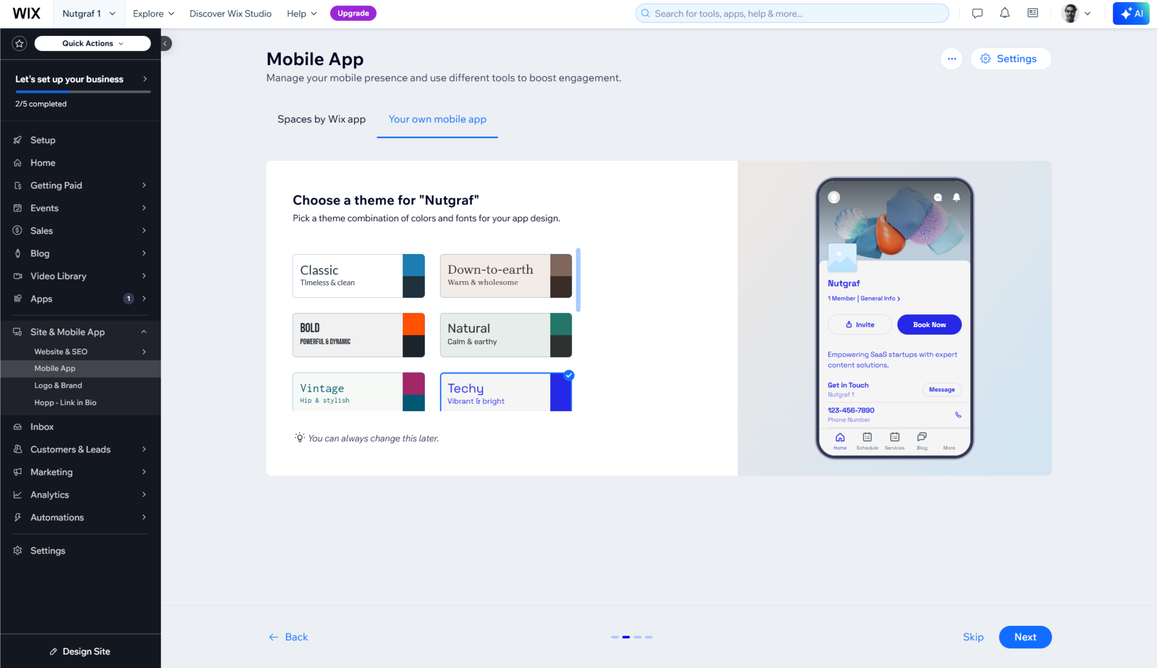
    Wix App Builder setup

    (Image credit: Wix)

    Wix App Builder: Setup

    Configurare un’app mobile con Wix App Builder è semplice e adatto anche a chi non ha competenze tecniche. Si inizia inserendo il titolo dell’app e scegliendo una palette di colori.

    In alternativa, grazie al chatbot con intelligenza artificiale introdotto nel 2024, è possibile partire da una conversazione: basta spiegare il tipo di attività e gli obiettivi dell’app. L’IA propone un layout iniziale, poi chiede quali funzionalità si desiderano. Non servono termini tecnici: è sufficiente descrivere lo scopo dell’app, e il bot suggerirà le funzioni più adatte. È anche possibile caricare un logo personalizzato prima che venga generato il design finale.

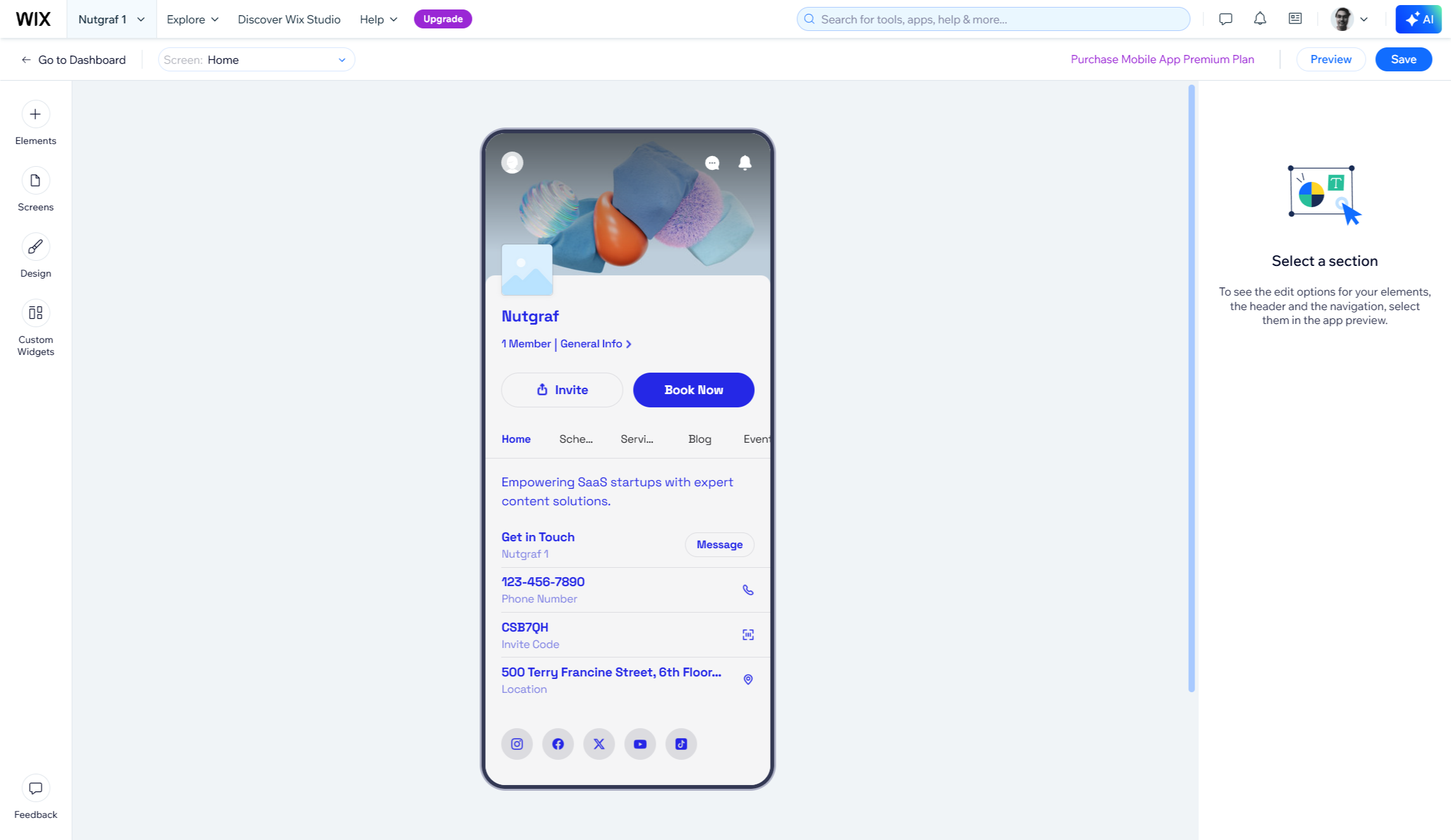
    Dopo aver scelto un template o lasciato che l’IA crei l’app, si può modificare il progetto a piacere. La piattaforma include un anteprima interattiva, utile per testare l’esperienza utente prima della pubblicazione. Wix fornisce supporto guidato per il processo di pubblicazione su App Store e Google Play. Una volta online, l’app beneficia di aggiornamenti automatici e di nuove funzionalità rilasciate dalla piattaforma.

    Wix App Builder: Supporto

    Wix offre per l’App Builder lo stesso solido sistema di supporto che assiste gli utenti del suo website builder. La risorsa principale è l’Help Center di Wix, ricco di articoli dettagliati, video tutorial e guide passo-passo su creazione, pubblicazione e gestione delle app. I contenuti sono suddivisi in sezioni tematiche, per facilitare la ricerca.

    Per un’assistenza più diretta, Wix mette a disposizione supporto clienti attivo 24/7 su tutti i piani a pagamento, con opzioni via chat, richieste di richiamata e ticket, anche in più lingue. Il team è raggiungibile sia tramite l’app Wix che dal sito ufficiale, e i tempi di risposta variano in base al piano sottoscritto.

    L’assistenza copre problemi tecnici, dubbi sul design e difficoltà nella pubblicazione sugli store Apple e Google. Inoltre, il Centro Assistenza include video tutorial specifici sull’uso di App Builder. Anche se non esiste un canale dedicato esclusivamente allo strumento, la semplicità del processo riduce al minimo la necessità di interventi tecnici.

    Recensione Wix App Builder: verdetto finale

    Wix App Builder è una soluzione valida per le aziende che vogliono raggiungere gli utenti mobile senza affrontare costi elevati o difficoltà tecniche. Con l’aggiornamento del 2024, il sistema integra funzioni basate su IA, rendendo la creazione dell’app semplice come una conversazione. Basta descrivere la propria idea e la piattaforma genera un’app completa e professionale. Per chi già utilizza Wix, l’integrazione diretta con il sito e la sincronizzazione automatica dei contenuti permettono di risparmiare tempo e ridurre errori.

    Tuttavia, è importante considerare costi ricorrenti e limitazioni. Il piano parte da 99 dollari al mese (circa 91 euro), a cui si sommano le spese di registrazione sugli store: circa 91 euro l’anno per l’App Store e 25 dollari una tantum (circa 23 euro) per Google Play. Queste cifre possono pesare su piccole imprese o startup che non hanno ancora una base solida nel mondo mobile. Inoltre, pur offrendo buona flessibilità, la piattaforma non consente la personalizzazione avanzata di un’app sviluppata su misura o di altri strumenti no-code più complessi. L’uso resta fortemente legato all’ecosistema Wix, quindi chi non ha già un sito Wix potrebbe non trovare beneficio.

    Nel complesso, Wix App Builder rappresenta una via di mezzo tra strumenti base e sviluppo personalizzato, bilanciando personalizzazione, funzionalità professionali e semplicità d’uso. Per piccole e medie imprese con un sito Wix e l’intenzione di creare un’app per iOS e Android, il servizio ha un buon valore, anche se il prezzo è elevato.

    Wix App Builder editor

    (Image credit: Wix)

    Source: Latest from TechRadar IT-IT in Reviews.

  • Collaboration: The Most Underrated UX Skill No One Talks About

    Collaboration: The Most Underrated UX Skill No One Talks About

    June 5, 2025
    Software

    When people talk about UX, it’s usually about the things they can see and interact with, like wireframes and prototypes, smart interactions, and design tools like Figma, Miro, or Maze. Some of the outputs are even glamorized, like design systems, research reports, and pixel-perfect UI designs. But here’s the truth I’ve seen again and again in over two decades of working in UX: none of that moves the needle if there is no collaboration.

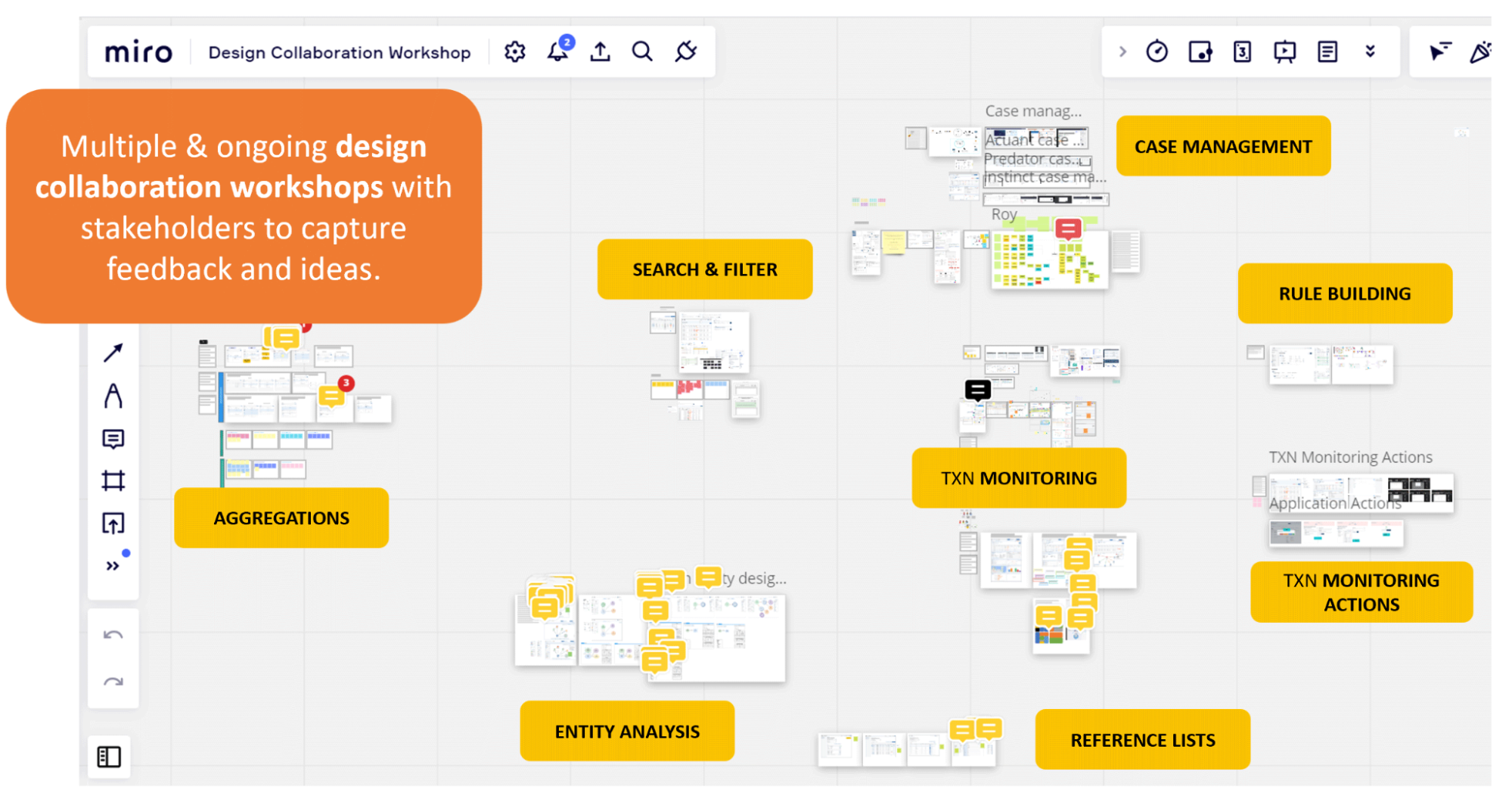
    Great UX doesn’t happen in isolation. It happens through conversations with engineers, product managers, customer-facing teams, and the customer support teams who manage support tickets. Amazing UX ideas come alive in messy Miro sessions, cross-functional workshops, and those online chats (e.g., Slack or Teams) where people align, adapt, and co-create.

    Some of the most impactful moments in my career weren’t when I was “designing” in the traditional sense. They have been gaining incredible insights when discussing problems with teammates who have varied experiences, brainstorming, and coming up with ideas that I never could have come up with on my own. As I always say, ten minds in a room will come up with ten times as many ideas as one mind. Often, many ideas are the most useful outcome.

    There have been times when a team has helped to reframe a problem in a workshop, taken vague and conflicting feedback, and clarified a path forward, or I’ve sat with a sales rep and heard the same user complaint show up in multiple conversations. This is when design becomes a team sport, and when your ability to capture the outcomes multiplies the UX impact.

    Why This Article Matters Now

    The reason collaboration feels so urgent now is that the way we work since COVID has changed, according to a study published by the US Department of Labor. Teams are more cross-functional, often remote, and increasingly complex. Silos are easier to fall into, due to distance or lack of face-to-face contact, and yet alignment has never been more important. We can’t afford to see collaboration as a “nice to have” anymore. It’s a core skill, especially in UX, where our work touches so many parts of an organisation.

    Let’s break down what collaboration in UX really means, and why it deserves way more attention than it gets.

    What Is Collaboration In UX, Really?

    Let’s start by clearing up a misconception. Collaboration is not the same as cooperation.

    • Cooperation: “You do your thing, I’ll do mine, and we’ll check in later.”
    • Collaboration: “Let’s figure this out together and co-own the outcome.”

    Collaboration, as defined in the book Communication Concepts, published by Deakin University, involves working with others to produce outputs and/or achieve shared goals. The outcome of collaboration is typically a tangible product or a measurable achievement, such as solving a problem or making a decision. Here’s an example from a recent project:

    Recently, I worked on a fraud alert platform for a fintech business. It was a six-month project, and we had zero access to users, as the product had not yet hit the market. Also, the users were highly specialised in the B2B finance space and were difficult to find. Additionally, the team members I needed to collaborate with were based in Malaysia and Melbourne, while I am located in Sydney.

    Instead of treating that as a dead end, we turned inward: collaborating with subject matter experts, professional services consultants, compliance specialists, and customer support team members who had deep knowledge of fraud patterns and customer pain points. Through bi-weekly workshops using a Miro board, iterative feedback loops, and sketching sessions, we worked on design solution options. I even asked them to present their own design version as part of the process.

    After months of iterating on the fraud investigation platform through these collaboration sessions, I ended up with two different design frameworks for the investigator’s dashboard. Instead of just presenting the “best one” and hoping for buy-in, I ran a voting exercise with PMs, engineers, SMEs, and customer support. Everyone had a voice. The winning design was created and validated with the input of the team, resulting in an outcome that solved many problems for the end user and was owned by the entire team. That’s collaboration!

    It is definitely one of the most satisfying projects of my career.

    On the other hand, I recently caught up with an old colleague who now serves as a product owner. Her story was a cautionary tale: the design team had gone ahead with a major redesign of an app without looping her in until late in the game. Not surprisingly, the new design missed several key product constraints and business goals. It had to be scrapped and redone, with her now at the table. That experience reinforced what we all know deep down: your best work rarely happens in isolation.

    As illustrated in my experience, true collaboration can span many roles. It’s not just between designers and PMs. It can also include QA testers who identify real-world issues, content strategists who ensure our language is clear and inclusive, sales representatives who interact with customers on a daily basis, marketers who understand the brand’s voice, and, of course, customer support agents who are often the first to hear when something goes wrong. The best outcomes arrive when we’re open to different perspectives and inputs.

    Why Collaboration Is So Overlooked?

    If collaboration is so powerful, why don’t we talk about it more?

    In my experience, one reason is the myth of the “lone UX hero”. Many of us entered the field inspired by stories of design geniuses revolutionising products on their own. Our portfolios often reflect that as well. We showcase our solo work, our processes, and our wins. Job descriptions often reinforce the idea of the solo UX designer, listing tool proficiency and deliverables more than soft skills and team dynamics.

    And then there’s the team culture within many organisations of “just get the work done”, which often leads to fewer meetings and tighter deadlines. As a result, a sense of collaboration is inefficient and wasted. I have also experienced working with some designers where perfectionism and territoriality creep in — “This is my design” — which kills the open, communal spirit that collaboration needs.

    When Collaboration Is The User Research

    In an ideal world, we’d always have direct access to users. But let’s be real. Sometimes that just doesn’t happen. Whether it’s due to budget constraints, time limitations, or layers of bureaucracy, talking to end users isn’t always possible. That’s where collaboration with team members becomes even more crucial.

    The next best thing to talking to users? Talking to the people who talk to users. Sales teams, customer success reps, tech support, and field engineers. They’re all user researchers in disguise!

    On another B2C project, the end users were having trouble completing the key task. My role was to redesign the onboarding experience for an online identity capture tool for end users. I was unable to schedule interviews with end users due to budget and time constraints, so I turned to the sales and tech support teams.

    I conducted multiple mini-workshops to identify the most common onboarding issues they had heard directly from our customers. This led to a huge “aha” moment: most users dropped off before the document capture process. They may have been struggling with a lack of instruction, not knowing the required time, or not understanding the steps involved in completing the onboarding process.

    That insight reframed my approach, and we ultimately redesigned the flow to prioritize orientation and clear instructions before proceeding to the setup steps. Below is an example of one of the screen designs, including some of the instructions we added.

    This kind of collaboration is user research. It’s not a substitute for talking to users directly, but it’s a powerful proxy when you have limited options.

    But What About Using AI?

    Glad you asked! Even AI tools, which are increasingly being used for idea generation, pattern recognition, or rapid prototyping, don’t replace collaboration; they just change the shape of it.

    AI can help you explore design patterns, draft user flows, or generate multiple variations of a layout in seconds. It’s fantastic for getting past creative blocks or pressure-testing your assumptions. But let’s be clear: these tools are accelerators, not oracles. As an innovation and strategy consultant Nathan Waterhouse points out, AI can point you in a direction, but it can’t tell you which direction is the right one in your specific context. That still requires human judgment, empathy, and an understanding of the messy realities of users and business goals.

    You still need people, especially those closest to your users, to validate, challenge, and evolve any AI-generated idea. For instance, you might use ChatGPT to brainstorm onboarding flows for a SaaS tool, but if you’re not involving customer support reps who regularly hear “I didn’t know where to start” or “I couldn’t even log in,” you’re just working with assumptions. The same applies to engineers who know what is technically feasible or PMs who understand where the business is headed.

    AI can generate ideas, but only collaboration turns those ideas into something usable, valuable, and real. Think of it as a powerful ingredient, but not the whole recipe.

    How To Strengthen Your UX Collaboration Skills?

    If collaboration doesn’t come naturally or hasn’t been a focus, that’s okay. Like any skill, it can be practiced and improved. Here are a few ways to level up:

    1. Cultivate curiosity about your teammates.
      Ask engineers what keeps them up at night. Learn what metrics your PMs care about. Understand the types of tickets the support team handles most frequently. The more you care about their challenges, the more they’ll care about yours.
    2. Get comfortable facilitating.
      You don’t need to be a certified Design Sprint master, but learning how to run a structured conversation, align stakeholders, or synthesize different points of view is hugely valuable. Even a simple “What’s working? What’s not?” retro can be an amazing starting point in identifying where you need to focus next.
    3. Share early, share often.
      Don’t wait until your designs are polished to get input. Messy sketches and rough prototypes invite collaboration. When others feel like they’ve helped shape the work, they’re more invested in its success.
    4. Practice active listening.
      When someone critiques your work, don’t immediately defend. Pause. Ask follow-up questions. Reframe the feedback. Collaboration isn’t about consensus; it’s about finding a shared direction that can honour multiple truths.
    5. Co-own the outcome.
      Let go of your ego. The best UX work isn’t “your” work. It’s the result of many voices, skill sets, and conversations converging toward a solution that helps users. It’s not “I”, it’s “we” that will solve this problem together.

    Conclusion: UX Is A Team Sport

    Great design doesn’t emerge from a vacuum. It comes from open dialogue, cross-functional understanding, and a shared commitment to solving real problems for real people.

    If there’s one thing I wish every early-career designer knew, it’s this:

    Collaboration is not a side skill. It’s the engine behind every meaningful design outcome. And for seasoned professionals, it’s the superpower that turns good teams into great ones.

    So next time you’re tempted to go heads-down and just “crank out a design,” pause to reflect. Ask who else should be in the room. And invite them in, not just to review your work, but to help create it.

    Because in the end, the best UX isn’t just what you make. It’s what you make together.

    Further Reading On SmashingMag

    • “Presenting UX Research And Design To Stakeholders: The Power Of Persuasion,” Victor Yocco
    • “Transforming The Relationship Between Designers And Developers,” Chris Day
    • “Effective Communication For Everyday Meetings,” Andrii Zhdan
    • “Preventing Bad UX Through Integrated Design Workflows,” Ceara Crawshaw

    Source: Articles on Smashing Magazine — For Web Designers And Developers.

  • Autonomous coding agents: A Codex example

    June 4, 2025
    Software
    Photo of Birgitta Böckeler
    Birgitta Böckeler

    Birgitta is a Distinguished Engineer and AI-assisted delivery expert at Thoughtworks. She has over 20 years of experience as a software developer, architect and technical leader.

    This article is part of “Exploring Gen AI”. A series capturing Thoughtworks technologists’ explorations of using gen ai technology for software development.

    04 June 2025

    In the past few weeks, multiple “autonomous background coding agents” have been released.

    • Supervised coding agents: Interactive chat agents that are driven and steered by a developer. Create code locally, in the IDE. Tool examples: GitHub Copilot, Windsurf, Cursor, Cline, Roo Code, Claude Code, Aider, Goose, …
    • Autonomous background coding agents: Headless agents that you send off to work autonomously through a whole task. Code gets created in an environment spun up exclusively for that agent, and usually results in a pull request. Some of them also are runnable locally though. Tool examples: OpenAI Codex, Google Jules, Cursor background agents, Devin, …

    I gave a task to OpenAI Codex and some other agents to see what I can learn. The following is a record of one particular Codex run, to help you look behind the scenes and draw your own conclusions, followed by some of my own observations.

    The task

    We have an internal application called Haiven that we use as a demo frontend for our software delivery prompt library, and to run some experiments with different AI assistance experiences on software teams. The code for that application is public.

    The task I gave to Codex was regarding the following UI issue:

    Actual:

    Current state screenshot - some labels in a web UI, "DeliveryManagement", "Client-Research"

    What I wanted from the agent:

    Screenshot of what we want: The labels should be more human readable, "Delivery Management", "Client Research"

    Prompt:
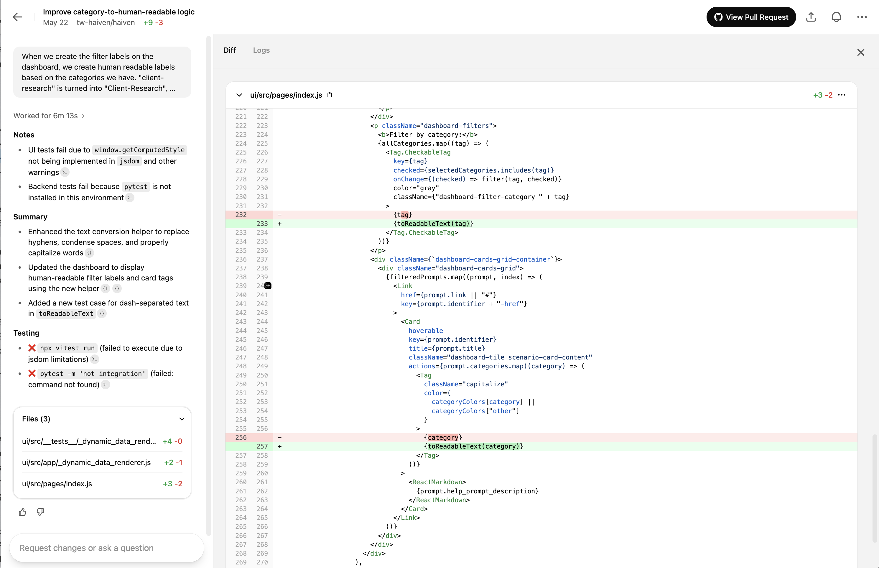
    When we create the filter labels on the dashboard, we create human readable labels based on the categories we have. "client-research" is turned into "Client-Research", "deliveryManagement" into "DeliveryManagement". Improve the sophistication of the "category-to-human-readable" logic so that the labels are appearing to the user as "Client Research" and "Delivery Management"

    This task is

    • Relatively small
    • A typical “cosmetics” task that is not super urgent and might get deprioritised again and again

    Agent logs

    I’m sharing the detailed logs here so that you can get an impression of what is going on under the hood.

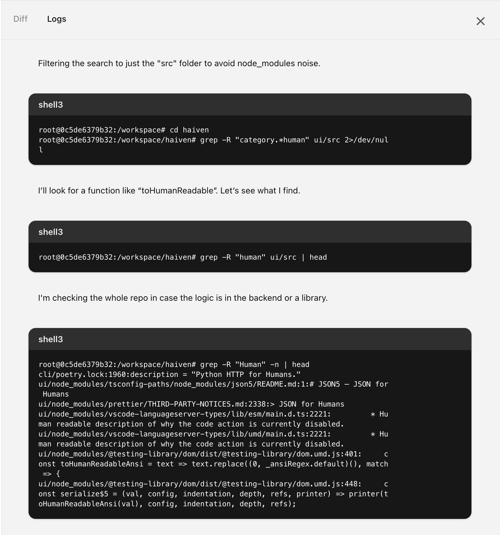
    Here’s what the logs view looks like in Codex:

    A screenshot of Codex's "Logs" view, showing examples of step summaries and command executions

    Collecting information first

    The first 17 log entries were all about reading AGENTS.md and README.md:

    • “I need to check the AGENTS.md in the repository root for instructions.”
    • looks for AGENTS.md, but I had actually called it AGENT.md, which led to some back and forth until it figured that out
    • reads README.md
    • Looks at .pre-commit, finds a test setup

    The following tables list the rest of the log messages verbatim. After each of those messages, the agent executed a command, for some of them I added that actual command for context. I’m sure that the log messages are just summaries of the tokens that were actually going on behind the scenes, because the messages are way too short to represent the full “thinking” the model must have been going through.

    Searching for the relevant code with lots of grep

    Message Command (samples) Notes
    I need to search for “category-to-human-readable” to locate where to make changes for the frontend labels. grep -R "human readable" -n  
    I’ll look for any mentions of “category” in the project.    
    Grep output is massive because of node_modules; I’ll limit it to src instead.    
    I’ll search for “to human” in the src directory to find relevant references.    
    I’ll open and check index.js to see what’s inside.    
    I’m checking if the category-to-human-readable transformation is handled in _navigation_items or elsewhere.    
    I’m going to look up “human readable” to get more info on the topic. grep -R "human-readable" -n ui/src | head  
    I wonder if there’s a function for converting categories into something more readable.    
    Filtering the search to just the “src” folder to avoid node_modules noise.   second time it’s running into this, didn’t ‘remember’
    I’ll look for a function like “toHumanReadable”. Let’s see what I find.    
    I’m checking the whole repo in case the logic is in the backend or a library. grep -R "Human" -n | head  
    I’ll limit the scope to app/ and ui/src to avoid the large node_modules folder.   third time it’s running into this, didn’t ‘remember’
    I think the logic might be missing, so I’ll check _navigation_items and other modules for categories. grep -R "human" app -n | head  
    I think it’s time to look a bit deeper. Let’s dive in and explore. grep -R "human" app | wc -l To “look deeper”, it searches for “human” again, but pipes it into wc instead of head?

    Finally, it’s getting closer! The labels were previously crudely capitalized via CSS, it finds that

    Message Command (samples) Notes
    I’m checking for references to “capitalize” or category transformation in the frontend. Output: <br>root@0c5de6379b32:/workspace/haiven# grep -R "capitalize" -n ui/src | head<br>ui/src/pages/index.js:250: className="capital<br>ize"<br>ui/src/styles/globals.css:1915:.capitalize {<br>ui/src/styles/globals.css:1916: text-transform: capitalize;<br>ui/src/styles/globals.css:1931: text-transform: capitalize;<br>  
    I’ll check around the Tag section in index.js.    
    Tag display capitalizes words incorrectly due to hyphen or camelCase; I’ll look at filter categories.    

    Now it’s starting to check for more relevant code in the app folder, where the backend is. It doesn’t find anything, which is correct, there’s nothing relevant there

    Message Command (samples) Notes
    I’ll check the repo for how categories are formatted, focusing on hyphens and camelCase. grep -R "categories" -n app | head  
    Time to try a new search! grep -R "client" -n app | head  
    I’ll take a closer look at the prompts in the test data. grep -R "categories:" -n app/tests | head Why?
    It looks like the test data has limited categories. I’ll check the docs for any differences. grep -R "client-research" -n  
    I’ll start by opening the files to take a closer look. sed -n '1,100p' ui/src/app/_navigation_items.js  

    Now it’s going back to searching in the ui folder – it found the CSS previously, and is now looking for existing code that it can reuse to solve the task. That’s great, because we indeed already have a similar function, and it finds it:

    Message Command (samples) Notes
    I need a function to convert tags like “client-research” to “Client Research” for filters. grep -R "to.*Readable" -n ui/src | head  
    I’m opening the toReadableText function inside _dynamic_data_renderer.js to explore it.    
    I’m moving through the page to get the details I need.    

    It now finds a gap in the existing function’s implementation:

    Message Command (samples) Notes
    I see that hyphens aren’t handled by the function. I need to adjust it for hyphens.    
    I’ll modify toReadableText to handle hyphens, ensuring proper capitalization and spacing. Let’s check tests!   It actually didn’t check any tests
    I’ll check _dynamic_data_renderer.js to examine toReadableText and modify it for hyphen-case.    
    I’ll check tests/_sidebar.test.js to review the related categories there.    
    I’ll check other files to see if toReadableText appears anywhere.    
    I’ll check if _sidebar or others contain a toReadableText function.    

    Update the test for the function that it wants to change:

    Message Command (samples) Notes
    I’ll adjust the function to handle hyphen-case, then update tests to reflect that.    
    I’ll check the test file after line 36 to ensure hyphen-case is covered.    
    I’ll scroll through lines 60 to 120 to examine the rest of the file.    
    I’m scrolling the rest to capture all the relevant information.    
    I’ll add tests for hyphen-case and update toReadableText, including modifying index.js for categories.    
    I’ll adjust _dynamic_data_renderer.js and index.js to use toReadableText and update tests. git status --short  

    You can configure some environment startup commands in Codex, I had configured that to be yarn install, which led to the following:

    Message Command (samples) Notes
    There are untracked .yarn/ and .yarnrc files. I’ll check and clean them up.    
    I’ll check the root of ‘ui’ and remove any unnecessary Yarn 4 entries.    
    I’ll look at the commit history to see if those .yarn files were added later. git log --oneline -n 1  
    I’ll review the repository’s .gitignore to confirm if Node modules are excluded. grep yarn .gitignore  
    I see no entry for .yarn or .yarnrc. I’ll check and remove them if needed. cat ui/.gitignore  
    I’ll check if I can remove .yarn or .yarnrc files since they shouldn’t be committed.    
    It looks like yarn.lock changes were made. Time to reset to HEAD.    

    Actual code changes:

    Message Command (samples) Notes
    Time to modify the code. I’ll begin the necessary updates now. sed -n '1,30p' ...  
    I’m going to add a hyphen to the necessary part of the code.    
    I’m going to make changes to the index.js file now.    
    I’ll import toReadableText and start using it in the code.    
    I’ll update index.js to import toReadableText and adjust the _dynamic_data_renderer tests.    
    I need to replace {tag} with {toReadableText(tag)} for better rendering.    
    I’ll take a look at the differences to better understand the changes. git diff  
    I’ll review the changes in index.js to see what’s been modified.    
    I’ll add a new test for hyphenated cases in _dynamic_data_renderer.test.js.    
    I’ll consider inserting a test after line 35.    

    Running our code linter next, nice:

    Message Command (samples) Notes
    I’ll format the code using Prettier as instructed. cd ui && npx prettier -w ... Prettier is mentioned in the AGENTS.md. It seems to run prettier successfully, though none of the files were changed
    I’ll review the logs to gather more information.    

    Trying to run the tests – unsuccessfully:

    Message Command (samples) Notes
    I’ll run the yarn tests to check if everything’s working fine.    
    Tests might’ve been cached or need network—output’s empty, so I’ll check the log.    
    The lockfile isn’t updated. I’ll try running ‘yarn install’ since the environment allows it.    
    The environment is offline, so yarn install can’t be run, but I see a node_modules folder.    
    I see node_modules are already installed. I’ll check the log for why tests failed.    
    The error happens because Yarn 4 relies on .yarn and .yarnrc, which we removed.   ?
    It looks like .yarnrc.yml isn’t tracked. I’ll also check .yarn for tracking.    
    I’m double-checking the package.json to see if “haiven-ui” is the correct name.   ?
    I’ll check the Node version to confirm if it’s 18 or 20 by running node -v.   weird, the node version specified in package.json is 22.6
    I think switching to npx vitest run could fix the error. Let’s try that.    
    The output is long—now I’ll capture the last summary lines. Error: Not implemented: window.getComputedStyle(elt, pseudoElt)  
    The output is too long, so I’ll extract the key points for a summary.    

    Going on a tangent about setting up the venv, which is totally unnecessary because it only plans changes for frontend code:

    Message Command (samples) Notes
    The tests failed due to case differences, but now I’ll activate the virtual environment.   AGENTS.md contains instructions to activate venv for the Python backend, but we’re in the frontend here, so…
    Hmm, the .venv isn’t here. I should check if it needs creation or already exists.    
    It looks like the .venv directory is missing. Let’s review AGENT’s instructions carefully.    
    The environment seems offline, but there might be a script to set up dependencies locally.    
    I can’t run “poetry install” offline, but I’ll check the .cursor folder for dependencies.    
    I can’t run backend tests with the current setup, but I’ll try pytest anyway.    

    Gave up on the tests, now wrapping up the changes:

    Message Command (samples) Notes
    Tests failed due to missing dependencies. Now, I’ll check status and proceed with committing.    
    I think the .yarnrc.yml was left over from a previous yarn install. Removing it.    
    I’ll grab the relevant file lines for the citations now.    
    I’ll get the surrounding line range for the changes in index.js. nl -ba ui/src/pages/index.js | sed -n '12,28p'  
    I’ll grab the relevant lines around those changes now.    
    It’s time to finalize the PR message and verify the commit.    
    UI tests failed due to environment issues. I’ll reference the last failure lines. Done!    

    Screenshot of the final results view in OpenAI Codex

    Here is the full pull request created by Codex.

    Observations

    Brute text search

    I found it interesting to see that Codex, and most of the other coding assistants I’m using, are resorting more and more to simple text search to find relevant code. In the log above you see how Codex goes through a bunch of search terms with grep, to find relevant pieces of code (“human”, “human readable”, “humanReadable”, …). The reason why I find it interesting is because there have been a lot of seemingly more sophisticated code search mechanisms implemented, like semantic search over codebase indices with vectors / embeddings (Cursor, GH Copilot, Windsurf), or using the abstract syntax tree as a starting point (Aider, Cline). The latter is still quite simple, but doing text search with grep is the simplest possible.

    It seems like the tool creators have found that this simple search is still the most effective after all – ? Or they’re making some kind of trade-off here, between simplicity and effectiveness?

    The remote dev environment is key for these agents to work “in the background”

    Here is a screenshot of Codex’s environment configuration screen (as of end of May 2025). As of now, you can configure a container image, environment variables, secrets, and a startup script. They point out that after the execution of that startup script, the environment will not have access to the internet anymore, which would sandbox the environment and mitigate some of the security risks.

    Screenshot of Codex's environment configuration screen (as of end of May 2025); Shows configurable container image, environment variables, secrets, and a setup script.

    For these “autonomous background agents”, the maturity of the remote dev environment that is set up for the agent is crucial, and it’s a tricky challenge. In this case e.g., Codex didn’t manage to run the tests.

    And it turned out that when the pull request was created, there were indeed two tests failing because of regression, which is a shame, because if it had known, it would have easily been able to fix the tests, it was a trivial fix:

    Screenshot of the Codex error messages indicating that it couldn't run the tests.

    This particular project, Haiven, actually has a scripted developer safety net, in the form of a quite elaborate .pre-commit configuration. () It would be ideal if the agent could execute the full pre-commit before even creating a pull request. However, to run all the steps, it would need to run

    • Node and yarn (to run UI tests and the frontend linter)
    • Python and poetry (to run backend tests)
    • Semgrep (for security-related static code analysis)
    • Ruff (Python linter)
    • Gitleaks (secret scanner)

    …and all of those have to be available in the right versions as well, of course.

    Figuring out a smooth experience to spin up just the right environment for an agent is key for these agent products, if you want to really run them “in the background” instead of a developer machine. It is not a new problem, and to an extent a solved problem, after all we do this in CI pipelines all the time. But it’s also not trivial, and at the moment my impression is that environment maturity is still an issue in most of these products, and the user experience to configure and test the environment setups is as frustrating, if not more, as it can be for CI pipelines.

    Solution quality

    I ran the same prompt 3 times in OpenAI Codex, 1 time in Google’s Jules, 2 times locally in Claude Code (which is not fully autonomous though, I needed to manually say ‘yes’ to everything). Even though this was a relatively simple task and solution, turns out there were quality differences between the results.

    Good news first, the agents came up with a working solution every time (leaving breaking regression tests aside, and to be honest I didn’t actually run every single one of the solutions to confirm). I think this task is a good example of the types and sizes of tasks that GenAI agents are already well positioned to work on by themselves. But there were two aspects that differed in terms of quality of the solution:

    • Discovery of existing code that could be reused: In the log here you’ll find that Codex found an existing component, the “dynamic data renderer”, that already had functionality for turning technical keys into human readable versions. In the 6 runs I did, only 2 times did the respective agent find this piece of code. In the other 4, the agents created a new file with a new function, which led to duplicated code.
    • Discovery of an additional place that should use this logic: The team is currently working on a new feature that also displays category names to the user, in a dropdown. In one of the 6 runs, the agent actually discovered that and suggested to also change that place to use the new functionality.
    Found the reusable code Went the extra mile and found the additional place where it should be used
    Yes Yes
    Yes No
    No Yes
    No No
    No No
    No No

    I put these results into a table to illustrate that in each task given to an agent, we have multiple dimensions of quality, of things that we want to “go right”. Each agent run can “go wrong” in one or multiple of these dimensions, and the more dimensions there are, the less likely it is that an agent will get everything done the way we want it.

    Sunk cost fallacy

    I’ve been wondering – let’s say a team uses background agents for this type of task, the types of tasks that are kind of small, and neither important nor urgent. Haiven is an internal-facing application, and has only two developers assigned at the moment, so this type of cosmetic fix is actually considered low priority as it takes developer capacity away from more important things. When an agent only kind of succeeds, but not fully – in which situations would a team discard the pull request, and in which situations would they invest the time to get it the last 20% there, even though spending capacity on this had been deprioritised? It makes me wonder about the tail end of unprioritised effort we might end up with.


    Source: Martin Fowler.

  • Smashing Animations Part 4: Optimising SVGs

    Smashing Animations Part 4: Optimising SVGs

    June 4, 2025
    Software

    SVG animations take me back to the Hanna-Barbera cartoons I watched as a kid. Shows like Wacky Races, The Perils of Penelope Pitstop, and, of course, Yogi Bear. They inspired me to lovingly recreate some classic Toon Titles using CSS, SVG, and SMIL animations.

    But getting animations to load quickly and work smoothly needs more than nostalgia. It takes clean design, lean code, and a process that makes complex SVGs easier to animate. Here’s how I do it.

    Start Clean And Design With Optimisation In Mind

    Keeping things simple is key to making SVGs that are optimised and ready to animate. Tools like Adobe Illustrator convert bitmap images to vectors, but the output often contains too many extraneous groups, layers, and masks. Instead, I start cleaning in Sketch, work from a reference image, and use the Pen tool to create paths.

    Tip: Affinity Designer (UK) and Sketch (Netherlands) are alternatives to Adobe Illustrator and Figma. Both are independent and based in Europe. Sketch has been my default design app since Adobe killed Fireworks.

    Beginning With Outlines

    For these Toon Titles illustrations, I first use the Pen tool to draw black outlines with as few anchor points as possible. The more points a shape has, the bigger a file becomes, so simplifying paths and reducing the number of points makes an SVG much smaller, often with no discernible visual difference.

    Bearing in mind that parts of this Yogi illustration will ultimately be animated, I keep outlines for this Bewitched Bear’s body, head, collar, and tie separate so that I can move them independently. The head might nod, the tie could flap, and, like in those classic cartoons, Yogi’s collar will hide the joins between them.

    Drawing Simple Background Shapes

    With the outlines in place, I use the Pen tool again to draw new shapes, which fill the areas with colour. These colours sit behind the outlines, so they don’t need to match them exactly. The fewer anchor points, the smaller the file size.

    Sadly, neither Affinity Designer nor Sketch has tools that can simplify paths, but if you have it, using Adobe Illustrator can shave a few extra kilobytes off these background shapes.

    Optimising The Code

    It’s not just metadata that makes SVG bulkier. The way you export from your design app also affects file size.

    Exporting just those simple background shapes from Adobe Illustrator includes unnecessary groups, masks, and bloated path data by default. Sketch’s code is barely any better, and there’s plenty of room for improvement, even in its SVGO Compressor code. I rely on Jake Archibald’s SVGOMG, which uses SVGO v3 and consistently delivers the best optimised SVGs.

    Layering SVG Elements

    My process for preparing SVGs for animation goes well beyond drawing vectors and optimising paths — it also includes how I structure the code itself. When every visual element is crammed into a single SVG file, even optimised code can be a nightmare to navigate. Locating a specific path or group often feels like searching for a needle in a haystack.

    That’s why I develop my SVGs in layers, exporting and optimising one set of elements at a time — always in the order they’ll appear in the final file. This lets me build the master SVG gradually by pasting it in each cleaned-up section. For example, I start with backgrounds like this gradient and title graphic.

    Instead of facing a wall of SVG code, I can now easily identify the background gradient’s path and its associated linearGradient, and see the group containing the title graphic. I take this opportunity to add a comment to the code, which will make editing and adding animations to it easier in the future:

    <svg ...> <defs> <!-- ... --> </defs> <path fill="url(#grad)" d="…"/> <!-- TITLE GRAPHIC --> <g> <path … /> <!-- ... --> </g> </svg> 

    Next, I add the blurred trail from Yogi’s airborne broom. This includes defining a Gaussian Blur filter and placing its path between the background and title layers:

    <svg ...> <defs> <linearGradient id="grad" …>…</linearGradient> <filter id="trail" …>…</filter> </defs> <!-- GRADIENT --> <!-- TRAIL --> <path filter="url(#trail)" …/> <!-- TITLE GRAPHIC --> </svg> 

    Then come the magical stars, added in the same sequential fashion:

    <svg ...> <!-- GRADIENT --> <!-- TRAIL --> <!-- STARS --> <!-- TITLE GRAPHIC --> </svg> 

    To keep everything organised and animation-ready, I create an empty group that will hold all the parts of Yogi:

    <g id="yogi">...</g> 

    Then I build Yogi from the ground up — starting with background props, like his broom:

    <g id="broom">...</g> 

    Followed by grouped elements for his body, head, collar, and tie:

    <g id="yogi"> <g id="broom">…</g> <g id="body">…</g> <g id="head">…</g> <g id="collar">…</g> <g id="tie">…</g> </g> 

    Since I export each layer from the same-sized artboard, I don’t need to worry about alignment or positioning issues later on — they’ll all slot into place automatically. I keep my code clean, readable, and ordered logically by layering elements this way. It also makes animating smoother, as each component is easier to identify.

    Reusing Elements With <use>

    When duplicate shapes get reused repeatedly, SVG files can get bulky fast. My recreation of the “Bewitched Bear” title card contains 80 stars in three sizes. Combining all those shapes into one optimised path would bring the file size down to 3KB. But I want to animate individual stars, which would almost double that to 5KB:

    <g id="stars"> <path class="star-small" fill="#eae3da" d="..."/> <path class="star-medium" fill="#eae3da" d="..."/> <path class="star-large" fill="#eae3da" d="..."/> <!-- ... --> </g> 

    Moving the stars’ fill attribute values to their parent group reduces the overall weight a little:

    <g id="stars" fill="#eae3da"> <path class="star-small" d="…"/> <path class="star-medium" d="…"/> <path class="star-large" d="…"/> <!-- ... --> </g> 

    But a more efficient and manageable option is to define each star size as a reusable template:

    <defs> <path id="star-large" fill="#eae3da" fill-rule="evenodd" d="…"/> <path id="star-medium" fill="#eae3da" fill-rule="evenodd" d="…"/> <path id="star-small" fill="#eae3da" fill-rule="evenodd" d="…"/> </defs> 

    With this setup, changing a star’s design only means updating its template once, and every instance updates automatically. Then, I reference each one using <use> and position them with x and y attributes:

    <g id="stars"> <!-- Large stars --> <use href="#star-large" x="1575" y="495"/> <!-- ... --> <!-- Medium stars --> <use href="#star-medium" x="1453" y="696"/> <!-- ... --> <!-- Small stars --> <use href="#star-small" x="1287" y="741"/> <!-- ... --> </g> 

    This approach makes the SVG easier to manage, lighter to load, and faster to iterate on, especially when working with dozens of repeating elements. Best of all, it keeps the markup clean without compromising on flexibility or performance.

    Adding Animations

    The stars trailing behind Yogi’s stolen broom bring so much personality to the animation. I wanted them to sparkle in a seemingly random pattern against the dark blue background, so I started by defining a keyframe animation that cycles through different opacity levels:

    @keyframes sparkle { 0%, 100% { opacity: .1; } 50% { opacity: 1; } } 

    Next, I applied this looping animation to every use element inside my stars group:

    #stars use { animation: sparkle 10s ease-in-out infinite; } 

    The secret to creating a convincing twinkle lies in variation. I staggered animation delays and durations across the stars using nth-child selectors, starting with the quickest and most frequent sparkle effects:

    /* Fast, frequent */ #stars use:nth-child(n + 1):nth-child(-n + 10) { animation-delay: .1s; animation-duration: 2s; } 

    From there, I layered in additional timings to mix things up. Some stars sparkle slowly and dramatically, others more randomly, with a variety of rhythms and pauses:

    /* Medium */ #stars use:nth-child(n + 11):nth-child(-n + 20) { ... } /* Slow, dramatic */ #stars use:nth-child(n + 21):nth-child(-n + 30) { ... } /* Random */ #stars use:nth-child(3n + 2) { ... } /* Alternating */ #stars use:nth-child(4n + 1) { ... } /* Scattered */ #stars use:nth-child(n + 31) { ... } 

    By thoughtfully structuring the SVG and reusing elements, I can build complex-looking animations without bloated code, making even a simple effect like changing opacity sparkle.

    Then, for added realism, I make Yogi’s head wobble:

    @keyframes headWobble { 0% { transform: rotate(-0.8deg) translateY(-0.5px); } 100% { transform: rotate(0.9deg) translateY(0.3px); } } #head { animation: headWobble 0.8s cubic-bezier(0.5, 0.15, 0.5, 0.85) infinite alternate; } 

    His tie waves:

    @keyframes tieWave { 0%, 100% { transform: rotateZ(-4deg) rotateY(15deg) scaleX(0.96); } 33% { transform: rotateZ(5deg) rotateY(-10deg) scaleX(1.05); } 66% { transform: rotateZ(-2deg) rotateY(5deg) scaleX(0.98); } } #tie { transform-style: preserve-3d; animation: tieWave 10s cubic-bezier(0.68, -0.55, 0.27, 1.55) infinite; } 

    His broom swings:

    @keyframes broomSwing { 0%, 20% { transform: rotate(-5deg); } 30% { transform: rotate(-4deg); } 50%, 70% { transform: rotate(5deg); } 80% { transform: rotate(4deg); } 100% { transform: rotate(-5deg); } } #broom { animation: broomSwing 4s cubic-bezier(0.5, 0.05, 0.5, 0.95) infinite; } 

    And, finally, Yogi himself gently rotates as he flies on his magical broom:

    @keyframes yogiWobble { 0% { transform: rotate(-2.8deg) translateY(-0.8px) scale(0.998); } 30% { transform: rotate(1.5deg) translateY(0.3px); } 100% { transform: rotate(3.2deg) translateY(1.2px) scale(1.002); } } #yogi { animation: yogiWobble 3.5s cubic-bezier(.37, .14, .3, .86) infinite alternate; } 

    All these subtle movements bring Yogi to life. By developing structured SVGs, I can create animations that feel full of character without writing a single line of JavaScript.

    Try this yourself:

    See the Pen Bewitched Bear CSS/SVG animation [forked] by Andy Clarke.

    Conclusion

    Whether you’re recreating a classic title card or animating icons for an interface, the principles are the same:

    1. Start clean,
    2. Optimise early, and
    3. Structure everything with animation in mind.

    SVGs offer incredible creative freedom, but only if kept lean and manageable. When you plan your process like a production cell — layer by layer, element by element — you’ll spend less time untangling code and more time bringing your work to life.


    Source: Articles on Smashing Magazine — For Web Designers And Developers.

Previous Page
1 … 903 904 905 906 907 … 911
Next Page
MONIMEGA
  • Instagram
  • Facebook
  • Twitter
Gestisci Consenso
Per fornire le migliori esperienze, utilizziamo tecnologie come i cookie per memorizzare e/o accedere alle informazioni del dispositivo. Il consenso a queste tecnologie ci permetterà di elaborare dati come il comportamento di navigazione o ID unici su questo sito. Non acconsentire o ritirare il consenso può influire negativamente su alcune caratteristiche e funzioni.
Funzionale Always active
L'archiviazione tecnica o l'accesso sono strettamente necessari al fine legittimo di consentire l'uso di un servizio specifico esplicitamente richiesto dall'abbonato o dall'utente, o al solo scopo di effettuare la trasmissione di una comunicazione su una rete di comunicazione elettronica.
Preferenze
L'archiviazione tecnica o l'accesso sono necessari per lo scopo legittimo di memorizzare le preferenze che non sono richieste dall'abbonato o dall'utente.
Statistiche
L'archiviazione tecnica o l'accesso che viene utilizzato esclusivamente per scopi statistici. L'archiviazione tecnica o l'accesso che viene utilizzato esclusivamente per scopi statistici anonimi. Senza un mandato di comparizione, una conformità volontaria da parte del vostro Fornitore di Servizi Internet, o ulteriori registrazioni da parte di terzi, le informazioni memorizzate o recuperate per questo scopo da sole non possono di solito essere utilizzate per l'identificazione.
Marketing
L'archiviazione tecnica o l'accesso sono necessari per creare profili di utenti per inviare pubblicità, o per tracciare l'utente su un sito web o su diversi siti web per scopi di marketing simili.
  • Manage options
  • Manage services
  • Manage {vendor_count} vendors
  • Read more about these purposes
Visualizza le preferenze
  • {title}
  • {title}
  • {title}