MONIMEGA
  • Blog
    • Politics
    • Software
    • Technology
    • Business
    • Design
    • Hardware
    • Health
    • Italy
    • Music
    • Sports
    • Strategy
    • World
  • Contatto
  • Galleria
  • Informazioni
  • Servizi
  • New TUXEDO InfinityBook Pro Powered by AMD Ryzen AI 300

    June 18, 2025
    Software

    TUXEDO Computers has been hard at work to create a new notebook that is ready for just about any need. The InfinityBook Pro 14 Gen10 is powered by the AMD Ryzen AI 300 with up to 12 cores and 24 threads and an AMD Radeon 800M GPU.

    Besides the powerhouse CPU/GPU combo, the InfinityBook Pro also offers a 14-inch Omnia IPS display with a 16:10 ratio, matte/non-glare screen, a viewing angle of 89/89/89/89 degrees, a refresh rate of 120Hz, a resolution of 2880×1800, an sRGB color gamut of 100 percent, a brightness of 500 nits, and a contrast ratio of 1500:1.

    You also get DDR5-5600 dual-channel RAM up to 128 GB and 2x M.2 2280 for NVMe (PCI-Express 4.0 x4) storage.

    The InfinityBook Pro isn’t just about power, it’s also about panache, thanks to an ultra compact and light, all aluminum chassis that measures 311x17x220mm and weighs just 1.5kg.

    This new notebook is cooled by two 7mm thin fans and two heat pipes, which help to keep the CPU with a constant power level of up to 65 watts (at full fan speed).

    You can configure and order your InfinityBook Pro now, with a base price (16GB of RAM and 500GB of storage) for ~EUR1,092 (approximately $1,267).


    Source: Linux Magazine News (path: lmi_news).

  • Expert Generalists: first three characteristics

    June 18, 2025
    Software

    Writing a sophisticated computer program often requires a lot of detailed knowledge. If we do this in Java, we need to know the syntax of the language, the wide range of libraries available to assist us in the work, the various tools required to verify and build our programs. If we do this in Python instead, we are faced with a different syntax, libraries that are named and work differently, a whole other ecosystem to build and run our work.

    Faced with these details, a natural response is to recruit people who are knowledgeable about a specific ecosystem. Thus we see job descriptions that say “at least three years of Java”, or even deeper requirements for subsets of that community, with experience in specific tools. What use is a skilled Python programmer to such a team?

    We’ve always felt that such desires are wrong-headed. The characteristics that we’ve observed separating effective software developers from the chaff aren’t things that depend on the specifics of tooling. We rather appreciate such things as: the knowledge of core concepts and patterns of programming, a knack for decomposing complex work-items into small, testable pieces, and the ability to collaborate with both other programmers and those who will benefit from the software.

    Throw such a Python programmer into a Java team, and we’d expect them to prosper. Sure they would ask a lot of questions about the new language and libraries, we’d hear a lot of “how do you do this here?” But such questions are quickly answered, and the impediments of Java-ignorance soon wither away.

    An experienced Pythonista who understands the core patterns and practices of software development can be a productive member of a team building software in Java. Knowing how to handle snakes can be surprisingly handy.

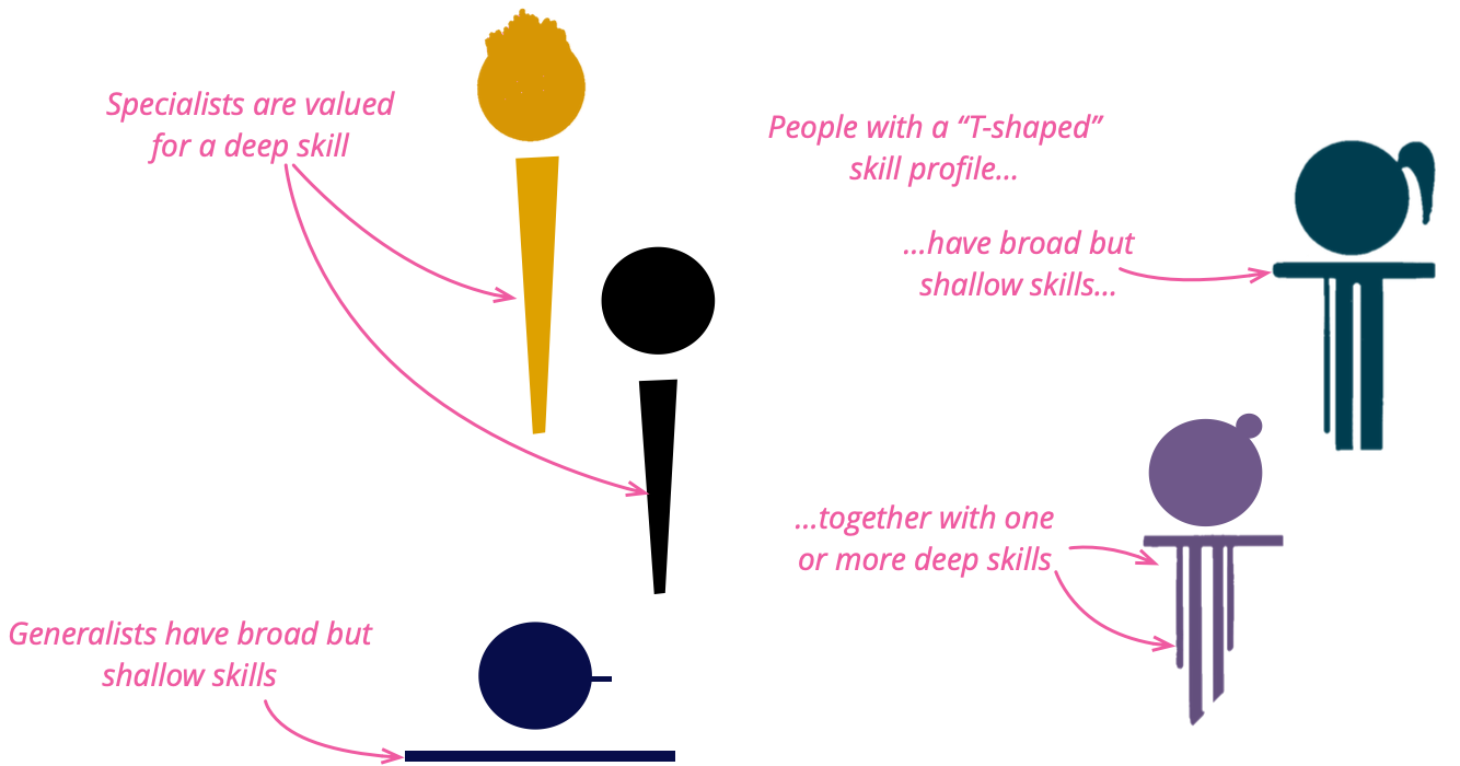
    This echoes a long debate about the relative value of specialists and generalists. Specialists are seen as people with a deep skill in a specific subject, while generalists have broad but shallow skills. A dissatisfaction with that dichotomy led to the idea of “T-shaped people”: folks that combine deep knowledge in one topic, with a broad but shallow knowledge of many other topics. We’ve seen many such people quickly grow other deep legs, which doesn’t do much for the “T-shape” name (as we’ll discuss below), but otherwise leads to success. Often experience of a different environment leads to trying things that seem innovative in a new home. Folks that only work in a single technological neighborhood are at the constant risk of locking themselves into a knowledge silo, unaware of many tools that could help them in their work.

    This ability goes beyond just developer skills. We’ve seen our best business analysts gain deep skills in a couple of domains, but use their generalist skills to rapidly understand and contribute in new domains. Developers and User Experience folks often step outside “their lanes” to contribute widely in getting work done. We’ve seen this capability be an essential quality in our best colleagues, to the degree that its importance is something we’ve taken for granted.

    But increasingly we see the software industry push for increasing, narrower specialization.

    So over the last year or so we have started to resist this industry-wide push for narrow skills, by calling out this quality, which we call an Expert Generalist. Why did we use the word “expert”? There are two sides to real expertise. The first is the familiar depth: a detailed command of one domain’s inner workings. The second, crucial in our fast-moving field is the ability to learn quickly, spot the fundamentals that run beneath shifting tools and trends, and apply them wherever we land. As an example from software teams, developers who roam across languages, architectures, and problem spaces may seem like “jack-of-all-trades, master-of-none,” yet repeated dives below surface differences help them develop durable, principle-level mastery. Over time these generalists can dissect unfamiliar challenges, spot first-principles patterns, and make confident design decisions with the assurance of a specialist – and faster. Being such a generalist is itself a sophisticated expertise.

    We’ve long noticed that not just anyone succeeds as an Expert Generalist, but once we understand the traits that are key for such Expert Generalists, organizations can shape learning programs, hiring filters, and career paths that deliberately develop them. Indeed our hiring and career progression at Thoughtworks has been cultivating this skill for over two decades, but doing so informally. We think the industry needs to change gears, and treat Expert Generalist as a first-class skill in its own right: something we name, assess, and train for. (But beware, we find many Expert Generalists, including at least one author of this article, cringe at the word “expert”.)

    When we’ve observed Expert Generalists, there are certain attributes that stand out.

    Curiosity

    Expert Generalists display a lot of curiosity. When confronted with a new technology or domain, their default reaction is to want to discover more about it, to see how it can be used effectively. They are quite happy to spend time just exploring the new topic area, building up some familiarity before using it in action. For most, learning new topics is a pleasure in itself, whether or not it’s immediately applicable to their work.

    This characteristic is noticeable when Expert Generalists get an answer to a question. Rather than just typing in some code from Stack Overflow, an Expert Generalist’s curiosity usually motivates them to ensure they understand the answer, taking the opportunity to expand their knowledge, and check that the answer they got is appropriate. It’s also present when asking a question. There is an art to asking questions that elicit deeper answers without leading the witness.

    Collaborativeness

    Learning about a new topic area may require reading, watching videos, and prototyping. But we see the greatest aid here is another vital characteristic: collaborativeness. A wise Expert Generalist knows that they can never really learn about most of the things they run into. Their T-shape will grow several legs, but never enough to span all the things they need to know, let alone want to know. Working with people who do have those deeper skills is essential to being effective in new domains.

    Working with an otherly-skilled worker allows the generalist to contribute while the skilled collaborator spots more effective paths that only a specialist would know. The generalist appreciates these corrections, learning from them. Learning involves both knowing more about the new domain, but also learning to differentiate between areas where the generalist can do primary contributions and areas where the generalist needs help from the specialist. We notice Expert Generalists are never afraid to ask for help, they know there is much they are ignorant of, and are eager to involve those who can navigate through those areas.

    An effective combination of collaborative curiosity requires humility. Often when encountering new domains we see things that don’t seem to make sense. Effective generalists react to that by first understanding why this odd behavior is the way it is, because there’s usually a reason, indeed a good reason considering its context. Sometimes, that reason is no longer valid, or was missing an important consideration in the first place. In that situation a newcomer can add considerable value by questioning the orthodoxy. But at other times the reason was, and is still valid – at least to some extent. Humility encourages the Expert Generalist to not leap into challenging things until they are sure they understand the full context.

    This humility extends to recognizing the different trade-offs we see across architectures. An architecture designed to support large volumes of simple transactions will differ from one designed to handle a few complex interactions. Expert Generalists are comfortable in a world where different trade-offs make sense in different circumstances, usually because their travels have exposed them to these differences.

    Customer Focus

    This curiosity and eagerness to collaborate with people with different skills does raise a danger. Someone driven by curiosity can chase every shiny object. This is where the characteristic of customer-focus comes into play. We are often impressed with how an Expert Generalist takes each unfamiliar technology and questions how it helps the customer. We are fans of Kathy Sierra’s notion that our purpose as software developers is to help our customers become “badass” at what they do.

    Customer-focus is the necessary lens to focus curiosity. Expert generalists prioritize their attention on the things that will help them help their users to excel. This encourages learning about what their customers do, and how they can improve their work. It focuses attention on technologies that contribute to building those things. Customer-focus energizes collaboration, encouraging the exchange of information between customer and technologist, and allowing the Expert Generalist to coordinate other technologists towards enabling the customers’ excellence.

    Favor Fundamental Knowledge

    Software development is a vast field, where nobody can know everything, or even a reasonable fraction of everything, so we all need to prioritize what topics we learn. Expert Generalists favor fundamental knowledge, that doesn’t become outdated with changes when platforms update. These are often expressed as patterns or principles. Such knowledge tends to age slowly, and is applicable when folks move into new environments. For example the basic moves of refactoring are the same whatever language you are programming, the core patterns of distributed systems reappear regularly (and it’s no coincidence that’s why we wrote books on those topics – we like book sales that last for many years).

    Blend of Generalist and Specialist Skills

    Thus generalists often have deep knowledge of fundamentals, and we usually see them have deep knowledge of a few other topics too. They combine a broad general skill with several areas of deeper knowledge, usually acquired as it’s necessary for products they’ve worked on, coupled with the curiosity to dig into things that puzzle most people. These deeper areas may not be relevant to every engagement they work on, but is a signal for their acumen and curiosity. We’ve learned to be suspicious of people who present as a generalist yet don’t have a few deep specialties.

    We mentioned before that a common name for this skills profile is that of the “T-shaped” person, implying a blend of specialist and generalist skills. While the T-shape moniker did catch on, it comes with a major problem in the metaphor, we don’t find such folks have only a single deeper skill. They usually have a few, of varying depth. We’re not the only people to identify this problem, and there have been several other names proposed to describe this skill-set, although the alternatives all have their own problems. 1

    1: Kent Beck came up with the metaphor of “paint drip people”, although a problem with this metaphor is that paint-drips aren’t usually something we desire. “π-shape” at least admits two deeper skills, but again implies an arbitrary limit that doesn’t work in practice. “Comb-shaped” implies many deeper skills, which is good, but it also implies they are all the same depth, which isn’t true.

    The vertical stroke of a skill set represents broader, long-lasting domains, not specific tools or frameworks. An expert generalist therefore pursues depth in distributed-data systems—partitioning and replication strategies, fault-tolerance mechanisms, consistency models, and consensus algorithms—instead of mastering only Databricks notebooks. In the cloud, they focus on cloud-native architecture: auto-scaling heuristics, multi-region fail-over etc rather than focusing on AWS-specific configuration syntax. On the front end, they study browser-based UI architecture—rendering pipelines, state-reconciliation patterns, and accessibility primitives—instead of the latest React APIs.

    Sympathy for Related Domains

    Expert generalists often find themselves in unfamiliar territory—be it a new software stack, a new domain, or a new role. Rather than chasing exhaustive detail from day one, they cultivate a rough, perceptive sense of what works in the new environment. That helps them make choices that go with the grain—even when it differs from their previous experience.

    Jackie Stewart, a triple Formula 1 world champion (1969-93), described how, while he wasn’t an engineer of the cars he drove, he still needed a sense of how they worked, how they responded to what the driver was trying to do, a sense he called mechanical sympathy. Martin Thompson brought this concept into software, by talking about how a similar knowledge of how computer hardware works is vital to writing high-performance software.

    We think that the notion of mechanical sympathy has a broader sense in software, in that we do need to cultivate such a sympathy for any adjacent domain to the ones we are working on. When working on a database design, we need such a sympathy for the user-interface so we can construct a design that will work smoothly with the user-experience. A user-experience designer needs such a sympathy with software constraints so when choosing between similarly valuable user flows, they take into account how hard it is to build them.

    This also shows itself with new teams. When joining a new team, expert generalists tend to listen to the established ways that a team works, introducing different approaches thoughtfully. Even when coming in as leaders, they don’t default to tearing up existing workflows in favor of those more familiar to them. Their curiosity extends to understanding why different people work in different ways, trying out unfamiliar working styles, then incorporating their experience to develop practices to improve from the current state.

    Assessing Expert Generalists

    We have two crucial checkpoints for spotting —and then nurturing —expert generalists: the hiring interview and ongoing career progression.

    Hiring

    Traditional interview loops still revolve around product trivia—“Explain Spark’s shuffle stages,” “How does Databricks Delta time-travel work?” A candidate who has never touched those tools can still be exactly the kind of person we need: someone who quickly grasps unfamiliar concepts, breaks complex systems into manageable parts, and collaborates across functions. Focusing on a single stack or cloud provider risks filtering out such talent.

    To surface that potential, widen the conversation beyond tool recall. Ask candidates to talk through past experiences:

    • How did they approach a particularly challenging situation?
    • When have they ventured into an unfamiliar domain, and how did they get up to speed?
    • How do they collaborate with people inside and outside their own organisation or discipline?

    These stories reveal learning velocity, systems thinking, and people skills—the raw material of an expert generalist.

    Example · Process-control engineer We once met an engineer whose entire résumé was industrial PLC work—no general-purpose language, no web, no cloud. Yet his record of diagnosing control-system failures and the questions he asked during the interview showed exceptional learning agility. Hired for those qualities, he grew into a respected technical leader and later a product owner. Rejecting him for not knowing “our” tools would have been a costly miss.

    Career progression

    Inside the organisation, narrow verticals can freeze growth: UI developers, QAs, data engineers, or cloud experts seldom step outside their lanes. The growth paths map one-to-one with vertical silos: UI Engineer → Senior UI Engineer → UI Architect, or Data Engineer → Senior Data Engineer → Principal Databricks Guru. The unintended message is, “wander outside your lane and your progress stalls.

    We have found that encouraging people to experiment—letting them make mistakes and learn in adjacent disciplines—yields remarkable benefits. A business analyst writing code out of curiosity, a front-end engineer dabbling in DevOps, a data engineer trying product analysis: each cross-pollination broadens both the individual and the team.

    Example · Medical-domain analyst A non-technical professional from healthcare joined us as a business analyst. His passion for tech pulled him into code reviews and pairing sessions. Over time he became an outstanding tech lead and a broader strategic thinker than many traditional “pure” engineers.

    Both stories underscore the same lesson: if we base assessment and advancement solely on a checklist of tools, we forfeit the chance to work with brilliant, adaptable people—and we hamper the organisation’s ability to innovate.

    Growing Expert Generalists

    From Tools to Fundamentals

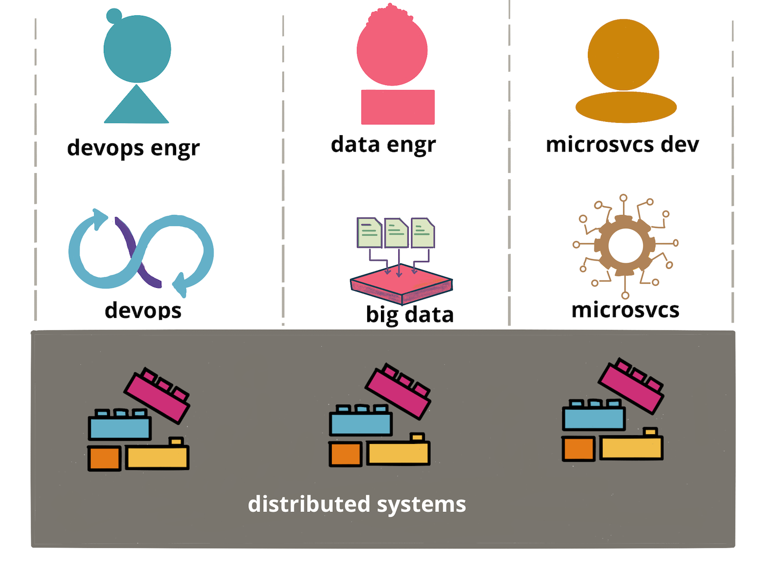
    IT trends get triggered by pivotal inventions that enable new business opportunities. Product providers and tool vendors quickly build products, and the industry focus often shifts to expertise in tools and frameworks rather than the underlying technical trends. For example, in the 1990s, when graphical-user-interface two-tier architectures were popular, the essential skill was mastering Object-Oriented Programming — its iterative, collaborative design — yet most attention centred on tools like Rational Rose, the C++ programming language, and frameworks such as Microsoft Foundation Classes. When the Web arrived, understanding Web architecture and global-scale caching was crucial, but early hype gravitated toward technologies like J2EE. In today’s cloud era, with complex microservice based architectures, big-data technologies, and expansive DevOps toolchains, the foundational discipline of distributed systems is often overlooked while certifications in specific tools dominate.

    One of the biggest problems with excessive focus on tools and framework expertise is when it is cemented into organizational structures. Teams and organisations get structured around tool expertise, with hardened boundaries making it difficult for people from one team to acquire skills from others. Beyond language preferences like Python or Java, you can see this crystallise in the three most common software verticals—Application Development, Data Engineering, and DevOps. Are labels like “Application Development,” “DevOps,” and “Data Engineer” just harmless shorthand for the work we do? Not really. Once these words harden into career lanes, they solidify the very silos that the Agile and DevOps culture was meant to dismantle. The labels become an organisational anti-pattern—turning flow into a series of hand-offs when it should be a cross-functional sprint. All three share the same distributed-systems foundations, and anyone who masters those fundamentals can navigate all three without getting lost in each vertical’s ever-growing toolset. An expert generalist recognizes this and makes the deliberate effort to master those fundamentals.

    Why does our attention keep drifting toward tool expertise? It isn’t because people are shortsighted or lazy; it’s because the fundamentals are hard to see amid the noise. Key ideas hide under stacks of product docs, YouTube tutorials, vendor blogs, and conference talks. At one end of the spectrum lie dense academic papers and university courses; at the other, vendor certifications tied to a single product. Connecting these dots — cutting through the surface to reach the essentials — takes deliberate effort. One proven aid is the language of patterns: reusable problem-solution pairs that capture the core principle without the brand labels. That’s why we belive in investing in exploring, distilling, and sharing such patterns — so the industry conversation can shift from “Which tool should I learn next?” to “Which underlying principles and patterns must I master?”

    In our experience, the good grasp of this common language of patterns and principles also strengthens the product-service partnership. Today the relationship is often one-way: product teams ship features, service teams consume APIs. Product teams decide how to certify an engineer as an expert in a product and service teams aim to do those certifications. Cloud providers and tool vendors often demand a certain number of “certified professionals” before they will recognise a service provider as a competent partner. Yet our experience shows little correlation between certifications and competence. The focus on fundamentals pays off when competence is most needed: an engineer versed in Raft can untangle a Kubernetes control-plane stall that might puzzle several certified admins, and a Delta Lake write anomaly can be resolved from first-principles reasoning about optimistic-concurrency control instead of searching vendor docs. Once developers across roles share the lingua franca of a system’s internals, the partnership becomes bidirectional — both sides can diagnose, propose, and refine solutions together. Better yet, the engineers who have a good grasp of the fundamentals are able to partner well with multiple product and platform teams, without needing to have product specific training for each product

    An Example Workshop: Breaking silos and building partnerships

    We’ve seen that we can grow the Expert Generalist skill through mentoring and exposure to varied ecosystems, but one of the consequences of recognizing Expert Generalist as a first-class skill is that we should provide training in a similar way that we do with specialist skills. Such training currently barely exists in our profession. We’ve begun to fill that gap with workshops that are deliberately focused on developing the Expert Generalist competence, and we think there should be more training along these lines.

    To help stimulate thinking about this, here’s the details of such a workshop, aimed at developers to connect Application Development, Data Engineering, and DevOps. The workshop views this work through a distributed systems lens, shifting attention to shared building blocks and establishing a common language across teams. Although this example is developer-centric, we think the same principle can be adapted just as effectively to any role that benefits from cross-disciplinary insight.

    As we saw earlier, each discipline—Application Development, Data Engineering, and DevOps—faces the same distributed-systems realities, yet we still lack a shared language. The key challenges of these systems are the same. They must replicate state, tolerate partial failures, and still offer consistency guarantees to end users. A catalogue of patterns around the implementation of partitioning, replication, consistency, and consensus—that lets every team talk about the fundamentals without tool-specific jargon is a good start. One workshop will not turn people into expert generalists, but it does give them a head-start and a clear window into the challenges their peers tackle every day. That visibility lowers the barrier to cross-discipline tasks and deepens everyone’s understanding of the products and platforms they use.

    The workshop structure – Building the miniature

    One of the challenges in teaching the abstract patterns is that the developers need to do some mental mapping to connect the pattern to the product in use. This is why we chose an approach to structure the workshops around specific products, but then focus on the patterns that are most relevant and using the product as a window into the broader concepts.

    The way we structured the workshops to teach distributed-system patterns, is by coding pocket versions of Kafka, Kubernetes, and Delta Lake. The idea is to pick a flagship product from each broad area of specialty, and build it step by step. Implementing a flagship system in just a few hundred lines flips your perspective from ‘a user’ of a product to ‘a builder’. An important mindset shift. To keep the exercise grounded in reality, write it in the product’s own language, mirror its file and method names, and rely on real infrastructure — ZooKeeper or etcd, an on-disk log, live sockets. The result stays close enough to the original to highlight the pivotal design choices while still giving you a safe canvas for experimentation. This approach is powerful, because each target is often open source, the moment the miniature works, you can open the full codebase on GitHub, recognise the directory structure, and feel confident submitting a patch. The miniature is not a toy; it is a gateway.

    We have three workshops, one for each of the three systems.

    Build Your Own Kafka — a miniature written in Java.

    We use ZooKeeper for membership and store every message in a single append-only log. Even on one node you meet the classic fsync dilemma: flush every write for safety or batch for speed. Add a second process and you’re suddenly faced with many decisions. You need partition leader election, quorum acknowledgements, an in-sync replica list, and a high-water-mark so consumers never read uncommitted data. (A cluster-wide controller comes later, once multiple partitions appear.) Each mechanism maps to a production feature in Kafka. After walking this code you recognise why a broker stalls when a replica slows and know exactly which metric to graph next time it happens. The takeaway pattern is simple: an append-only log guarded by quorum replication—a design you will encounter throughout modern distributed systems.

    Kubernetes from the Inside Out.

    Start by writing a controller that watches a JSON document in etcd, then calls reconcile() until the local Docker daemon reflects that desired state. Very quickly you have to choose how to list running containers, queue events, and keep spec and status distinct—exactly the concerns that dominate the Kubernetes code base. Add real failure cases and things get tricky. What should the controller do when a container exits? How does a Postgres container keep its data? Each decision forces you to reason about restart policies and persistent-volume claims. After that exercise, the dense Go structs in kube-controller-manager feel like natural continuations of a model you already understand. The core learning: the power of a declarative desired state converged by reconcile loops – the common pattern of orchestration in modern distributed systems

    ACID on Object Storage – A miniature Delta Lake.

    Create a directory of Parquet files and pair it with a text log; each data change appends a JSON file naming the new data file. Move this setup into a miniature object store and every append becomes its own key-value write, with the Parquet file as the value. To handle concurrent writers, wrap the append in an optimistic lock that retries if the log tail changes. After a dozen commits start-up drags, so you add a checkpoint file and learn first-hand why Delta Lake emits one every N transactions. From there, time-travel queries drop out naturally from the log-plus-checkpoint design. The key takeaway, achieving ACID guarantees on eventually consistent storage through an immutable transaction log, optimistic concurrency, and periodic checkpointing – a pattern vital for modern data lakehouses.

    Each miniature leaves you with a concrete pattern — append-only log, reconcile loop, optimistic commit—that travels well beyond the original context. When the next new tool arrives, you’ll recognise the pattern first and the product name second, which is precisely the habit that turns professionals into Expert Generalists.

    Expert Generalists still need Specialists

    While we’ve spent this article praising the Expert Generalist, we simultaneously do not deny the value of specialist knowledge. Even the most skilled Expert Generalist may have to spend valuable time figuring out the details of how to do something with a new platform. Their knowledge of common patterns helps them know what to look for, their skill helps them research faster, but it’s still longer than what a specialist already knows. Furthermore an Expert Generalist may miss a vital technique that’s particular to a domain, essentially because the Expert Generalist doesn’t know what they don’t know – a trap a specialist is far less likely to fall into. In our experience, a team of Expert Generalists without specialist knowledge of the core technology of their work will still get the job done, but will be significantly slower than a team with specialist skills on board.

    The point here is that to be the most efficient, the team needs some specialist skill. There needs to be at least one deep specialist on a team for any core technology that the team is working with. But we’ve found that, providing the team is collaborating effectively, we don’t need very many. Often one or maybe two people is quite enough.

    With someone with specialist knowledge present, a less knowledgeable Expert Generalist can quickly ask a question when they are faced with a task that needs the depth. Similarly the specialist should review the work of less knowledgeable colleagues, so they can spot when folks are taking the wrong path and show them the better way.

    We think it is important to have such a specialist available full-time on the team. Much of their value comes from being responsive to questions and issues as they come up. In this situation, the important cost to monitor is the Cost of Delay – the speed of resolving questions is much more important that the utilization of the specialists. So it’s worth having a full-time specialist even if it means they aren’t fully occupied.2

    2: This also indicates how to tell if you don’t have enough specialists on a team: measure how long it takes to answer questions. This follows Reinertsen’s advice to monitor queue sizes.

    All of this does need everyone involved to have right kind of collaborative attitudes. The specialist needs to be someone who is keen to share their knowledge with everyone else on the team, and is approachable with dumb questions. The Expert Generalists need be comfortable demonstrating their ignorance, and actually enjoy being told they are doing something wrong in an unfamiliar environment. All in all there needs to be plenty of psychological safety around.

    And, of course, the people with specialist skills can often be Expert Generalists themselves, with the specialty being legs in their T.

    The flip-side of this is the danger of teams that consist only of specialists. Things outside their specialty can easily be missed. For example a data engineering team that’s full of specialist data engineers can miss anything that isn’t specific to data engineering, such as quality strategy, release management, and value articulation.

    Expert Generalists in the Age of LLMs

    Large Language Models and tools based on LLMs are growing in prominence. We’ve observed that Expert Generalist capabilities are considerably more valuable with these LLMs. The relationship between Expert Generalists and LLMs is often similar to that between Expert Generalists and specialists in a team. Similarly to a specialist, an LLM can rapidly answer questions that an Expert Generalist will have when working in a new domain. This significantly lowers the barrier for exploring completely new and unfamiliar tools, offering a quick way to get started.

    An Expert Generalist, armed with a solid grasp of fundamentals and the knack to master principles and patterns, can truly harness the power of LLMs. They’re not just asking an LLM to write code in a new language; they’re able to ask more insightful questions, critically assess the AI-generated suggestions against their broader understanding, and adapt those suggestions to fit sound architectural patterns. Their curiosity discourages them from simply accepting an answer, but to understand how proposed solutions work – which is exactly the behavior needed to overcome the unreliability inherent in LLM-given advice.

    We’ve noticed that Expert Generalists approach working with LLMs in a different way. Rather than looking for “the answer”, they prompt them to generate questions, explaining mechanisms, and providing examples and even tools that help explore the underlying mechanisms of an idea.

    So, despite the early days of this technology, we think that the rise of LLMs will further enhance the importance of skilled Expert Generalists, and thus incentivize enterprises to put more effort into identifying, and training people with these skills.

    Why Organizations Need Expert Generalists

    The simplest reason why organizations should pay more attention to Expert Generalists is the loss of opportunities to staff teams. Finding exactly the right kind of specialist limits the candidate pool, either from hiring from outside, or by internal transfers. As long as there’s enough specialist skill available to assist, Expert Generalists often do as well, indeed often better, than adding another specialist.

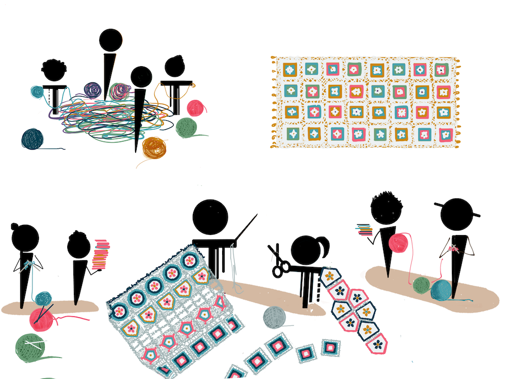
    But the benefits of Expert Generalists go further than that. Modern software systems involve many components, needing collaboration between specialties to deliver features to production. Too often we see stifled communication, with folks blocked while waiting on dependent teams to schedule necessary work. Lots of these queues between teams impedes flow, slowing down the release of valuable features.

    Expert Generalists can unplug the pipes. Sometimes they do this by making the interaction smoother due to their overlapping skills, sometimes they know enough to do some of these dependent tasks themselves. Indeed one of the greatest values an Expert Generalist brings is the ability to Get Things Done. The customer-focus drives a good Expert Generalist to use their collaborativeness, curiosity, and skills blend to drive features to completion. If it requires crossing competency boundaries, they will find a way to do it. If they need to rapidly acquire some deeper skills, they will do so. They do risk taking on more than they can chew in the process, but that ability to close the deal is often imperative in getting critical software out the door.

    Expert Generalists are particularly valuable at working across the specialist skill boundaries, handling interactions and filling in gaps.

    The ability to see complex systems across their full breadth can be essential when things go wrong. Faults are often not in the depth of a single technology, but in the implicit interactions between them. If specialists can’t see the whole picture, they easily miss what falls between the gaps.

    The presence of Expert Generalists crossing the competency boundaries can also increase knowledge transfer between competency groups, increasing everyone’s sympathy for related domains. This mechanism also encourages specialists to explore the Expert Generalist skill for themselves.

    Specialists tend to use their familiar tool in contexts where it doesn’t make sense. We can’t fault them for that, if you’ve never seen a screwdriver, you’ll naturally reach for a hammer first. Expert Generalists are more likely to pick appropriate tools. There is a risk there, of introducing too many tools into an environment. Sometimes it’s better to use a familiar-but-inferior tool, than to introduce a complicated tool for a narrow task that’s a burden once the Expert Generalist moves on. A wise Expert Generalist will take that factor into account.

    The broad view that Expert Generalist develops naturally leads them towards leadership roles. Crossing specialties encourages them to develop communication skills, particularly skills on explaining different disciplines to each other. Collaboration naturally grows relationships with key people around an organization. Customer-focus, Getting Things Done, build credibility with business leadership. Organizations that take deliberate steps to nurture Expert Generalists can reap the reward by growing technologists with a strategic perspective, without necessarily pushing them into management tracks.

    All that said, despite the fact that we are clearly big proponents of Expert Generalists, there are downsides. Perhaps the greatest is that although we’ve found it possible to assess people for their Expert Generalist skill, it’s a difficult task, often requiring intensive participation from known-capable Expert Generalists. Years on the job, quizzes, and certifications are much easier tests to administer (although we are cynical about how they relate to delivering value).

    A team full of Expert Generalists, but without particular skills for the central domains and platforms they are working on, will be less productive – at least until the Expert Generalists develop those skills. As we mentioned earlier, it’s important to have someone with those deep skills on the team, who can either be specialist in that domain or an Expert Generalist who has that as one of the legs in their “T”.

    All in all, we’ve seen so many of our colleagues develop their Expert Generalist skill, without the name, and build upon it to be critical parts of successful technology and business initiatives. They are the people we have learned from, the people our clients go to with problems to solve and opportunities to exploit. Our hope with this article is that more people in our profession (and perhaps others) will start to recognize “Expert Generalist” as a first-class skill, and put more effort in describing its characteristics, how to assess it, and how to grow it. We believe that giving this skill proper recognition can do much to improve the practice of our profession.

    Takeaways

    • Expert Generalists share several key traits
      • Curiosity
      • Collaborativeness
      • Customer-focus
      • Favoring fundamental knowledge
      • A blend of specialist and generalist skills
      • Sympathy for related domains
    • Teams should blend Expert Generalists with a few key specialists
    • Expert Generalist skills are enhanced by LLMs
    • Expert Generalists ensure complex tasks get done
    • We need to treat Expert Generalist as a first class skill
      • Evaluate people’s skill as an Expert Generalist in hiring and promotion
      • Develop training just as much as for specialist skills


    Source: Martin Fowler.

  • Recensione The Legend of Zelda: Breath of the Wild Nintendo Switch 2 Edition

    Recensione The Legend of Zelda: Breath of the Wild Nintendo Switch 2 Edition

    June 18, 2025
    Hardware

    Nintendo ha scelto di inaugurare la nuova generazione con uno dei suoi giochi più iconici: The Legend of Zelda: Breath of the Wild – Edizione Nintendo Switch 2, una versione potenziata dello storico titolo di lancio della prima Switch.

    Dopo aver passato decine di ore su Tears of the Kingdom, temevamo che tornare al predecessore potesse farlo sembrare ridotto o privo di profondità. Eppure, Breath of the Wild resta un’esperienza magistrale, capace di stupire ancora per la sua libertà, la sua eleganza e il suo mondo dinamico. Anche senza le meccaniche avanzate del seguito, continua a essere una delle opere più influenti e affascinanti mai realizzate da Nintendo.

    The Legend of Zelda: Breath of the Wild Nintendo Switch 2 Edition

    (Image credit: Nintendo)

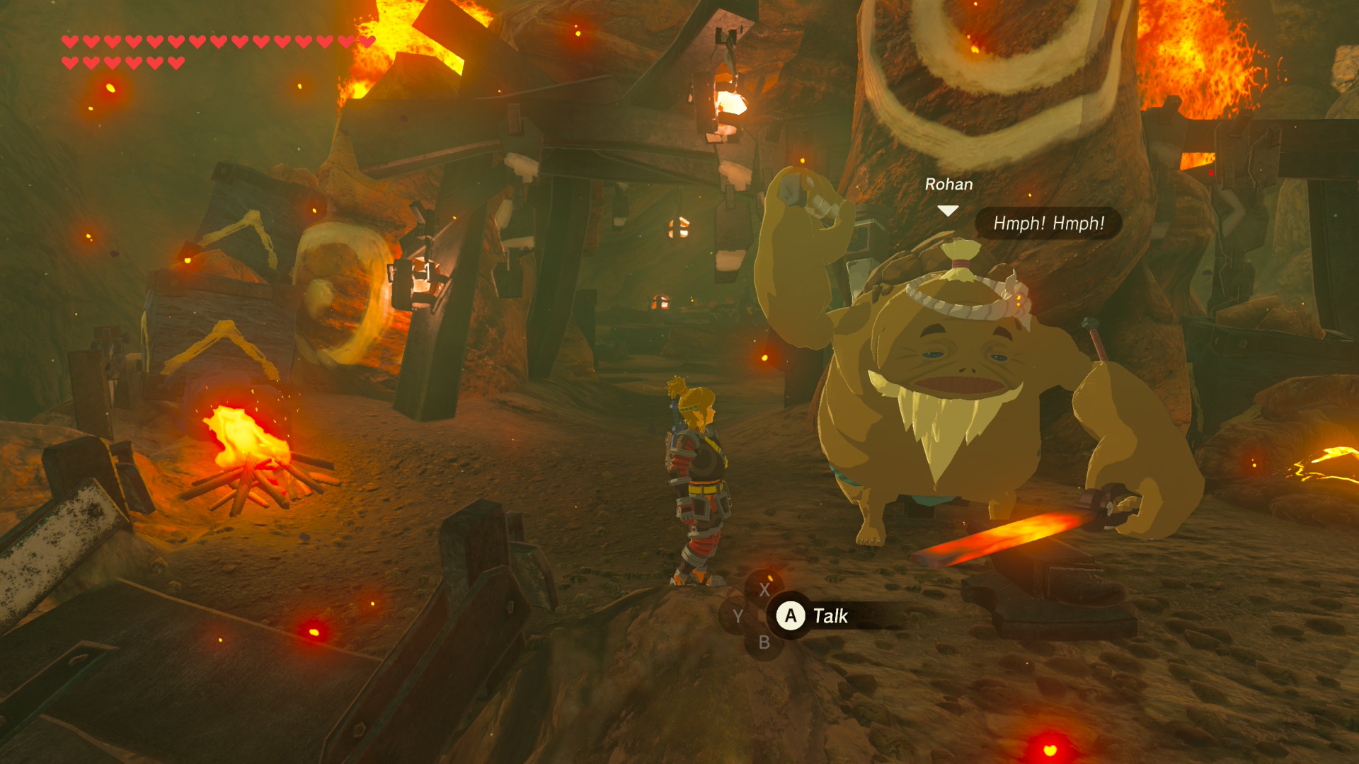
    Nonostante fosse il primo capitolo della saga a esplorare un vero open world in 3D, The Legend of Zelda: Breath of the Wild ha lasciato un’impronta indelebile nel medium. Dopo una brevissima introduzione, Nintendo lascia che siano i giocatori a scegliere il ritmo della propria avventura: si può andare subito a sfidare Ganon oppure perdersi per decine di ore tra montagne, deserti e villaggi, conoscendo la gente di Hyrule e risolvendo misteri sparsi ovunque.

    Questa libertà si estende anche alle meccaniche di gioco: sin dall’inizio vengono forniti strumenti semplici ma potenti, lasciando totale spazio alla creatività. Qualsiasi idea strampalata, far rotolare un albero su un accampamento nemico, lanciare una spada metallica durante un temporale per fulminare un mostro, usare una torretta laser come arma improvvisata, può funzionare. Ed è proprio questa sensazione di possibilità che ha reso il titolo così rivoluzionario.

    La tanto discussa durabilità delle armi è l’emblema di questo spirito: ogni oggetto si consuma, obbligando a reinventarsi costantemente. E in quel momento di necessità, spesso nascono le trovate più geniali. Anche a distanza di otto anni, pochi open world riescono ad avvicinarsi a un tale livello di libertà, coerenza e meraviglia.

    Cambiare marcia

    The Legend of Zelda: Breath of the Wild Nintendo Switch 2 Edition

    (Image credit: Nintendo)

    Certo, parliamo pur sempre di The Legend of Zelda: Breath of the Wild – Nintendo Switch 2 Edition. A differenza di altri giochi aggiornati per Switch 2, qui non c’è alcun contenuto inedito. Nemmeno i DLC già esistenti di Breath of the Wild sono inclusi nella versione completa del gioco.

    Sia Breath of the Wild che Tears of the Kingdom sono stati aggiornati esclusivamente sul piano tecnico per la nuova console. Un limite comprensibile, ma che viene parzialmente compensato dal fatto che entrambi i titoli sono inclusi nell’abbonamento Nintendo Switch Online + Pacchetto Aggiuntivo.

    Best bit

    The Legend of Zelda: Breath of the Wild Nintendo Switch 2 Edition

    (Image credit: Nintendo)

    Tuttavia, anche senza contenuti inediti, The Legend of Zelda: Breath of the Wild – Nintendo Switch 2 Edition vale pienamente l’upgrade. Il gioco gira ora a 1080p in modalità portatile e arriva fino a 4K in modalità dock, con supporto all’HDR che rende il mondo di Hyrule ancora più vivido e vibrante. Entrambe le modalità mantengono i 60fps stabili per tutta la durata dell’esperienza.

    Avviare Breath of the Wild e vederlo girare al doppio del framerate a cui si era abituati quasi stona… ma è un miglioramento davvero benvenuto. Naturalmente, la prima cosa che ho fatto una volta caricato il mio vecchio salvataggio (ora ci sono due slot disponibili, un’aggiunta utile ma anche un po’ deludente) è stata dirigermi subito alla famigerata Foresta dei Korogu, che nella versione originale metteva in ginocchio il framerate. Ebbene sì: adesso fila tutto liscio. Può sembrare banale su hardware più potente, ma chi ha sofferto quella zona su Wii U o Switch sa bene quanto cambi la percezione.

    Note it down

    The Legend of Zelda: Breath of the Wild Nintendo Switch 2 Edition

    (Image credit: Nintendo)

    Avevo detto che The Legend of Zelda: Breath of the Wild – Nintendo Switch 2 Edition non include nulla di nuovo nel gioco in sé, ma non è del tutto vero: c’è una novità nell’app Nintendo Switch Online, ovvero la funzione Zelda Notes. Si tratta di una companion app che aggiunge diverse funzionalità, come la possibilità di localizzare i sacrari rimanenti con una voce GPS che vi guida, o una ruota bonus giornaliera che può offrirvi ricompense casuali come pasti gratuiti, salute piena o addirittura la riparazione delle armi.

    La parte più interessante, però, sono i cosiddetti ‘Ricordi Vocali’. Sono sparsi in oltre 100 punti della mappa, e camminandoci vicino si attiverà un messaggio audio di Zelda, ambientato 100 anni prima degli eventi del gioco, durante i preparativi per la Calamità. Sono piccoli ma preziosi approfondimenti di lore che rendono l’esplorazione di Hyrule ancora più coinvolgente. Certo, sarebbe stato molto meglio averli integrati direttamente nel gioco, anziché dover tenere il telefono acceso di continuo.

    In definitiva, Breath of the Wild – Nintendo Switch 2 Edition è un aggiornamento solido, seppur essenziale, di un capolavoro. Il boost a framerate e risoluzione lo rende consigliatissimo, soprattutto se non l’avete mai giocato. Chi però spera in contenuti nuovi potrebbe restare deluso, a meno che non sia disposto a sfruttare Zelda Notes… con il cellulare in mano.

    Perché giocare a The Legend of Zelda: Breath of the Wild Nintendo Switch 2 Edition?

    Ragioni per giocare

    Non avete mai giocato Breath of the Wild o volete rigiocarlo

    Non c’è davvero alcun motivo per tornare alla versione originale su Nintendo Switch o Wii U, se avete accesso a The Legend of Zelda: Breath of the Wild – Nintendo Switch 2 Edition. Il frame rate raddoppiato e le migliorie visive rendono questa la versione definitiva del gioco, senza alcun dubbio.

    Vi appassiona la lore di Zelda

    Sembra incredibile, ma l’app mobile Zelda Notes è davvero un’aggiunta eccellente. I Ricordi Vocali arricchiscono l’esplorazione con momenti narrati da Zelda stessa, raccontando eventi e luoghi vissuti prima del risveglio di Link. Un modo inedito e coinvolgente per immergersi nella storia di Hyrule.

    Ragioni per NON giocare

    Non avete una Switch 2

    Anche se questa è senza dubbio la versione migliore del gioco, The Legend of Zelda: Breath of the Wild – Nintendo Switch 2 Edition non rappresenta un salto così rivoluzionario da giustificare l’acquisto immediato della nuova console solo per giocarci.

    Accessibilità

    The Legend of Zelda: Breath of the Wild – Nintendo Switch 2 Edition non introduce miglioramenti significativi sul fronte dell’accessibilità. Rimangono disponibili il mirino tramite giroscopio e il remapping dei comandi tramite il menu della console, ma i prompt a schermo non si aggiornano di conseguenza, rendendo l’esperienza poco intuitiva. In sostanza, nessuna novità degna di nota per chi cerca opzioni più accessibili.


    Source: Latest from TechRadar IT-IT in Reviews.

  • LibreOffice Tested as Possible Office 365 Alternative

    June 16, 2025
    Software

    This original story has been updated because the quoted source, Politiken, was misinformed about the situation. 

    The Danish Ministry of Digital Affairs is only testing the possibility of migrating from Office 365 to LibreOffice and is not looking to ditch Windows for Linux. 

    The original Politiken article now includes the following passage: “Clarification: In an earlier version of this article, it was stated that the Ministry of Digital Affairs would replace the Windows operating system with Linux and be free of Microsoft by the fall. This is not correct. That statement has therefore been removed. The ministry will only replace Office 365 with LibreOffice.”

    As first reported by Politiken, Denmark is poised to make a major change with regard to the software it uses. The move is happening because Denmark’s Minister for Digital Affairs, Caroline Stage Olsen, indicates that Denmark wants to have control over its data and systems.

    According to Jan Damsgaard, head of the Department of Digitalization at Copenhagen Business School, “Denmark, as the most digitised country in the world, is completely dependent on American tech companies, and that is clearly not a sustainable situation.” He continues, “I think it’s very good that the digitalisation ministry is among those to try out these open source systems.”

    Copenhagen (Denmark’s capital) had already planned on cutting ties with Microsoft, because of concerns that political fallout could lead to the inability to send emails or communicate internally.

    Copenhagen isn’t the only town planning on making the shift. Aarhus (the second largest city in Denmark) also plans to make the move.

    Of course, the Ministry of Digital Affairs does have a backup plan to revert to Microsoft products if the migration proves too complicated.


    Source: Linux Magazine News (path: lmi_news).

  • Recensione Bravely Default Flying Fairy HD Remaster

    Recensione Bravely Default Flying Fairy HD Remaster

    June 16, 2025
    Hardware

    Bravely Default Flying Fairy HD Remaster è uno dei titoli più insoliti del lancio di Nintendo Switch 2: un vero e proprio reperto videoludico che, proprio grazie alla sua natura immutata, riesce ancora oggi a divertire. Rimasto pressoché identico alla versione originale per 3DS, è una capsula del tempo che ci ricorda perché abbiamo amato certi JRPG. Ostinato nel non voler cambiare, ma proprio per questo rassicurante e ancora sorprendentemente efficace.

    Come ricordato dal produttore Tomoya Asano prima dell’uscita della remaster, Bravely Default nacque come omaggio ai grandi RPG dell’era 16-bit. Il suo successo, in patria e all’estero, ha dato il via alla linea HD-2D di Square Enix, che ha poi prodotto Octopath Traveler e il remake di Dragon Quest III. L’impronta è chiara: siamo davanti a un gioco che riprende lo spirito dei classici Final Fantasy, con un viaggio epico attraverso il mondo per salvare i cristalli, tra villaggi minacciati e divinità in pericolo.

    Tutto ha inizio con una voragine che inghiotte il villaggio di Norende, lasciando in vita solo Tiz. I cristalli che regolano il mondo sono stati oscurati, ma quando Tiz incontra la Vestale del Vento Agnes Oblige, parte con lei per proteggerla e cercare un modo per risvegliare i cristalli. A loro si uniscono presto Edea Lee e l’enigmatico Ringabel, formando il classico quartetto di eroi della luce.

    Il gameplay è un RPG a turni, arricchito da un job system profondo e soprattutto da un’idea chiave: le meccaniche Brave e Default, che aggiungono tensione e strategia agli scontri. Brave consente di agire più volte a costo di punti azione (BP), ma lasciando poi il personaggio scoperto per alcuni turni. Default invece fa guadagnare BP difendendosi, aprendo la porta a contrattacchi devastanti pianificati con cura. Ancora oggi, questo sistema rimane tra i più interessanti della storia recente del genere.

    Bravely Default Flying Fairy HD Remaster

    (Image credit: Square Enix)

    Imparatevi a pianificare bene: i combattimenti contro i boss si vincono solo sfruttando a fondo il sistema Brave/Default e la varietà dei mestieri. Le classi spaziano da quelle più tradizionali – come maghi, ladri e cavalieri – a ruoli più insoliti come il mercante, ognuno con le proprie abilità uniche.

    La forza del sistema sta nella possibilità di combinare abilità da mestieri diversi: padroneggiando una classe, potrete trasferire alcune tecniche in un’altra, creando personaggi ibridi con strategie uniche. Un mago con la rapidità di un ladro, o un cavaliere con poteri curativi: tutto diventa possibile e incoraggia la creatività.

    Il classico rischio degli RPG a turni, la monotonia, viene arginato con strumenti intelligenti. Se sentite il bisogno di livellare o guadagnare denaro, potete impostare azioni automatiche, accelerare la velocità delle battaglie o regolare la frequenza degli incontri. Un approccio moderno a un’anima profondamente classica.

    Bravely Default Flying Fairy HD Remaster

    (Image credit: Square Enix)

    È difficile trovare veri difetti in Bravely Default Flying Fairy HD Remaster. All’epoca fu considerato uno dei migliori RPG per Nintendo 3DS, e questa riedizione non fa che confermare quel giudizio. Il cast è ancora brillante, la scrittura conserva fascino e umorismo, e il sistema di combattimento resta uno dei più appaganti mai visti in un JRPG a turni.

    Quasi nulla è stato cambiato. I modelli dei personaggi e il mondo di gioco sono gli stessi asset 3D low-poly dell’originale, con qualche texture migliorata qua e là. Il tempo passato si nota soprattutto nelle animazioni rigide e nella modellazione meno curata dei personaggi secondari. Tuttavia, l’incredibile stile artistico del gioco continua a reggere benissimo l’ingrandimento su schermi moderni: villaggi e ambientazioni hanno ancora oggi una bellezza fiabesca e riconoscibile.

    Qualche nuova aggiunta

    Bravely Default Flying Fairy HD Remaster

    (Image credit: Square Enix)

    Le vere novità di Bravely Default Flying Fairy HD Remaster sembrano più dettate dalla necessità che da una reale volontà di arricchire l’esperienza originale. Il gioco su 3DS faceva ampio uso delle funzionalità di rete e del StreetPass per inviare aiuti in battaglia e condividere abilità con altri giocatori. Su Switch 2, tutto questo è stato adattato con poca eleganza: l’incontro spontaneo con altri utenti è stato rimpiazzato da “fantasmi” in città, un compromesso che toglie molto del fascino sociale dell’originale.

    I due minigiochi inediti, invece, sembrano aggiunti solo per sfruttare i controlli touch della console e dare una parvenza di esclusività. Luxencheer Rhythm Catch è un rhythm game basilare con qualche brano iconico e animazioni carine, ma risulta poco coinvolgente. Ringabel’s Panic Cruise, invece, ha idee più intriganti: si guida un’aeronave reagendo a comandi fisici come leve e fischietti. Potrebbe essere la base per qualcosa di più, ma in questa forma sembra più una demo tecnica che una vera aggiunta ludica. Entrambi sono relegati a sottosezioni del menu, e probabilmente dimenticati in fretta.

    Bravely Default Flying Fairy HD Remaster

    (Image credit: Square Enix)

    Tolti i minigiochi e un paio di migliorie marginali, Bravely Default Flying Fairy HD Remaster è praticamente identico all’originale per Nintendo 3DS. Nessuna nuova traduzione, nessuna rivoluzione strutturale: solo qualche comodità in più e l’adattamento da doppio a singolo schermo. E va bene così.

    Anzi, è proprio questa fedeltà a renderlo speciale nel panorama attuale. In un’epoca in cui i remake spesso snaturano i titoli originali, Flying Fairy HD Remaster resta ancorato alla sua identità, offrendo un JRPG classico, profondo e ben scritto a una nuova generazione. Chi l’ha già giocato forse farà fatica a trovare un motivo per tornare, ma per tutti gli altri è un’occasione perfetta per riscoprire uno dei migliori giochi di ruolo degli ultimi 15 anni, oggi disponibile tanto sul grande schermo quanto in modalità portatile.

    Perché giocare a Bravely Default Flying Fairy HD Remaster?

    Bravely Default Flying Fairy HD Remaster

    (Image credit: Square Enix)

    Ragioni per giocarci

    Non avete mai provato l’originale

    Un’avventura che omaggia i classici ma li rielabora con uno stile unico: Bravely Default resta uno dei migliori JRPG degli ultimi 15 anni, senza perdere un briciolo di fascino

    Adorate pianificare ogni mossa

    Qui non basta attaccare a testa bassa: ogni boss può mettervi al tappeto se non pensate in anticipo. La combinazione tra sistema di turni e classi vi costringe a giocare d’astuzia, sempre.

    Vi innamorate delle storie e dei personaggi

    Il gruppo di protagonisti è irresistibile: battute, dinamiche e momenti toccanti rendono il viaggio un piacere continuo. La loro alchimia è il cuore pulsante del gioco.

    Ragioni per NON giocarci

    Avete già giocato l’originale e cercate novità

    Se conoscete Bravely Default a memoria, qui troverete lo stesso identico gioco. È sempre un piacere da rigiocare, ma non aspettatevi nuove sorprese o contenuti inediti.

    Volete sfruttare al massimo la vostra nuova Switch 2

    Questo è pur sempre un titolo nato su Nintendo 3DS, con pochissimi ritocchi grafici e due minigiochi minori come aggiunte. Non è il gioco che vi farà scoprire di cosa è capace la nuova console.

    Accessibilità

    Sebbene Bravely Default Flying Fairy HD Remaster consenta di modificare lingua e sottotitoli, e offra un minimo supporto al remapping dei tasti a livello hardware (solo con Switch 2 Charging Grip o Pro Controller), non include alcuna funzione di accessibilità avanzata. Mancano opzioni essenziali come una modalità daltonismo o impostazioni visive dedicate.


    Source: Latest from TechRadar IT-IT in Reviews.

  • Recensione Canon PowerShot V1

    Recensione Canon PowerShot V1

    June 16, 2025
    Hardware

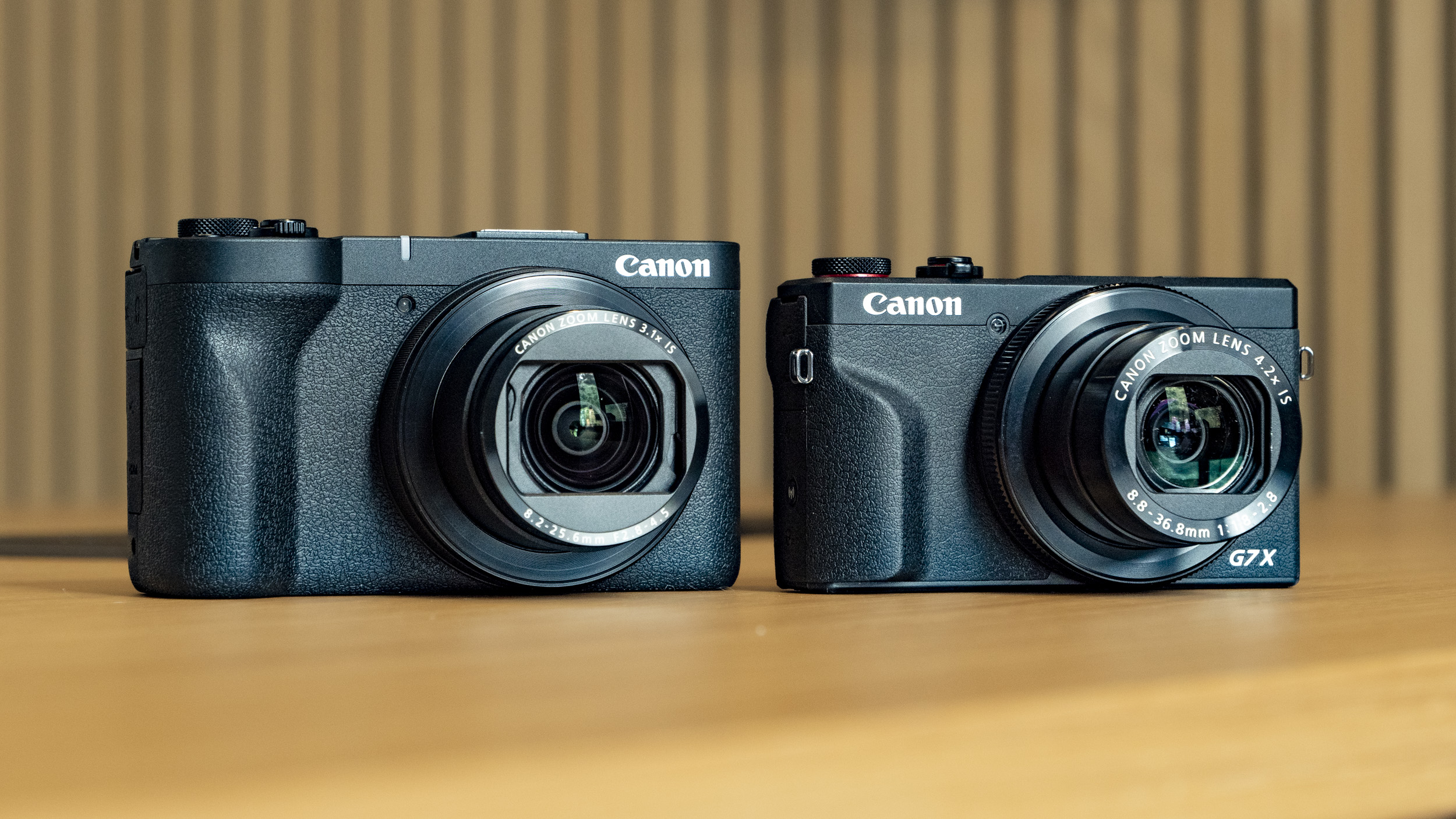
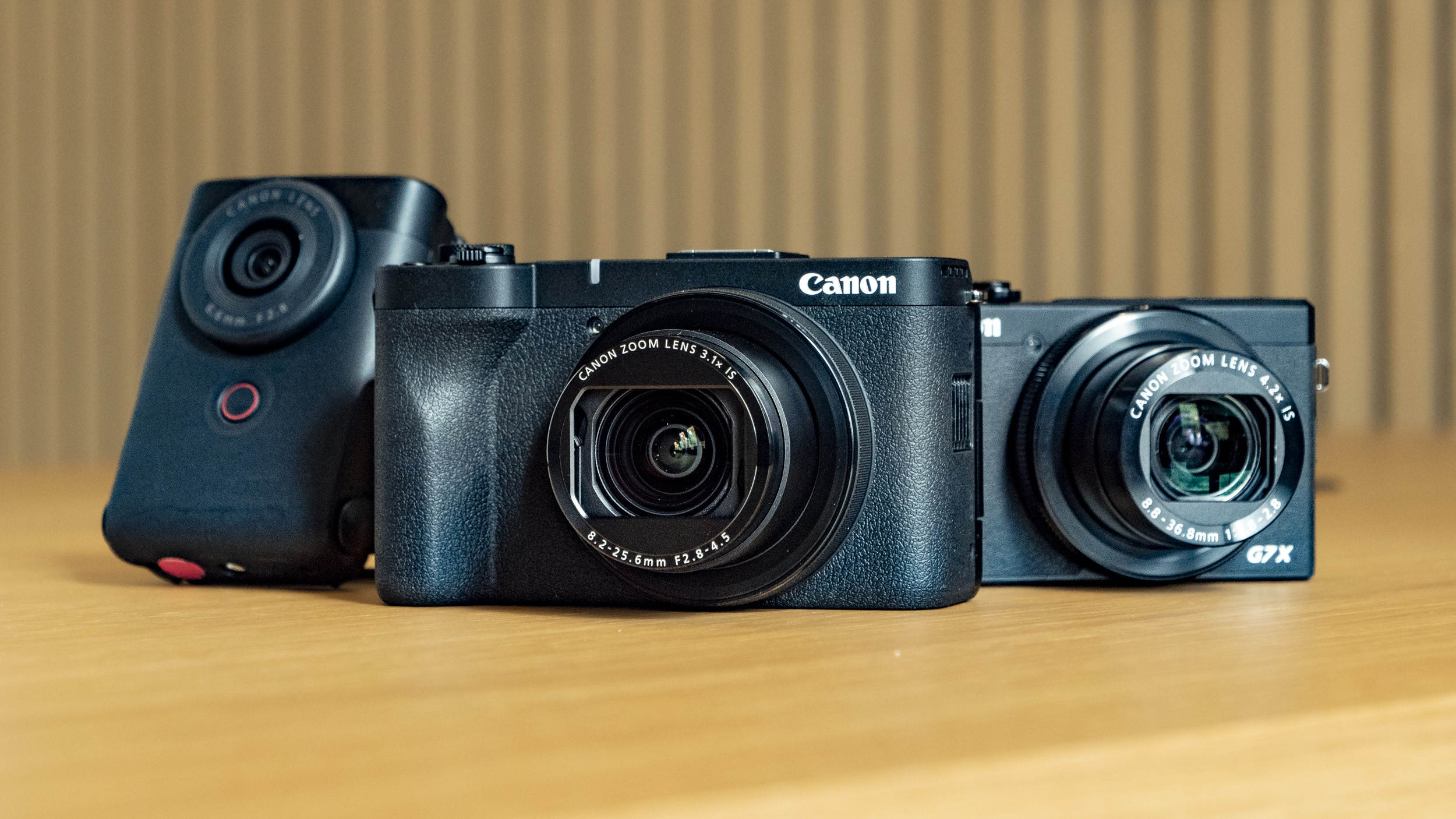
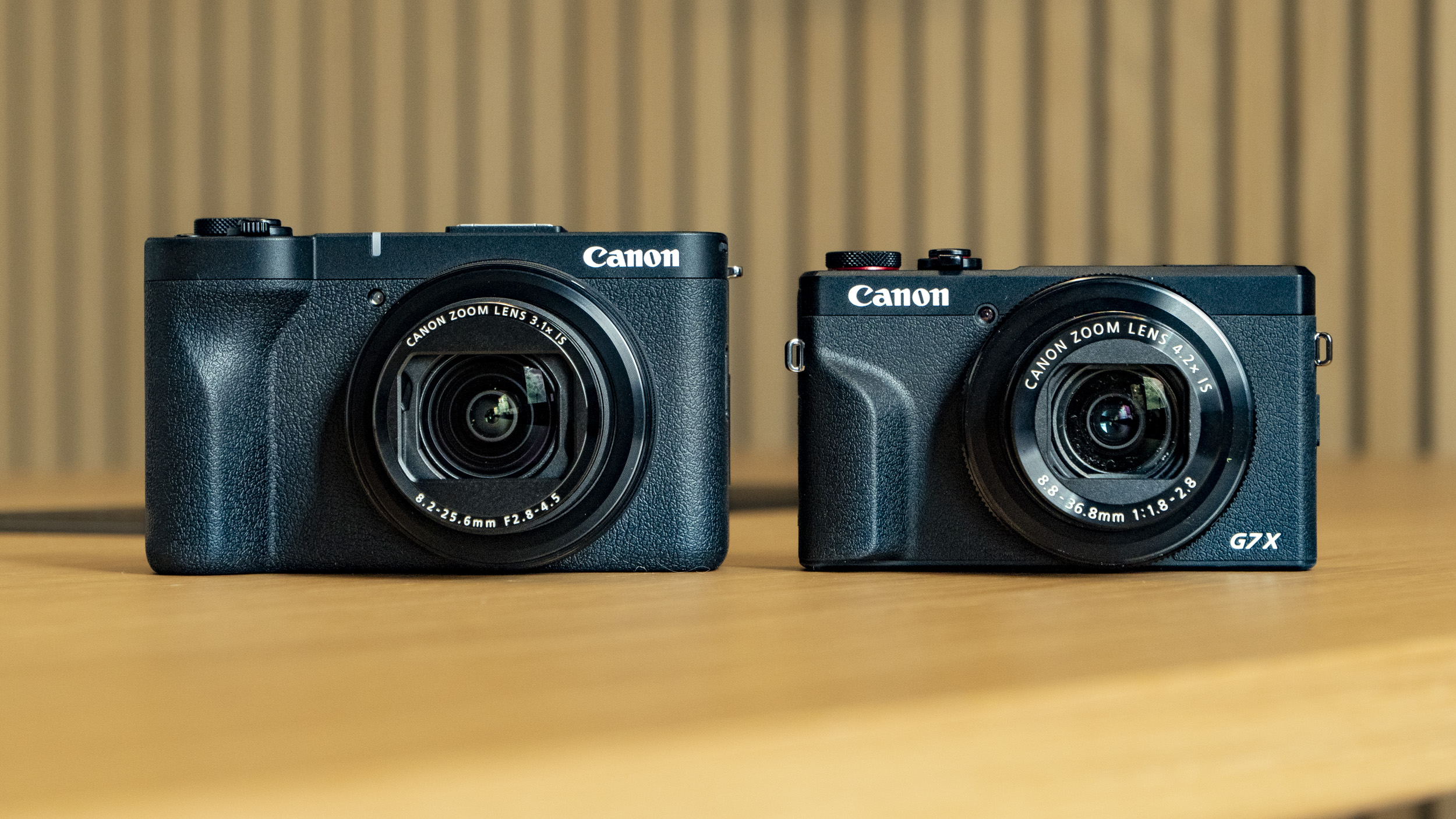
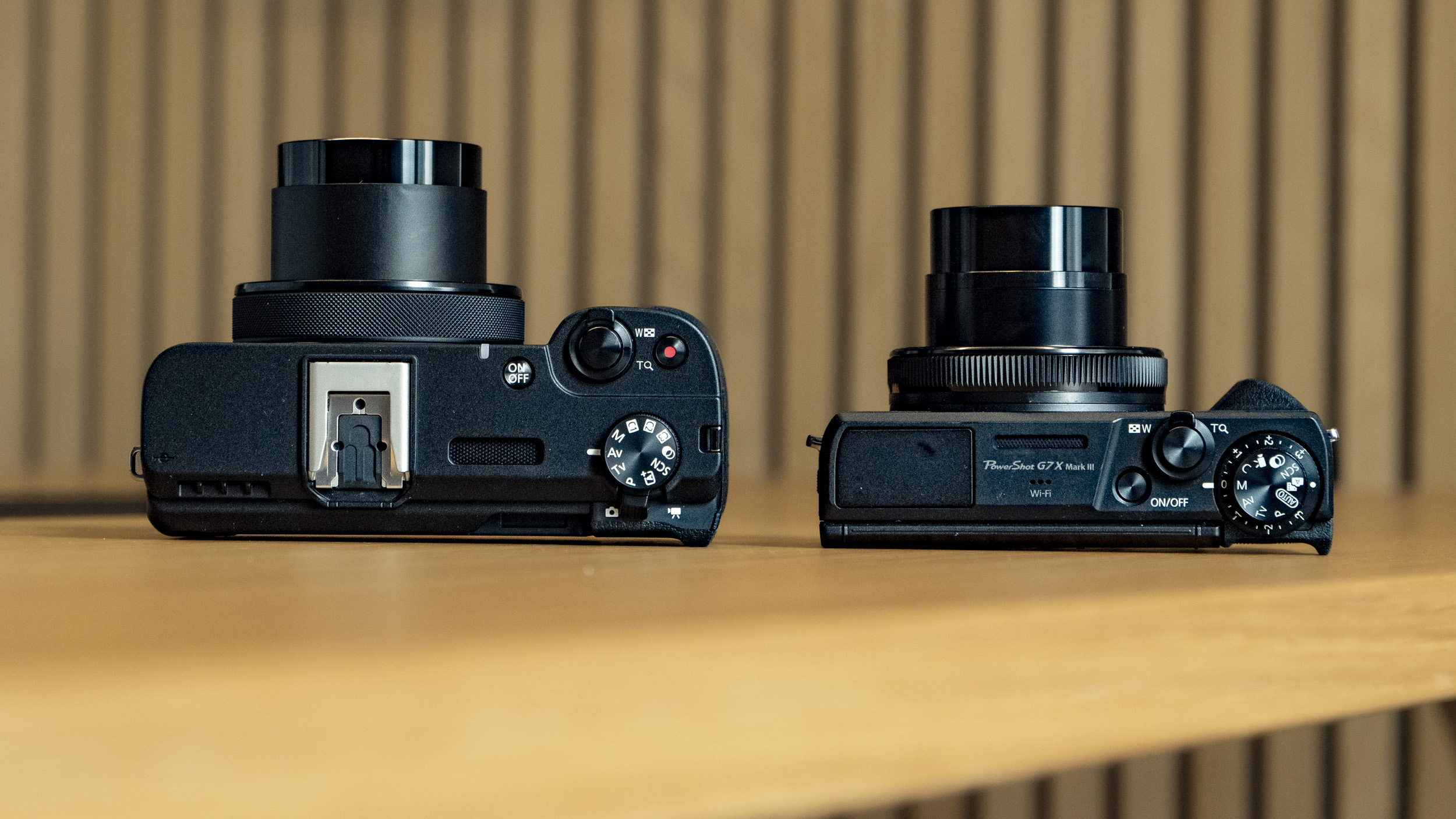
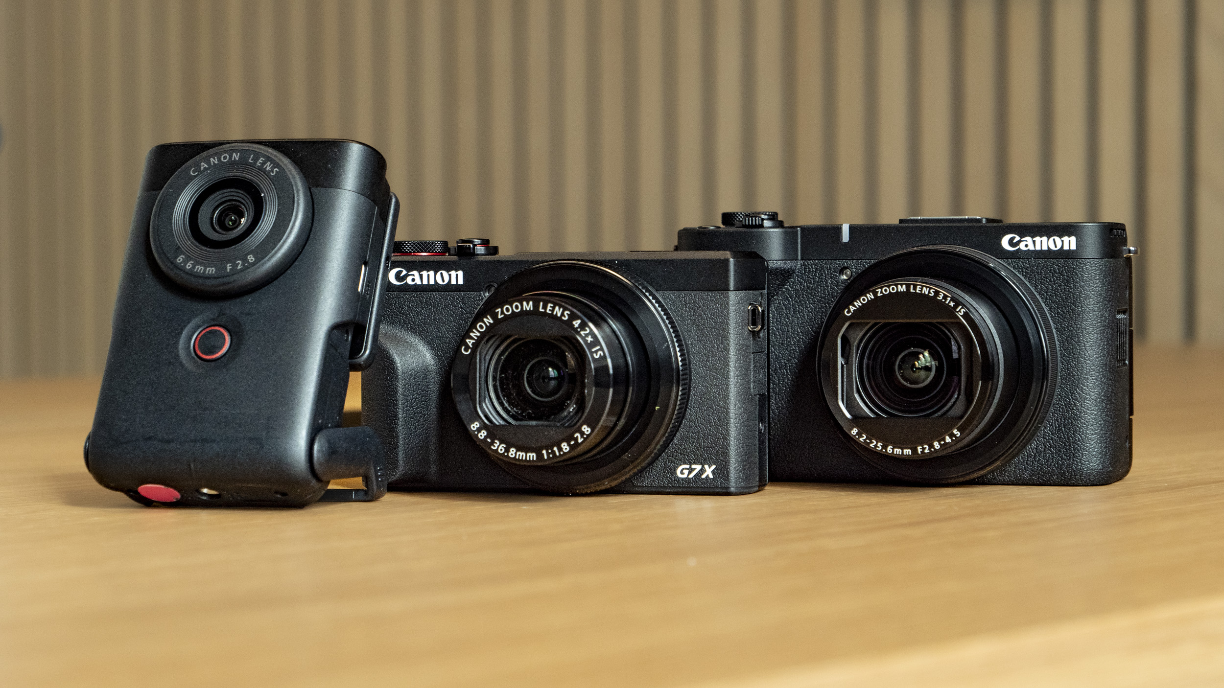
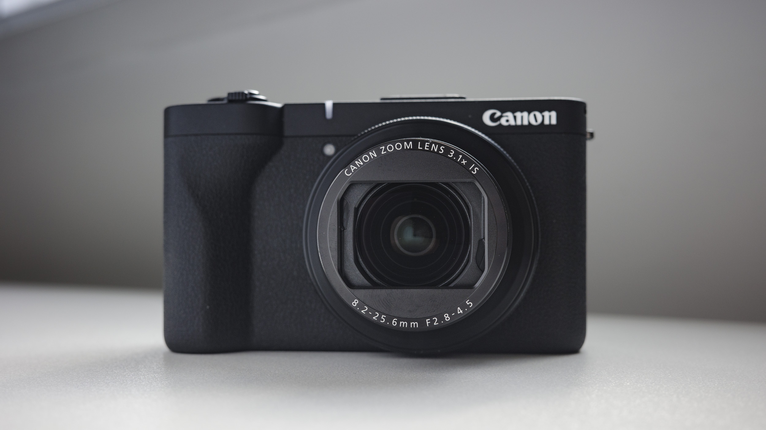
    C’è molta curiosità intorno alla nuova PowerShot V1, una compatta della serie V pensata per il vlogging che si presenta come una sorta di sorella maggiore della più datata ma ancora popolare PowerShot G7X Mark III, grazie a un sensore da 1,4 pollici completamente inedito e a un obiettivo 16-50mm. Affiancando le due fotocamere, le somiglianze nel design e nella disposizione dei comandi sono evidenti: entrambe sono compatte tascabili, ma la V1 è leggermente più grande e offre una dotazione video molto convincente. Il confronto più diretto è con la Sony ZV-1 II, ma anche la DJI Osmo Pocket 3 rappresenta un’alternativa interessante con stabilizzazione su gimbal. In molti casi, però, la V1 si impone come una scelta più equilibrata.

    Tra le specifiche principali spicca il sensore da 22,3MP in formato 3:2, che misura 18,4 x 12,3 mm – una superficie ben più ampia rispetto al classico sensore da 1 pollice (13,2 x 8,8 mm) montato dalle rivali. In teoria, un sensore più grande garantisce una qualità d’immagine superiore, ma c’è un compromesso: l’obiettivo zoom 3,1x della PowerShot V1 ha un’apertura massima di f/2.8-4.5, meno luminosa rispetto a quella della ZV-1 II (f/1.8-4) o della stessa G7X Mark III (f/1.8-2.8). Questo limita un po’ le prestazioni in condizioni di scarsa luce, riducendo in parte il vantaggio offerto dal sensore più grande.

    Resta comunque un obiettivo molto versatile, il più ampio del gruppo, e il suo range 16-50mm è perfetto per il vlogging. Anche attivando la stabilizzazione digitale, che comporta un piccolo crop dell’immagine, l’inquadratura rimane sufficientemente ampia da permettere riprese a braccio: quei 2 mm in più sul lato grandangolo fanno davvero la differenza.

    Image 1 of 2

    Canon PowerShot V1 compact vlogging camera on a wooden desk alongside the PowerShot G7X Mark III

    (Image credit: Tim Coleman)
    Image 2 of 2

    Canon PowerShot V1 compact vlogging camera on a wooden desk alongside the PowerShot G7X Mark III and PowerShot V10

    (Image credit: Tim Coleman)

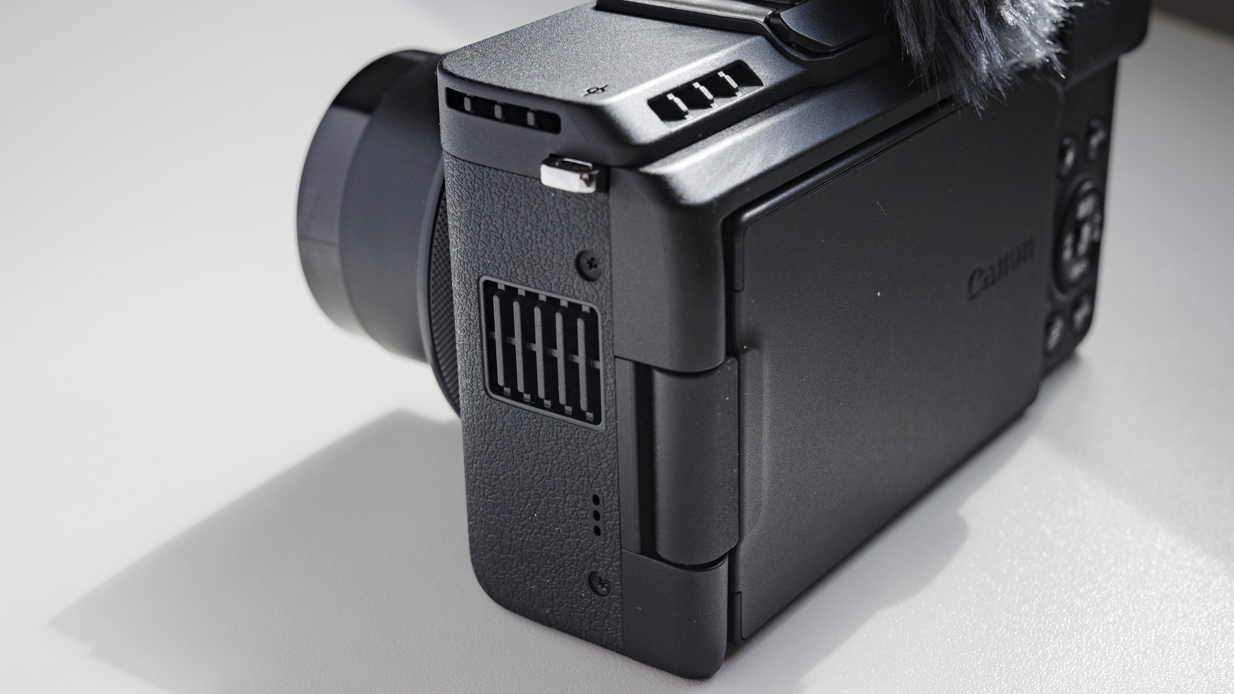
    La PowerShot V1 offre una dotazione video completa, che include feritoie di raffreddamento per registrazioni illimitate in 4K a 30fps, filtro ND integrato, il miglior autofocus mai visto su una compatta PowerShot e ingressi per microfono e cuffie. Anche i fotografi non resteranno delusi: la slitta hotshoe supporta flash esterni (esclusi quelli a 5 pin), mentre la raffica di scatto arriva a 15fps e raddoppia con l’otturatore elettronico, sempre assistita da un autofocus preciso con tracking del soggetto.

    Girando in 4K a 60fps, però, bisogna accettare due compromessi: l’assenza di stabilizzazione e un crop dell’immagine di 1,4x. Su carta sembrano limiti notevoli, ma grazie al grandangolo da 16mm ho potuto comunque gestire le riprese a mano libera senza perdere l’inquadratura. Il discorso è diverso per la stabilizzazione: chi registra vlog camminando farebbe meglio a scendere a 30 o 24fps per mantenere il video più fluido.

    Al netto di questi aspetti, la PowerShot V1 si conferma una fotocamera solida e convincente. Considerando il prezzo competitivo e alcune funzioni superiori persino a quelle della concorrenza Sony, ha tutte le carte in regola per diventare un nuovo punto di riferimento per i vlogger.

    Canon PowerShot V1 specifiche

    Canon PowerShot V1 specifiche

    Tipologia:

    Camera compatta

    Sensori:

    1.4-pollici, 22.3MP

    Lunghezza focale:

    16-50mm

    Apertura massima:

    f/2.8-4.5

    Dimensioni:

    118.3 x 68 x 45.2mm

    Peso:

    15oz / 426g

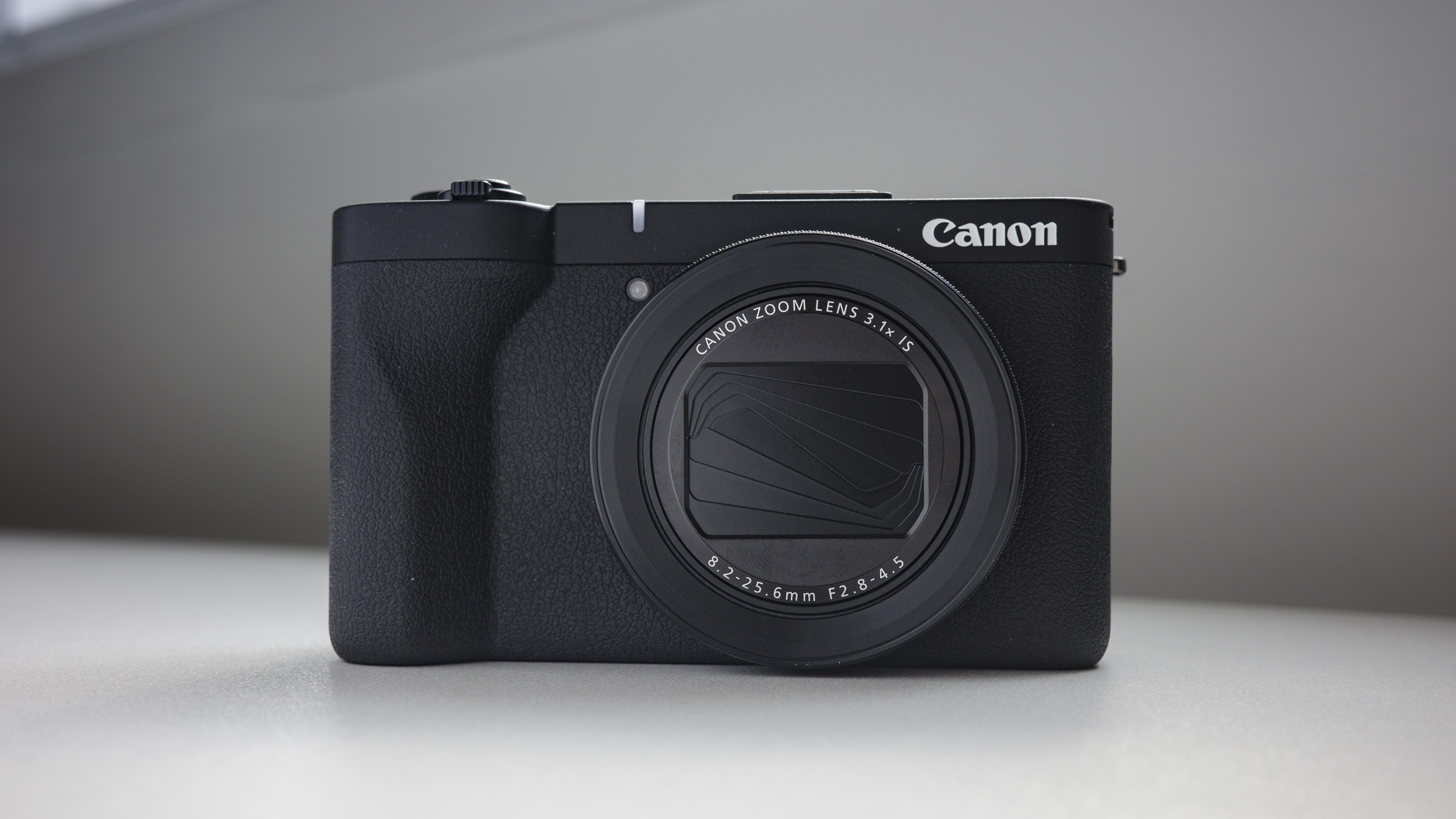
    Canon PowerShot V1 compact vlogging camera on a white desk

    (Image credit: Tim Coleman)

    Canon PowerShot V1: Prezzo e disponibilità

    La Canon PowerShot V1 ha debuttato sul mercato italiano a un prezzo di 1.049 €, al lancio disponibile tramite i rivenditori autorizzati.

    La sua dotazione ricca di funzioni video e il form factor pocket-friendly la posizionano come un’alternativa valida a tante opzioni “da creator”.

    • Prezzo: 4/5

    Canon PowerShot V1: Design

    Canon ha realizzato una compatta solida e ben bilanciata, progettata con una chiara priorità verso il video. Il design e la disposizione dei comandi ricordano da vicino quelli della PowerShot G7X Mark III, ma su una scala più ampia che ha permesso di introdurre elementi aggiuntivi come la slitta hotshoe, lo schermo orientabile e, naturalmente, il sensore più grande.

    Questa impronta spiccatamente “video-centrica” si riflette però anche in alcune assenze evidenti: mancano sia il mirino elettronico sia il flash integrato, due caratteristiche che ci si potrebbe aspettare in una compatta di fascia medio-alta.

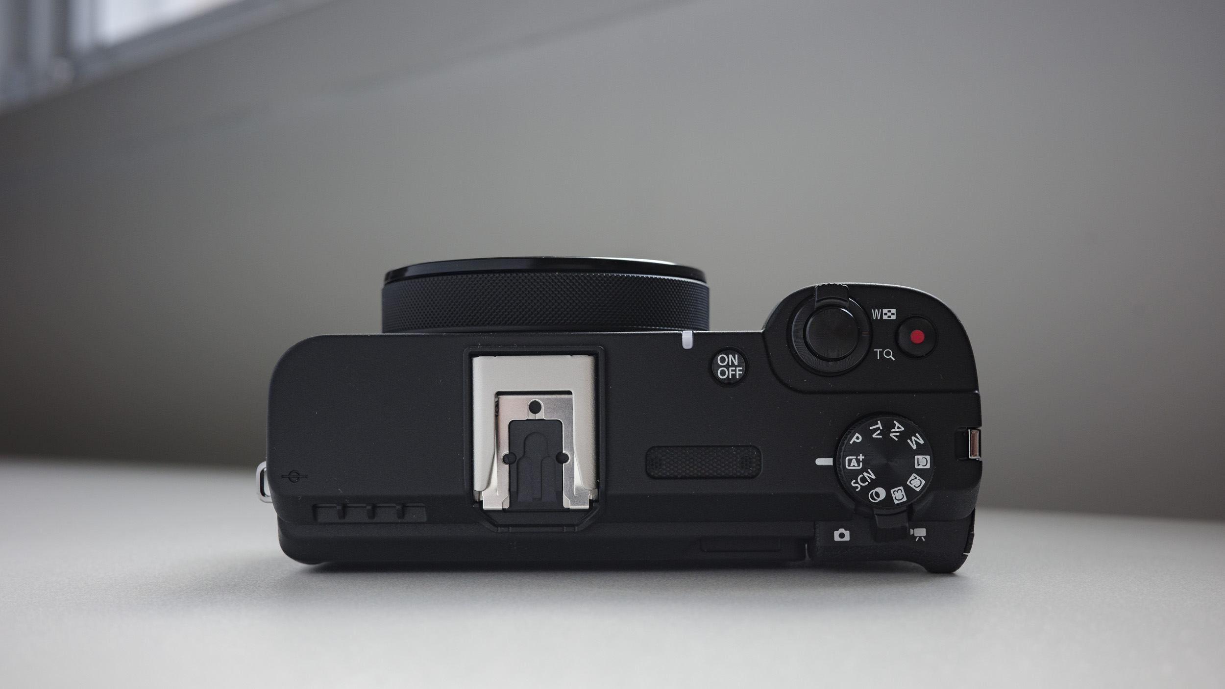
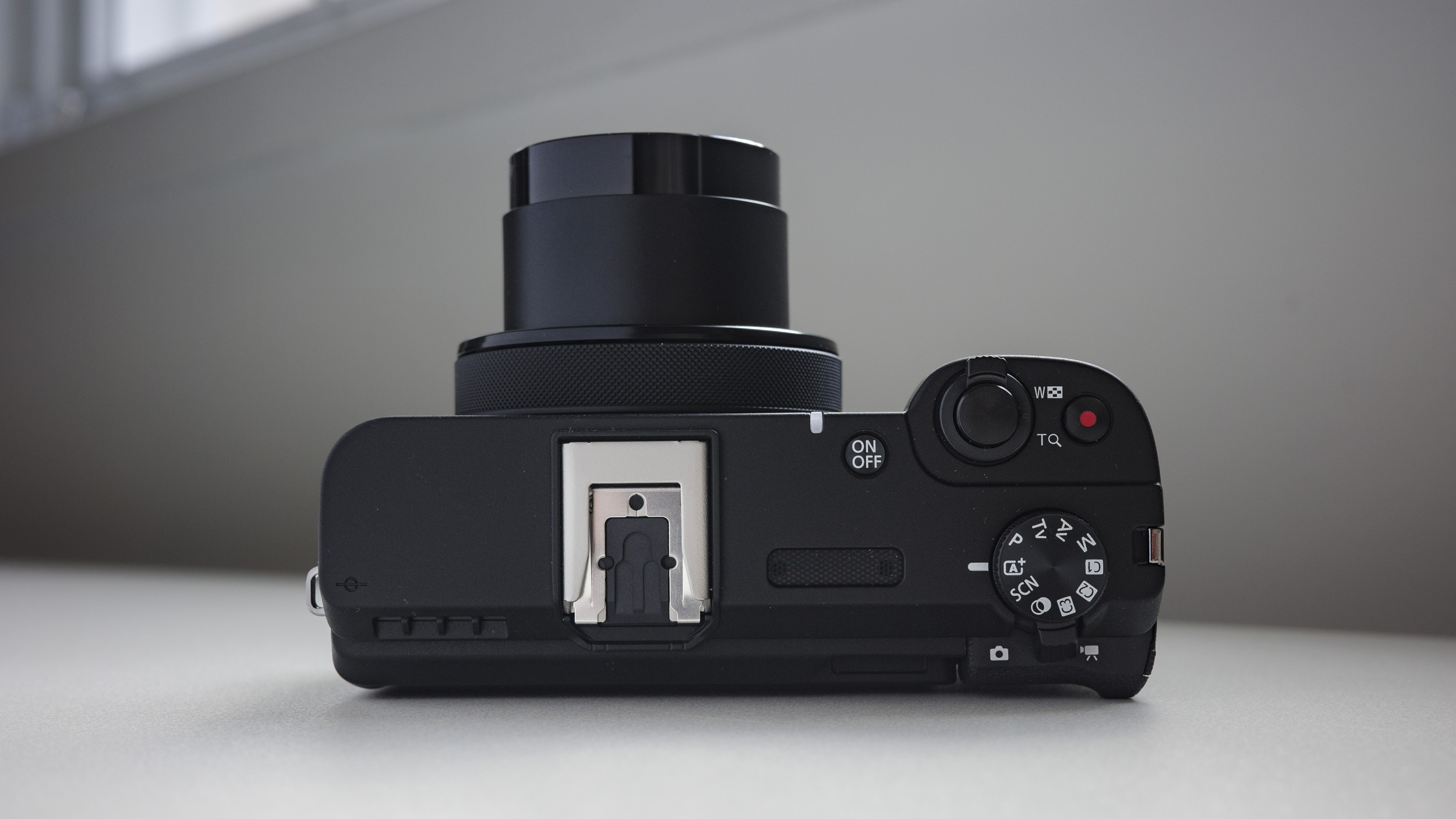
    La macchina si impugna bene grazie al generoso grip frontale, e offre numerosi pulsanti e comandi personalizzabili. Merita una menzione il selettore sull’obiettivo, perfetto per modificare rapidamente l’apertura o altri parametri, e l’interruttore posteriore che consente di passare al volo dalla modalità foto a quella video.

    Nel complesso, la PowerShot V1 è risultata intuitiva da usare grazie a controlli ben etichettati e a un’interfaccia ordinata. L’unico vero neo riguarda la modalità slow-motion, nascosta in profondità nei menu: una scelta poco coerente con il target, considerando che altri produttori la rendono accessibile direttamente da una ghiera fisica.

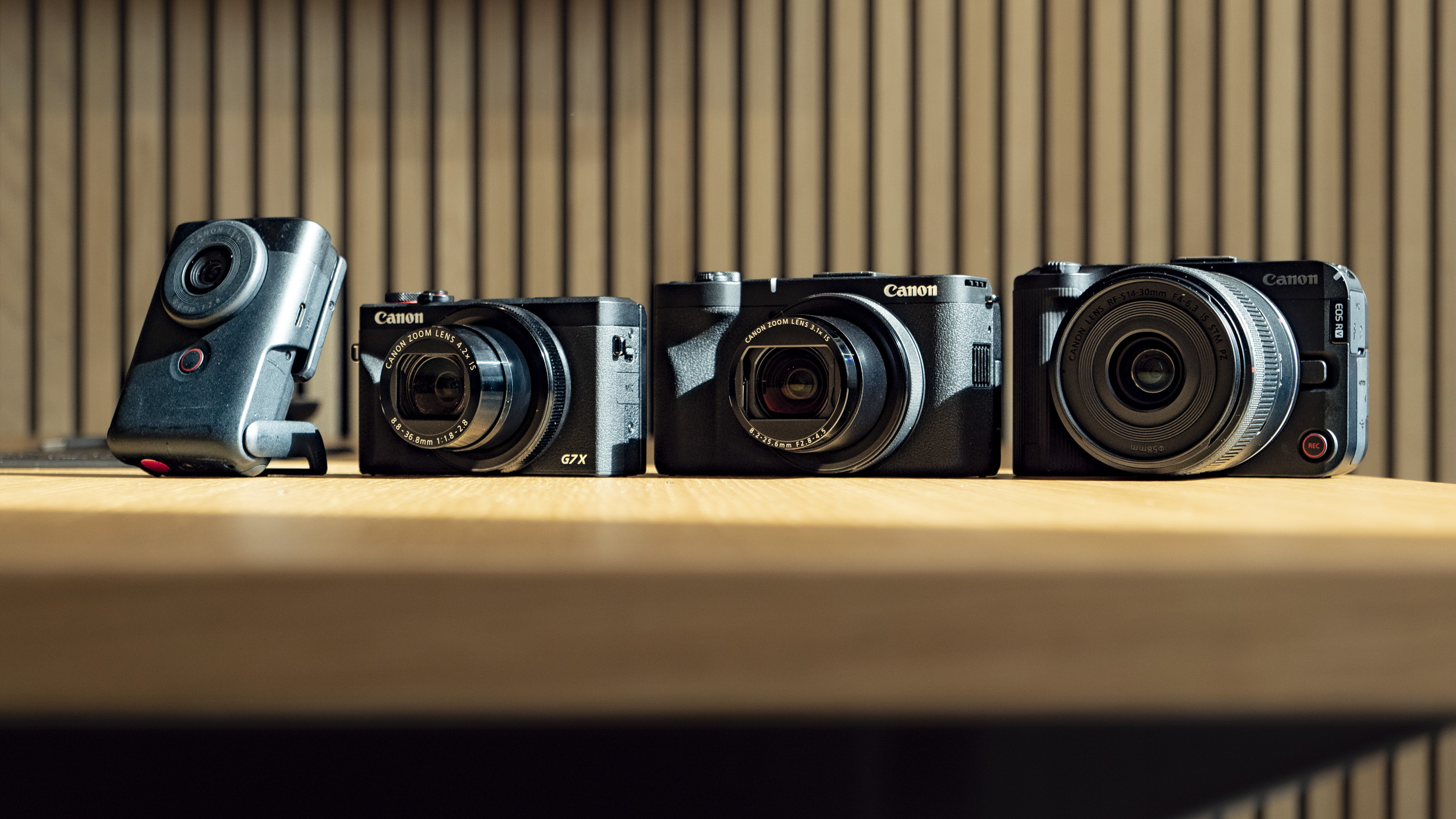
    Image 1 of 4

    Canon PowerShot V1 compact vlogging camera on a wooden desk alongside the PowerShot G7X Mark III

    (Image credit: Tim Coleman)
    Image 2 of 4

    Canon PowerShot V1 compact vlogging camera on a wooden desk alongside the PowerShot G7X Mark III

    (Image credit: Tim Coleman)
    Image 3 of 4

    Canon PowerShot V1 compact vlogging camera on a wooden desk alongside the PowerShot G7X Mark III and PowerShot V10

    (Image credit: Tim Coleman)
    Image 4 of 4

    Canon PowerShot V1 compact vlogging camera on a wooden desk alongside the PowerShot G7X Mark III, PowerShot V10 and EOS R50 V

    (Image credit: Tim Coleman)

    A fotocamera spenta e con l’obiettivo retratto, sono riuscito a infilare la PowerShot V1 nella tasca della giacca, un risultato notevole considerando la presenza del sensore da 1,4 pollici. Attenzione però: non aspettatevi di farcela con una tasca dei jeans, nemmeno con quelli larghi che vanno di moda ultimamente.

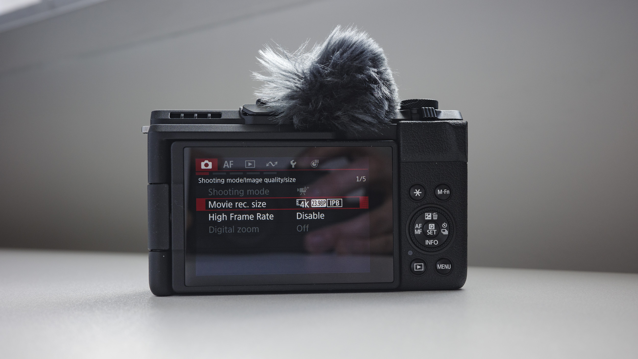
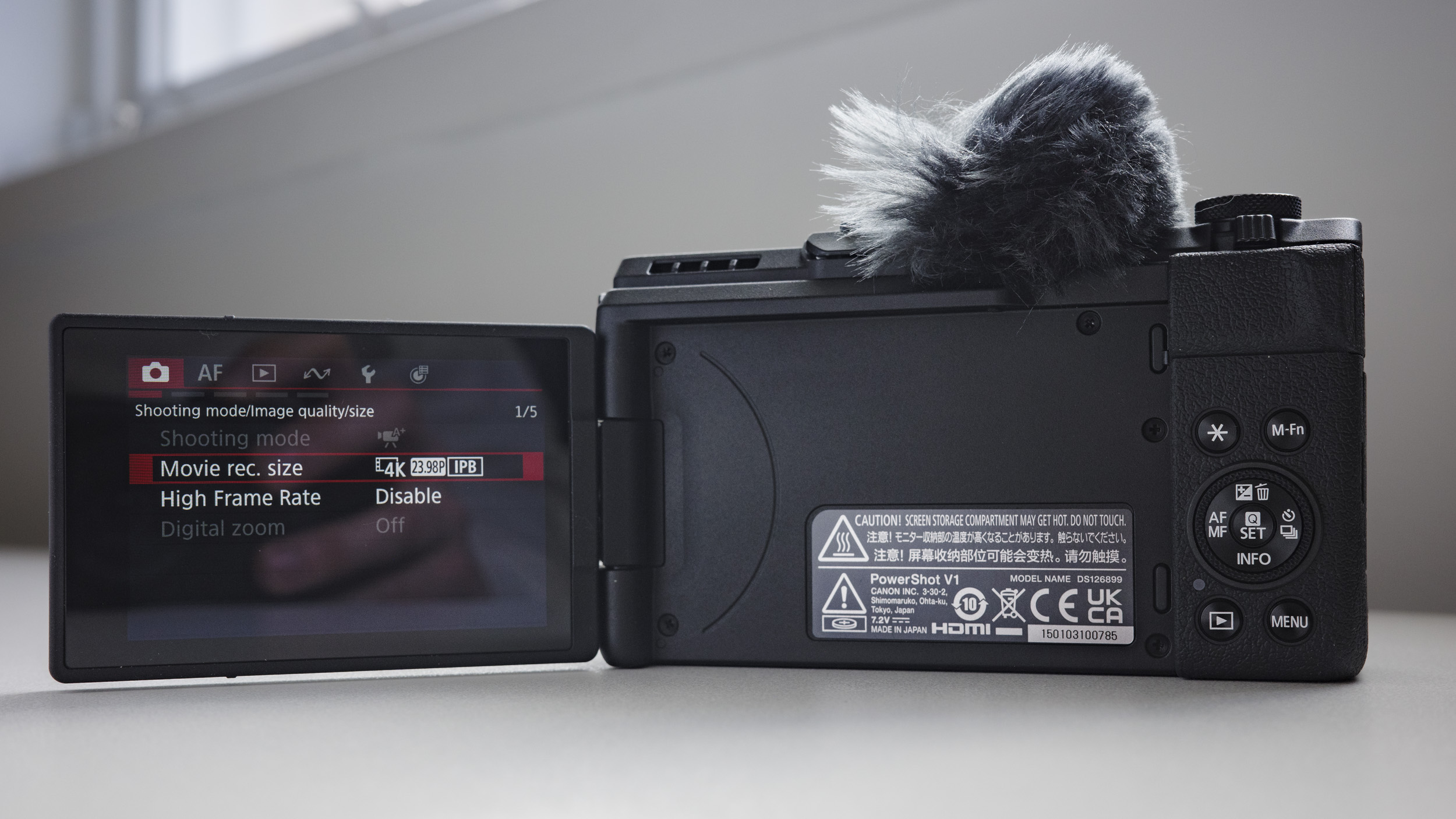
    Lo schermo touchscreen orientabile è ormai uno standard per le fotocamere orientate al video nel 2025: si apre lateralmente, si inclina verso l’alto per inquadrature dal basso e può essere ruotato completamente in avanti per il vlogging. Come già detto, manca però un mirino elettronico, quindi tutte le inquadrature vanno fatte tramite lo schermo. In generale non è un problema, ma nelle giornate più soleggiate ho sentito la mancanza di un mirino antiriflesso, soprattutto per evitare di strizzare gli occhi davanti al display lucido.

    Image 1 of 7

    Canon PowerShot V1 compact vlogging camera on a white desk, lens folded away

    (Image credit: Tim Coleman)
    Image 2 of 7

    Canon PowerShot V1 compact vlogging camera on a white desk, lens extended

    (Image credit: Tim Coleman)
    Image 3 of 7

    Top plate of the Canon PowerShot V1 compact vlogging camera on a white desk, lens retracted

    (Image credit: Tim Coleman)
    Image 4 of 7

    Top plate of the Canon PowerShot V1 compact vlogging camera on a white desk, lens extended

    (Image credit: Tim Coleman)
    Image 5 of 7

    Rear of the Canon PowerShot V1 compact vlogging camera on a white desk

    (Image credit: Tim Coleman)
    Image 6 of 7

    Rear of the Canon PowerShot V1 compact vlogging camera on a white desk

    (Image credit: Tim Coleman)
    Image 7 of 7

    Screen of Canon PowerShot V1 compact vlogging camera open out, on a white desk

    (Image credit: Tim Coleman)

    La connettività è in linea con quanto ci si aspetta da una compatta orientata al video. C’è una porta USB-C per il trasferimento dati e la ricarica, che supporta anche lo streaming UVC/UAC (approfondito nella prossima sezione). Presenti anche i jack da 3,5 mm per microfono e cuffie, oltre a un’uscita micro HDMI: sarebbe stato preferibile un’uscita HDMI full-size, ma viste le dimensioni contenute della fotocamera, non è una mancanza grave.

    Le prese d’aria per il raffreddamento si trovano sulla parte superiore e sul lato sinistro del corpo: grazie a queste, la PowerShot V1 può registrare video in 4K senza limiti di tempo. È una caratteristica sorprendente per una fotocamera di questa fascia, e va riconosciuto a Canon il merito di averla integrata. La documentazione segnala comunque la possibilità di surriscaldamento con i framerate più elevati, ma un indicatore a schermo mostra la temperatura per tempo, evitando brutte sorprese.

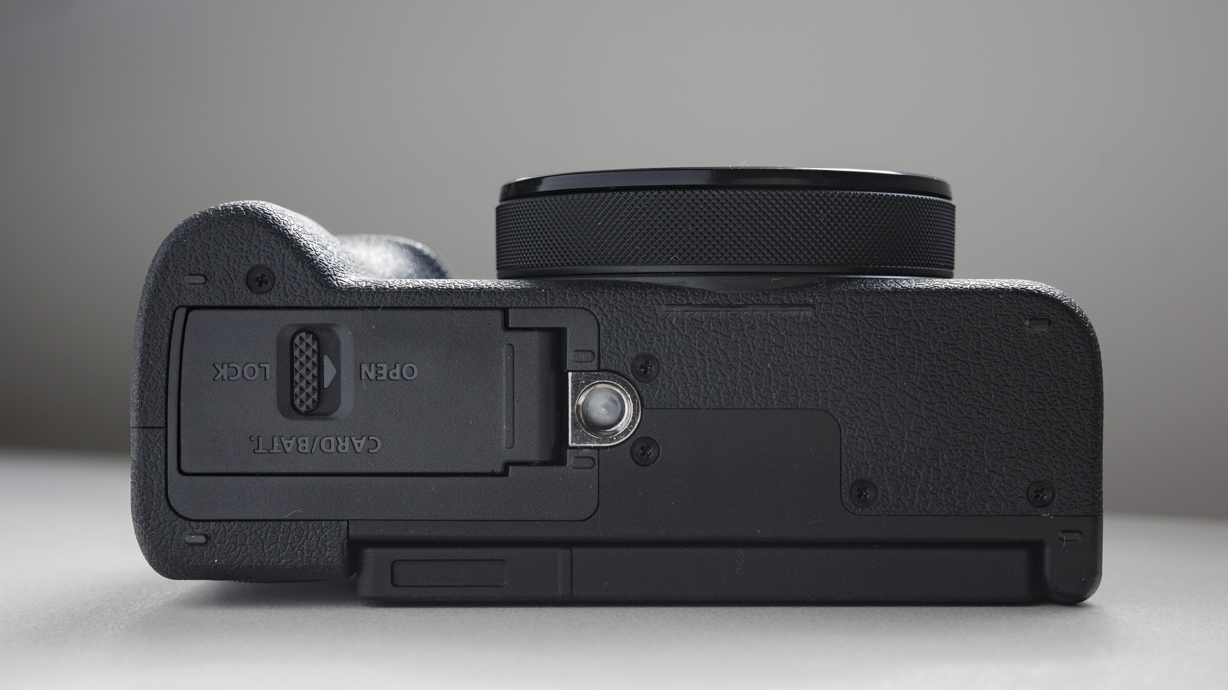
    Probabilmente proprio a causa di queste aperture per il raffreddamento, la fotocamera non è tropicalizzata né resistente agli agenti atmosferici: attenzione quindi in caso di pioggia o polvere. Sul fondo troviamo un attacco per treppiede standard e lo sportello che ospita batteria e singolo slot per schede SD.

    • Design: 3.5/5
    Image 1 of 4

    Closeup of Canon PowerShot V1 compact vlogging camera's cooling vents, on a white desk

    (Image credit: Tim Coleman)
    Image 2 of 4

    Closeup of Canon PowerShot V1 compact vlogging camera's mic and headphone ports, on a white desk

    (Image credit: Tim Coleman)
    Image 3 of 4

    Underside of the Canon PowerShot V1 compact vlogging camera on a white desk

    (Image credit: Tim Coleman)
    Image 4 of 4

    Top plate of the Canon PowerShot V1 compact vlogging camera on a white desk, lens extended, windmuff attached

    (Image credit: Tim Coleman)

    Canon PowerShot V1: Performance

    Canon ha equipaggiato la PowerShot V1 con uno zoom più ampio rispetto alla maggior parte delle concorrenti: mentre 18mm è la norma, qui si parte da 16mm, una lunghezza focale perfetta per il vlogging a mano libera grazie al campo visivo più ampio. L’escursione dello zoom ottico arriva fino a 3.1x, equivalente a 50mm, risultando utile per i ritratti e per avvicinarsi a soggetti lontani.

    Il comparto ottico si difende bene anche nelle riprese ravvicinate, permettendo scatti macro e riprese dinamiche ideali come cutaway nei video – i primi piani di fiori nella nostra galleria di esempio ne sono una prova concreta.

    Lo stabilizzatore ottico integrato (OIS) è certificato per un’efficacia fino a 5 stop, il che si traduce in buone prestazioni nella fotografia. Per quanto riguarda i video, entra in gioco la stabilizzazione elettronica (DIS), che comporta un leggero crop dell’immagine, più marcato se si attiva l’opzione DIS avanzata. In questo contesto, i 16mm di lunghezza focale minima risultano ancora più utili: anche con la stabilizzazione attiva, l’inquadratura rimane abbastanza ampia per includere il volto o l’intero busto in un’inquadratura da vlogging.

    La stabilizzazione video è generalmente efficace e consente riprese a mano libera senza fastidiosi tremolii. Nel confronto con le due rivali più dirette, la PowerShot V1 si piazza nel mezzo: la DJI Osmo Pocket 3, grazie al gimbal integrato, resta imbattibile per fluidità, mentre la sola stabilizzazione digitale della Sony ZV-1 II non convince fino in fondo in ottica vlogging.

    L’autofocus, infine, è un altro punto di forza: Canon ha incluso il suo sistema Dual Pixel AF II, rapido e preciso. È in grado di agganciare soggetti quasi all’istante, riconoscendo persone e animali con affidabilità. Nei nostri test, ha individuato correttamente volti umani, gatti e cani, seguendoli in movimento senza incertezze.

    Canon PowerShot V1 compact camera

    (Image credit: Future | Sam Kieldsen)

    La PowerShot V1 integra un microfono interno capace di registrare audio a 16-bit in formato AAC o PCM. Nella confezione è incluso anche un wind muff peloso, stile “dead cat”, che si inserisce direttamente nella slitta superiore e si posiziona sopra al microfono per attenuare il rumore del vento nelle registrazioni all’aperto. Questo accessorio risulta quasi indispensabile se si utilizza il microfono integrato, anche se può ostacolare leggermente l’accesso ad alcuni comandi della fotocamera, come il pulsante di accensione. L’efficacia è buona, ma in presenza di vento forte qualche disturbo audio può comunque emergere.

    Naturalmente, chi realizza contenuti in modo professionale utilizzerà un microfono esterno, collegabile tramite l’ingresso da 3,5 mm. È possibile anche monitorare l’audio in cuffia e sullo schermo. Durante i test, abbiamo utilizzato un DJI Mic 2 con ricevitore montato sulla slitta: la qualità sonora è risultata nettamente superiore rispetto al microfono interno, con una gestione del vento più efficace.

    Tra le funzioni pensate per il vlogging figura anche una comoda spia rossa (tally lamp) che segnala chiaramente quando la registrazione è attiva. Ci sono inoltre opzioni per focus peaking in modalità manuale, zebra pattern per l’esposizione e persino il timecode – strumenti apprezzati da chi crea video con un occhio alla precisione.

    Per registrare video in 4K senza interruzioni è fondamentale utilizzare una scheda SD sufficientemente veloce. Canon consiglia una UHS-II, ma nei nostri test anche una Lexar V60 ha mostrato qualche incertezza; il consiglio è quindi di optare per una scheda V90 per andare sul sicuro.

    L’autonomia è discreta: con una batteria carica si possono scattare circa 400 foto o registrare poco più di un’ora di video, secondo Canon. Nella nostra esperienza, registrando in 4K si resta leggermente al di sotto. Tuttavia, grazie alla porta USB-C è possibile alimentare la fotocamera in modo continuo, rendendola ideale per sessioni casalinghe senza preoccuparsi della durata della batteria.

    La stessa porta USB può trasformare la V1 in una webcam di fascia alta. Supporta gli standard UVC/UAC, quindi funziona con la maggior parte delle piattaforme di live streaming.

    • Performance: 4/5

    Canon PowerShot V1: qualità dell’immagine

    Durante il periodo di prova con la PowerShot V1, ho avuto modo di testare tutte le principali modalità video, scattare alcune foto, valutare le prestazioni della stabilizzazione e registrare brevi vlog utilizzando il microfono interno, oltre a girare qualche clip di supporto (B-roll). Nel video di esempio che trovate qui sotto, sono inclusi spezzoni registrati in 4K a 30fps e a 60fps, test di stabilizzazione elettronica, uso dello zoom ottico 3.1x e altre funzionalità utili per la creazione di contenuti video.

    In genere, l’esposizione e la resa cromatica della fotocamera sono collegate all’area di messa a fuoco. Quando l’autofocus era fissato su di me, l’esposizione risultava corretta grazie anche al filtro ND automatico integrato. Tuttavia, nei vlog ho notato alcune variazioni nel tono della pelle: a volte perfetto, altre con dominanti verdi o magenta. Per risultati più coerenti, è consigliabile impostare il bilanciamento del bianco manualmente invece di affidarsi all’opzione automatica.

    Anche i video in 4K a 60fps risultano ottimi, sebbene – come già accennato – a questo frame rate si rinunci alla stabilizzazione elettronica dell’immagine e si debba accettare un crop di 1.4x. Personalmente non ho trovato il ritaglio troppo penalizzante, anzi: l’effetto è simile a uno zoom naturale, utile soprattutto per catturare B-roll più ravvicinati.

    Un crop è presente anche quando si attiva la modalità DIS potenziata (non disponibile in 4K 60fps), ma grazie al grandangolo da 16mm del V1 c’è comunque un buon margine per ritagliare l’inquadratura restando all’interno di una visuale adatta al vlogging. La scelta di Canon di partire da 16mm è stata decisamente azzeccata: sembra un dettaglio da poco, ma fa tutta la differenza nel tipo di riprese che si possono ottenere.

    Image 1 of 5

    Red flowers, close up

    (Image credit: Tim Coleman)
    Image 2 of 5

    Red flowers, close up

    (Image credit: Tim Coleman)
    Image 3 of 5

    Dafodills on a cloudy day, from a low angle

    (Image credit: Tim Coleman)
    Image 4 of 5

    Dafodills on a cloudy day, from a low angle

    (Image credit: Tim Coleman)
    Image 5 of 5

    Dafodills on a cloudy day, from a low angle

    (Image credit: Tim Coleman)

    Il sensore da 22,3MP da 1,4 pollici della PowerShot V1 è completamente nuovo, ma ritroviamo la classica gestione del colore di Canon – e questa è un’ottima notizia. Le foto in piena risoluzione risultano naturali e ricche di dettaglio: pelle, capelli e barba, ad esempio, vengono riprodotti in modo estremamente nitido, come si nota nello scatto selfie qui sopra.

    Grazie alla resa cromatica di Canon, i JPEG usciti direttamente dalla fotocamera sono già molto piacevoli, ma ho scattato anche in RAW, sviluppando poi le immagini con Adobe Lightroom. Nella galleria qui sotto potete vedere i risultati: sono rimasto soddisfatto soprattutto dalla gamma cromatica, dai dettagli nelle ombre e dal contrasto che sono riuscito a recuperare con piccoli interventi.

    Nonostante il sensore sia ampio per una compatta, non definirei la V1 un mostro da scatti in scarsa luminosità. Il rumore digitale inizia a farsi notare già a valori ISO non troppo elevati – probabilmente a causa dell’apertura massima non molto luminosa dell’obiettivo. Nei JPEG la grana viene gestita bene dalla fotocamera, e anche in Lightroom si riesce a ridurre con efficacia, ma resta un limite da considerare, anche perché la macchina non dispone di un flash integrato per illuminare le scene più buie.

    Image 1 of 13

    Canon PowerShot V1 photo of bust of Vincent Van Gogh

    (Image credit: Future | Sam Kieldsen)
    Image 2 of 13

    Canon PowerShot V1 photo of lighthouse and boat

    (Image credit: Future | Sam Kieldsen)
    Image 3 of 13

    Canon PowerShot V1 black and white photo of a caravan in a car park

    (Image credit: Future | Sam Kieldsen)
    Image 4 of 13

    Canon PowerShot V1 black and white photo of stained concrete on a beach

    (Image credit: Future | Sam Kieldsen)
    Image 5 of 13

    Canon PowerShot V1 sample photo of a tree with pink blossom in front of terraced houses

    (Image credit: Future | Sam Kieldsen)
    Image 6 of 13

    Canon PowerShot V1 photo of terraced houses

    (Image credit: Future | Sam Kieldsen)
    Image 7 of 13

    Canon PowerShot V1 photo of a sleeping cat

    (Image credit: Future | Sam Kieldsen)
    Image 8 of 13

    Canon PowerShot V1 photo of a boat in a harbour in front of a town

    (Image credit: Future | Sam Kieldsen)
    Image 9 of 13

    Canon PowerShot V1 photo of a dog in front of a shop

    (Image credit: Future | Sam Kieldsen)
    Image 10 of 13

    Canon PowerShot V1 photo of an apartment building

    (Image credit: Future | Sam Kieldsen)
    Image 11 of 13

    Canon PowerShot V1 photo of motorbikes on a road at dusk

    (Image credit: Future | Sam Kieldsen)
    Image 12 of 13

    Canon PowerShot V1 photo of boats in a harbour at dusk

    (Image credit: Future | Sam Kieldsen)
    Image 13 of 13

    Canon PowerShot V1 photo of a narrow residential street at dusk

    (Image credit: Future | Sam Kieldsen)

    Come accennato in precedenza, l’apertura massima dell’obiettivo non è particolarmente luminosa, e avrei preferito qualcosa di simile a f/1.8-2.8. Detto ciò, mantenere quelle specifiche all’interno di un obiettivo così compatto non sarebbe stato tecnicamente possibile. In ogni caso, impostando il diaframma alla sua apertura massima (f/2.8-4.5) e mantenendo una distanza di messa a fuoco ravvicinata, si riesce comunque a ottenere un piacevole effetto di profondità ridotta, con uno sfocato gradevole sullo sfondo.

    • Qualità delle immagini: 4.5/5

    Canon PowerShot V1

    Canon PowerShot V1

    Attributi

    Note

    Punteggio

    Prezzo

    Prezzo adeguato per le specifiche offerte, ma le alternative di DJI e Sony costano meno.

    4/5

    Design

    Compatta e leggera, ma priva di mirino elettronico e protezione contro le intemperie.

    3.5/5

    Performance

    Great autofocus and image stabilization and a serviceable internal mic.

    4/5

    Qualità delle immagini

    L’obiettivo versatile e il sensore da 1,4 pollici offrono scatti nitidi e colori vibranti, con ampio margine di intervento in post-produzione grazie ai profili Log e al supporto RAW.

    4.5/5

    Perché comprare la Canon PowerShot V1?

    Ragioni per acquistare

    Volete una vlog camera che scatti anche buone foto

    Pur pensata principalmente per i video, la combinazione tra stabilizzazione ottica, buona ergonomia e scatto in RAW rende la V1 una fotocamera solida anche per le foto.View Deal

    Volete un’ottima qualità d’immagine già pronta all’uso

    Grazie alla nota resa cromatica Canon, a un buon obiettivo e al grande sensore da 1,4 pollici, questa è una compatta da vlogging di alta qualità anche in modalità punta e scatta.View Deal

    Ragioni per NON acquistare

    Siete fotografi prima di tutto

    La PowerShot V1 offre una buona qualità fotografica, ma l’assenza di mirino e flash integrato ne limita l’attrattiva. È prima di tutto una videocamera.View Deal

    Cercate la vlog camera più economica possibile

    La V1 ha un buon rapporto qualità-prezzo, ma se vi interessa solo il vlogging meglio valutare la DJI Osmo Pocket 3: costa meno della metà ed è perfetta per i vlog in movimento.View Deal


    Source: Latest from TechRadar IT-IT in Reviews.

  • What I Wish Someone Told Me When I Was Getting Into ARIA

    What I Wish Someone Told Me When I Was Getting Into ARIA

    June 16, 2025
    Software

    If you haven’t encountered ARIA before, great! It’s a chance to learn something new and exciting. If you have heard of ARIA before, this might help you better understand it or maybe even teach you something new!

    These are all things I wish someone had told me when I was getting started on my web accessibility journey. This post will:

    • Provide a mindset for how to approach ARIA as a concept,
    • Debunk some common misconceptions, and
    • Provide some guiding thoughts to help you better understand and work with it.

    It is my hope that in doing so, this post will help make an oft-overlooked yet vital corner of web design and development easier to approach.

    What This Post Is Not

    This is not a recipe book for how to use ARIA to build accessible websites and web apps. It is also not a guide for how to remediate an inaccessible experience. A lot of accessibility work is highly contextual. I do not know the specific needs of your project or organization, so trying to give advice here could easily do more harm than good.

    Instead, think of this post as a “know before you go” guide. I’m hoping to give you a good headspace to approach ARIA, as well as highlight things to watch out for when you undertake your journey. So, with that out of the way, let’s dive in!

    So, What Is ARIA?

    ARIA is what you turn to if there is not a native HTML element or attribute that is better suited for the job of communicating interactivity, purpose, and state.

    Think of it like a spice that you sprinkle into your markup to enhance things.

    Adding ARIA to your HTML markup is a way of providing additional information to a website or web app for screen readers and voice control software.

    • Interactivity means the content can be activated or manipulated. An example of this is navigating to a link’s destination.
    • Purpose means what something is used for. An example of this is a text input used to collect someone’s name.
    • State means the current status content has been placed in and controlled by states, properties, and values. An example of this is an accordion panel ​​that can either be expanded or collapsed.

    Here is an illustration to help communicate what I mean by this:

    • The presence of HTML’s button element will instruct assistive technology to report it as a button, letting someone know that it can be activated to perform a predefined action.
    • The presence of the text string “Mute” will be reported by assistive technology to clue the person into what the button is used for.
    • The presence of aria-pressed="true" means that someone or something has previously activated the button, and it is now in a “pushed in” state that sustains its action.

    This overall pattern will let people who use assistive technology know:

    1. If something is interactive,
    2. What kind of interactive behavior it performs, and
    3. Its current state.

    ARIA’s History

    ARIA has been around for a long time, with the first version published on September 26th, 2006.

    ARIA was created to provide a bridge between the limitations of HTML and the need for making interactive experiences understandable by assistive technology.

    The latest version of ARIA is version 1.2, published on June 6th, 2023. Version 1.3 is slated to be released relatively soon, and you can read more about it in this excellent article by Craig Abbott.

    You may also see it referred to as WAI-ARIA, where WAI stands for “Web Accessibility Initiative.” The WAI is part of the W3C, the organization that sets standards for the web. That said, most accessibility practitioners I know call it “ARIA” in written and verbal communication and leave out the “WAI-” part.

    The Spirit Of ARIA Reflects The Era In Which It Was Created

    The reason for this is simple: The web was a lot less mature in the past than it is now. The most popular operating system in 2006 was Windows XP. The iPhone didn’t exist yet; it was released a year later.

    From a very high level, ARIA is a snapshot of the operating system interaction paradigms of this time period. This is because ARIA recreates them.

    The Mindset

    Smartphones with features like tappable, swipeable, and draggable surfaces were far less commonplace. Single Page Application “web app” experiences were also rare, with Ajax)-based approaches being the most popular. This means that we have to build the experiences of today using the technology of 2006. In a way, this is a good thing. It forces us to take new and novel experiences and interrogate them.

    Interactions that cannot be broken down into smaller, more focused pieces that map to ARIA patterns are most likely inaccessible. This is because they won’t be able to be operated by assistive technology or function on older or less popular devices.

    I may be biased, but I also think these sorts of novel interactions that can’t translate also serve as a warning that a general audience will find them to be confusing and, therefore, unusable. This belief is important to consider given that the internet serves:

    • An unknown number of people,
    • Using an unknown number of devices,
    • Each with an unknown amount of personal customizations,
    • Who have their own unique needs and circumstances and
    • Have unknown motivational factors.

    Interaction Expectations

    Contemporary expectations for keyboard-based interaction for web content — checkboxes, radios, modals, accordions, and so on — are sourced from Windows XP and its predecessor operating systems. These interaction models are carried forward as muscle memory for older people who use assistive technology. Younger people who rely on assistive technology also learn these de facto standards, thus continuing the cycle.

    What does this mean for you? Someone using a keyboard to interact with your website or web app will most likely try these Windows OS-based keyboard shortcuts first. This means things like pressing:

    • Enter to navigate to a link’s destination,
    • Space to activate buttons,
    • Home and End to jump to the start or end of a list of items, and so on.

    It’s Also A Living Document

    This is not to say that ARIA has stagnated. It is constantly being worked on with new additions, removals, and clarifications. Remember, it is now at version 1.2, with version 1.3 arriving soon.

    In parallel, HTML as a language also reflects this evolution. Elements were originally created to support a document-oriented web and have been gradually evolving to support more dynamic, app-like experiences. The great bit here is that this is all conducted in the open and is something you can contribute to if you feel motivated to do so.

    ARIA Has Rules For Using It

    There are five rules included in ARIA’s documentation to help steer how you approach it:

    1. Use a native element whenever possible.
      An example would be using an anchor element (<a>) for a link rather than a div with a click handler and a role of link.
    2. Don’t adjust a native element’s semantics if at all possible.
      An example would be trying to use a heading element as a tab rather than wrapping the heading in a semantically neutral div.
    3. Anything interactive has to be keyboard operable.
      If you can’t use it with a keyboard, it isn’t accessible. Full stop.
    4. Do not use role="presentation" or aria-hidden="true" on a focusable element.
      This makes something intended to be interactive unable to be used by assistive technology.
    5. Interactive elements must be named.
      An example of this is using the text string “Print” for a button element.

    Observing these five rules will do a lot to help you out. The following is more context to provide even more support.

    ARIA Has A Taxonomy

    There is a structured grammar to ARIA, and it is centered around roles, as well as states and properties.

    Roles

    A Role is what assistive technology reads and then announces. A lot of people refer to this in shorthand as semantics. HTML elements have implied roles, which is why an anchor element will be announced as a link by screen readers with no additional work.
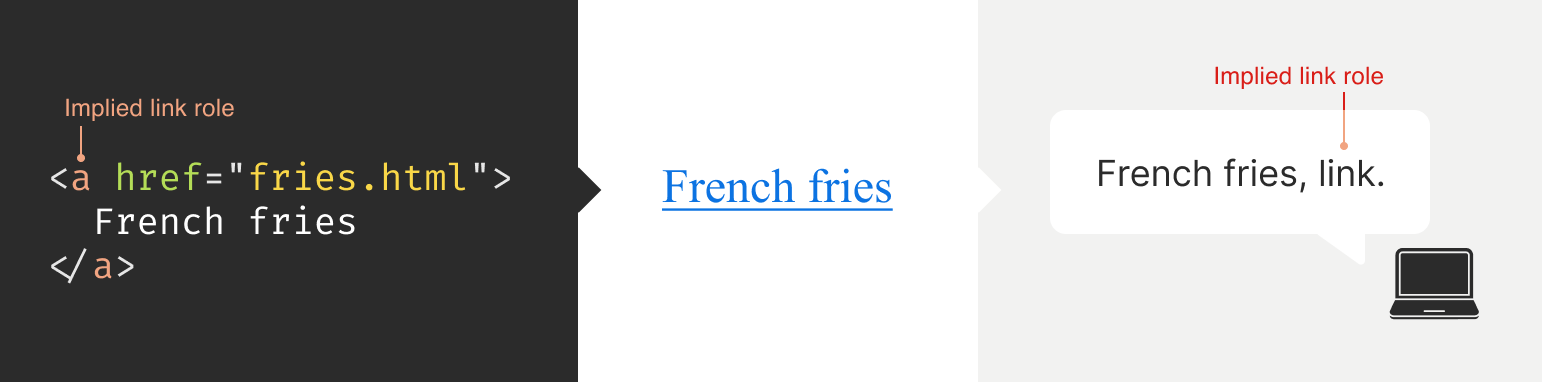
    Implied roles are almost always better to use if the use case calls for them. Recall the first rule of ARIA here. This is usually what digital accessibility practitioners refer to when they say, “Just use semantic HTML.”

    There are many reasons for favoring implied roles. The main consideration is better guarantees of support across an unknown number of operating systems, browsers, and assistive technology combinations.

    Roles have categories, each with its own purpose. The Abstract role category is notable in that it is an organizing supercategory not intended to be used by authors:

    Abstract roles are used for the ontology. Authors MUST NOT use abstract roles in content.

    <!-- This won't work, don't do it -->
    <h2 role="sectionhead">
      Anatomy and physiology
    </h2>
    
    <!-- Do this instead -->
    <section aria-labeledby="anatomy-and-physiology">
      <h2 id="anatomy-and-physiology">
        Anatomy and physiology
      </h2>
    </section>
    

    Additionally, in the same way, you can only declare ARIA on certain things, you can only declare some ARIA as children of other ARIA declarations. An example of this is the the listitem role, which requires a role of list to be present on its parent element.

    So, what’s the best way to determine if a role requires a parent declaration? The answer is to review the official definition.

    States And Properties

    States and properties are the other two main parts of ARIA‘s overall taxonomy.

    Implicit roles are provided by semantic HTML, and explicit roles are provided by ARIA. Both describe what an element is. States describe that element’s characteristics in a way that assistive technology can understand. This is done via property declarations and their companion values.

    ARIA states can change quickly or slowly, both as a result of human interaction as well as application state. When the state is changed as a result of human interaction, it is considered an “unmanaged state.” Here, a developer must supply the underlying JavaScript logic to control the interaction.

    When the state changes as a result of the application (e.g., operating system, web browser, and so on), this is considered “managed state.” Here, the application automatically supplies the underlying logic.

    How To Declare ARIA

    Think of ARIA as an extension of HTML attributes, a suite of name/value pairs. Some values are predefined, while others are author-supplied:

    For the examples in the previous graphic, the polite value for aria-live is one of the three predefined values (off, polite, and assertive). For aria-label, “Save” is a text string manually supplied by the author.

    You declare ARIA on HTML elements the same way you declare other attributes:

    <!-- 
      Applies an id value of 
      "carrot" to the div
    -->
    <div id="carrot"></div>
    
    <!-- 
      Hides the content of this paragraph 
      element from assistive technology 
    -->
    <p aria-hidden="true">
      Assistive technology can't read this
    </p>
    
    <!-- 
      Provides an accessible name of "Stop", 
      and also communicates that the button 
      is currently pressed. A type property 
      with a value of "button" prevents 
      browser form submission.
    -->
    <button 
      aria-label="Stop"
      aria-pressed="true"
      type="button">
      <!-- SVG icon -->
    </button>
    

    Other usage notes:

    • You can place more than one ARIA declaration on an HTML element.
    • The order of placement of ARIA when declared on an HTML element does not matter.
    • There is no limit to how many ARIA declarations can be placed on an element. Be aware that the more you add, the more complexity you introduce, and more complexity means a larger chance things may break or not function as expected.
    • You can declare ARIA on an HTML element and also have other non-ARIA declarations, such as class or id. The order of declarations does not matter here, either.

    It might also be helpful to know that boolean attributes are treated a little differently in ARIA when compared to HTML. Hidde de Vries writes about this in his post, “Boolean attributes in HTML and ARIA: what’s the difference?”.

    Not A Whole Lot Of ARIA Is “Hardcoded”

    In this context, “hardcoding” means directly writing a static attribute or value declaration into your component, view, or page.

    A lot of ARIA is designed to be applied or conditionally modified dynamically based on application state or as a response to someone’s action. An example of this is a show-and-hide disclosure pattern:

    • ARIA’s aria-expanded attribute is toggled from false to true to communicate if the disclosure is in an expanded or collapsed state.
    • HTML’s hidden attribute is conditionally removed or added in tandem to show or hide the disclosure’s full content area.
    <div class="disclosure-container">
      <button 
        aria-expanded="false"
        class="disclosure-toggle"
        type="button">
        How we protect your personal information
      </button>
      <div 
        hidden
        class="disclosure-content">
        <ul>
          <li>Fast, accurate, thorough and non-stop protection from cyber attacks</li>
          <li>Patching practices that address vulnerabilities that attackers try to exploit</li>
          <li>Data loss prevention practices help to ensure data doesn't fall into the wrong hands</li>
          <li>Supply risk management practices help ensure our suppliers adhere to our expectations</li>
        </ul>
        <p>
          <a href="/security/">Learn more about our security best practices</a>.
        </p>
      </div>
    </div>
    

    A common example of a hardcoded ARIA declaration you’ll encounter on the web is making an SVG icon inside a button decorative:

    <button type="button>
      <svg aria-hidden="true">
        <!-- SVG code -->
      </svg>
      Save
    </button>
    

    Here, the string “Save” is what is required for someone to understand what the button will do when they activate it. The accompanying icon helps that understanding visually but is considered redundant and therefore decorative.

    Declaring An Aria Role On Something That Already Uses That Role Implicitly Does Not Make It “Extra” Accessible

    An implied role is all you need if you’re using semantic HTML. Explicitly declaring its role via ARIA does not confer any additional advantages.

    <!-- 
      You don't need to declare role="button" here.
      Using the <button> element will make assistive 
      technology announce it as a button. The 
      role="button" declaration is redundant.
     -->
    <button role="button">
      Save
    </button>
    

    You might occasionally run into these redundant declarations on HTML sectioning elements, such as <main role="main">, or <footer role="contentinfo">. This isn’t needed anymore, and you can just use the <main> or <footer> elements.

    The reason for this is historic. These declarations were done for support reasons, in that it was a stop-gap technique for assistive technology that needed to be updated to support these new-at-the-time HTML elements.

    Contemporary assistive technology does not need these redundant declarations. Think of it the same way that we don’t have to use vendor prefixes for the CSS border-radius property anymore.

    Note: There is an exception to this guidance. There are circumstances where certain complex and complicated markup patterns don’t work as expected for assistive technology. In these cases, we want to hardcode the implicit role as explicit ARIA to ensure it works. This assistive technology support concern is covered in more detail later in this post.

    You Don’t Need To Say What A Control Is; That Is What Roles Are For

    Both implicit and explicit roles are announced by screen readers. You don’t need to include that part for things like the interactive element’s text string or an aria-label.

    <!-- Don't do this -->
    <button 
      aria-label="Save button"
      type="button">
      <!-- Icon SVG -->
    </button>
    
    <!-- Do this instead -->
    <button 
      aria-label="Save"
      type="button">
      <!-- Icon SVG -->
    </button>
    

    Had we used the string value of “Save button” for our Save button, a screen reader would announce it along the lines of, “Save button, button.” That’s redundant and confusing.

    ARIA Roles Have Very Specific Meanings

    We sometimes refer to website and web app navigation colloquially as menus, especially if it’s an e-commerce-style mega menu.

    In ARIA, menus mean something very specific. Don’t think of global or in-page navigation or the like. Think of menus in this context as what appears when you click the Edit menu button on your application’s menubar.

    Using a role improperly because its name seems like an appropriate fit at first glance creates confusion for people who do not have the context of the visual UI. Their expectations will be set with the announcement of the role, then subverted when it does not act the way it is supposed to.

    Imagine if you click on a link, and instead of taking you to another webpage, it sends something completely unrelated to your printer instead. It’s sort of like that.

    Declaring role="menu" is a common example of a misapplied role, but there are others. The best way to know what a role is used for? Go straight to the source and read up on it.

    Certain Roles Are Forbidden From Having Accessible Names

    These roles are caption, code, deletion, emphasis, generic, insertion, paragraph, presentation, strong, subscript, and superscript.

    This means you can try and provide an accessible name for one of these elements — say via aria-label — but it won’t work because it’s disallowed by the rules of ARIA’s grammar.

    <!-- This won't work-->
    <strong aria-label="A 35% discount!">
      $39.95
    </strong>
    
    <!-- Neither will this -->
    <code title="let JavaScript example">
      let submitButton = document.querySelector('button[type="submit"]');
    </code>
    

    For these examples, recall that the role is implicit, sourced from the declared HTML element.

    Note here that sometimes a browser will make an attempt regardless and overwrite the author-specified string value. This overriding is a confusing act for all involved, which led to the rule being established in the first place.

    You Can’t Make Up ARIA And Expect It To Work

    I’ve witnessed some developers guess-adding CSS classes, such as .background-red or .text-white, to their markup and being rewarded if the design visually updates correctly.

    The reason this works is that someone previously added those classes to the project. With ARIA, the people who add the content we can use are the Accessible Rich Internet Applications Working Group. This means each new version of ARIA has a predefined set of properties and values. Assistive technology is then updated to parse those attributes and values, although this isn’t always a guarantee.

    Declaring ARIA, which isn’t part of that predefined set, means assistive technology won’t know what it is and consequently won’t announce it.

    <!-- 
      There is no "selectpanel" role in ARIA.
      Because of this, this code will be announced 
      as a button and not as a select panel.
    -->
    <button 
      role="selectpanel"
      type="button">
      Choose resources
    </button>
    

    ARIA Fails Silently

    This speaks to the previous section, where ARIA won’t understand words spoken to it that exist outside its limited vocabulary.

    There are no console errors for malformed ARIA. There’s also no alert dialog, beeping sound, or flashing light for your operating system, browser, or assistive technology. This fact is yet another reason why it is so important to test with actual assistive technology.

    You don’t have to be an expert here, either. There is a good chance your code needs updating if you set something to announce as a specific state and assistive technology in its default configuration does not announce that state.

    ARIA Only Exposes The Presence Of Something To Assistive Technology

    Applying ARIA to something does not automatically “unlock” capabilities. It only sends a hint to assistive technology about how the interactive content should behave.

    For assistive technology like screen readers, that hint could be for how to announce something. For assistive technology like refreshable Braille displays, it could be for how it raises and lowers its pins. For example, declaring role="button" on a div element does not automatically make it clickable. You will still need to:

    • Target the div element in JavaScript,
    • Tie it to a click event,
    • Author the interactive logic that it performs when clicked, and then
    • Accommodate all the other expected behaviors.

    This all makes me wonder why you can’t save yourself some work and use a button element in the first place, but that is a different story for a different day.

    Additionally, adjusting an element’s role via ARIA does not modify the element’s native functionality. For example, you can declare role="image" on a div element. However, attempting to declare the alt or src attributes on the div won’t work. This is because alt and src are not supported attributes for div.

    Declaring an ARIA Role On Something Will Override Its Semantics, But Not Its Behavior

    This speaks to the previous section on ARIA only exposing something’s presence. Don’t forget that certain HTML elements have primary and secondary interactive capabilities built into them.

    For example, an anchor element’s primary capability is navigating to whatever URL value is provided for its href attribute. Secondary capabilities for an anchor element include copying the URL value, opening it in a new tab or incognito window, and so on.

    These secondary capabilities are still preserved. However, it may not be apparent to someone that they can use them — or use them in the way that they’d expect — depending on what is announced.

    The opposite is also true. When an element has no capabilities, having its role adjusted does not grant it any new abilities. Remember, ARIA only announces. This is why that div with a role of button assigned to it won’t do anything when clicked if no companion JavaScript logic is also present.

    You Will Need To Declare ARIA To Make Certain Interactions Accessible

    A lot of the previous content may make it seem like ARIA is something you should avoid using altogether. This isn’t true. Know that this guidance is written to help steer you to situations where HTML does not offer the capability to describe an interaction out of the box. This space is where you want to use ARIA.

    Knowing how to identify this area requires spending some time learning what HTML elements there are, as well as what they are and are not used for. I quite like HTML5 Doctor’s Element Index for upskilling on this.

    Certain ARIA States Require Certain ARIA Roles To Be Present

    This is analogous to how HTML has both global attributes and attributes that can only be used on a per-element basis. For example, aria-describedby can be used on any HTML element or role. However, aria-posinset can only be used with article, comment, listitem, menuitem, option, radio, row, and tab roles. Remember here that these roles can be provided by either HTML or ARIA.

    Learning what states require which roles can be achieved by reading the official reference. Check for the “Used in Roles” portion of each entry’s characteristics:

    Automated code scanners — like axe, WAVE, ARC Toolkit, Pa11y, equal-access, and so on — can catch this sort of thing if they are written in error. I’m a big fan of implementing these sorts of checks as part of a continuous integration strategy, as it makes it a code quality concern shared across the whole team.

    ARIA Is More Than Web Browsers

    Speaking of technology that listens, it is helpful to know that the ARIA you declare instructs the browser to speak to the operating system the browser is installed on. Assistive technology then listens to what the operating system reports. It then communicates that to the person using the computer, tablet, smartphone, and so on.

    A person can then instruct assistive technology to request the operating system to take action on the web content displayed in the browser.

    This interaction model is by design. It is done to make interaction from assistive technology indistinguishable from interaction performed without assistive technology.

    There are a few reasons for this approach. The most important one is it helps preserve the privacy and autonomy of the people who rely on assistive technologies.

    Just Because It Exists In The ARIA Spec Does Not Mean Assistive Technology Will Support It

    This support issue was touched on earlier and is a difficult fact to come to terms with.

    Contemporary developers enjoy the hard-fought, hard-won benefits of the web standards movement. This means you can declare HTML and know that it will work with every major browser out there. ARIA does not have this. Each assistive technology vendor has its own interpretation of the ARIA specification. Oftentimes, these interpretations are convergent. Sometimes, they’re not.

    Assistive technology vendors also have support roadmaps for their products. Some assistive technology vendors:

    • Will eventually add support,
    • May never, and some
    • Might do so in a way that contradicts how other vendors choose to implement things.

    There is also the operating system layer to contend with, which I’ll cover in more detail in a little bit. Here, the mechanisms used to communicate with assistive technology are dusty, oft-neglected areas of software development.

    With these layers comes a scenario where the assistive technology can support the ARIA declared, but the operating system itself cannot communicate the ARIA’s presence, or vice-versa. The reasons for this are varied but ultimately boil down to a historic lack of support, prioritization, and resources. However, I am optimistic that this is changing.

    Additionally, there is no equivalent to Caniuse, Baseline, or Web Platform Status for assistive technology. The closest analog we have to support checking resources is a11ysupport.io, but know that it is the painstaking work of a single individual. Its content may not be up-to-date, as the work is both Herculean in its scale and Sisyphean in its scope. Because of this, I must re-stress the importance of manually testing with assistive technology to determine if the ARIA you use works as intended.

    How To Determine ARIA Support

    There are three main layers to determine if something is supported:

    1. Operating system and version.
    2. Assistive technology and version,
    3. Browser and browser version.

    1. Operating System And Version

    Each operating system (e.g., Windows, macOS, Linux) has its own way of communicating what content is present to assistive technology. Each piece of assistive technology has to accommodate how to parse that communication.

    Some assistive technology is incompatible with certain operating systems. An example of this is not being able to use VoiceOver with Windows, or JAWS with macOS. Furthermore, each version of each operating system has slight variations in what is reported and how. Sometimes, the operating system needs to be updated to “teach” it the updated AIRA vocabulary. Also, do not forget that things like bugs and regressions can occur.

    2. Assistive Technology And Version

    There is no “one true way” to make assistive technology. Each one is built to address different access needs and wants and is done so in an opinionated way — think how different web browsers have different features and UI.

    Each piece of assistive technology that consumes web content has its own way of communicating this information, and this is by design. It works with what the operating system reports, filtered through things like heuristics and preferences.

    Like operating systems, assistive technology also has different versions with what each version is capable of supporting. They can also be susceptible to bugs and regressions.

    Another two factors worth pointing out here are upgrade hesitancy and lack of financial resources. Some people who rely on assistive technology are hesitant to upgrade it. This is based on a very understandable fear of breaking an important mechanism they use to interact with the world. This, in turn, translates to scenarios like holding off on updates until absolutely necessary, as well as disabling auto-updating functionality altogether.

    Lack of financial resources is sometimes referred to as the disability or crip tax. Employment rates tend to be lower for disabled populations, and with that comes less money to spend on acquiring new technology and updating it. This concern can and does apply to operating systems, browsers, and assistive technology.

    3. Browser And Browser Version

    Some assistive technology works better with one browser compared to another. This is due to the underlying mechanics of how the browser reports its content to assistive technology. Using Firefox with NVDA is an example of this.

    Additionally, the support for this reporting sometimes only gets added for newer versions. Unfortunately, it also means support can sometimes accidentally regress, and people don’t notice before releasing the browser update — again, this is due to a historic lack of resources and prioritization.

    The Less Commonly-Used The ARIA You Declare, The Greater The Chance You’ll Need To Test It

    Common ARIA declarations you’ll come across include, but are not limited to:

    • aria-label,
    • aria-labelledby,
    • aria-describedby,
    • aria-hidden,
    • aria-live.

    These are more common because they’re more supported. They are more supported because many of these declarations have been around for a while. Recall the previous section that discussed actual assistive technology support compared to what the ARIA specification supplies.

    Newer, more esoteric ARIA, or historically deprioritized declarations, may not have that support yet or may never. An example of how complicated this can get is aria-controls.

    aria-controls is a part of ARIA that has been around for a while. JAWS had support for aria-controls, but then removed it after user feedback. Meanwhile, every other screen reader I’m aware of never bothered to add support.

    What does that mean for us? Determining support, or lack thereof, is best accomplished by manual testing with assistive technology.

    The More ARIA You Add To Something, The Greater The Chance Something Will Behave Unexpectedly

    This fact takes into consideration the complexities in preferences, different levels of support, bugs, regressions, and other concerns that come with ARIA’s usage.

    Philosophically, it’s a lot like adding more interactive complexity to your website or web app via JavaScript. The larger the surface area your code covers, the bigger the chance something unintended happens.

    Consider the amount of ARIA added to a component or discrete part of your experience. The more of it there is declared nested into the Document Object Model (DOM), the more it interacts with parent ARIA declarations. This is because assistive technology reads what the DOM exposes to help determine intent.

    A lot of contemporary development efforts are isolated, feature-based work that focuses on one small portion of the overall experience. Because of this, they may not take this holistic nesting situation into account. This is another reason why — you guessed it — manual testing is so important.

    Anecdotally, WebAIM’s annual Millions report — an accessibility evaluation of the top 1,000,000 websites — touches on this phenomenon:

    Increased ARIA usage on pages was associated with higher detected errors. The more ARIA attributes that were present, the more detected accessibility errors could be expected. This does not necessarily mean that ARIA introduced these errors (these pages are more complex), but pages typically had significantly more errors when ARIA was present.

    Assistive Technology May Support Your Invalid ARIA Declaration

    There is a chance that ARIA, which is authored inaccurately, will actually function as intended with assistive technology. While I do not recommend betting on this fact to do your work, I do think it is worth mentioning when it comes to things like debugging.

    This is due to the wide range of familiarity there is with people who author ARIA.

    Some of the more mature assistive technology vendors try to accommodate the lower end of this familiarity. This is done in order to better enable the people who use their software to actually get what they need.

    There isn’t an exhaustive list of what accommodations each piece of assistive technology has. Think of it like the forgiving nature of a browser’s HTML parser, where the ultimate goal is to render content for humans.

    aria-label

    Is Tricky

    aria-label is one of the most common ARIA declarations you’ll run across. It’s also one of the most misused.

    aria-label can’t be applied to non-interactive HTML elements, but oftentimes is. It can’t always be translated and is oftentimes overlooked for localization efforts. Additionally, it can make things frustrating to operate for people who use voice control software, where the visible label differs from what the underlying code uses.

    Another problem is when it overrides an interactive element’s pre-existing accessible name. For example:

    <!-- Don't do this -->
    <a 
      aria-label="Our services"
      href="/services/">
      Services
    </a>
    

    This is a violation of WCAG Success Criterion 2.5.3: Label in Name, pure and simple. I have also seen it used as a way to provide a control hint. This is also a WCAG failure, in addition to being an antipattern:

    <!-- Also don't do this -->
    <a 
      aria-label="Click this link to learn more about our unique and valuable services"
      href="/services/">
      Services
    </a>
    

    These factors — along with other considerations — are why I consider aria-label a code smell.

    aria-live

    Is Even Trickier

    Live region announcements are powered by aria-live and are an important part of communicating updates to an experience to people who use screen readers.

    Believe me when I say that getting aria-live to work properly is tricky, even under the best of scenarios. I won’t belabor the specifics here. Instead, I’ll point you to “Why are my live regions not working?”, a fantastic and comprehensive article published by TetraLogical.

    The ARIA Authoring Practices Guide Can Lead You Astray

    Also referred to as the APG, the ARIA Authoring Practices Guide should be treated with a decent amount of caution.

    The Downsides

    The guide was originally authored to help demonstrate ARIA’s capabilities. As a result, its code examples near-exclusively, overwhelmingly, and disproportionately favor ARIA.

    Unfortunately, the APG’s latest redesign also makes it far more approachable-looking than its surrounding W3C documentation. This is coupled with demonstrating UI patterns in a way that signals it’s a self-serve resource whose code can be used out of the box.

    These factors create a scenario where people assume everything can be used as presented. This is not true.

    Recall that just because ARIA is listed in the spec does not necessarily guarantee it is supported. Adrian Roselli writes about this in detail in his post, “No, APG’s Support Charts Are Not ‘Can I Use’ for ARIA”.

    Also, remember the first rule of ARIA and know that an ARIA-first approach is counter to the specification’s core philosophy of use.

    In my experience, this has led to developers assuming they can copy-paste code examples or reference how it’s structured in their own efforts, and everything will just work. This leads to mass frustration:

    • Digital accessibility practitioners have to explain that “doing the right thing” isn’t going to work as intended.
    • Developers then have to revisit their work to update it.
    • Most importantly, people who rely on assistive technology risk not being able to use something.

    This is to say nothing about things like timelines and resourcing, working relationships, reputation, and brand perception.

    The Upside

    The APG’s main strength is highlighting what keyboard keypresses people will expect to work on each pattern.

    Consider the listbox pattern. It details keypresses you may expect (arrow keys, Space, and Enter), as well as less-common ones (typeahead selection and making multiple selections). Here, we need to remember that ARIA is based on the Windows XP era. The keyboard-based interaction the APG suggests is built from the muscle memory established from the UI patterns used on this operating system.

    While your tree view component may look visually different from the one on your operating system, people will expect it to be keyboard operable in the same way. Honoring this expectation will go a long way to ensuring your experiences are not only accessible but also intuitive and efficient to use.

    Another strength of the APG is giving standardized, centralized names to UI patterns. Is it a dropdown? A listbox? A combobox? A select menu? Something else?

    When it comes to digital accessibility, these terms all have specific meanings, as well as expectations that come with them. Having a common vocabulary when discussing how an experience should work goes a long way to ensuring everyone will be on the same page when it comes time to make and maintain things.

    macOS VoiceOver Can Also Lead You Astray

    VoiceOver on macOS has been experiencing a lot of problems over the last few years. If I could wager a guess as to why this is, as an outsider, it is that Apple’s priorities are focused elsewhere.

    The bulk of web development efforts are conducted on macOS. This means that well-intentioned developers will reach for VoiceOver, as it comes bundled with macOS and is therefore more convenient. However, macOS VoiceOver usage has a drastic minority share for desktops and laptops. It is under 10% of usage, with Windows-based JAWS and NVDA occupying a combined 78.2% majority share:

    The Problem

    The sad, sorry truth of the matter is that macOS VoiceOver, in its current state, has a lot of problems. It should only be used to confirm that it can operate the experience the way Windows-based screen readers can.

    This means testing on Windows with NVDA or JAWS will create an experience that is far more accurate to what most people who use screen readers on a laptop or desktop will experience.

    Dealing With The Problem

    Because of this situation, I heavily encourage a workflow that involves:

    1. Creating an experience’s underlying markup,
    2. Testing it with NVDA or JAWS to set up baseline expectations,
    3. Testing it with macOS VoiceOver to identify what doesn’t work as expected.

    Most of the time, I find myself having to declare redundant ARIA on the semantic HTML I write in order to address missed expected announcements for macOS VoiceOver.

    macOS VoiceOver testing is still important to do, as it is not the fault of the person who uses macOS VoiceOver to get what they need, and we should ensure they can still have access.

    You can use apps like VirtualBox and Windows evaluation Virtual Machines to use Windows in your macOS development environment. Services like AssistivLabs also make on-demand, preconfigured testing easy.

    What About iOS VoiceOver?

    Despite sharing the same name, VoiceOver on iOS is a completely different animal. As software, it is separate from its desktop equivalent and also enjoys a whopping 70.6% usage share.

    With this knowledge, know that it’s also important to test the ARIA you write on mobile to make sure it works as intended.

    You Can Style ARIA

    ARIA attributes can be targeted via CSS the way other HTML attributes can. Consider this HTML markup for the main navigation portion of a small e-commerce site:

    <nav aria-label="Main">
      <ul>
        <li>
          <a href="/home/">Home</a>
          <a href="/products/">Products</a>
          <a aria-current="true" href="/about-us/">About Us</a>
          <a href="/contact/">Contact</a>
        </li>
      </ul>
    </nav>
    

    The presence of aria-current="true" on the “About Us” link will tell assistive technology to announce that it is the current part of the site someone is on if they are navigating through the main site navigation.

    We can also tie that indicator of being the current part of the site into something that is shown visually. Here’s how you can target the attribute in CSS:

    nav[aria-label="Main"] [aria-current="true"] {
      border-bottom: 2px solid #ffffff;
    }
    

    This is an incredibly powerful way to tie application state to user-facing state. Combine it with modern CSS like :has() and view transitions and you have the ability to create robust, sophisticated UI with less reliance on JavaScript.

    You Can Also Use ARIA When Writing UI Tests

    Tests are great. They help guarantee that the code you work on will continue to do what you intended it to do.

    A lot of web UI-based testing will use the presence of classes (e.g., .is-expanded) or data attributes (ex, data-expanded) to verify a UI’s existence, position and states. These types of selectors also have a far greater likelihood to be changed as time goes on when compared to semantic code and ARIA declarations.

    This is something my coworker Cam McHenry touches on in his great post, “How I write accessible Playwright tests”. Consider this piece of Playwright code, which checks for the presence of a button that toggles open an edit menu:

    // Selects an element with a role of button 
    // that has an accessible name of "Edit"
    const editMenuButton = await page.getByRole('button', { name: "Edit" });
    
    // Requires the edit button to have a property 
    // of aria-haspopup with a value of true
    expect(editMenuButton).toHaveAttribute('aria-haspopup', 'true');
    

    The test selects UI based on outcome rather than appearance. That’s a far more reliable way to target things in the long-term.

    This all helps to create a virtuous feedback cycle. It enshrines semantic HTML and ARIA’s presence in your front-end UI code, which helps to guarantee accessible experiences don’t regress. Combining this with styling, you have a powerful, self-contained system for building robust, accessible experiences.

    ARIA Is Ultimately About Caring About People

    Web accessibility can be about enabling important things like scheduling medical appointments. It is also about fun things like chatting with your friends. It’s also used for every web experience that lives in between.

    Using semantic HTML — supplemented with a judicious application of ARIA — helps you enable these experiences. To sum things up, ARIA:

    • Has been around for a long time, and its spirit reflects the era in which it was first created;
    • Has a governing taxonomy, vocabulary, and rules for use and is declared in the same way HTML attributes are;
    • Is mostly used for dynamically updating things, controlled via JavaScript;
    • Has highly specific use cases in mind for each of its roles;
    • Fails silently if mis-authored;
    • Only exposes the presence of something to assistive technology and does not confer interactivity;
    • Requires input from the web browser, but also the operating system, in order for assistive technology to use it;
    • Has a range of actual support, complicated by the more of it you use;
    • Has some things to watch out for, namely aria-label, the ARIA Authoring Practices Guide, and macOS VoiceOver support;
    • Can also be used for things like visual styling and writing resilient tests;
    • Is best evaluated by using actual assistive technology.

    Viewed one way, ARIA is arcane, full of misconceptions, and fraught with potential missteps. Viewed another, ARIA is a beautiful and elegant way to programmatically communicate the interactivity and state of a user interface.

    I choose the second view. At the end of the day, using ARIA helps to ensure that disabled people can use a web experience the same way everyone else can.

    Thank you to Adrian Roselli and Jan Maarten for their feedback.

    Further Reading

    • “What the Heck is ARIA? A Beginner’s Guide to ARIA for Accessibility,” Kat Shaw
    • “Accessibility APIs: A Key To Web Accessibility,” Léonie Watson & Chaals McCathie Nevile
    • “Semantics to Screen Readers,” Melanie Richards
    • “What ARIA does not do,” Steve Faulkner
    • “What ARIA still does not do,” stevef
    • “APG support tables — why they matter,” Michael Fairchild
    • “ARIA vs HTML,” Adrian Roselli

    Source: Articles on Smashing Magazine — For Web Designers And Developers.

  • Linux Mint 20 Reaches EOL

    June 12, 2025
    Software

    It’s that time again, Linux Mint fans. You have to upgrade. Why? Because Linux Mint 20 has reached its EOL. Version 20 of the popular Linux distribution was released in June of 2020 as a Long-Term Support (LTS) release, which in Linux Mint terms, is five years of support.

    Fortunately, there’s a new LTS version available that has already enjoyed its first point release. Linux Mint 22.1 (aka “Xia”) comes loaded with improvements and goodies, such as a new and improved Cinnamon desktop, improved Flatpak support, better window management with multi-monitor configurations, a better default font, a switch to the PipeWire sound server, and better VirtualBox support. With version 22.2 on the horizon, you’ll see Fingwit integration for fingerprint authentication and Libadwaita support for theming. Version 22 will be supported until 2029.

    Unfortunately, the recommended upgrade path is a fresh installation. However, you can follow this upgrade path: version 20.3 to 21 to 21.3 to 22. Whether you do a fresh installation or go the upgrade path, make sure you back up your data first. If you go the fresh install route, download the ISO from the official Linux Mint download page and make sure to read the official post regarding the EOL for Linux Mint 20.


    Source: Linux Magazine News (path: lmi_news).

  • Recensione Samsung Galaxy A56

    Recensione Samsung Galaxy A56

    June 12, 2025
    Hardware

    Samsung Galaxy A56 5G Enterprise Edition: recensione rapida

    Chi ha acquistato un Galaxy A55 o addirittura un Galaxy S25 negli ultimi mesi potrebbe storcere il naso davanti all’arrivo del nuovo Samsung Galaxy A56 5G Enterprise Edition. Questo smartphone non solo migliora sensibilmente le specifiche interne, ma lo fa mantenendo un prezzo simile, diventando così una scelta molto allettante per chi non vuole (o non può) investire in un top di gamma.

    A prima vista, l’A56 sembra quasi identico al modello precedente: dimensioni, peso, batteria e fotocamere posteriori rimangono invariati, con un modulo a tre lenti di pari dimensione. Ma è sotto la scocca che il nuovo arrivato mostra i muscoli.

    Lo schermo è leggermente più ampio, il SoC è decisamente più potente, la GPU è migliorata e la ricarica via cavo è molto più veloce (fino al 68% in 30 minuti via USB-C). Rimane l’assenza della ricarica wireless, una delle poche rinunce evidenti.

    La dicitura Enterprise Edition si riferisce a questa versione con 8GB di RAM e 128GB di memoria interna, proposta a un prezzo inferiore di almeno 100 euro rispetto al modello da 256GB.

    Ma la vera forza dell’A56 è la resistenza. La certificazione IP67 garantisce protezione da acqua e polvere, fino a 30 minuti immerso a un metro di profondità. Il display, inoltre, è protetto da Gorilla Glass Victus+, una scelta che aumenta notevolmente la robustezza in caso di cadute o urti.

    Insomma, tutto dipende dal budget e da cosa cercate in uno smartphone. Per chi lavora spesso all’aperto o desidera un telefono solido ma senza rinunciare a un look elegante da daily driver, l’A56 è una proposta molto valida.

    Samsung Galaxy A56 5G Enterprise Edition

    (Image credit: Mark Pickavance)

    In Italia, il Samsung Galaxy A56 5G Enterprise Edition è disponibile al prezzo ufficiale di 479 euro sul sito Samsung, in linea con quanto proposto nel resto d’Europa. Si tratta della versione con 8 GB di RAM e 128 GB di storage, destinata principalmente all’utenza business ma perfettamente adatta anche a chi cerca un dispositivo solido e prestante.

    Oltre a questa, sono previste altre due varianti:

    – 8 GB di RAM e 256 GB di storage, il modello più comune sul mercato consumer;

    – 12 GB di RAM e 256 GB di storage, pensato per chi desidera il massimo in termini di multitasking e capacità.

    Tutte le configurazioni sono disponibili in quattro colori: Rosa, Oliva, Grafite e una tonalità chiara neutra, con finiture che richiamano i flagship della serie S.

    Per quanto riguarda il mercato italiano, il Galaxy A56 si colloca in una fascia di prezzo intermedia: più caro del Galaxy XCover7 (venduto a circa 274 euro) e del Nokia XR21 (intorno ai 403 euro), ma con specifiche tecniche nettamente superiori. In termini di prestazioni e qualità costruttiva, si avvicina molto al Motorola ThinkPhone, pur mantenendo un’identità più sobria e meno “corporate”.

    Insomma, un’opzione davvero interessante per chi cerca un telefono robusto, moderno e con buone prestazioni, senza dover necessariamente puntare a un top di gamma da oltre 700 euro.

    Samsung Galaxy A56 5G Enterprise Edition

    (Image credit: Mark Pickavance)
    • Valore: 3.5/5

    Samsung Galaxy A56 5G Enterprise Edition: Specifiche

    Caratteristica

    Specifica

    CPU:

    Samsung Exynos 1580

    GPU:

    Samsung Xclipse 540

    NPU:

    6K MAC NPU 1066MHz (14.7 TOPs)

    RAM:

    8GB LPDDR4X (opzionale fino a 12GB)

    Memoria:

    128GB (opzionale fino a 256GB), No MicroSD

    Schermo:

    6.7-pollici Super AMOLED 1200 nits

    Risoluzione:

    1080 x 2340 pixels

    SIM:

    2x Nano SIM + 2x eSIM

    Peso:

    198 grammi

    Dimensioni:

    162.2 x 77.5 x 7.4 mm

    Specifiche tecniche Rugged:

    Resistente alla polvere e all’acqua (fino a 1 m per 30 minuti)

    Fotocamere posteriori:

    50MP (wide) + 13MP ultrawide + 5MP Macro

    Fotocamera frontale

    12MP

    Connessione:

    WiFi 6E, Bluetooth 5.4

    OS:

    Android 15

    Batteria:

    5000 mAh

    Colori:

    Rosa, Oliva, Grafite, Grigio chiaro

    Samsung Galaxy A56 5G Enterprise Edition: design

    Chi ha già usato il Galaxy A53 si sentirà a casa: il Galaxy A56 non stravolge le linee, ma perfeziona il linguaggio stilistico già noto. Il design si ispira chiaramente a quello degli iPhone più recenti, con una cornice metallica che abbraccia un corpo in vetro elegante e simmetrico.

    Il fronte è protetto da vetro Corning Gorilla Glass Victus+, lo stesso utilizzato anche per la parte posteriore, a conferma dell’intento di dare al dispositivo un look più raffinato e resistente. Al centro dell’attenzione visiva c’è il display AMOLED da 6,7 pollici, immerso in una scocca pulita e lineare.

    L’unico elemento che rompe l’armonia del retro è il modulo fotocamere, che sporge di circa 2,8 mm rispetto al corpo. Considerando che lo spessore totale dello smartphone è di 7,4 mm, il rigonfiamento risulta piuttosto evidente, un aumento del 38% in quel punto. A differenza del Motorola ThinkPhone 25, che includeva una custodia per livellare la sporgenza, Samsung non fornisce né un bumper né un alimentatore in confezione.

    La filosofia alla base è chiaramente quella di un design minimalista: a parte il tasto di accensione e il bilanciere del volume, non ci sono altri pulsanti visibili, per mantenere un’estetica sobria e moderna.

    Samsung Galaxy A56 5G Enterprise Edition

    (Image credit: Mark Pickavance)

    A completare la dotazione esterna del Galaxy A56 troviamo solo una porta USB-C e lo slot per la SIM, senza alcuna sorpresa particolare. Nessun jack audio da 3,5 mm, e Samsung non include nemmeno un adattatore USB-C per chi preferisce ancora le cuffie cablate, una scelta ormai comune, ma che potrebbe far storcere il naso a chi non ha ancora adottato il wireless.

    Lo slot SIM accetta due Nano SIM, ma è supportata anche la tecnologia eSIM. Tuttavia, resta il limite di due numeri attivi contemporaneamente, anche con l’uso misto fisico-digitale. Manca del tutto il supporto per schede MicroSD, quindi i 128 GB di archiviazione dell’Enterprise Edition rappresentano lo spazio massimo disponibile sul dispositivo.

    Chi apprezza il design sobrio e funzionale della serie Galaxy non avrà molto da ridire. Con una custodia protettiva, la sporgenza del comparto fotografico può risultare meno invasiva, rendendo il telefono visivamente più equilibrato. Resta da capire se il vetro impiegato su entrambi i lati saprà resistere ai ritmi quotidiani di un utilizzo business o outdoor, come Samsung lascia intendere.

    Samsung Galaxy A56 5G Enterprise Edition

    (Image credit: Mark Pickavance)

    Design: 4/5

    Samsung Galaxy A56 5G Enterprise Edition: hardware

    Samsung è tra i pochi produttori a progettare internamente i propri chip, e sul Galaxy A56 troviamo infatti il nuovo Exynos 1480 (noto internamente come Exynos 8855). Si tratta di un SoC a otto core divisi in tre cluster: uno Cortex-A720 a 2,91 GHz, due Cortex-A720 a 2,6 GHz e quattro Cortex-A520 da 1,95 GHz per la massima efficienza energetica. Il tutto realizzato con processo produttivo a 4nm FinFET, in linea con quanto proposto dai rivali Qualcomm e MediaTek.

    La parte grafica è affidata alla GPU Xclipse 540, basata su architettura RDNA 3 di AMD. Senza anticipare troppo i benchmark, possiamo dire che questa configurazione riesce a offrire una fluidità notevole nell’uso quotidiano, anche con giochi pesanti o simulazioni complesse. Detto questo, si tratta di una potenza forse eccessiva per chi utilizza il telefono solo per social, chat e navigazione: in questi casi, lo spreco energetico potrebbe incidere sull’autonomia.

    E parlando di autonomia, l’A56 monta una batteria da 5000 mAh, una capacità standard per i dispositivi moderni. Samsung non ha puntato su batterie “monstre” da 10000 mAh o più, preferendo invece un approccio più bilanciato tra peso (sotto i 200g) e durata. Il risultato è un telefono comodo da usare e da trasportare, che in condizioni normali regge tranquillamente una giornata piena senza problemi.

    Uno dei punti di forza veri è però lo schermo: un Super AMOLED da 6,7 pollici, con luminosità di picco fino a 1200 nit. Non il pannello più brillante sul mercato, ma comunque ottimo anche sotto la luce diretta del sole. I colori sono regolabili tra le modalità Vivace e Naturale, con possibilità di regolare anche il bilanciamento del bianco. È presente anche una modalità Eye Comfort, utile per chi guarda lo schermo a lungo in ambienti poco illuminati, anche se limita il controllo sulla gamma cromatica.

    In sintesi, schermo e prestazioni elevatissime fanno dell’A56 una proposta molto solida, anche se qualche compromesso sull’autonomia resta da considerare.

    Samsung Galaxy A56 5G Enterprise Edition

    (Image credit: Mark Pickavance)

    Lato autonomia, l’A56 convince ma non entusiasma sotto ogni punto di vista. La batteria da 5000 mAh garantisce una buona durata, ma ci sono un paio di compromessi da tenere in considerazione. Il primo è l’assenza della ricarica wireless, ormai comune anche in dispositivi di fascia media. Il secondo è che per sfruttare la ricarica rapida a 45W bisogna acquistare un caricatore compatibile, perché Samsung non lo include in confezione. Una scelta coerente con le normative europee, ma che in questo caso penalizza un prodotto pensato per un uso intenso e professionale.

    Altro dettaglio discutibile è la gestione del vassoio SIM. Il Galaxy A56 supporta la tecnologia eSIM, e può gestire fino a due numeri di telefono contemporaneamente. Tuttavia, lo slot fisico può contenere due Nano SIM, il che lo rende superfluo se si utilizzano già due eSIM. Sarebbe stato molto più utile offrire uno slot ibrido con possibilità di inserire una MicroSD, vista l’assenza totale di espansione di memoria su questo modello.

    Al netto di questi dettagli, però, la qualità costruttiva e la dotazione hardware sono davvero solide, e per il prezzo richiesto in Italia non si può davvero parlare di mancanze gravi. L’A56 rimane un telefono ben costruito, robusto e pensato per durare nel tempo.

    • Hardware: 4/5

    Samsung Galaxy A56 5G Enterprise Edition: Fotocamere

    Samsung Galaxy A56 5G Enterprise Edition

    (Image credit: Mark Pickavance)

    Fino a poco tempo fa, parlare di fotocamere su telefoni rugged significava accettare compromessi evidenti: sensori scarsi, app limitate e prestazioni ben lontane dagli standard degli smartphone tradizionali. Il Galaxy A56 rompe finalmente questo schema.

    Samsung ha infatti integrato un nuovo sensore Sony IMX906 da 50 MP, con apertura f/1.8, stabilizzazione ottica (OIS) e autofocus a rilevamento di fase (PDAF). È in grado di registrare video in 4K a 30 fps e sfrutta il pixel binning per produrre scatti da 12 MP nitidi, ben bilanciati e ricchi di dettagli. Per la prima volta su un dispositivo di questo tipo, le foto sono realmente usabili in quasi tutte le condizioni.

    Non è tutto perfetto, però: in piena luce solare il sensore tende a sovraesporre le aree più luminose, come superfici riflettenti o cieli limpidi. E in ambienti interni poco illuminati, i colori risultano meno vividi rispetto agli scatti all’aperto, anche se la grana è ben controllata.

    Manca inoltre uno zoom ottico: è presente solo un ingrandimento digitale 2x che ritaglia l’immagine dal sensore principale, una soluzione accettabile ma non ideale per chi cerca versatilità fotografica.

    Nel complesso, però, si tratta di un netto passo avanti rispetto alla media dei rugged, e rappresenta una delle migliori esperienze fotografiche disponibili su uno smartphone pensato per resistere.

    Samsung Galaxy A56 5G

    (Image credit: Samsung)

    Il Galaxy A56 offre un set di fotocamere posteriori apparentemente completo, ma con prestazioni che dipendono fortemente dalle condizioni di luce. Il sensore principale da 50 MP Sony IMX906 resta il più affidabile, ma è affiancato da due moduli più limitati.

    L’ultragrandangolo, ad esempio, funziona solo in scenari molto luminosi e sembra pensato più per esigenze pratiche, come fotografare interni per annunci immobiliari, che per scatti creativi. Lo stesso vale per il sensore macro da 5 MP, che diventa realmente utile solo in presenza di luce intensa e diretta.

    Curiosamente, la fotocamera frontale scende da 32 MP a 12 MP rispetto al modello precedente. Tuttavia, il sensore Samsung S5K3LC utilizzato è inaspettatamente efficace: i risultati nei selfie e nelle videochiamate sono nitidi, ben bilanciati e supportano anche la registrazione in 4K. Paradossalmente, è una delle migliori fotocamere del dispositivo.

    In definitiva, il sistema fotografico dell’A56 permette buoni risultati, ma è necessario saper gestire bene le condizioni ambientali. La qualità cala in fretta in ambienti chiusi o con poca luce, e l’assenza di uno zoom ottico limita la versatilità complessiva. Ci sono diverse modalità software interessanti, come slow motion e hyperlapse, ma per ottenere scatti realmente convincenti occorre saperci lavorare un po’ su.

    Samsung Galaxy A56 5G Enterprise Edition esempi di foto

    Image 1 of 9

    Samsung Galaxy A56 5G Enterprise Edition example images

    (Image credit: Mark Pickavance)
    Image 2 of 9

    Samsung Galaxy A56 5G Enterprise Edition example images

    (Image credit: Mark Pickavance)
    Image 3 of 9

    Samsung Galaxy A56 5G Enterprise Edition example images

    (Image credit: Mark Pickavance)
    Image 4 of 9

    Samsung Galaxy A56 5G Enterprise Edition example images

    (Image credit: Mark Pickavance)
    Image 5 of 9

    Samsung Galaxy A56 5G Enterprise Edition example images

    (Image credit: Mark Pickavance)
    Image 6 of 9

    Samsung Galaxy A56 5G Enterprise Edition example images

    (Image credit: Mark Pickavance)
    Image 7 of 9

    Samsung Galaxy A56 5G Enterprise Edition example images

    (Image credit: Mark Pickavance)
    Image 8 of 9

    Samsung Galaxy A56 5G Enterprise Edition example images

    (Image credit: Mark Pickavance)
    Image 9 of 9

    Samsung Galaxy A56 5G Enterprise Edition example images

    (Image credit: Mark Pickavance)
    • Fotocamere: 5/5

    Samsung Galaxy A56 5G Enterprise Edition: performance

    Mettendo a confronto il Samsung Galaxy A56 con altri rugged phone come il Motorola ThinkPhone 25, emergono differenze evidenti. Il dispositivo di Samsung è più pesante e meno generoso sul fronte dello storage (128 GB nella versione Enterprise), ma guadagna terreno sul piano delle prestazioni grazie al chip Exynos 1480, che garantisce una reattività e una fluidità da fascia alta.

    Nei test grafici, il Galaxy A56 riesce perfino a “saltare” il punteggio massimo in alcune prove, segno che la GPU RDNA 3 integrata fa davvero la differenza. Nonostante qualche risultato anomalo su PassMark o PCMark, forse legato alla configurazione con meno memoria, l’esperienza d’uso resta eccellente anche con app esigenti.

    Lato batteria, il Motorola si difende meglio in termini di efficienza, offrendo una durata simile con una batteria più piccola. Il Galaxy A56 integra una batteria da 5000 mAh, che consente fino a 16 ore d’uso continuato con lo schermo settato su luminosità minima. Tuttavia, la modalità always-on incide non poco sui consumi se non viene disattivata.

    In condizioni normali, due giorni di utilizzo sono raggiungibili, ma per attività outdoor più prolungate sarà comunque necessario affidarsi a un power bank. Nonostante ciò, le prestazioni complessive rendono l’A56 una delle opzioni più potenti nella categoria rugged, vicina a quanto offrono i flagship classici.

    • Performance: 4.5/5

    Samsung Galaxy A56 5G Enterprise Edition

    (Image credit: Mark Pickavance)

    Samsung Galaxy A56 5G Enterprise Edition: Verdetto finale

    Il Galaxy A56 si conferma come uno smartphone equilibrato e performante, capace di offrire prestazioni elevate e una buona efficienza energetica in un design elegante e resistente. Manca la ricarica wireless, è vero, ma con una ricarica rapida fino a 45W (purché si acquisti un caricatore compatibile, non incluso) si sopperisce bene a questa assenza.

    Lato software, però, la situazione è più complessa. Da un lato, abbiamo Android 15 personalizzato con l’interfaccia One UI e il supporto a sei anni di aggiornamenti garantiti, il che è un grande punto a favore per chi vuole uno smartphone longevo. Dall’altro, Samsung inserisce una sfilza di applicazioni preinstallate non richieste e, in alcuni casi, perfino ripristinate dopo la rimozione (“Ho tolto LinkedIn, non rimettermelo, grazie”). Questo comportamento può diventare irritante, soprattutto per chi sceglie la Enterprise Edition da 128GB, dove lo spazio è limitato.

    Non è tutto. Il telefono integra Google Gemini, Microsoft Copilot e Samsung AI, ma invece di scegliere quale usare, sembra che voglia spingere gli utenti a utilizzarli tutti contemporaneamente. “Ricordate Clippy?” — quella sensazione di essere osservati e interrotti si ripresenta in versione 2025, con strumenti che invadono spesso l’esperienza utente invece di migliorarla. Una futura ondata di disattivazioni è quasi inevitabile.

    Alla fine, questo Galaxy A56 è uno dei migliori smartphone da lavoro e per l’uso all’aperto, anche più del Motorola ThinkPhone 25 sotto certi aspetti. Ma mentre il ThinkPhone costa solo 299 euro, l’A56 parte da 479 euro in Italia, e la versione Enterprise non offre reali vantaggi rispetto al modello da 256GB (più RAM, più spazio, stesso supporto software).

    Se Samsung decidesse di abbassare il prezzo della versione Enterprise, potrebbe diventare davvero competitivo anche per le aziende. Ma allo stato attuale, è un telefono eccellente, frenato solo da alcune scelte software e dalla politica sui caricabatterie.

    Perché acquistare il Samsung Galaxy A56 5G Enterprise Edition?

    Samsung Galaxy A56 5G Enterprise Edition Scheda tecnica

    Attributi

    Note

    Punteggio

    Valore

    Prezzo non basso, ma giustificato dalle specifiche tecniche

    3.5/5

    Design

    Sottile ed elegante, ma resistente a polvere e schizzi (IP67)

    4/5

    Hardware

    Supporto Nano SIM ed eSIM, display AMOLED HDR10+ di alto livello

    4/5

    Fotocamere

    Nuovo sensore Sony IMX906 da 50MP, ma manca lo zoom ottico

    4/5

    Performance

    Exynos 1580 e GPU Xclipse 540: una combo sorprendentemente potente

    4.5/5

    Verdetto

    Design funzionale e ben realizzato, con qualche limite secondario

    4/5

    Ragioni per acquistare

    Vi serve uno smartphone adatto all’uso all’aperto

    La resistenza ad acqua e polvere del Samsung Galaxy A56 5G è perfetta per lavorare sotto la pioggia o affrontare qualche caduta accidentale. Non ha fastidiosi sportellini in gomma che col tempo si deteriorano, anche se immergerlo completamente resta sconsigliato.

    Cercate un rugged che stia davvero in tasca

    Molti rugged phone sono troppo ingombranti o pesanti. Il Galaxy A56 5G, invece, mantiene un formato compatto e leggero, paragonabile ai modelli premium, pur offrendo la robustezza di uno smartphone pensato per resistere a polvere e schizzi.

    Ragioni per NON comprare

    Cercate uno smartphone con autonomia prolungata

    Con un uso continuo, il Galaxy A56 5G garantisce circa due giorni di autonomia: più che sufficiente per l’uso quotidiano, ma non l’ideale per escursioni o campeggi di più giorni. Tuttavia, con una power bank o una stazione di ricarica, si ricarica rapidamente grazie al supporto ai 45W.

    Avete bisogno di molto spazio per app e dati

    La versione Enterprise offre solo 128GB di memoria interna, la metà rispetto agli standard attuali. Se salvate molti dati o registrate video frequentemente, lo spazio potrebbe esaurirsi in fretta. Inoltre, manca lo slot MicroSD, quindi l’espansione non è possibile.


    Source: Latest from TechRadar IT-IT in Reviews.

  • Creating The &ldquo;Moving Highlight&rdquo; Navigation Bar With JavaScript And CSS

    Creating The &ldquo;Moving Highlight&rdquo; Navigation Bar With JavaScript And CSS

    June 11, 2025
    Software

    I recently came across an old jQuery tutorial demonstrating a “moving highlight” navigation bar and decided the concept was due for a modern upgrade. With this pattern, the border around the active navigation item animates directly from one element to another as the user clicks on menu items. In 2025, we have much better tools to manipulate the DOM via vanilla JavaScript. New features like the View Transition API make progressive enhancement more easily achievable and handle a lot of the animation minutiae.

    (Large preview)

    In this tutorial, I will demonstrate two methods of creating the “moving highlight” navigation bar using plain JavaScript and CSS. The first example uses the getBoundingClientRect method to explicitly animate the border between navigation bar items when they are clicked. The second example achieves the same functionality using the new View Transition API.

    The Initial Markup

    Let’s assume that we have a single-page application where content changes without the page being reloaded. The starting HTML and CSS are your standard navigation bar with an additional div element containing an id of #highlight. We give the first navigation item a class of .active.

    See the Pen Moving Highlight Navbar Starting Markup [forked] by Blake Lundquist.

    For this version, we will position the #highlight element around the element with the .active class to create a border. We can utilize absolute positioning and animate the element across the navigation bar to create the desired effect. We’ll hide it off-screen initially by adding left: -200px and include transition styles for all properties so that any changes in the position and size of the element will happen gradually.

    #highlight { z-index: 0; position: absolute; height: 100%; width: 100px; left: -200px; border: 2px solid green; box-sizing: border-box; transition: all 0.2s ease; } 

    Add A Boilerplate Event Handler For Click Interactions

    We want the highlight element to animate when a user changes the .active navigation item. Let’s add a click event handler to the nav element, then filter for events caused only by elements matching our desired selector. In this case, we only want to change the .active nav item if the user clicks on a link that does not already have the .active class.

    Initially, we can call console.log to ensure the handler fires only when expected:

    const navbar = document.querySelector('nav'); navbar.addEventListener('click', function (event) { // return if the clicked element doesn't have the correct selector if (!event.target.matches('nav a:not(active)')) { return; } console.log('click'); }); 

    Open your browser console and try clicking different items in the navigation bar. You should only see "click" being logged when you select a new item in the navigation bar.

    Now that we know our event handler is working on the correct elements let’s add code to move the .active class to the navigation item that was clicked. We can use the object passed into the event handler to find the element that initialized the event and give that element a class of .active after removing it from the previously active item.

    const navbar = document.querySelector('nav'); navbar.addEventListener('click', function (event) { // return if the clicked element doesn't have the correct selector if (!event.target.matches('nav a:not(active)')) { return; } - console.log('click'); + document.querySelector('nav a.active').classList.remove('active'); + event.target.classList.add('active'); }); 

    Our #highlight element needs to move across the navigation bar and position itself around the active item. Let’s write a function to calculate a new position and width. Since the #highlight selector has transition styles applied, it will move gradually when its position changes.

    Using getBoundingClientRect, we can get information about the position and size of an element. We calculate the width of the active navigation item and its offset from the left boundary of the parent element. Then, we assign styles to the highlight element so that its size and position match.

    // handler for moving the highlight const moveHighlight = () => { const activeNavItem = document.querySelector('a.active'); const highlighterElement = document.querySelector('#highlight'); const width = activeNavItem.offsetWidth; const itemPos = activeNavItem.getBoundingClientRect(); const navbarPos = navbar.getBoundingClientRect() const relativePosX = itemPos.left - navbarPos.left; const styles = { left: ${relativePosX}px, width: ${width}px, }; Object.assign(highlighterElement.style, styles); } 

    Let’s call our new function when the click event fires:

    navbar.addEventListener('click', function (event) { // return if the clicked element doesn't have the correct selector if (!event.target.matches('nav a:not(active)')) { return; } document.querySelector('nav a.active').classList.remove('active'); event.target.classList.add('active'); + moveHighlight(); }); 

    Finally, let’s also call the function immediately so that the border moves behind our initial active item when the page first loads:

    // handler for moving the highlight const moveHighlight = () => { // ... } // display the highlight when the page loads moveHighlight(); 

    Now, the border moves across the navigation bar when a new item is selected. Try clicking the different navigation links to animate the navigation bar.

    See the Pen Moving Highlight Navbar [forked] by Blake Lundquist.

    That only took a few lines of vanilla JavaScript and could easily be extended to account for other interactions, like mouseover events. In the next section, we will explore refactoring this feature using the View Transition API.

    Using The View Transition API

    The View Transition API provides functionality to create animated transitions between website views. Under the hood, the API creates snapshots of “before” and “after” views and then handles transitioning between them. View transitions are useful for creating animations between documents, providing the native-app-like user experience featured in frameworks like Astro. However, the API also provides handlers meant for SPA-style applications. We will use it to reduce the JavaScript needed in our implementation and more easily create fallback functionality.

    For this approach, we no longer need a separate #highlight element. Instead, we can style the .active navigation item directly using pseudo-selectors and let the View Transition API handle the animation between the before-and-after UI states when a new navigation item is clicked.

    We’ll start by getting rid of the #highlight element and its associated CSS and replacing it with styles for the nav a::after pseudo-selector:

    <nav> - <div id="highlight"></div> <a href="#" class="active">Home</a> <a href="#services">Services</a> <a href="#about">About</a> <a href="#contact">Contact</a> </nav> 
    - #highlight { - z-index: 0; - position: absolute; - height: 100%; - width: 0; - left: 0; - box-sizing: border-box; - transition: all 0.2s ease; - } + nav a::after { + content: " "; + position: absolute; + left: 0; + top: 0; + width: 100%; + height: 100%; + border: none; + box-sizing: border-box; + } 

    For the .active class, we include the view-transition-name property, thus unlocking the magic of the View Transition API. Once we trigger the view transition and change the location of the .active navigation item in the DOM, “before” and “after” snapshots will be taken, and the browser will animate the border across the bar. We’ll give our view transition the name of highlight, but we could theoretically give it any name.

    nav a.active::after { border: 2px solid green; view-transition-name: highlight; } 

    Once we have a selector that contains a view-transition-name property, the only remaining step is to trigger the transition using the startViewTransition method and pass in a callback function.

    const navbar = document.querySelector('nav'); // Change the active nav item on click navbar.addEventListener('click', async function (event) { if (!event.target.matches('nav a:not(.active)')) { return; } document.startViewTransition(() => { document.querySelector('nav a.active').classList.remove('active'); event.target.classList.add('active'); }); }); 

    Above is a revised version of the click handler. Instead of doing all the calculations for the size and position of the moving border ourselves, the View Transition API handles all of it for us. We only need to call document.startViewTransition and pass in a callback function to change the item that has the .active class!

    Adjusting The View Transition

    At this point, when clicking on a navigation link, you’ll notice that the transition works, but some strange sizing issues are visible.

    (Large preview)

    This sizing inconsistency is caused by aspect ratio changes during the course of the view transition. We won’t go into detail here, but Jake Archibald has a detailed explanation you can read for more information. In short, to ensure the height of the border stays uniform throughout the transition, we need to declare an explicit height for the ::view-transition-old and ::view-transition-new pseudo-selectors representing a static snapshot of the old and new view, respectively.

    ::view-transition-old(highlight) { height: 100%; } ::view-transition-new(highlight) { height: 100%; } 

    Let’s do some final refactoring to tidy up our code by moving the callback to a separate function and adding a fallback for when view transitions aren’t supported:

    const navbar = document.querySelector('nav'); // change the item that has the .active class applied const setActiveElement = (elem) => { document.querySelector('nav a.active').classList.remove('active'); elem.classList.add('active'); } // Start view transition and pass in a callback on click navbar.addEventListener('click', async function (event) { if (!event.target.matches('nav a:not(.active)')) { return; } // Fallback for browsers that don't support View Transitions: if (!document.startViewTransition) { setActiveElement(event.target); return; } document.startViewTransition(() => setActiveElement(event.target)); }); 

    Here’s our view transition-powered navigation bar! Observe the smooth transition when you click on the different links.

    See the Pen Moving Highlight Navbar with View Transition [forked] by Blake Lundquist.

    Conclusion

    Animations and transitions between website UI states used to require many kilobytes of external libraries, along with verbose, confusing, and error-prone code, but vanilla JavaScript and CSS have since incorporated features to achieve native-app-like interactions without breaking the bank. We demonstrated this by implementing the “moving highlight” navigation pattern using two approaches: CSS transitions combined with the getBoundingClientRect() method and the View Transition API.

    Resources

    • getBoundingClientRect() method documentation
    • View Transition API documentation
    • “View Transitions: Handling Aspect Ratio Changes” by Jake Archibald

    Source: Articles on Smashing Magazine — For Web Designers And Developers.

Previous Page
1 … 902 903 904 905 906 … 911
Next Page
MONIMEGA
  • Instagram
  • Facebook
  • Twitter
Gestisci Consenso
Per fornire le migliori esperienze, utilizziamo tecnologie come i cookie per memorizzare e/o accedere alle informazioni del dispositivo. Il consenso a queste tecnologie ci permetterà di elaborare dati come il comportamento di navigazione o ID unici su questo sito. Non acconsentire o ritirare il consenso può influire negativamente su alcune caratteristiche e funzioni.

Funzionale Always active
L'archiviazione tecnica o l'accesso sono strettamente necessari al fine legittimo di consentire l'uso di un servizio specifico esplicitamente richiesto dall'abbonato o dall'utente, o al solo scopo di effettuare la trasmissione di una comunicazione su una rete di comunicazione elettronica.
Preferenze
L'archiviazione tecnica o l'accesso sono necessari per lo scopo legittimo di memorizzare le preferenze che non sono richieste dall'abbonato o dall'utente.
Statistiche
L'archiviazione tecnica o l'accesso che viene utilizzato esclusivamente per scopi statistici. L'archiviazione tecnica o l'accesso che viene utilizzato esclusivamente per scopi statistici anonimi. Senza un mandato di comparizione, una conformità volontaria da parte del vostro Fornitore di Servizi Internet, o ulteriori registrazioni da parte di terzi, le informazioni memorizzate o recuperate per questo scopo da sole non possono di solito essere utilizzate per l'identificazione.
Marketing
L'archiviazione tecnica o l'accesso sono necessari per creare profili di utenti per inviare pubblicità, o per tracciare l'utente su un sito web o su diversi siti web per scopi di marketing simili.
  • Manage options
  • Manage services
  • Manage {vendor_count} vendors
  • Read more about these purposes
Visualizza le preferenze
  • {title}
  • {title}
  • {title}